
Category — MoMA Exhibit
Art at MoMa: Ambiguous, Abstract and Atypical

I am usually a grumpy country girl. Every morning, I start my day with pouring complaints and sighs when I have to throw myself into a packed F train. One thing that I appreciate in my life of a city dweller is having an access to the cultural enrichment. Overflowing with museums, galleries and performance halls, New York City is all about the culture. Amongst all the powerhouses of inspiration, there is one place that I actually love the most. At the Museum of Modern Art, you are not allowed to perceive the paintings as they are. Instead, you find a thought, an insight, and inspiration of different artists. Before I entered MoMa, my eyes sparkled with curiosity. What would inspire me today? I always ask myself the same question, but each time MoMa provides me with a different answer. When I attentively and creatively examined the works from the exhibition “Abstract Expressionist New York,” three words came to my mind for deriving my own definition of Art: Ambiguous, Abstract, and Atypical.

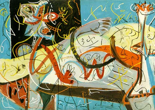
<1951. Enamel paint on canvas, 7′ 7 7/8″ x 7′ 2″ (233.4 x 218.4 cm). Acquired through the Lillie P. Bliss Bequest and the Mr. and Mrs. David Rockefeller Fund. © 2010 Pollock-Krasner Foundation / Artists Rights Society (ARS), New York>
Art is Ambiguous: Abstract art finds its values from ambiguity. Among the paintings, today’s exhibition could be summarized by “rediscovery of Jackson Pollock.” Jackson Pollock was an American painter who significantly influenced other abstract artists by developing the action painting method for the first time. This was just general information that I had about him. I knew about his style of spraying the paints all over the canvas creating undefined figures, but I couldn’t appreciate his artwork before. I secretly grumbled whenever I passed by his paintings, “Hey, I did the same thing when I was in 4th grade art class!”
Nonetheless, something has changed this time. I could not arrogantly walk away from his painting. The one that stroke me the most was “Echo: Number 25, 1951.” I never knew Pollock’s painting blobs had this deep sensation in them. As if I were seeing a vibrant herd of horses on some oriental painting, all the ambiguous figures were weaved together and emitted a powerful energy. From his painting, I was able to find the first, simple definition of art: it is a process of creating something from nothing.
 <1941-44. Oil on canvas, 27 1/4 x 17 1/8″ (69.2 x 43.5 cm). Gift of Renate Ponsold Motherwell>
Art is Abstract: Abstractism prevents us from judging the values of the artwork. The one aspect that I really love about abstract art is that there is no right or wrong answer for your own interpretation of the work. Most of them do not even have a title. For the ones that actually have a title, I tend check the title at the last minute: by doing so, I can freely think and interpret the artwork through my own lens. When I was looking at Robert Motherwell’s “The Little Spanish Prison,” I didn’t look at the credit to check the title. Somehow, the painting’s yellow and white stripes with one accentuated pink vertical block on the bottom reminded me of a prison cell. After checking the title, I was very happy. It wasn’t simply because I made the correct guess; but, I was able to connect my thoughts with the artist and communicate with him through his painting.

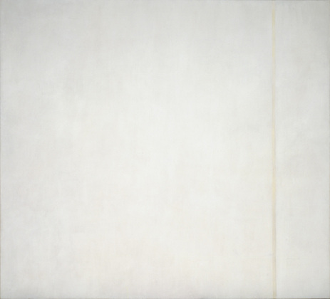
<1950. Egg tempera and enamel on canvas, 8′ 1/8″ x 8′ 9 1/2″ (244.1 x 268 cm). The Sidney and Harriet Janis Collection. © 2010 Barnett Newman Foundation / Artists Rights Society (ARS), New York>
Art is Atypical: If we see an artwork like Barnett Newman’s “The Voice,” we arrogantly say, “A 4 year-old can even do this!” Yes, his painting is nothing but a giant white canvas with one indefinite line on the side. And yes, maybe a 4-year-old can imitate his painting after staring at it for 5 seconds. However, here is the real difference. You might have thought of the same idea, but you’re not the one who created this art. You are not the one who executed the same idea to share with other people. It seems very easy to be an artist, but certainly not everyone can become one. Whether the painting is consisted of seemingly meaningless colors, shapes and lines, its value for is in being someone’s exclusive idea that wasn’t originally expressed. A typical artist follows what other people think. However, an atypical artist listens to his own voice and expresses what he thinks.
I personally consider having a definite and unique style as the most significant trait of an artist. In that perspective, Pollock’s natural and vibrant flows of enamel painting on the white canvas reveal his creativity and philosophy as an artist. I also admire his audacity of executing his ideas even though knowing that people are going to insensitively degrade his or her artistic values for its simplicity and easiness. As I was approaching the newly derived definition of art, I became terribly lost. In art, there is no right or wrong answer. Each one of us has a different voice from one another, and we all have different perspective through our own lenses. I was able to make different approaches for deriving the new definition of art by encountering new inspirations from the exhibition “Abstract expressionist New York.” There is no one definition that can solely stand for defining art. When my opinion and the artist’s intention finds an intersection, that is the moment that art meets its fullest value.
December 13, 2010 No Comments
MoMentous
I had been to the MoMa once before, I remember, vaguely. I must have been young because I could hardly recognize it. When I walked through the exhibits, it all seemed so enchanting. Granted, some were a little too abstract for my taste. But others seemed so inventive and thought provoking, so I wrote a few down.
One specific artist written on the top of my list was Barnett Newman. Newman’s work stirred up conversations. Most around me were unappreciative, and just saw a line. At first, I did too. But lines are not just lines when they are exhibited at the MoMa, so I decided to take a look. Apparently, the idea behind Mr. Newman’s collection was to convey a sense of separateness, while being completely connected. It is a message of the human race, and how disconnected we all feel but in reality, we are all together. After reading that, it was much more than just a straight line. Modern art, I believe, is really just the manifestation of a concept. Instead of creating an aesthetic, it focuses more on an idea than the final product. A line isn’t exactly a work of art, unless the line represents an idea.
I see where some people may lose appreciation here. But there is something to say about the concepts behind some of the pieces I saw at the museum.

http://nsm.uh.edu/~dgraur/images/newman.bei.jpg
Robert Frank’s exhibit interested me as well. Frank was a photographer in the 1930s whose work in black and white film “stood out” to say the least. I shuffled through a book of his prints, some of which were enlarged on the adjacent wall. They were beautiful, and caught real people doing mundane things. One that struck me hard, and pained me to see, was Dead Horse.

http://lh5.ggpht.com/_hBqdPD_7M_Y/SoedMrNL97I/AAAAAAAAF7E/gtikTfiGsHE/robert-frank-dead-horse%5B3%5D.jpg?imgmax=800
I have seen war photography, and I have seen pictures of crime and death, but never of a horse. Maybe I have a soft spot for the animals, but this was something I never wanted to see. But maybe that is art – bringing to light what no one would intend on showing you. It evoked emotions, alright.
But the one piece that struck me the most, was Big Red by Sam Francis. I do not really know why, but I must have stood by myself staring for a good five minutes. The intricate layerings and the colors just brought about a lot in me. It must be the pure size of it – it’s huge – and the solemness of the painting. I almost wanted to cry.

http://farm1.static.flickr.com/63/207519788_c3c5fa59a7.jpg
So, I went home and made it my laptop background. It’s the most I can do to pay personal homage.
December 9, 2010 No Comments
The MOMA: Gravity—and Expectations—Defied
If anything, I was skeptical. Modern art had always been a concept that I wasn’t all that enthusiastic to know more about. Still, I knew it wasn’t worth it to complain—so there I was.
The entrance restored my faith in our adventure. Within steps of the ropes was an exhibit that attracted the attention of dozens: two seamless pieces of what seemed to be film reel, moving back and forth suspended between two fans, adorned the rise before the stairs. The work literally seemed to defy gravity, and the lighting made it possible for the clear, taut ropes keeping the reel aloft to be made invisible. Feeling slightly less wary of what I was to be subjected to, I ventured onward—and began to see fascinating things all around. One of the first pieces to catch my attention was Richard Pousette-Dart’s “Fugue #2.” At a first glance, it made no sense to me; it just looked like incoherent swirls and shapes. However, upon looking at the title, I began to realize a pattern. Knowing nothing of art, I drew upon my knowledge of music: a fugue is a piece of music that is written using the same main theme repeated and layered over itself. With that in mind, the painting seemed to be using the same concept; the more I looked at it, the more I could see repetition of swirl patterns, of subtle layering. It seemed as though the artist picked such a title to shroud the piece in further mystery than it offered alone, yet still offering insight into the intent that would otherwise be overlooked. Not all of the art was quite so discernable, though. Works such as Hans Hofmann’s “Memorie in Aeternum” caused me endless consternation—despite the piece’s beautiful colors, defined shapes and soft background, I could not determine the true meaning behind the piece (and the title certainly didn’t help me).
It seems that, although much modern art is quite prestigious—and rightfully so—some slip through the cracks…and onto the walls. Despite the fact that the definition of art isn’t incredibly subjective, I just couldn’t bring myself to accept some of the things that were exhibited. One example was the construction paper area. Sure, some of the works were intricate and beautiful, but I must admit that I almost laughed a little when I saw “Untitled (Collage with Squares Arranged According to the Laws of Chance).” I just couldn’t shake the feeling that my mom had kept something that I had made in kindergarten that looked just like that…
Still, as I shook my head and walked away, I realized that I was never far from a piece of art that shocked me with its skill and conceptual insight. Like the loops of film that were floating on the newly visible cables in the midday’s natural light, even though I was sometimes able to see through the myth of the glory of the MOMA, my expectations (like gravity) were defied—and in one of the most beautiful ways possible.
December 9, 2010 No Comments
Abstract Art
We often hear the clichéd phrase “art is in the eye of the beholder.” It is based on this phrase, that I make the claim that the Abstract Expressionist Exhibit at the MoMA was completely bizarre. However in this context, bizarre doesn’t necessarily have a negative connotation. I found some of these bizarre paintings aesthetically pleasing, while others not so much.
Jackson Pollock’s idiosyncratic style was perhaps the most eye-catching in the exhibit. On his canvases we see a mesh of vibrant colors, and unique shapes and figures that do not fail to attract viewers. My favorite painting by Jackson Pollock has to be “The Flame”. In this painting, Jackson blends an array of colors to portray a formidable flame. Another one of his paintings that really caught my attention was the “Stenographic Figure.” In this painting, there appears to be two alien like figures, but they are hard to distinguish because they are blended into the colorful background, and this adds to the strangeness of the painting. This painting has a sense of insanity to it that makes it alluring. Jackson’s “Number 1A”, which was one of the largest paintings in the exhibit, was also another painting that had this sense of insanity. It looked as if he just threw paint on the canvas. This paint spill look, and the seemingly rough texture of this painting help in creating this effect. Overall, Jackson Pollock’s work was extremely lively.
Some of the abstract art on display left me really confused. The supposed artwork done by those such as Barnett Newman and Mark Rothko fit into this category of being confusing. Due to the simplicity in their paintings, I could never consider their works as art. Each one of Barnett Newman’s paintings on display was dominated by a solid color, with either one or a few vertical stripes. One of his works, called “The Voice”, was just a blank white canvas, with a vertical stripe. In my mind “The Voice” is an inappropriate title, as the work fails to generate even a whisper. It is so lifeless, that from a distance, one might not be able to distinguish the painting from the wall it is lodged upon. Also, like Barnett Newman’s paintings, I can’t credit Mark Rothko’s work as being art, because his paintings were also overly simplistic. In his paintings, instead of using thin, vertical stripes, he uses thick horizontal stripes and places them on a solid background. One such painting of his, “No. 14”, has four horizontal stripes placed on a brown background; it was a very bland painting. As a viewer, I found it puzzling to see such simple works on display at the world famous Museum of Modern Art.
Every individual has a distinct taste for art, and with its large collection of artwork, the Museum of Modern Art, will satisfy all visitors. In my mind, the Abstract Expressionist Exhibit has its highs and lows. I found the work of Jackson Pollock to be very energetic, while that of Mr. Newman and Mr. Rothko to be lackluster. Overall, seeing this exhibit at the MoMA was a great experience, which allowed me to explore my views on abstract art.
links for images
http://lh3.ggpht.com/_KzfpIs7qjJ4/SsVW4vwPs2I/AAAAAAAAAmI/5i3cnvDiuDw/CRI_151099.jpg
http://www.danploy.com/Assets/Art_History_photos/Panofsky_Stenographic%20Figure.jpg
December 9, 2010 No Comments
The Order of Art

What is art? That was the only question I still could not answer, even when I was standing in front of several well-known and celebrated paintings by several significant artists of the 20th century. Before I arrived at the Modern Museum of Art, I knew that the day would be a challenging one. As an art student, it seemed like I had to know what the exact criteria was for the perfect painting, or any piece of art really. To tell you the truth not a single person can give an accurate definition of what art is, and I had to discover this all on my own as I stood puzzled in front of Louis Nevelson’s Sky Cathedral. When I first observed it close up, I realized that each single section of the humongous sculpture was “art” in itself. Upon further reflection, Nevelson’s goal was to create a collage of sculptures, thus create a piece that was art within art. Standing alone in front of this majestic collage-like structure, I feel time halter just for a moment. Eureka!
The definition of art from any dictionary is the expression or application of human creative skill and imagination producing works to be appreciated primarily for their beauty or emotional power. After observing all the different pieces of Sky Cathedral, I can say I finally understand art, if only for my own understanding. Works of art are beautiful or emotionally moving because they appeal to the natural law of order and chaos. For the American born sculptor Louis Nevelson, chaos was one of his most creative and useful tools as an artist. The old saying, “From chaos comes order” contributes to the beauty of art, especially for collage-like sculptures. The difficulty of making unique miniature sculptures, and then conjoining them to make one beautiful sculpture displays the exact meaning of the saying. To all celebrated artists, they understand that art is not only a reflection of themselves, but also a technique in which they are able to establish order in a world overwhelmed by chaos.

The Trafalgar Square of the Dutch painter Piet Mondrian further exemplifies the truth in the saying. In the painting, Mondrian simply paints a few black lines and several yellow, red, and blue rectangular shapes. But this piece is considered beauty by its very definition because of the way random lines and shapes are put into a specific order to create such a painting. Every time we look at a painting such as this, we are specifically reminded of Mondrian’s work, simply because his style of painting lines in one place, and rectangular places in another remind everyone of this idea of order from chaos.
The trip to the MoMA was educational and entertaining because I was able to understand the full meaning of what art is. Although art may be subjective, there are several universal characteristics that make something a masterpiece. Personally, art is the transformation of a chaotic being or substance into that which is ordered and systematic. In retrospect, I feel that this personal definition holds true when reviewing the pieces of art I have seen at MoMA.
December 9, 2010 No Comments
Museum of Modern ‘Art’
It’s ironic to consider that while I admittedly possess little artistic ability, I have a very critical eye for what I consider art to be. While some may label this knack as hypocritical, I consider it to be an inner voice a reason. Call me old fashioned, but in my mind the best art is that which possesses an identifiable subject, like the statue of David, or any other of Michelangelo’s works. You can only imagine then how I must have felt surrounded by various Jackson Pollacks and other abstract works at the Museum of Modern Art last week.
Before proceeding any further, I think it is important to point out that I have but one minor problem with the (no doubt) effort-filled, time consuming works that were on display: they aren’t art. (Of course, such is just my opinion and it’s impossible for me to prove the validity of such a claim, but I will make it anyway.) Perhaps my opinion has something to do with my long held belief that if I or my little eight-year old brother could produce a piece of equal or greater value then it ought to be classified not as art, but ‘a piece of work;’ it surely took a great deal of time and effort to produce many of the exhibited pieces and I believe that the phrase, “piece of work” (not ‘piece of art’), best captures the intentions of the artist whose work it is, and at the same time leaves a certain reverence for the successes of the artists in the past.
The first ‘piece of work’ that I came across was the two-fans exhibit at the base of the stairwell leading to floor number two. The piece, which featured constantly moving circular strips of material between two fans was certainly an attention-grabber. Was it creative? Yes. Did it pass the MoMLB (me or my little brother) test? No; and it certainly wouldn’t be the last piece to earn that distinction. Perhaps though more than any other section in the museum, it was the Barnett Newman display that I will remember the most. Newman, it appeared enjoyed very simplistic pieces, often only one or two colors were used along with his ‘trademark’ vertical line (how original). The room may as well have contained one painting as they seemingly all were reworks of the same concept. Worse than that though was the slovenly painted inch and a half wide by nine feet high piece of canvas that hung in the far right corner of the room. If that was art, then the molding in my house just needs to be turned upright, and I would have 4 Newman-esque works in each room of my house. Newman’s work though wouldn’t be the last that forced me to question my traditional artistic viewpoint, as nearly everything else that I saw made me ask myself the question, ‘Is this art, or not?’
As I left the museum on Thursday, if nothing else I learned that there are plenty of ways to look at any particular piece of work. Am I really as intolerant toward new forms of ‘art’ as the better half of my paper suggests? No, I am though very leery on those who suggest that anything can be art; ultimately it boils down to the one’s vantage point: art to you very well may not be art to me. Then again, it’s always good to expand one’s horizon, and the trip was no exception, I saw things I wouldn’t have ordinarily seen and am glad that I did.
December 9, 2010 No Comments
Moma Review
Modern art is controversial. A lot of people hate it, claiming their infant sibling could create a canvass equivalent to those of Pollock or Newman. Maybe they could, I won’t bother to elucidate the technical details of most of these pieces. People tend to look at a persons art and life separately. Those who claim Jackson Pollock was a foolish drunk who drowned his life in a bottle and occasionally splattered paint on a board are differentiating between his life and work to a hypercritical and frankly illogical degree. Dislike of an artwork is not reason enough to ridicule the artist. For the most part abstract artists were the first of their kind, exploring new mediums and challenging old unspoken restrictions on painting, drawing and design. At a bare minimum these artists deserve a degree of respect and an acknowledgement for their part in the liberating of art.
Not everyone is a fan of red boxes and brown lines, abstract art is an acquired taste; it’s sort of the olive of the art world. The various subcategories of the trend vary so immensely that it is easy to love one work and hate another. I appreciate abstract art. The most extreme versions tend to shy away from my personal taste, I’m not big on hanging up a black canvass and calling it brilliant but someone saw some value in doing so, and others manage to enjoy it.
I have come to know the much of the permanent collection at Moma well, but it’s impossible to wander its halls and not find something that feels new. This time the first piece that stuck with me was “Glass in Snow” by Harry Callahan. Upon initial glass this photograph looks like some random black lines and squiggles thrown upon a paper but after adjusting to the lighting and soft shadows, you recognize the sharp shards of glass implanted in what you’re told is a bank of snow. What I found so appealing about the piece was the invisibleness of the shards, without the description one would have any idea that the figures were glass. It’s dangerous, and really beautiful at the same time. I found the image to be both refreshing and intriguing and Callahan’s other photos were of similar style.
The other piece I was impressed with was “Untitled” by Norman Lewis (1949). It’s an oil painting on canvas but completely different in design from any oil I’ve seen before. My taste in fine art is eclectic but when I draw or paint I prefer design as opposed to figure sketching. This piece is dark and fluid but with contrasting straight edges that don’t actually distract you from the smoothness of the piece. I like the mystery, it looks like it could be the background of a fantasy movie or the sort of thing you imagine while reading a dark novel.
Every time I visit Moma I do so from slightly older eyes. It’s interesting to note the pieces that I always love, the ones I lose interest in and the ones I see differently having since learned different things. Knowledge of an artist’s life can provide a new level of appreciation for his or her work while understanding of a time period can reveal subtle commentaries within a piece. Moma continues to impress me with its unique array of exhibitions and again its lovely permanent collection. I look forward to what it will offer next.
December 9, 2010 No Comments
What is “Art?”
What is art? Is it a series of lines drawn strategically to create an image, or is it a series of lines randomly scrawled across a blank canvas? Is it a blatant image, or is it abstract? Is it a story of a person, or is it a story of emotion? The Museum of Modern Art gave me a glimpse of the wide variety of art that artists have to offer the world.
Upon entering, I saw a glass container holding soil and a few green plants. As simple as this structure was, I thought it resembled the essence of art in nature. I thought it was a clever piece of art right at the entrance of the MoMa, a small glimpse of the art that was to be presented once I passed the ticket holders and walked toward the galleries waiting for my viewing.
When I walked upstairs, I encountered a colorful array of empty food containers and household products stacked and splayed across a wall of white; this was George Maciunas’ “One Year.” It amazed me to see every item Maciunas ate or drank behind this glass display. Maciunas was the leader of the fluxus movement, where artists and music composers all over the world focused on anti-art and anti-music to subvert previous art traditions. The fluxus movement focused on each artist’s individuality and gave each artist the freedom to express his or her art in ways that were untraditional in the past. Maciunas took me by surprise by using organized food containers to use as art materials rather than the typical paint and blank canvas. It was a collage all on its own: Maciunas stacked his food item packages according to the product itself and made the heights vary in such a way that the peaks appeared to resemble the skyscrapers of New York City.

As I walked through the MoMa, I entered the Abstract Expressionism display subtitled “The Big Picture.” These artists aimed to create art that would “reassert the highest ideals of humankind” (MoMa). I noticed many of these abstract works resembled pain and destruction to refer to the war and Holocaust that occurred in the years prior to the movement. Jackson Pollock’s “The Flame” immediately caught my eye as I entered the gallery; the dark colors of black and red emanated fire and the black claw-like strokes resembled victims’ hands outstretched for help during the Holocaust. The oil paint on the fiberboard canvas seemed the painting texture the way flames have texture.
As I continued into the next room, I saw huge canvases with scarce strokes of lines. Barnett Newman was an artist who made paintings that “downplayed traceable signs of the artist’s hand” (MoMa). One particular work called “The Voice” featured a white canvas with an off-white line going down the right side of the painting. As I approached the painting to look at the strokes, it appeared as if the painting was a photograph, for it was completely smooth and I could not tell that it had been painted onto the canvas. All of Newman’s paintings varied in the colors used and the locations of these vertical lines. I noticed that in some of these paintings, the vertical lines were painted first before the “ground,” or the space behind the vertical lines, and others had the vertical lines painted after the ground was painted.

The next room was abundant in paintings with what appeared to consist of random splashes of paint on canvases. Jackson Pollock proved to be one of the most profound abstract expressionists in his time. He used paint pouring and drip techniques to cover his canvases in a completely abstract way. Although Pollock’s “Full Fathom Five” was one of his first pieces using drip technique, it appeared to be the most complex; I had to speculate the painting to see the nails and keys and cigarettes embedded underneath the oil paints. Incorporating these items into his work gave the painting more texture and dimension overall. His other works consisted of the characteristic drip technique he was known for and also varied in colors. Most of his works had the colors black and white in it to show extreme contrasts in the paintings. After seeing his characteristic drip technique paintings, I came across “Echo: Number 25, 1951.” It was completely different from his other paintings and seemed to have an abstract pattern to it. Using only black and beige colors, he created feather-like strokes on his canvas and elegant swirls. It gave the painting a whimsical, feminine touch, which was a vast difference compared to his other works.

As I walked into a room full of sculptures, I came across David Smith’s “Cubi X.” I really enjoyed looking at this structure because I could see the silhouette of a person walking mid-stride. There is a bit of irony with Smith’s use of stainless steel, a metal that does not easily bend; this structure depicts a person in motion, perhaps even dancing, and motion requires fluidity and movement, something that metal is not meant to do. I admire all of these artists, especially the abstract artists due to their vast creativity and vision in creating works of art that require viewers to look beyond what is displayed in front of them; I thoroughly enjoyed delving into my imagination to see what images I could fathom from these pieces of art.
December 8, 2010 No Comments
MoMA Review
From the first piece we saw at MoMA, “One Year” by George Maciunas, I knew that in order to enjoy this trip I had to abandon my previous notions of what art is. The Fluxus movement is contradictory in nature… an art form that promotes anti-art ideals. Their goal is to expand our definition of what art is and one must keep an open mind when taking in a piece such as this, which seems like just a collection of things piled up on a wall. Even though it is anti-art, I do see elements of traditional art in it. I can tell that each item is carefully thought out and placed, and as a whole makes a pattern of bright colors in an unexpected medium.

Once we got to the main exhibition of Abstract Expressionist Art, I found that the paintings I could appreciate most were the ones that were grounded in reality, and had elements of a face or a body that I could point out. Sometimes I couldn’t pick anything out upon first look, but was able to identify some things after reading the title and background information next to it. This made the experience feel like a scavenger hunt, it was fun to try to guess and find what the artist was trying to portray when he painted. I appreciate this about abstract art because in this way the realistic pieces are too easy, there’s more to this than just drawing what’s in front of you.
One painting I particularly enjoyed was by Adolph Gottlieb, entitled “Man Looking at Woman” (1949) I liked this painting because it uses simple colors, just greyscale with a bit of yellow and maybe a dull pink. There are squiggles and lines which i’m unsure of the significance of, if there is any. These surround the focus of the piece which, as the title would allude, is a man looking at a woman. They are drawn in an interesting way though; the whole piece gives the viewer an air of hieroglyphics. It must be difficult for someone in 1949, which are fairly recent times, to try to capture an art form that dates back to 4000BC but I think he is very successful in reaching his goal.

Another theme that I found in many paintings that texture. It was quite interesting how thick the paint is layered on some of these pieces, and how different colors are used each layer which serves to give a unique look to the painting. Many of them I found were painted using “oil and sand on canvas,” such as “Western Air” by Robert Motherwell. I took a close up of this painting to show what stuck out in my mind, which was the gritty and messy feeling of the painting which could probably only be achieved using the rough sand.

Overall, I had a great experience visiting MoMA. However, as much as I open my mind to what art is, I don’t think I’ll ever gain an appreciation for pieces like this one:

December 8, 2010 No Comments
Abstract MoMA
What is art? That was the question we were given when we had arrived at the Museum on Modern Art. Despite spending a couple of hours walking around, observing some of the most famous art works in the world, I left still not knowing exactly what art was. Art is subjective and that is the only answer to that question. What I find to be a masterpiece, you may find to be a piece of trash. And vice versa. Depending on each person, people find different meanings in different pieces of work. It is what you make of each painting or sculpture or drawing that makes it art.
MoMA introduced me to a wide variety of abstract art that I have to admit, seemed very odd to me. A white wall painted over and over in different colors? That’s art? A few swirly lines? That’s a masterpiece? I think I remember myself doing that same work when I was about five years old. Those are the types of thoughts that went through my mind when seeing works such as those. Barnett Newman was a main artist at the museum that had a whole room dedicated to his work. I couldn’t believe that his art goes for thousands of dollars. But that goes to show that art doesn’t have a definite meaning. I should not be criticizing someone who has major works in a museum such as the MoMA. Just because I don’t find his work to be powerful or interesting, that doesn’t mean others don’t either. Obviously people do if Newman is such an acclaimed and successful artist.
Although I have to admit that I wasn’t so amazed by a few of the paintings and other works of art that we saw at the MoMA, most of the pieces we saw I do consider to be art. One of my favorite artists I saw in the exhibit was Jackson Pollock. One thing I especially admired about his work is that his paintings have texture. He had depth in his art and it popped colors out at you that really grab your attention. “When I am in my painting, I’m not aware of what I’m doing. It is only after a sort of ‘get acquainted’ period that I see what I have been about. I have no fear of making changes, destroying the image, etc., because the painting has a life of its own. I try to let it come through. It is only when I lose contact with the painting that the result is a mess. Otherwise there is pure harmony, an easy give and take, and the painting comes out well.” -http://en.wikipedia.org/wiki/Jackson_Pollock
As you can see from this quote by Jackson Pollock, he simply let’s his paint have a life of its own. He doesn’t think too much about what he is drawing. He just DOES IT! It is like he makes abstract art in an abstract manner of doing so. Nothing is organized or prepared. It is simply spontaneous and that is what makes his work so unique.
I think one of the greatest things about abstract art is that you can make the painting or sculpture what you want it to be. There is no concrete picture being portrayed so the viewer can observe the piece in his or her own way. For example, at one point in the museum Matthew and I walked by a sculpture that appeared to resemble some type of animal. Matt said it was a fish. I said it was a grasshopper. It turns out the name of the sculpture was “Australia.” Abstract art brings opinion upon itself and that is okay. We should all be able to find different images and meanings behind what we see.
I am definitely glad that we were able to go to the MoMA because it without a doubt opened up my eyes to the various forms of art in the world. And whether I agree with some or not, it is still good to know the variety behind the different styles.
December 8, 2010 No Comments