While I couldn’t explore the Guggenheim Museum in person or walk through its halls full of art, the online presence still provided great experience that I would not have gained otherwise. Often times, when I used to visit a museum I did not sign up for tours. Instead, I went with my friends to simply observe and enjoy art that caught our eye. As a result, however, I feel that sometimes we do not spend enough time to understand the history and purpose behind certain artwork or fully process it. Therefore, I think that one of the biggest advantages of the online museum platform is being able to listen to an individual speak about the artwork. Moreover, sometimes particular exhibits in a museum are extremely crowded and therefore does not enable one to fully explore or visit that exhibit. Now, one can visit any exhibit and have the ability to spend more time. I was capable of doing so by supplementing my visit with a google tour and audio guides of exhibits that are accessible on the site. All of these faculties enabled me to discover new art and spend more time learning and appreciating the detail and background behind each piece.


One piece of information that I would not have learned, had I been there in person, would be about the history of the architecture of the Guggenheim Museum. Being there in person, one would instantly take notice of its spiral architecture. However, I was capable of learning that the original purpose of the museum was to be a top-down museum. Mr. Floyd Wright, the architect behind the museum, initially intended for people to take the elevator all the way up and then explore the exhibits as they progressed downwards- which is not the case today. Additionally, Mr. Wright created and implemented the concept of organic architecture in the design due to its proximity with Central Park in order to create a design that complemented the beauty of nature.
Despite this, I do believe that the experience of being in a museum in person is quite different. For some pieces, the brush strokes, luster, and color variation are details that may have been more magnified in person. Additionally, the ability to step back and see the exhibit as a whole to see the overall message is also another detail that is not captured online. Moreover, another downside of the tour is that not many pieces are depicted and described which lead me to go on the google tour and visit exhibits online to further explore the museum.
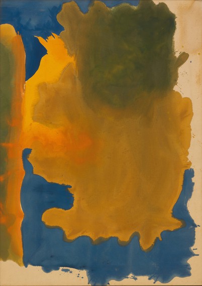
 Canal, 1963, Helen Frankenthaler
From my visit to the museum, one particular exhibit that I was drawn to was The Fullness of Color. This exhibit had artwork from the 1960s in which artists were experimenting with abstract art and creating new techniques. The artist of the art piece above, Helen Frankthaler, created the technique of soak stain in the 1950s which is depicted in Canal. The vibrancy of the colors used as wells as the melding of the colors together naturally really drew me to this piece and I think that being able to see this piece in person would have been a better experience in order to see the texture and see the melding of colors up close as well.