


Contact Information
Professor: Edward Smaldone
Edward.Smaldone@qc.cuny.eduITF: Maggie Dickinson
Email: maggie.dickinson@gmail.com
Office Hours: Monday 1-4pm, Tuesday 2-5pmCategories
Article Sources
Blogroll
A Semester’s Worth of Stubs

Although it seems like our first semester in college has flown by in an instant, when you reflect on the the semester, it is interesting to see how much we’ve experienced, where we’ve been, and what we have seen. I don’t want to sound all nostalgic and touchy-feely about the fact that our class is over. But I do think that it’s always important to to look back after you’ve finished anything and assess how much you’ve accomplished. Let’s take a stroll down memory lane and look back at some of the semester’s main events:
Instead of going in chronological order, I will follow my tickets stubs starting from the top left and proceeding clockwise. The upper-left-most ticket stub is none other than our beloved classical guitar boy band, the Assad Brothers. While I greatly respected them as musicians, I felt that the concert wasn’t as riveting as many of the other concerts that we’ve seen this year. I was practically more engaged by their Brazilian accents than the music itself. One thing that still puzzles me about that show was why one of the brothers randomly disappeared for a little while. One of the best parts of their act is the spectacle of seeing both brothers perform in such flawless unison. With one Assad brother on the stage alone, it just wasn’t the same.
Let’s keep rolling to the next stub, which for some reason I placed vertically. This is from our trip to the MoMa, when we saw the Matisse exhibit, in addition to other interesting works, including some Jackson Pollock paintings. I have two distinct memories from this visit. First of all, I will never forget the feeling of showing my Macaulay ID and receiving my ticket stub, which read “Free: $0.00.” That gets me every time. But more seriously, I remember telling Professor Smaldone that I didn’t see the beauty in the Mark Rothko or Barnett Newman paintings. Highly disappointed with my close-mindedness, Professor Smaldone gave me an inspiring lesson about the way to approach works of art and different ways of looking at the works than I had done before. Although I am still not such a big Rothko or Newman fan, that experience definitely changed my perspective on modern art.
Onto the next blue ticket from the 92nd Street Y. This one was from the lecture with Victor Wooten and Daniel J. Levitin, which was one of the more controversial outings among several of our classmates. I clearly remember taking the subway back to Queens and listening to a bunch of our classmates, including Greg, Erica, and Alyssa, argue about the merit of Wooten’s philosophy that anyone can learn to play music well at any point in their life, regardless of their musical background. Whether or not you agree with Wooten’s philosophy, I have to say that his bass version of “Amazing Grace” is one of the most incredible pieces of music that I’ve ever heard. Watch a version of it on YouTube. Just look at his fingers! Absolutely amazing.
The next three tickets are from Cosi Fan Tutte, Iolanthe and Brigadoon. Because most of us spent a lot of time thinking about these three over the weekend in preparation of the final, I don’t think you really need me to remind you about them. However, some of you may be wondering why my ticket from the Met Opera is handwritten. Well, that would be because I smartly lost the one Professor Smaldone gave to me in class, so I had to get a makeshift ticket.
The next ticket is from our first class trip to Le Poisson Rouge, followed by the ticket from my group outing to the Guggenheim, and finally my ticket from Fall for Dance. I hope that this post brought back some memories from the semester. I can’t imagine that Semester 2 about the People of NYC will be as enjoyable, but let’s hope for the best!
My Snapshot 2010 Experience
Although it was raining frogs yesterday, I braved the weather to attend Snapshot 2010, the last official event of Seminar 1. All of our photos were curated in the Macaulay Cabaret under the theme, “Crossroads,” for many similarities were present. I commend the volunteer curators for assembling a beautiful display; the model buildings that also held some photographs was a nice touch for the New York theme. However, the real fun proved to be “re-curating” the exhibit. With our Vado video cameras, my group shot footage of the exhibit to show how we would organize it via video. The result is “Day and Night,” which uses the photographs to show a day in the life of a New Yorker, from dawn to dusk. We felt that all of the student’s submissions provided a chronological sequence in addition to displaying the similarities in content. However, I did not find their way of sorting the photographs to be impressive. Grouping similarly themed pictures together helps show the differences in approaching the theme, but that method seemed too conventional and easy to put together. Anyone can dedicate a section to portraits. I’ll be looking forward to seeing contrasts next year.
Canvas? Paint? No, Just Sound
Each year in London, a British artist is chosen to receive the Turner Prize, which is a monetary award given to an artist who “pushes the definition of ‘art’ in <a> novel and provocative way.” This year, the Turner Prize was awarded to Susan Philipsz, who creates all of her artwork using nothing but sound. Her art is “displayed” in various galleries, and one piece, titled “Lowlands”, is now on display at the Tate Modern Gallery. This particular work consists of an empty, off-white room, where Philipsz’s voice can be heard through three speakers, singing three variations of an old Scottish lament. A visitor who saw “Lowlands” said that she enjoyed it much more than she enjoyed the previous Turner Prize winner’s artwork. She claimed that while the other works were “visually unsatisfying”, Philipsz’s “has a completeness — it’s very simple and it moves you in a different way.” Another visitor said that Philipsz’s art reminded him of sculptor Richard Serra. He said that “her art makes you think of your place in the world, and opens you up to your feelings.” Isn’t it strange that the artwork with nothing visual about it gave one the sense of completeness and evokes deep emotions?
However, not everyone was as satisfied with “Lowlands” as the above visitors were. Many people were confused by it, claiming that it was not something that they were used to. They found it very interesting, but were unsure of how to react emotionally. Others said that the artwork would have been better experienced in different environments in order to get the full effect.
Below is a short excerpt from one of the variations of “Lowlands” sung by Philipsz. It is very simple and sort of haunting, in a way, which actually adds to its beauty. Just imagine listening to this while standing in an empty, off-white room. Sure would make you think!
http://www.youtube.com/watch?v=Kp1IjBycbdI
You can read more about this here.
Pac Man!
I’m sure you all know the game Pac Man, even if you’ve never played it, surely you’ve heard of it. But, just in case you didn’t, here’s what it is: (I’m not really sure how to describe the game, so just watch the video)
Basically, the point of the game is to not get eaten and get all the little dots! If you’ve never played it before, it’s actually a lot harder than it looks (at least for me). So why are we talking about Pac Man? Aside from it being a classic game, I saw this cute video and thought to blog about it. A person named Guillaume Reymond, decided to use people as pixels to create a game of Pac Man. It’s actually pretty cool, check it out:
There are various different videos that uses people as pixels to remake classic games like tetris, space invaders, and a few more. These videos have won the youtube awards, and well I consider it to be very artistic. We know how difficult it is to edit our videos, and working in a group usually present some problems. This is one really fun type of art, and it a lot of work to organize.
For anyone who would like to see more of these people as pixel videos, just google: Guillaume Reymond
Oh and here’s a cute take of Pac Man!
Octogaga
 When one thinks of Times Square, the concept of tourist attractions come to mind. One of the veteran places in this area that entices millions of visitors is the Wax Museum of Madame Tussauds, which features the wax figures of celebrities of the past and present. However, aside from the humorous poses with these statues, do you contemplate the process of making these works of art? Recently, Madame Tussauds undertook the task of creating eight was figures of the pop star sensation Lady Gaga for the wax museums created around the world. The process is a very long one, for the statues are created from scratch. Artists build up from a metal frame with clay to create a plaster mold in order to pour in wax. The hair of the celebrities are individually inserted as wigs, extensions, or both. Even the clothes are painstakingly made from various materials, and the shoes are cobbled.
The process of creating these wax figures reminds of Yigal Ozeri’s works. Artists create an illusion of skin color and makeup with paint using various techniques and building it up, just like how Ozeri creates an illusion of a photo with paint as well. I am also reminded of the moveable type printing press, for two molds of Lady Gaga’s face and body were made to form the eight figures. You can learn more about the process here:
Afghanistan in Theater and Art
As I’ve alluded to before, I often read the Queens College emails sent out about upcoming events. Those of you who also read about upcoming events at Queens are probably familiar with the travelling mural exhibit at the Godwin-Ternbech Museum. I personally love the title- Windows and Mirrors: Reflections on the War in Afghanistan. Here’s a link to the beautiful slideshow of artwork: Slideshow I thought of this exhibit as I read about “The Great Game: Afghanistan”, a play by the Tricycle Theater that offers an indepth look at the country we’re at war with. How we use art to understand the world around us continues to fascinate me.
Giant Nativity at the Met
Beginning in 1954, an annual Christmas Display has been going on at the Metropolitan Museum of Art, due to the dedication and hard work of Loretta Hines Howard. Howard began collecting crèche figures in 1925 and came up with the idea to display these figures set up as a nativity scene alongside with decorated Christmas trees for the public to see in the holiday season. Throughout the years, new crèche figures have been given to the museum and Howard’s ancestors have carried on her legacy in adding to the presentation.
Now, what exactly are these crèche figures? In a normal nativity set, there are figures representing all who were around when Jesus was born in a manger. These crèche figures are those figures that are in a normal nativity set, except these crèche figures are like little works of art themselves. They are like small sculptures, ranging from 6 to 20 inches in height and appear lifelike. They are made out of terracotta, and were worked on by many famous artists in Naples, Italy. My mother had actually seen this display when she was in her twenties and she said it was beautiful. I think over the break I would like to go see it because I’m sure these pictures don’t do it justice. I have seen many nativity scenes before and I’m sure the overwhelming amount of such intricate figures would be something worth seeing. Here is a link to the article for anyone who is interested in learning more. Below, I will put some pictures 🙂


Shoah Revisited
Yesterday, Professor Smaldone made a blog post about the re-release about the film “Shoah,” about the Holocaust, and I felt that I had to make my own post about the topic. I would like to speak about two different ideas related to this topic. Firstly, I would like to discuss two films about the Holocaust that I have seen that were not mentioned by Professor Smaldone’s post. Secondly, I would like to briefly discuss my own trip week-long visit to Poland in June, and share with you some pictures that I took of the actual places where the monstrosities that are depicted in these films were committed by the Nazis.
Before and during my trip to Poland, my class was shown many films about the Holocaust. There are many incredible films that have been produced about the Holocaust, and it is important to understand that the events of these films actually happened in our world, relatively recently. Several films about the Holocaust are not only emotional because of the subject matter, but have been truly amazing works of art. “Schindler’s List”, which Professor Smaldone mentioned in his post, is probably the most famous Holocaust movie ever made. The film, which was directed by Steven Spielberg is must-see for anyone who like to historically and culturally knowledgeable. The other films that Professor Smaldone mentioned were “Life is Beautiful” and “Shoah.” You can read more about these films in this New York Times Article. However, I believe that best two Holocaust films that I have seen are “The Pianist” and “Escape from Sobibor.” Both of these films are extremely well-made, in addition to being inspiring stories of survival and heroism. “Escape from Sobibor” tells the true story of the most successful uprising by Jewish prisoners during the Holocaust, and is based on the book by the same name. It also features admirable acting performances by Alan Arkin, Joanna Pacula, and Rutger Hauer. As good as the film was, I thought “The Pianist” was one of the most well-made movies I’ve seen period. In addition to the flawless directing of Roman Polanski and acting of Adrien Brody, and the numerous Academy Awards it received, the film is overflowing with artistic beauty. The combination of the jaw-dropping visual images the magnificent music creates an essentially perfect aesthetic creation.
Because don’t want to drag this blog post on for too long, I will keep my description of my trip to Poland brief. I would simply like to comment that living in Poland for a week, in which I visited countless concentration camps, cemeteries, and memorial sites from the Holocaust was an experience that is difficult to describe in words. I will never be able to watch these films with the same mindset as I had before I went on the trip. I took hundreds of pictures during my week in Poland, but I will select a few to show on the blog that will be very meaningful if you watch or have watched any of the films described in this post. You can see them at the top of the post.
Watch the entire film “Escape from Sobibor” here:
http://www.youtube.com/watch?v=s4stuU9yc4k
Watch the Pianist trailer here:
http://www.youtube.com/watch?v=itR0-I9idXk
Liquid Sculptures
Recently, I discovered a new type of art that combines the use of science as well. After looking at some of the works, I was really impressed at its beauty. For those who do not know, liquid sculpture images are fluids in motion, frozen in time by a flash of light. They are droplets witnessed in mid-splash.
The man most responsible for creation of such art is named Martin Waugh. Martin’s utilizes high-speed photography make it possible to capture the smooth and effortless curves of the liquid beauty. He captures the droplets with a very high speed flash photography and with no alteration with the shapes or composition. The main effort of his work though, is orchestrating the lights and liquids to create the colors and shapes. He orchestrates these sculptures by accurately aiming the drops and releasing them with precise timing. Color, viscosity, and surface tension are controlled with dye, glycerin, and soap.
Waugh shows us the beauty of the free flowing aspect of water, producing a very calm and peace feel. He also gives each of his works a name, which relates to the picture that is being portrayed. For example, “Big Hat Little Head” shown below, possesses such a name because the large droplet on top looks like a hat.

"Big Hat Little Head" (left) & "Windshield" (right)

"Old Glory Bowl"
Waugh’s work has also been used in advertisements for famous companies like Smirnoff.

Waugh & Smirnoff
Artistic ways to say four words
There are four words that some people wait their entire life to hear, and quite, some people’s lives depended on it. These words can’t just come from anyone or be insincere, it has to be something from your heart to be truly special and meaningful. Those four words are “Will you marry me?”. Some people come up with the most creative ways to say these words, and a lot of them use art.
Check out this video to see a man’s proposal to his girlfriend with the use of a video game! It’s truly sweet and adorable. Another example relates to a topic that we’ve talked about a lot, graffiti.
Art can do amazing things, helping people cope with their conditions or inspire love. Is there anything more powerful in the world?
Lady Gaga for Music Snobs
The question of mainstream versus individuality is a huge question facing niche artists. There’s an amazing article in the New Yorker that discusses Lady Gaga’s awkward position of making the weird and off-beat mainstream. As Sasha Fere-Jones puts it Gaga “knows that the one-hit wonders are weirder and cooler than the well-paid musicians who stretch their careers over seven years on the stage and twenty more behind it. Can she have it both ways?” Lady Gaga tries to be an artist, calling her label Haus of Gaga, pushing the limits with fashion, and name dropping high-brow philosophers.
She also thrives off being different. Recently Gaga wore a dress made out of real meat, created an elaborate music video for Alejandro, and in general is known as an unconventional pop-artist. She allows for music snobs to appreciate her music for intellectual reasons. The question is how long can that last and does it matter to her. In this day in age pop has become weirder. Britney Spears and Jessica Simpson represent the cookie cutter, bland pop of the 90’s. Now artists like Rihanna and Gaga are pushing ahead with a new brand of pop. They have music videos that are more elaborate, more disturbing, more violent, than any ground covered by Mandy Moore. The question is what happens when weird becomes normal? This phenomenon happens with any form of anything. For example, punk music went from extremely fringe with dangerous undertones to so mainstream that Disney stars like Selena Gomez often wear clothing formerly identified with punk style. Personally, I’m interested in seeing how mainstream will affect the fringe groups. If everything is normal, what is weird?
Smart Art

Photomicrograph of a mouse hippocampus, an area of the brain critical for learning and memory
Brains: at first blush, these squishy gray blobs don’t exactly scream “art” or “beauty.” But luckily for us, neuroscientist Carl Schoonover’s new book Portraits of the Mind: Visualizing the Brain from Antiquity to the 21st Century doesn’t stop at first blush.
In fact, most of Schoonover’s images involve subsequently injecting first blush with loads of radioactive dye before photographing it magnified several thousand times, thus producing some of the most beautiful and fascinating images I have ever seen.
Admittedly much of what makes these images incredible can be chalked up to the awe-inspiring experience of seeing the physical seat of human consciousness up close and personal, but even divorced from their subject the pictures are truly incredible. Some, like the image below, possess the minimalistic serenity of marble sculpture.

Photomicrograph of the microscopic blood vessels that carry nutrients to neurons in the brain, obtained with a scanning electron microscope. This sample, from human cerebral cortex, shows a large blood vessel at the surface of the brain (top), which sends down thin, densely branched capillaries to deliver blood throughout the entire cortex
Others (again, below), with bold splashes of color breaking out of the black like paint strokes, remind me of the previously blogged about Overpainted Photographs done by Gerhard Richter.

Photomicrograph of the molecular scaffolding of axons.
And many (as seen below yet again) exhibit a complex layering of color as intricate and energetic as any Jackson Pollock.
This photomicrograph shows a few of the many neurons that are found in the neocortex
So the next time you hear the phrase “brains before beauty,” ask yourself: what’s the difference?
CLICK HERE for more images and info
Did you ever want to be a Disney Princess? Tangled is the last fairytale…
Admittedly enough, when going to the movie theater during my Thanksgiving break, I chose Harry Potter over a Disney fairy tale. Even with that mindset, Disney’s latest animated movie “Tangled,” still did extremely well. It beat out Harry Potter this weekend, raking in $21.5 million during its second weekend.

Meet the tiny little Disney Rapunzel!
However, despite this film’s success, it seems this is the end of the “Disney princess movie” trend. Since “Snow White” came out in 1937, Disney has been releasing movies that depict fun, musical, and kid friendly (the stepsisters in “Cinderella” didn’t get their eyes pecked out at the end of the Disney movie 😉 ) spins on classic fairy tales. And let’s be honest, we all grew up with these movies. I still have about a dozen video tapes (gasp!? Videos instead of DVDs?!) with all the Disney movies I grew up with.
But it seems this trend is finally coming to an end after more than 7 decades. According to this article (and many other articles online), the “curtain is closing” on the Disney movies. The chief of the Pixar animation studios Ed Catmull states “Films and genres do run a course. They may come back later because someone has a fresh take on it … but we don’t have any other musicals or fairy tales lined up.” I also recall reading in another article a few weeks ago that studies show that by the age of five, girls no longer care about dressing up like a princess. Some six year old girls were already concerned about being hot, a trend that I definitely notice these days. But that’s a separate issue.
It seems we are entering a new era that has become disillusioned with Disney Fairy Tales. Like everything else in life, Disney and Pixar has to move on to something “new and inventive.” While this is slightly saddening and nostalgic, it was bound to happen. There is sadly not an unlimited supply of fairy tales, so even if they were to make a movie out of every fairy tale known to man (though Pixar recently did trash their ideas of a “Jack and the Beanstalk” and “Snow Queen” animated film), they would run dry at some point or the other. Perhaps it’s best to close the curtains now. Someday in the future, when we’re old and gray and we’re watching our grandchildren ignore us, we may see a new line of fairy tale animated films being dished out. Trends float in and out.
As long as Disney World is still fairy-tale centric, I won’t complain.
The Art of Enticing (…You to Buy Movie Tickets, that is)
Bill Gold is a world renowned movie poster artist. A little unconventionality is what Gold uses to help sell movie tickets. Before Gold came along, the art of movie posters were mainly pictures of three heads of the characters in the movie. Gold wanted his posters to tell a story, to be more than just 3 heads on a poster. His concepts have been used in countless movie posters, such as those of Casablanca, Rope, House of Wax and Barbarella, to name a few.
 In Casablanca, Gold stuck to the idea of showcasing the characters on the poster, yet created mystery in the way Ingrid Berman looked at Bogart so as not to hint to their relationship. He created excitement by placing a gun in Bogart’s hand.
 In Rope, Gold used the piece of rope in the poster to instigate curiosity. “What is going to happen with that piece of rope?” The red sky in the background he says is added for dramatic effect. “It’s not a settling sky. The red makes it more imposing.”
 Barbarella was a sci-fi movie of the 1960s. In the poster Gold experimented with shapes and stills. He says, “You would normally have boxes down the side show all the stills, but this has a bursting excitement to it, like something has blown up. Pieces seem to be flying off the center. So here Jane Fonda is big up top, and then when you come down below, there’s a small sexy little figure with the tag line ‘See Barbarella do her thing.’ What’s her thing? We’d love to see it.”
 Lastly, House of Wax was his poster of the first major 3-D film production. He says he’s not particularly proud of this poster, however the corniness and cheesiness of it is what they were going for. They wanted the poster to make it blatantly obvious that what you were about to see is a 3-D film where things jump out of the screen at you. That’s why he feels this piece is such an important part of history.
The art of movie posters is, in essence, the art of enticing people to come see a particular movie. Gold, now in his 80s, is a master of the art and has created over 2,000 movie posters in his career. Its a balance between art and commerce and in order for it to be successful it must appeal to customers enough so that they’ll reach into their pockets and put down the money to see the movie.
Reality vs Illusion?
Seeing this image for the first time, what would you conceive it to be: a mere photograph, perhaps?

Surprisingly, this was not taken with a camera.
The masterpiece above was painted on an oil canvas by artist Yigal Ozeri. His works frequently feature youthful women basking in the beauties of nature. The settings are not glamorous, but rather mundane. Yet, Ozeri creates his paintings in such a way that makes these settings appear fresh, surreal, and gorgeous. Themes of femininity and sensuality also dominate his creations in addition to that of nature. Realism is his trade, and this style of art is specifically dubbed “photorealistic painting.”
Ozeri was born in 1958 in Isreal, and currently lives and works in New York City. Since 1988, his paintings have been featured in solo exhibitions in New York, along in other international locations such as Munich, Basel, and Vienna. Currently, his works can be viewed in various locations, including New York: The Hudson Valley Center for Contemporary Art and the New York Public Library.
More of Ozeri’s work can be viewed here.
More photorealistic painters and their works are featured here.
To Whom it May Concern
 It all started a year ago, when a mysterious and creepy video featuring slightly disturbing imagery over an experimental electronica soundtrack was uploaded on to the iamamiwhoami channel on Youtube. The videos were continuously uploaded, and the public wondered of the meaning behind the project. Soon after, the people behind the channel sent a package to MTV, and so it became clear that it was a viral campaign for a music project. Many speculated that Christina Aguilera was behind the project, for at the same time, she was working on her new album that would feature a new sound. Others thought that Goldfrapp or Fever Ray were involved, due to their electronica repertoire. However, by analyzing the screenshots of the mysterious person that starred in these videos, the people who have been following the campaign figured out that singer Jonna Lee of Sweden was involved. Even though she was discovered to be behind the act, Jonna kept mum, and the music videos continued.
By then, two sets of videos were released; the first set proved to be “teasers” for the next set of videos, which were the singles of the project’s studio album, which spells out I AM BOU(twice)NTY in chronological order. Remixes for these songs are also available on iTunes. The next set of videos by iamamiwhoami called upon the YouTube community to choose a volunteer as a representative, which we find out by the end of that set, is YouTube user ShootUpTheStation. The following set is documented by him, the chosen one. In these videos he is prepared for a certain coming.
That coming was the “live concert” which debuted online on November 16, and was available for streaming for only six hours. The concert was filmed in the middle of nowhere of Sweden, with only the members of the project and ShootUpTheStation. Although the video appears to be taken in one shot, clever cuts are inserted in to give it a constant flow. Throughout, the imagery used in the past videos make a recurring role as the songs are performed live. Unfortunately, in the concert, the volunteer is supposedly burned to death.
Aside from the alarming sexual references displayed in nature, I am absolutely enamored by iamamiwhoami’s music, and congratulate the team behind it for their extreme effort in constructing such an elaborate marketing scheme. Unfortunately, many of the videos are deleted, so it is hard to follow the storyline, but other users on Youtube have posted them up instead. Here is a single from the I AM BOUNTY album.
You can watch the full live concert here.
Some explanations of the videos and whole project by the followers of this project are available at the Wikipedia page.
“On Line:” Interesting new exhibition at MoMA
Who wouldn’t be drawn to an article that’s titled “Squiggly, Tangly, and Angular?” It appears that “On Line” is a new exhibition at MoMA, which was organized by chief curator of drawings at MOMA Connie Butler, and a guest curator, Catherine de Zegher, the former director of the Drawing Center in SoHo.
This exhibit focuses on the transition of art throughout the twentieth century. Artists began to shift from using paper or flat surfaces as their sole artistic medium, and decided to start exploring real three-dimensional space through the artistic lenses. The exhibition has over three hundred different pieces of art work by a wide range of artists, and it starts with Picasso. At the entrance is one of his pieces from 1912 which displays cut-cardboard guitars that seem to shoot right out at you. Around this Picasso piece are the works of other artists who decided to explore art in all of its dimensions. There’s Malevich who uses drawn lines to somehow create a fourth dimension. Artist Kurt Schwitters who treats his lines like beams and risers in hi architectural collages. Kandinsky (the exhibition’s title stems from his writing) transforms his lines into visual dances.
And high above all of these art pieces, are late 19th century women flapping around in their dresses, dancing and performing a piece by the choreographer Loie Fuller (1862-1928). Loie Fuller inspired artists during her lifetime to “to think of drawing not as static and finite but as action in space and lines as points in motion.”
This is a very interesting display based on the description. It’s historical and based on a transition that’s been going on for a century, and that’s what makes it feel so contemporary. Art is not a still thing, or at least an amateur like I never thought it was. It is also not flat and lifeless, or rather, it shouldn’t be. Even the two dimensional drawings on a paper have the potential to be brought to life. If I’m correct, I believe that some of these pieces are on a canvas, yet they seem to represent more dimensions than the flat piece of cardboard paper would normally allow them to represent.
For more information on the exhibition, you can go to MoMa’s site.

The poster for the exhibition.
Lyrical Abstraction
There is a new exhibition now at The Hebrew Home at Riverdale called, “Lyrical Abstraction: Works from the Permanent Collection by Natvar Bhavsar and Robert Natkin.” When I first saw this, I had no idea what lyrical abstraction was, until I looked it up and learned that it was a period in America from the 1960’s-1970’s. It is characterized by a focus on color and texture, which is the first thing you notice when you look at paintings in that style.
 This piece, by Robert Natkin, was painted between 1978 and 1979. When I first saw it, I was reminded of Vir Heroicus Sublimus by Barnett Newman, the piece we saw at the Moma. It is so simple, yet complex. At first glance, it may just look like a reddish blob, but after close inspection, you can see the different shades and colors that the artist used, and how it is able to capture the observer’s eye.
 This piece by Natvar Bhasvar was made between 1986 and 1991, and although it was painted far after the period of Lyrical Abstraction, I think it really capture’s the spirit of the period. The center is a bright yellow, but the outer edges are darker, as though the center is a bright flame that is fighting against the darkness surrounding it. There is also some red speckled at the bottom and bottom-right, which gives the painting more texture and color, and adds more depth to it.
I think this looks like a great exhibition to introduce someone to a very interesting style called Lyrical Abstraction, and I think it will definitely be a worthwhile visit. The exhibition is at The Hebrew Home at Riverdale until January 9, 2011.
Official Site
Dealing with Autism
Autism, in short, is a developmental disorder that appears in the first 3 years of life, and affects the brain’s normal development of social and communication skills. If anyone has ever met anyone with autism, you’ll know it is extremely difficult for them to communicate. They don’t speak out their thoughts and feelings like we do, which is our main outlet of frustrations or any other thing we need to release.
Susan’s blog “Crazy Art” and my psychology class were what led me to post this blog. Many autistic children uses art as their way of expression. A 12 year old boy named Wil makes paper collages as his way of letting out his emotions. All artist use their form of art to express something, whether it is an opinion or an emotion. Art is important for us all, but for these autistic children, that is their only voice. Some psychologists hope that they will be able to get a deeper sense of autism through these children’s work and help more with their condition.

Here are two articles about the autistic children: Click and Click
The Super Sufjan Stevens Show
After Alexa wrote a great article on Sufjan Stevens evolution as an artist I was able to experience his artistic process firsthand at his concert. Since so much has been said about his specific transition and evolution as an artist, I would like to specifically talk about his creativity as a performer.
Although I go to many concerts, I’ve never blogged about one until now. This concert was different, it was like riding a roller coaster. The tension between his older, calmer, folkier sound and his wild, new, and more synthesized style was beautifully orchestrated. The set started with him standing in front of a scrim with just a spotlight and his banjo. For the next song the scrim was lightened to reveal a large orchestra. The newer songs were accompanied by visual clips on a projector. The visual clips included cartoons and other artwork inspired by an artist who thought he was a prophet who had been repeatedly visited by aliens. This artist, Royal Roberts, had a huge impact on Sufjan and his new album. Some of the video clips, like the one below, are Stevens and friends dancing in stop motion.
Sufjan explained in an interview that his new style was developed after he suffered from a viral infection that affected his nervous system. The way the body works and the question of what is organic became a huge theme for Stevens. He mentioned at the concert that his new approach meant collecting sounds as opposed creating it. In that way the show reminded me of the performance we saw at Le Poisson Rouge, the way the composer incorporated collections of sounds into his music.
Sufjan Stevens was also accompanied by backup singers who doubled as dancers. As the whole thing went, the musical style was interesting and the theatrics resembled that of Lady Gaga. I personally like when musicians incorporate other art forms into their performance. Towards the end of the show, confetti and balloons were showered upon the audience. I thought it was over at that point, but then Stevens came out for an encore and ended the show with his creepiest song ever, John Wayne Gacy Jr., about the infamous clown serial killer. I still don’t know what to make of it, but thought I should share.
http://pitchfork.com/tv/%23/musicvideo/9957-sufjan-stevens-too-much-asthmatic-kitty
Modern Art at The Met
After reading Praveena’s great post on Robert Rauschenberg, I started thinking about all the great artists I’ve never heard of. Whenever I go to a museum it’s usually to see a special exhibit. Well, the other day I had that chance to explore the Modern Art section of The Metropolitan Museum of Art. Inspired by Praveena, I wrote down all the names of the artists whose pieces I particularly admired and decided to share them with all you fine folks.

The first artist is Yves Tanguy. This is the painting I loved, named “From Green to White”. He created it in 1954, a year before he died. He’s best known for his nonrepresentational surrealist style. This particular painting reminded me of a sci-fi version of Salvador Dali. It has a cartoon-like quality that I find amazing and I also love the vast landscape view. Just for background information, Surrealism is an artistic style founded in 1924 in Europe. Surrealist style focuses heavily on the idea of the subconscious and dreams. It represents the idea that art shouldn’t be understood logically.
 This is a painting by Stephen Hannock. This painting is called “The Oxbow: After Church, after Cole, Flooded, Green Light” (2000) What I found so interesting about this work is that if you look closely you can the that tha painting is filled with little white words. His style is referred to as “Imaginary Realism” which is also linked to Surrealism. I found an incredible essay by art historian Jason Rosenfeld on Hannock. Click here to read it. He is noted for his use of light in his paintings. I particularly like the specifically American quality of this piece. I chose this piece to represent postmodern art.
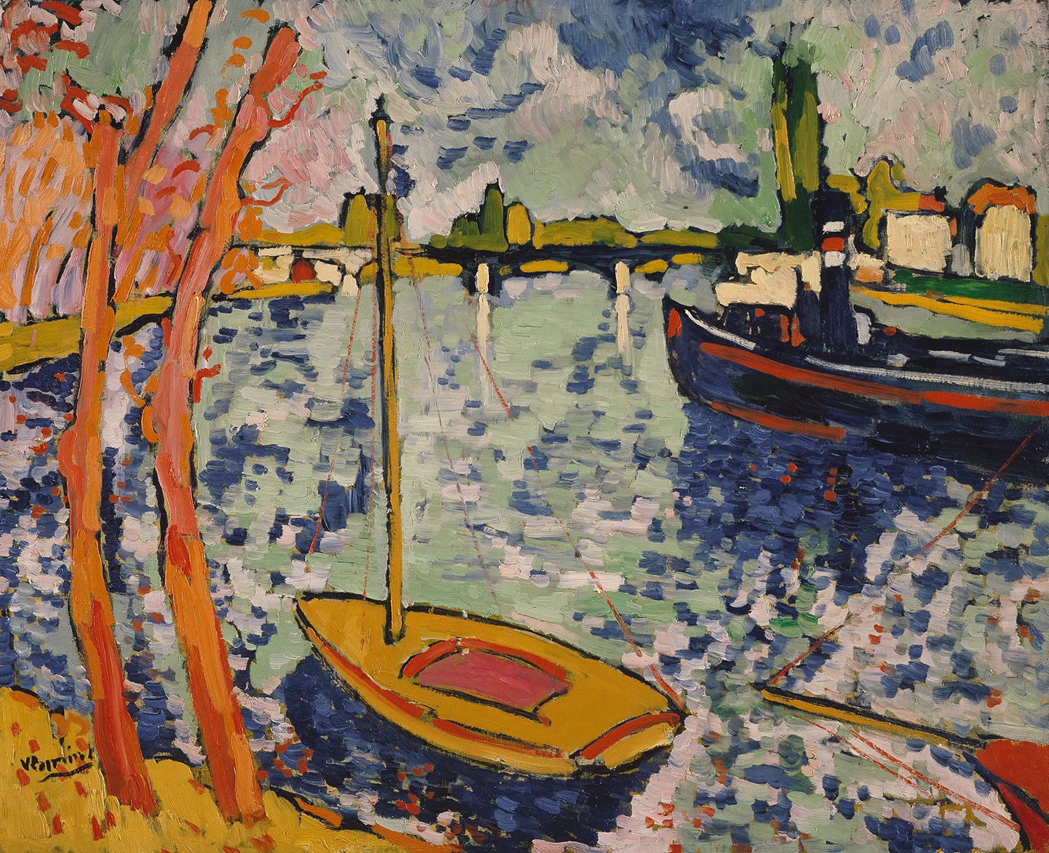
This next painting represents the Fauvist style of early 20th century modern art. It’s called “The River Seine at Chatou” (1906) by French artist Maurice de Vlaminck. Fauvism is heavily influenced by Impressionism and is marked by the intense use of color. One of the more famous Fauvists is Henri Matisse.
I chose these specific paintings and artists to explore the wide variety of styles and artists that fall under the category of modern art.
Art Spiegelman
I found it very fitting that Katherine wrote a post about remembering the tragedy of 9/11 through art on the night before my English class was scheduled to begin our analysis of Art Spiegelman’s “In the Shadow of No Towers.” Art Spiegelman is a highly respected graphic artist who is most famous for his Pulitzer Prize-winning graphic novel, “Maus,” which tells the story of his father’s life, illustrating the tale of his survival through the Holocaust. In the novel, Jewish characters are depicted by mice and Germans are depicted by cats. Maus not only tells the story of the tragedy of the Holocaust from a unique perspective, but it is a remarkable work of art that all of you should read if you haven’t already. However, “In the Shadow of No Towers” relates even more directly to Katherine’s post below mine.
Just days after the tragic events of September 11th, 2001, the cover of The New Yorker featured a black-on-black painting by Spiegelman of the towers that once stood tall at the sight that is now known as Ground Zero. When “In the Shadow of No Towers” was published in 2004, the same painting was displayed on the cover. The book was inspired by, but is not limited too, Spiegelman’s own experience in Lower Manhattan during the attacks. Ironically, the comic strips from the book were originally published the German newspaper “Die Zeit” because he wasn’t able to find a publisher in America. The graphic novel portrays many aspects of the 9/11 attacks through the use of symbolism that is more overt in certain panels than in others. The book also features old comic strips, some of which were published a century ago in American newspapers at time when political cartoons and yellow journalism were extremely influential in this country. While the old comic strips are very entertaining, Speigelman’s own depiction of 9/11 can have a much more emotional impact on the reader, especially if the reader is you: a New York City student who vividly remembers the day of the attacks.
Click on the Links at the top of the post to see the full images
Read The New York Times book review of In the Shadow of No Towers
Remembering Tragedy Through Art
The events of September 11th affected all New Yorkers, some more than others. But NYC has never witnessed such a tragedy as the terrorist attacks that happened on that day. Because it was such an enormous tragedy, September 11th has become almost synonymous with strength and spirit of New Yorkers. Therefore, a lot of art in New York City is reflective of the events of that day, and the many days that followed, when New Yorkers were trying to heal and get their lives back to normal, even though they would never be the same.

The Responders At Work
There is an exhibition currently at the New York City Police Musuem, called “Artist as Witness: The 9/11 Responders,” which focuses on the events that took place long after the attacks. The exhibition consists of 25 sketches and watercolors by Aggie Kenny. Kenny was a courtroom artist when she decided to take her sketchbook to the ground zero site during the Spring 2002 World Trade Center Recovery Operation. She didn’t take any photographs for reference and instead just sketched what she saw. Kenny explains, “After the attacks on 9/11, I was compelled to visit the site with my sketchbook. Sketching the scenes of the aftermath was my attempt to comprehend in incomprehensible.”

Exhausted Responders Resting
Kenny’s sketches focus on the responders, during both heroic and mundane moments. In her sketches, she captures the intense focus and strength of the responders, as well as their exhaustion. I think it’s important to see this exhibit to get a sense of what the responders had to go through. I can only imagine how exhausted, both mentally and physically, the responders must have been everyday after having to sift through all this dark, incomprehensible tragedy. I think that this exhibit can also provide at least some closure to the people who lost their loved ones on September 11th, and is an example of how art can heal. Through Aggie Kenny’s sketches and watercolors, we can honor the brave 9/11 responders, as well as the people who lost their lives on that tragic day.
Wagner at Symphony Space

In my music history class, we were recently discussing Richard Wagner and his grand German operas. A particular work of his that we studied was Der Ring des Nibelungen, which translates to “The Ring of the Nibelung.” This piece contains four operas total, and is thus classified as a song cycle. In song cycles, pieces of music must be performed in a certain arrangement in order to tell a story fully and correctly.
The first part of the cycle, Das Rheingold (The Rhine Gold), was recently performed live in Milan last December, and was shown as a film on Sunday at Symphony Space. The second and fourth divisions of the cycle – Die Walküre (The Valkyrie) and Götterdämmerung (The Twilight of the Gods) – will be shown at the same venue later this December (if you are interested in seeing these operas, click here for information). Of course, the operas cannot be performed together all at once; Wagner’s song cycle in total is approximately 15 hours!
Wagner, whom composed both the music and the libretto, claimed that this piece is a fine example of Gesamtkunstwerk, which is a term he created in order to describe artistic pieces that included multiple types of creativity. These expressions include theater, dance, music, and the visual arts, which explains why this blog is tagged in multiple categories. The German composer knew how to combine artistic styles very well. He assigned many characters, objects, and places with leitmotifs; these are musical themes that specify and associate with particular ideas, and that sound in the background as the said ideas are mentioned. In this way, the music and the text interact intimately and both add to the drama unfolding on stage.
A synopsis of Das Rheingold can be read here.
Slash Paintings
 Matthew Chambers has been known to use many interesting materials to create some of his artwork. Some of the art premiered over a year ago at the Rental Gallery consisted of works made using hamburgers, cats, and glass bottles. The most interesting artwork there, perhaps, were those which was made up of “strips of canvases deemed beyond help or hope.” These pieces, called “slash paintings” are comprised solely of things that would normally be thrown in the trash, which, as Chambers feels provides, “the perfect testament to the old adage, out of failure comes success.” He takes the old and ugly, and transforms it into something new and beautiful.
 (Sorry the picture is so tiny! It wouldn’t let me make it any larger.) This picture especially reminds me of the artist’s work who made pictures using chewed gum. And the idea is the same–taking something that most people would discard as garbage and using it to create something very cool. It seems as if I could have done something like this, but maybe it takes one person to come up with the idea first, and coming up with that idea in itself is a work of artistic genius.
Chamber’s most recent art exhibit at Untitled (on Orchard Street) features 36 vertical four-by-eight canvases of the slash paintings. This show differs from the last in that there are two large books upon entering the exhibit that explain each piece in detail. They tell the story behind each of Chamber’s works, providing insight into his creative mind.