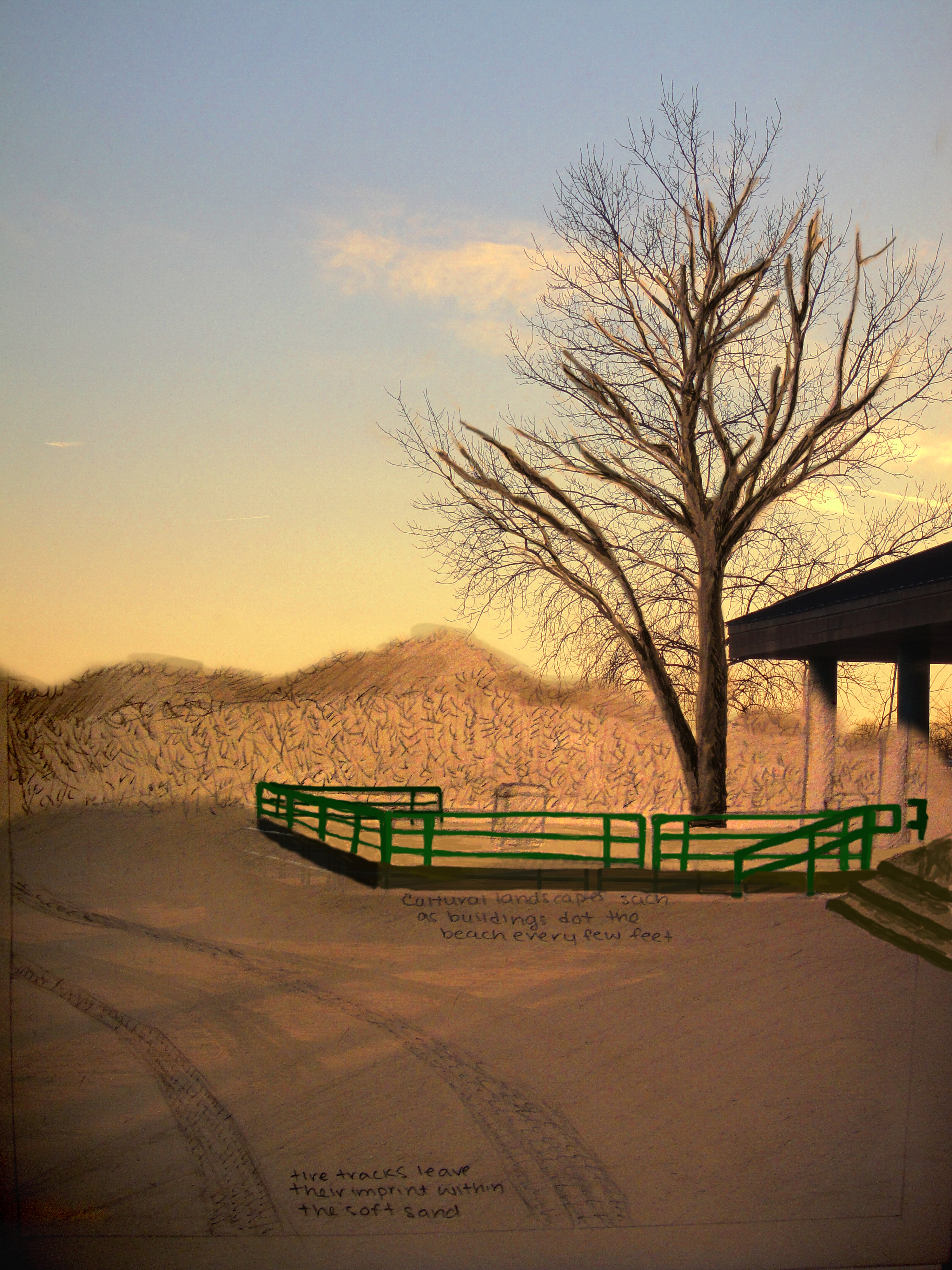
Great Kills Beach Landscapes

Landscape 1:

For this picture, i set the photograph as one layer and my sketch as another layer over it setting an alpha channel for it. I erased the sky and the roof of the building off the sketch so that the photograph would show through. Then, using the paint tool on Gimp and different levels of opacity for each color I painted and shaded in the trunk and main branches of the tree, the fencing of the building, the stairs, and the background plants. By keeping the opacity of the colors I used relatively low, i was able to allow for the details of the sketch behind the color to still be seen. And finally i made it so the sand is half my sketch, and half the photograph by setting the eraser opacity to 50%. This allowed for the sketch of the tracks to be seen as well as the shadows of the tree and building from the photograph behind it to be seen as well. I left the majority of the columns and the trash can in its original sketch format.
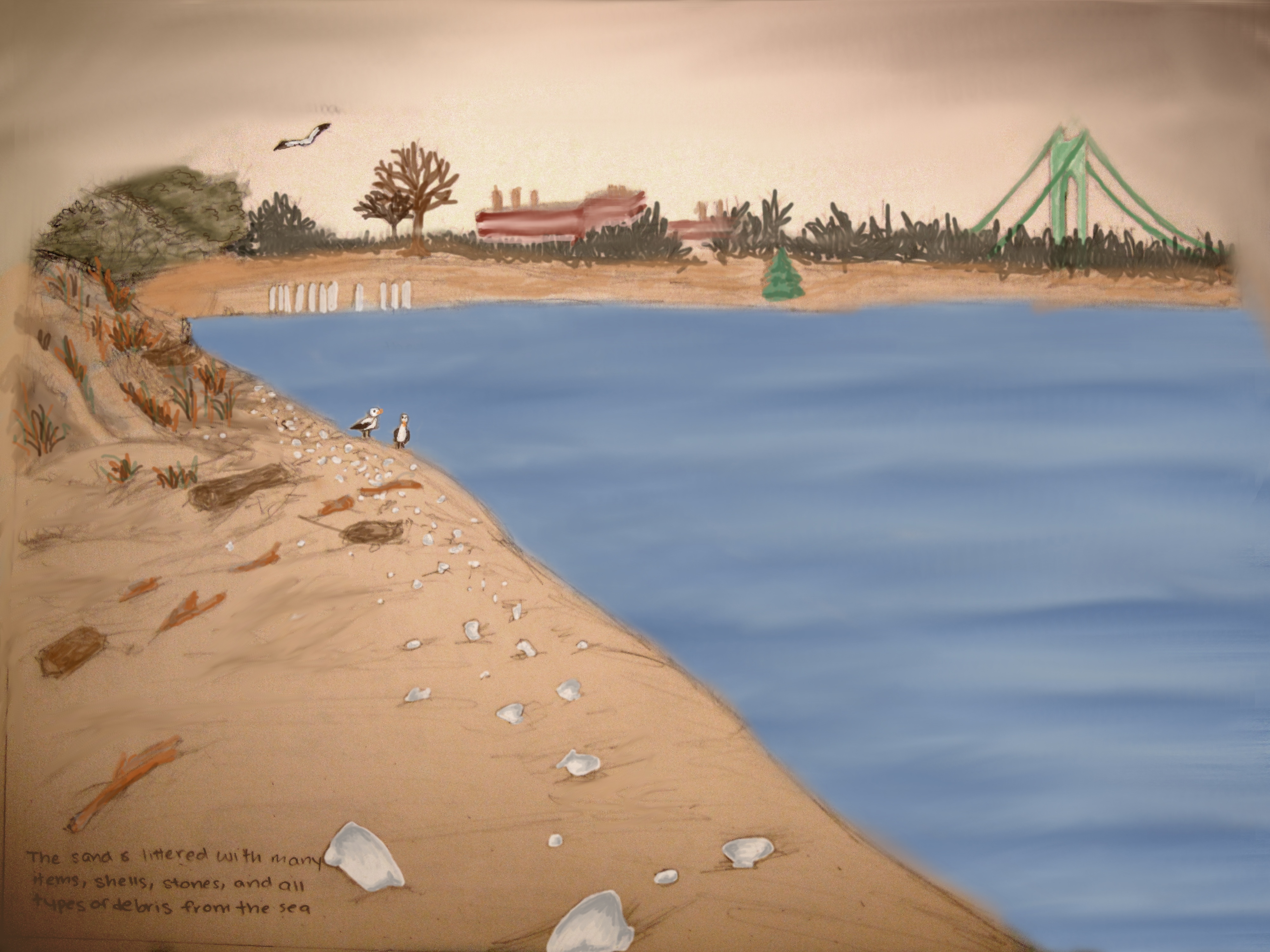
Landscape 2:

For this picture I used the ocean from the original photograph as one layer. I expanded the original size of the ocean by copying and pasting what I had and used the smudge tool to blend in the lines. Then, I layered my sketch over the photo as another layer and erased the ocean so the photograph could be seen. I used the paint tool to slightly darken the edges of the ocean where it met the shore and finished the water off with the smudge tool. Finally, i used the paint tool and different shades and opacities of the colors to paint everything else in it but the sky. For the shells and branches I used 3-5 shades of gray and brown respectively to add shadow and depth. For the other items in the background, I mainly just switched up the opacity levels of the color to add shading. For the sky, I used the smudge tool to smudge out the border that was originally there but i didn’t add any color.

Pctures/sketches edited in photoshop.

  1. To produce image one, I began with my drawing of a scene at the waterfront, and a picture of the same place; the angles were different enough in each of these that they would not correlate exactly. I played with opacity, gradients & regular layer masks and the warp options in transform (ctrl T) in order to create the angles that I needed piecemeal. Then I merged the ten or so pieces while in full color, used the healing brush and cloning tool to fix any minor areas of grey or clear lines and then adjusted the color levels of the “photo”. Following this I decreased the brightness and the contrast of the photo to make it seem like a real photo, and also to bring out some really cool highlighting colors. I then put a color burn effect on the background, copied it and merged the two layers to darken my drawn lines before merging the drawing and the “photo”. Finally, I placed a filter known as accented edges on the newly merged “photo” and background layer. This filter produced even more colors in the picture, and I merely darkened them again by merging another copy of my created photo atop the result.

  1. To make this image, I also began with one of my own drawings and a picture. In this case, the picture was not of the same place, though. I took one seagull from the picture, copied it and warped and transformed the resulting twins into the images in my drawing. I then used about 7 solid color layers, playing with modes like overlay, multiply and color burn, to color in my pencil drawing around the seagulls (using layer masks to hide unwanted color). Then I merged all of these layers to a copy of the background drawing. I applied accented edges to this picture, and then copied the layer. I masked the entire layer and then unmasked the words “The waterfront” with the paintbrush (while selecting the thumbnail of the layer mask and setting the color on white).

Lucinda_Zawadzki_GreatKillsPark(Crooke’sPoint)

For my first image, I used the program OpenCanvas to edit it. To start, I first opened up the photograph I took of the waterfront as a layer. Then, I opened up my sketch as another layer, placing this layer on top of the one of the photograph. Next, I erased the background of the sketch layer, excluding the rocks and the grass, to allow the actual photograph to show through. Afterwards, using my Wacom Bamboo tablet, I colored in the rocks, switching between the watercolor brush and the pencil tool, using various shades of gray to shade them in. Next, I colored in the ground and used the pencil tool to draw grass and sticks on the ground. Finally, I touched up anything that I needed to, and saved the image.


For my second image, I also used the program OpenCanvas to edit it. To start, I first opened up the photograph I took of the waterfront as a layer. Then, I opened up my sketch as another layer, but this time, I placed the sketch layer underneath the one of the photograph. Next, I erased the image of the side view mirror to reveal my sketch underneath. I also erased the ocean in the background to reveal my sketch. Afterwards, using my Wacom Bamboo tablet, I colored in the scene reflected in the side view mirror, and the ocean, switching between the watercolor brush and the pencil tool to do so. Finally, as I did with the other image, I touched up anything that I felt needed some more work and I saved the image.