
The Beauty of the 9/11 Memorial, and a Minor Flaw
When I first entered the memorial site, I kept looking around for where the waterfalls were. I could only hear the sound of rushing water, but the structure itself was nowhere to be seen. I followed the sound to its source and it slowly came into view. People were crowding around the sides of the waterfall, so I had to walk around before I actually got a spot to take a good look. Before coming to the memorial, I had only seen pictures of the two waterfalls. When I saw it live for the first time that day, I was stunned at its enormity; I had to stand still for a while and take in the whole view. It was beautiful. Pictures cannot fully depict the memorial’s vastness as well as the feeling of being engulfed by the sound of its rushing falls.
After taking in the initial view, I started looking at the details of the site. What stood out to me was the pattern of the water that was falling. It looked familiar. The original Twin Towers had a similar pattern.

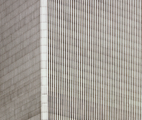
Source: http://www.brianrose.com/blog/category/world-trade-center/page/3/
Whether this was done on purpose or not, I thought it was brilliant. It is a great way to pay tribute for what was originally there.
Although the memorial is beautiful, there was one thing about it that I felt could be made better. Surrounding the waterfalls are names of those who lost their lives on that day. Their names are inscribed in bronze and the metal seems to be painted black. At certain places, the black paint is fading, revealing a yellow color.

This ruins the uniformity of the memorial and it appears old. I thought the designers of the memorial could have done a better job in choosing a suitable material for the names.
Besides that minor problem, I think this memorial is simply stunning and beautiful.
2 comments
Your observation that the lines of water mimic the lines of the towers is really insightful. It is apparent that many of the design aspects of the 9/11 Memorial prompt us to look back, but as Kisa mentions in her post the artist also wants the viewer to think about the future. What aspects of this site make you think about the future? Perhaps the fading paint?
Now that you mention it, I can definitely see aspects in the memorial that tell the viewer to look toward the future. I think the trees are a good example because they haven’t fully grown yet, so we are left pondering about how the site will look in the future. However, I don’t think the fading of the paint will make people look toward the future. Personally, when I look at the fading paint, I think about decay. Also, I think about the past because decay/wear is prevalent in old things.
Leave a Comment