Jae Han Blog Post #2 10/07/13

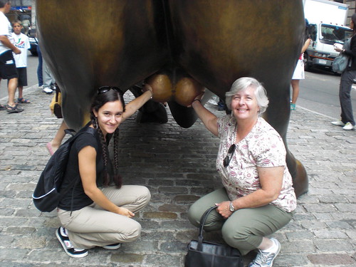
The “Charging Bull”, sculpted by Arturo Di Modica, stands in Bowling Green Park as one the major tourist attractions in Manhattan. Even in rainy weather, tourists are franticly squeezing in their opportunities for a picture with this bull.

Following the 1987 Stock Market Crash, the bull was completed in 1989. Its original placement in front of the New York Stock Exchange did not have a permit so it had to be moved to where it stands now; either way the bull has the same symbolic effect.

A bull market means, in short, that the the stock market is doing well. A bull market usually precedes a growth in economy. Knowing this, Modica wanted to use his bull sculpture in hopes to rally American spirit in capitalism and the hard-work attitude. By observing the details of the work you can clearly see how the bull support the themes of pride, success, and growth.

An animal that represents American success must be impressive, vigiliant, and fierce. One thing that Modica did in order to get those traits was to make it humungous. Standing at 18ft long and 11ft wide made with metal, the bull is about the size of a small truck and about the same weight. Modica also attempted to bring this sense of vigilance and ferocity within the bulls position. I could see the determination in the bulls eyes as if it would take off at any moment. It is also in a lunging position further anticipating take-off.  Its leg muscles are bulging, its head face down as if to ram, its hooves planted in the ground as if about to lunge forward, and it’s tail is pointed up. All these heavily emphasize an idea of action. Accordingly, the bull symbolizes action taken in America towards success in order to rekindle spirits in the US, specifically New York.

Being right next to this sculpture made me think of one last word to describe: “Intimidating”. In every way this bull represents a certain pride and determination us Americans have to see our economy grow. However impressive it may be, some seem to find interest in other details of the bull.

Nadejda Dimitrova – Blog #2

Nadejda Dimitrova – Blog #2

IMG_0927 IMG_0941Passage in Time by Malcolm Cochran is a grand work of art in Manhattan, New York. It is an 8’6’’ by 30’ wine bottle lying on its side at the end of Clinton Grove Park on 56th Street overlooking the Hudson River. It is made of carbon steel with thermal-sprayed zinc and bronze with a traditional green patina. While the structure was completed in 2005, its inspiration dates back to the 1930s when the cruise ship The Queen Mary would sail across the Atlantic Ocean, for inside the wine bottle is a recreation of the liner’s stateroom. The replica furniture is made from sheet metal and other materials that are all very metallic and smooth. The furniture includes a bed, table, chair, stove, toilet and two sinks. This silver décor makes the space look like a set from a movie of the silver screen. So the room of the inside is just as vintage as the wine bottle of the outside. On the other hand, while the inside is preserved, the outside is worn-looking. This shows how memories can stand the test of time. Spectators of this tangible art are sent into the past by looking through the portholes on all sides of the aged-looking bottle to view the room within. The historical aspect of this work of art makes it site-specific because it remembers a different time for the area on the waterfront – when The Queen Mary would make its stop in New York City after coming back from France. It is a message in a bottle, literally, that says to remember the events of the past. This idea is important and that’s why this work of public art was sponsored by Hudson River Park Trust of the New York City Department of Parks and Recreation. Now the people and visitors of the city have an interesting work of art that doubles as a mini museum in the park along the river to view and enjoy for years to come.

Nicolette Suberska Blog Post 2 (10/7/13)


I remember being fascinated by 5 Pointz Aerosol Art Center, Inc. for the first time mid May 2013, passing the “graffitied” building on my way to a concert with all my friends. I was with a group of people and didn’t really know or care where we were when we passed the building, so I quickly forgot about it. However, before this school year even started I received an e-mail from my English professor with the class syllabus, outlining all our work and trips. Since the topic was graffiti in New York City, I instinctively looked up this “5 Pointz” being discussed in my syllabus, and was pleasantly surprised to see that we were going to see the building I was so fascinated by.

I’ve always had an appreciation for art that wasn’t so conventional; whether it was plainly strange, or portrayed an unusual meaning, or had an odd form. The graffiti at this site-specific “graffiti museum” contains all three of these criteria. Many people associate graffiti with a stigma similar to that of tattoos, understanding that it’s art yet still believing it’s unconventional and unnecessary. However, graffiti can be viewed in two ways – street art or vandalism. I believe there is a fine line between the two and that it’s up to the audience’s perception. 5 Pointz prides itself on the fact that only those specifically selected to display their art legally on the walls of this factory building can and that artists from many countries around the world have chosen to do so, believing their work is worthy of the building. Graffiti is also a type of art that can mean whatever you want it to mean, whether that is paying tribute to artists that have passed away or telling a story like my personal favorite artist, Esteban del Valle does with an image so iconic it remains the wallpaper on my phone weeks after seeing it. Graffiti also has a different approach in terms of its form. Paintings take place on a canvas and require the use of specific brushes, a variety all in one painting sometimes, while sculptures are usually made with a multitude of materials, sometimes involving precious rocks or metal and later placed in a specific place for a specific reason. With graffiti, the wall is your canvas and a fairly priced aerosol can is your tool. IMG_6872-3

Despite how simple I made this sound, graffiti art is anything but that. These artists have sketches like any other artists and spend just as much time if not more than a painter or a sculptor, only without the luxury of being able to move their art or take it home to fix it. This, I believe, is the one reason graffiti is my favorite and most unique form of art. Graffiti artists, contrary to popular belief, don’t usually make art to make money, they make art for people to see it. The reason they are successful in doing so is because some people do appreciate it. 5 Pointz not only brings in curious teenagers or open minded adults who want to share this precious site, but rappers with an interest for this art and critics from all over the world. The array of different art adorning the outside parameters of the building adds life and vibrancy to a neighborhood otherwise covered with other forms of graffiti, such as tagging. The contrast is obvious and validates the idea that this site specific art IS art, and that it is a positive change for the neighborhood. Although not everyone, not every generation, may see the beauty and understand what this street art truly does for the community, I would never be surprised to come across dozens of people with awe on their faces visiting this area on any given day.

Unfortunately, this “graffiti Mecca”, as it is referred to according to its website, 5ptz.com, is being demolished and turned into two residential towers, whose architecture will surely be a form of art in itself, but not anything comparable to the unique and passionate street art.

Drew Podgorski – Blog Post 2

os-pictures-famous-us-city-sculptures-010


If you go for a stroll one day through the Financial District, odds are that you will see this amazing work by Isamu Noguchi, a Japanese-American artist and architect. What makes this cube such an interesting work is it’s relation to environment surrounding it. The cube’s contemporary styling with its sharp angles and straight lines connect marvelously with the architecture of the financial district, which since 9-11-2001 has consisted of newer, modern office buildings and luxury apartments, as the area has experienced the largest boom in real estate development seen in decades (partially as a result of the destruction caused by the 9-11 attacks). An interesting feature of the cube is that when one peers through the hole in the center, they are presented with a view of the architectural lines of the building behind it, perhaps alluding that the cube was designed to have such an interesting connection to the buildings surrounding it.   2960584264_604fd9964e_b

At the same time, the cube manages to differentiate itself from its surroundings, thanks to its bold color choice and its angular positioning, which leads to the lines on the cube being mostly diagonal, in sharp contrast with the vertical lines of the surrounding buildings. This meeting of something so similar but dissimilar at the same time is a breathtaking sight for anyone who just happens to pass by it.

Personally, the thing that I find most interesting  about the cube is something you can’t see. While viewing it, one might think it was a recent installation, perhaps not going back more than a few years at most. One would be wrong in thinking that however, as the cube was actually created in 1968. The idea that something could remain so relevant 45 plus years after its creation, and even more so have its main purpose, the connection to the surrounding area remain intact despite the rapid development in the area and the ever changing architectural taste of the times, is absolutely stunning. 2035943642_c497eb39cc_b


Megan Bogatz Blog Post #2 (Due Monday 10/07)

It takes awhile to reach The Cloisters museum. As you head up through Fort Tryon Park, you are immersed in nature. Leaves are falling on you, and birds are chirping everywhere. It’s hard to believe you are still on the island of Manhattan.

IMG_0027

Following a long excruciating climb to the top of a hill, you come upon a medieval looking building. Charles Collens, the architect of The Cloisters used medieval architectural elements in order to have a place to display the masterpieces created during that era. After admiring the outside of the building and surrounding wooded areas, you travel inside the non air-conditioned structure, up too many flights of stairs, and finally reach the main hall. Once you catch your breath, you admire the inside of this magnificent museum, which opened in 1938. Sculptures from Italy, Spain, France, and Germany line the elaborate halls and chapels. You head directly for the main event though, held in the Fuentidueña Chapel.

Fuentidueña Chapel

The Fuentidueña Chapel is a beautiful space, both elegant in it’s architecture and use of the space. However, there is something different about the space now, for it is filled with forty speakers in an oval formation. The comparison between the modern black speakers and the medieval sculptures made from stone is quite striking. These mysterious speakers are part of a public art piece currently being displayed at The Cloisters. This piece, known as The Forty Part Motet, is the first presentation of contemporary art at this museum. The exhibit, created by Janet Cardiff, plays a choral work by the 1500s composer Thomas Tallis. Cardiff designed this installation in a way that explored the question of “how sound may physically construct a space in a sculptural way and how a viewer may choose a path through this physical yet virtual space”. You explore this idea by walking along the oval path listening to the various voices, including bass, baritone, alto, tenor, and a child soprano. You then step into the middle of the oval formation and listen to the entire recording play together. As you explore the room the way Cardiff imagined, and hear all of the different tones, it gives you a sense of how music is a combination of beautiful parts. The other people in the room are responding to it in different ways. Some are sitting with closed eyes, immersing themselves in the space and the sound. Some are walking around, like you, experiencing the separate sounds. Some are just standing and smiling, as if the sound brings some sort of fond memory to mind. After the eleven minute segment ends, people file out of the chapel, some unchanged by the experience, some vastly affected. The aura of the space however, is forever changed.

IMG_0037


The Forty Part Motet is a perfect example of a site-specific public work. It is site specific because of the relationship between the sound installation and the chapel it is displayed in. The high ceilings and acoustically accurate materials in the chapel allow for a beautiful display of the music being played. It changes and at the same time conforms to the space it is presented in, just like any good site specific work should. The public art piece is simple, it is something that is only going to be displayed for a short period of time, and although it is not outside like most public art pieces, it is a temporary piece. The Forty Part Motet is a site-specific public work worth checking out. It combines space, sound and beauty that allows you to “climb inside the music”.

Click on the link below to hear a sample of the exhibit:

Sample


Vincent Blandino Blog Post #2: 5Pointz

While riding the 7 train in Long Island City, one simply cannot miss the building that is so outstanding to the public. This very building is 5pointz, a location where graffiti artists from around the world come to show off their talents alongside other graffiti artists. On the building, there is a plethora of many detailed works done by graffiti artists as well as just the names of graffiti artists. Almost every inch of the building is covered in some sort of illustration, filled with many colors, designs, and tastes these graffiti artists bring with them.

Many people often bash graffiti and would never even dare put it in the same sentence as ‘art.’ This is obviously shown through the many attempts of the city and the mayors trying to abolish the taggers’ works. It is even shown in our tendency to consider areas with graffiti present, ‘bad.’ With this almost natural distaste in graffiti, people fail to see the work and talent these artists show to the public. Yes, there are people that write on storefronts, subway stations, and walls simply because they feel like it. They could be trying to instill a sense of fear in the public, maybe even claiming a territory. 5pointz, however, is the place where graffiti and the graffiti writers transform into art and artists, respectively.photo

5pointz is simply the epitome of “site-specific art.” This term refers to any piece of public art that can convey meaning to onlookers and serve a purpose. 5points covers each aspect of this definition. It certainly conveys meaning to onlookers in many ways, given the many drawings and illustrations. These pieces of artwork were done the way they were because artists try to capture the observer’s emotions. The many moods these sketches give off are truly amazing, ranging from an evil mood to a Japanese style to just names of artists. The other part of this definition I give, which is that site-specific art serves a purpose, is also present with 5pointz. There are many purposes to why this building is what it is, whether it is to attract more tourists or be a legal place for graffiti artists to write without punishment. I believe the main reason, the main purpose, is to show off to the public that art is all around us. Art is even the same material that people distaste so much as to want to rid it throughout neighborhoods.

With this class, I feel I have finally understood more about art. I feel I have more appreciation of what is around me and in my neighborhood. 5pointz has helped me realize that art is present in all forms, especially as “site-specific art.” Although it seems that 5pointz will be destroyed in the near future, we can marvel at the very illustrations given to us as gifts by graffiti artists. These artists spent their time making a picture that would be seen by many people who serve as passersby either on the train above or walking along the street. They may have received recognition, but as far as I am aware, there were no monetary transactions for their art or for their artistic talent. I believe 5pointz will not die with its destruction but will remain alive through the photographs and memories of people that visited this landmark. It truly deserves the label of being an example of site-specific art.


Nicholas Lung- Blog Post 2 on Five Pointz

In an effort to find site-specific art that was suitable to my interest, I chose to visit Five Pointz.  This unique location is known as one of the graffiti capitals of the world and has drawn artists from all different places.  As I was contemplating where to go visit for this blog, I came across five pointz and immediately chose to go there.  As a kid, I had always been intrigued by graffiti art and had always tried reading and interpreting the messages on the walls.   Once I heard about five pointz, I knew it was the perfect place for me to venture to and explore.  When I got there, I was stunned.  My immediate reaction was one of both excitement and transformation.  I felt as if I had walked into a completely new world.  Never in my life had I felt so intrigued to explore and admire all the different murals.  Although I do not consider myself a huge fan of art, five pointz greatly exceeded my expectations and I have never thoroughly enjoyed art as much as I did there.  As I was walking through the area and gazing at the beautiful works of art and vibrant colors, I came across a painting that immediately caught my attention.

IMG_1278

It was simply a hand.  Normally, a picture of a hand would leave me expressionless and unresponsive.  However, there was something extremely different about this piece of art.  My first reaction to the pointing hand was that it had something to do with religion.  It seemed to me that the hand was pointing to heaven or to God.  One of the things that distinguished this piece of art to other ones I saw was the fact that it was the only one that I believe, had a religious purpose and message to it.  Another thing that caught my attention was the intricacy and many details of the hand.  Normally, I would see hands drawn or painted on a small canvas or piece of paper.  However, this hand was painted on a huge wall and enlarged to a great extent.  The fact that the hand was drawn and painted so large tells me that the artist was very preciseand careful to capture every element and detail of the piece.  Lastly, a distinguishable factor of this painting was the fact that it was one of the few that were not created with vibrant and flashy colors.  Rather, the hand was simply created with black and white and the pointing finger, with a glowing pink.

IMG_1279

After I came across this wonderful and creative piece, I decided to research the artist and any possible background information as to why it was created.  Although I was unable to find information about the hand and the piece of art itself, I did find some other interesting things.  Through the website www.dase.es, which was painted next to the hand, I discovered that the artist of this piece was a man by the name of Marc Álvarez.  I also found out that it was painted only last month and I’m really glad I had a chance to see it.  Marc Álvarez, also known as Dase, currently resides in Barcelona, Spain and is known to be a graphic designer, illustrator and painter.  After looking through the website, I find some of his work very creative and ingenious.  I admire him and his art because I feel that his work is special and carries a certain precision that I really appreciate.

I feel that this painting of a pointing hand is very site-specific.  If I came across this same painting at another location, I would most likely walk past it without a thought in my mind.  However, after walking through five pointz and seeing the different works of art and graffiti, I found the hand was very distinguishable and unique through its message, its meticulousness, and its “not flashy” look.  I am extremely content that I chose to go to five pointz because it was truly a great experience.  It saddens me that the government plans to take the building down to create more apartments and living space.  However, I plan on going back a few more times to appreciate the unique graffiti art before the building is destroyed.

Angel Ho Blog Post 2 10.07.13

Charging Bull is often a popular tourist destination in New York City that many visit but the history of the bull is not commonly known. The leas

P1010921-opt

t known aspect is that the bull was an illegal placement in the city by the artist, Arturo Di M

odica. As a gift to New York City, the bull was placed in the Financial District but soon

moved a couple feet away.


NYP-cover-opt            Created using $360,000 US dollars from his pocket, Di Modica created an sixteen feet long statue weighing over three and a half tons. Di Modica, an Italian-American artist, was born in Sicily but commutes back and forth from there to New York. Specializing in sculptures, Charging Bull is his most famous work included in a series of five bulls with only two placed. From the immense size, the bull had to be created in sections and moved in a huge vehicle. Di Modica placed the bull in front of the New York Stock Exchange in December of 1989 without permission from the city. The statue has yet to be moved from the Financial District because of the huge crowds it draws.

The bull holds significant as a symbol of optimism towards the financial markets and the prosperity that it can come with. The bull was derived off the term “bull market” meaning an increasing confidence and investing by investors because of anticipation towards the financial market. The bull is positioned with a lowered head and leaning back seemingly ready to leap forward and charge forward into the unknown. The bronze, hard metallic emphasizes the animal’s brute force symbolizing its resilience and endurance to whatever may be thrown its way such as the weather conditions.Charging_Bull_statue

This bull is site specific, holding an even greater meaning, due to its placement in the Financial District. If Charging Bull was placed in any other part of the city, it would hold less meaning because it would lose its financial meaning. The bull symbolizes prosperity in the financial market bringing it luck. The bull not only enhances the Financial District but was also created for this place. Di Modica created the bull for this certain place and would lose its meaning if it were to be moved.


David Rafalko “The Alamo”/ Astor Place Cube (Site-Specific Art) Blog Post

5249e23ddbfa3f2cf5003d7a._w.540_s.fit_“The Alamo” Sculpture, more commonly recognized by New Yorkers as the Astor Cube, is an interesting and popular site-specific work of public art. The Cube was created by American artist Tony Rosenthal in 1967. Its location is near Cooper Square and Lafayette Street in Astor Place, which is a short two block street in Lower Manhattan. Starbucks, K-Mart, as well as a few libraries, a movie theatre, and several shops surround the landmark, because of its situated location being in a usually busy intersection. Nearby are subway stations, which makes the Cube accessible from the 4,6,N, and R trains. Its name is derived from the Alamo Mission in San Antonio, Texas, given to it by the artist’s wife, as stated by a plaque on the structure. The Cube seems to be standing on one corner and therefore can be ‘spun’ around by one or many people.

Tony Rosenthal was born in the year 1914 as Bernard J. Rosenthal in Highland Park, a suburb of Chicago Illinois. Rosenthal attended sculpture classes at the Art Institute of Chicago in the early ’30s until he moved to Ann Arbor, Michigan, where he graduated with a Bachelor of Arts Degree at the University of MIchigan in 1936. Studying with him were renowned avant-garde artists and sculptors Alexander Archipenko and Carl Milles. From a young age, Tony Rosenthal was very fascinated with many art forms, including cubism and abstract art. These experiences would later inspire him to become a part of the American abstract expressionism movement. After serving in World War II, Tony took up a career in teaching at the American University in Washington, DC and later at the University of California.

Going back to “The Alamo”, it is important to note that this Cube was his most influential work since it established him as a “master of monumental public sculpture and standard bearer of contemporary structurist esthetic”, according to many historians. The artist, in his own words, stated that: “It is… important to me (Tony Rosenthal) that the sculpture interact with the people”. And that is exactly what it did. For decades, “The Alamo” has been frequented as a hangout spot for many groups of New Yorkers, mainly among the skater and hipster subgroups, as well as a meeting place for the “East Village kids” and St. Mark’s residents. People could be regularly seen either sitting or standing next to the Cube and teenagers would “play” with the Cube since it is able to spin on its axis all the way around. So it has been established that the Cube was actually designed to do this to give it a more playful and warm, child-like atmosphere in contrast to the hustle and bustle and seriousness of the big city. The Cube has also become an attraction for tourists visiting the city, who would take photos of and spin the Cube as well.

The Cube gives many people different reactions or perspectives on its purpose or underlying meaning. Some perceive it as a symbol representing immense strength because of its rather large size (8 by 8 by 8 feet) and perceived weight due to being made of Cor-Ten steel (approx. 1,800 pounds). Others see it as an ‘escape from reality’; in other words, it is speculated that the Cube, which stands out proudly and greatly as a large black figure in the bland background of simple buildings and trees, may be interpreted as a way to help relieve the stress of everyday life. Some say the Cube gives off a certain relaxed, positive energy which seems to attract people towards it. Being situated in a busy area gives some sense of wonder, enjoyment, and mystery to some of the working stiffs. It makes you stop and think. My view on the Cube is that I believe it is meant to act as sort of a ‘puzzle ‘ that wants to be solved but can’t be because it lacks the necessary pieces to be solved, such as some of the puzzles that we encounter in our own lives. The Cube contains protrusions and indentations which further relate to this theory. I can see that certain connection as a possible interpretation. Maybe it’s not even meant to have a meaning or purpose at all, maybe it’s just a display- a work of art made for others to indulge in and appreciate.

The Cube, in my opinion, successfully uses its space well in the area in which it is situated. People come with their friends to show its beauty and to take the time to interact with it. As I have said before, it makes for a great place for just sitting around and hanging out. The Astor Cube is a work of art which deserves to be displayed to the public, and what better place than the busy streets of Manhattan, where many can see it.

The Astor Cube was just one of five other cubes that Rosenthal had made, but it quickly became the most popular over time, nonetheless, more so than his other works, such as “Marty’s Cube” and “House of the Minotaur”. Even more so, this public work of art has arguably become the artist’s most popular work to date and will always be in his memory, since Rosenthal passed away at age 94 in 2009. It is hard truly hard to believe that this masterpiece was only meant to be a temporary 6 month exhibition at first, and then they were supposed to take it down. Thankfully, residents made petitions to keep the Cube.
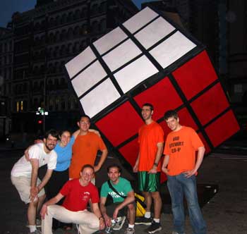
Some intriguing controversies surrounding the Cube involve a series of pranks which have taken place in the past years. For example, in 2003 a group dubbed “The ATF Squad” turned the Astor Cube into a giant Rubik’s Cube using painted cardboard panels.Two more instances of pranking took place in 2011, where a visual artist covered the Cube with her signature camouflage and later a group of Caltech Students made the Cube resemble the Weighted Companion Cube from the video game Portal. Because of this, the Cube goes through a lot of maintenance. There was recently a short documentary entitled “Man In A Cube” in which a 37-year-old writer claimed to have been living inside the Astor Cube because he: “was searching for solitude” and escape from “constant bombardment of social technology, email, and modern distractions” according to an article on apartmenttherapy.com. This was soon discovered to have been a hoax, though. The story was all part of an ad campaign for an organization named Whil with the intention of promoting meditation. The link for the short documentary can be found below:

http://www.youtube.com/watch?feature=player_embedded&v=Wcl9NPl481k

In conclusion, it can safely be said that “The Alamo” aka The Astor Cube is a very important work of public “site-specific” art because it successfully attempts to integrate with its surroundings and outdoor locale. It is definitely a sight to see and people are free to interact with and interpret it however they see fit. That is what art should be.



5 Pointz (Adam Poplawski)

Adam Poplawski

I have been taking the 7 train for many years and have never really paid attention to 5 Pointz. All I saw was graffiti; lots and lots of graffiti that really didn’t matter to me, or interest me in the slightest. Until it was discussed in my English class this year, I didn’t even know that it had an official name.  Then, when I had a chance to visit it, and actually walk through it on my own time, I was really blown away. There were so many different colors, techniques, and interesting pieces that were placed on this still-running factory building. After seeing this amazing location, right as you enter Long Island City, I knew that I had to come back to see it again.

tumblr_m3zs0swhKa1rodlslo1_500

Now that I have knowledge of what “site-specific art” is, I know that 5 Pointz-Long Island City is a shining example of it. The graffiti, or street art, is not just placed randomly. Every piece has a purpose, and is placed in an area for a reason, whether it is because an artist is particularly good or famous, or if they are just starting out. On the top rings of the building, the names of deceased artists are written as a sign of respect and homage to their art and their contributions to graffiti in general. When I learned that fact, it really struck a chord, knowing that all the names on those two tiers are like grave markers.   In the inside walls of the courtyard there are large murals that show off the intricacy of graffiti art. These are not just “ugly” names written on billboards, these are monumental pieces that take days, weeks, even months to complete for our viewing pleasure. All around the building there are various other pieces. The ones on the immediate side street are usually painted by artists who are not as famous, simply because it is not prime retail space. People have to physically walk by it to see it, and cars do not usually go down that road, which cause it to be inhabited by pieces from less renown artists.

The main reason that 5-Pointz is “site-specific” is because of the wall of graffiti that can be seen from the 7-train. I first saw this as an intrusion on the beautiful, luxurious condos and office buildings that now reside in Long Island City. Now, I see it as site-specific art is supposed to be seen, as something that “intervenes in our perception and use of space.” As I have said previously, every piece of art is there for a reason.  It must be shocking for someone, especially a tourist coming from Manhattan to see this giant wall of graffiti, especially in the middle of such a gentrified, urban neighborhood, full of shimmering and sparkling buildings. This shows the opposite of what we perceive a “nice” neighborhood to look like, and shows us that graffiti is not just a sign of urban decay or a ghetto. It can be, and it is, art. Even the way that is so highly organized, with specific places for specific types of artists, and is actually curated like a gallery, shows just how respected of a place it is.

The factory that 5 Pointz resides on also shows how the graffiti there is considered to be “site-specific.” The factory might have just stood there, collecting dust, just housing whatever needs to be housed there. This outdoor art gallery does not have to be in some sort of exclusive locale in the village, or in a high-end art gallery. These artists have completely transformed the banal; what was once a plane factory is now a beautiful testament to the beauty that is street art. The artists who showcase their work here are not doing it for millions of dollars. They are doing it because they love street art and they want to show it off to the world and more specifically, New York City. This building is now only a statement about graffiti, but also about the love of the craft by those who do it.

It seems, unfortunately, that 5 Pointz will torn down very soon. This factory which houses some of the most amazing pieces that I have ever seen will probably be replaced by a luxury condominium. I would love for this site-specific art to stay here a while longer, but if it doesn’t, I’m glad I was able to see it, and truly feel bad for the generations of people who won’t. I hope that everyone who has a chance to see 5 Pointz will see it; before it’s too late. Hopefully in the future, another area will open its doors for a revival of this noteworthy public art.


Kayla Talbot Blog Post # 2

Iran do Espírito SantoIRAN DO ESPÍRITO SANTO was born in Mococa, Brazil, in 1963, and is one of Brazil’s most highly regarded contemporary artists. Today, Santo lives and works in São Paulo, Brazil. He is well known for his austere and opulent drawings, wall paintings, and sculptors. Often working on an elaborate scale, Santo supports the Minimalist doctrine of non-objectivity through his large, abstract sculptures of everyday objects that he disorients the size and idea of through his use of surrealism. If one were to give him, say, a circular mirror, he would reflect on the object’s properties of material and shape. Then, he would transform the once mundane object into something sensual, yet Minimalistic at the same time. Santo’s background in photography is clearly apparent in the way he constructs his works as a photographer constructs her images. Also setting him apart is his preference to use incongruous materials, such as copper, glass, granite and stone for his pieces. Santo’s sculptures tend to strip away the irrelevant details of objects, leaving the essential line and forms of the things highly emphasized. In all of his works, Santo implements illusionistic devices to add to the object’s noteworthiness.

In the last twenty years, Santo’s works have been exhibited widely in various museums and galleries around the world. In the United States Santo has displays in museums such as the Museum of Modern Art – both in New York and San Francisco; – and the Museum of Contemporary Art, in San Diego. Santo’s works have also been included in the following museums: the Venice Biennale; the Bienel de São Paulo; the Istanbul Biennal; and the Museu de Arte Moderna de São Paulo.

WP_001823PLAYGROUND, commissioned by the Public Art Fund, is located at the Doris C. Freedman Plaza in the entrance of Central Park, at the intersection of 60th Street & 5th Avenue. This piece is Iran do Espírito Santo’s first public installation in the United States and it will be on show until February 16, 2014. Playground is a part of the Public Art Fund project, “Square Pegs, Round Holes: From White Cube to Public Sphere.” A first glance of Santo’s creation will bring the viewer to think: “this looks like a massive cube made from large stone blocks, with a number of blocks missing at the corners.” This art form; however, is more complex than this. A closer examination of the sculpture reveals that the work was not constructed out of separate, individual elements, but rather created through a stone-like concrete, as a unified form. The “mortar” between the blocks is not actually mortar, for it has exactly the same look, texture and finish as the “blocks” themselves. Thus, the visibly, supposedly “missing” corner pieces were never actually there; and therefore, the openings were deliberately composed by the artist, perhaps to allow transparency and access to the interior space of the artwork.

WP_001826

Playground is described by its creator – Do Espírito Santo – as a sort of “idealized ruin” that is a type of metaphorical playground. Santo admits that he loved to play with building blocks as a child, and given Playground’s architectural materials and oversized scale, Playground can thus been as a sort of blown up cartoon image of a young one’s fantasy structure. In addition to this, Santo has also “created a subtle, yet elegant, play between perception and reality, construction and destruction, and between idealized form and everyday objects and materials” (Public Art Fund). As previously stated, Santo employs an almost photographic process in his sculptures in the way that he reproduces everyday objects, or concepts, into a new material. His way of encapsulating attention to his pieces through their illusionist qualities is somewhat hypnotic.

WP_001828WP_001829


Conforming to the themeWP_001831 of the Public Art Fund project, Santo’s cube-like structure resembles that of a gray Lego or Tetris construction. Due to its missing corners, Playground appears unfinished. However, these missing cubes allow visitors the ability to walk inside, and create uniquely framed views of the surrounding area for those looking from the inside out. These missing pieces allow a seamlessly changing relationship between light and space, which plays with an observer’s perception. Exclusively placed on the edge of Central Park, where many children go, Santo’s piece is very popular to kids possessing imaginative minds, such as Santo’s. Observing the artwork, a bystander will witness that the majority of people who inspect the piece thoroughly, and examine the inside of the structure, are children who are most likely viewing Playground as Santo does: an “idealized ruin” and a blown up cartoon image of a young one’s fantasy structure. Playground is a very fun, thought-provoking, perception-changing work of art.

Marisa Balbo Blog Post #2

Statue of Alice, more commonly known as the Alice in Wonderland Sculpture, was created in 1959 by a Spanish-born American artist, Jose de Creeft. Jose was born in Spain in 1884, and began learning the art of sculpting in 1896. He moved to Paris and continued his art education. During that time period, all sculptors made their sculptures with clay, and the sculptors would then cast them in bronze or have them copied. In 1915, he discarded all the rules and began carving his sculptures in stone. In 1929, he moved to the United States, and he brought this new practice with him. He began teaching young artists how to carve their sculptures straight into their desired medium, as opposed to sculpting their creations and having them copied. Over the years, he became known for his stone, wood, marble, and terra cotta carvings, such as Continuite and Poet. He was credited with bringing the direct sculpting method to life in America. Jose’s work has been shown in places throughout the world, including Rome, Paris, and here in the United States.

The philanthropist George Delacorte commissioned the Alice in Wonderland sculpture to be done in memory of his wife who had passed away. She always used to read Alice’s Adventures in Wonderland to her children when they were very young, and the Delacorte family loved the whimsicality and the story line. The statue was a gift for New York City’s children to enjoy in memory of Delacorte’s wife.

The Alice in Wonderland Sculpture is 11 feet tall. Jose de Creeft, although known for his direct carving methods, carved the statue the traditional way: in clay and cast in bronze. The sculpture depicts Alice – whose face was sculpted in the likeness of Creeft’s daughter – sitting on a mushroom amid her friends: the dormouse – who is nibbling on some food, the Mad Hatter – who was made in the likeness of George Delacorte, the Cheshire Cat, and the White Rabbit with his pocket watch. Lines from The Jabberwocky are engraved all around the side of the sculpture.

George Delacorte wanted this sculpture to be in a place where the sculpture could be seen and enjoyed by children of all ages. Generally, children are not allowed to touch art, especially in museums. That being the thought in the forefront of his mind, Central Park seemed to be the perfect place for the Alice statue. Central Park is one of the most visited places in New York City, especially by families. He wanted the whimsical story to come to life for the children of New York City, so he and Jose de Creeft created a sculpture that children could interact with. This sculpture was created specifically for children to be able to explore the wonder of art, and contribute to it by climbing on it. The sculpture has been polished over the years by the hands of feet of thousands of children.

alice-l

Tom Viskoc Blog Post #2

In Long Island City, there is a building where people from all over the world visit to demonstrate their artistic ability. This building is 5 Pointz, an abandoned warehouse covered in graffiti. 5 pointz has gained a reputation as a place for the best graffiti artists to come and paint.

5 pointz was originally founded in 1993 as an attempt to rid other areas of the city of graffiti. The building let artists display their art for the public in a nonillegal way. Over time, it became something like a graffiti museum. It even had a curator, a graffiti artist named Jonathan Cohen (or by his tag name, Meres). His job would be to view artists works and to decide if and where they can paint on the building.

Artists will pay for a small space where they can demonstrate their work. The building is a collaboration of tons of different artists works, many with special meanings. The top of the building is lined with names of artists who have passed away. One artists has painted lightbulbs with different faces on the back of the building. The rear of the building is considered the prime real estate. A train passes the back of the building, which means thousands of people a day see the art located on this part of the warehouse.


5 pointz has developed a reputation as being one of the places to be for graffiti artists. Artists have come from places such as the Netherlands, Japan, Brazil, and Canada. Besides the popularity amongst graffiti artists, celebrities have visited the site over the last 2 decades as well. Doug E. Fresh, Mobb Deep, and Joan Jett are just some of the famous people who have been there in the last decade. 5 pointz has also appeared in recent popular culture. The final scene of the 2013 film Now You See Me takes place on the roof of this building.

After being there for twenty years, 5 pointz is expected to be demolished by the end of the year. Graffiti artists from around the world will have to find a new place to display their creativity and artisitc skill.

Brittany Cabanas Blog Post #2 10/7/13

giuseppe-penone-ideas-of-stone-lg

Giuseppe Penone has installed three 30-foot tall bronze trees in Madison Square Park titled Ideas of Stone. Penone is a well-known Italian artist that has been manipulating natural materials and forms in his artwork for forty years. He was also part of the Italian Arte Povera movement, where artists used everyday subjects and materials in their work to get rid of the separation between art and life. These trees also have natural river boulders placed between their limbs. Penone has used trees as living sculptures to show the relationship between man and nature. He manipulates the trees natural form and makes it look as if the tree has grown from the lawn, but he also leaves manmade traces such as the boulders, nails, and wires to show man’s affect on nature. The tree seen here looks as if it is being weighed down by the boulders and is trying to find a way to balance everything. Penone really shows the impact that man has on nature; implying here that man needs to find a balance between nature and what is manmade. Urban landscape has torn down a lot of nature and trees in order to build many buildings, stores, and businesses, so there isn’t much balance between organic objects and manmade ones. In Manhattan, we need businesses and stores just as much as we need natural landscape and trees. Penone’s artwork also shows concepts such as weight, balance, and scale, but he is most focused on the relationship between the manmade and natural world. Penone shows the force of gravity and, once again, the need to balance gravity with these boulders. Penone used this as a metaphor for balancing life. Everyday people are making decisions and looking to balance out their lives, even when you are being weighed down you still need to find a way to keep yourself up and balanced. Penone is searching for the balance between gravity, manmade objects, and nature, just as we are searching for balance in our lives. The boulder will balance on the tree as we balance ourselves to make everyday decisions.

Christina Zhu Blog Post #2 Public Art 10/07/13

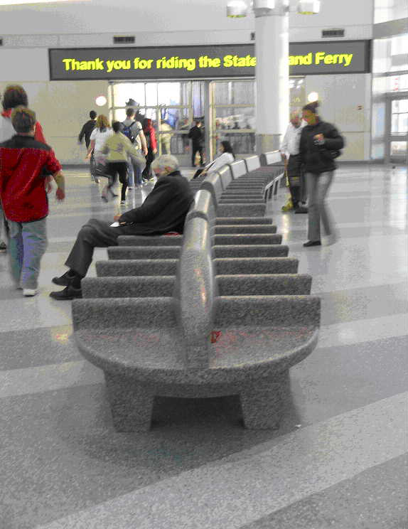
Located in lower Manhattan with a beautiful view of the city skyline, this building encases a work of art that most people don’t stop to notice. Everyday hundreds of people walk in and out of this building not knowing they are in the presence of a piece of public and site specific art. Many people will breeze past the art unaware that it is actually art. Others will think nothing of it and step, sit, or even leave their garbage on it. This wouldn’t be the case in a museum where people can obviously see what is art and what is not. They would never think twice to disrespect the art in the museum because they know it is art. In Whitehall Terminal most people are unaware that the granite benches they are sitting on is actually a work of art. Created by Ming Fay, these benches are functional art allowing viewers to become a part of it by sitting on the benches.

Ming Fay had a vision of these granite benches to portray Native American canoes crossing the New York Bay. He wanted people to have a fantasy journey before actually starting their real journey by sitting on these benches and thinking back to when Native Americans were traveling in canoes. The benches are serpentine shaped and cut into three sections. They are placed on top of a water themed terrazzo floor, which mimics crossing the bay very well. This theme of crossing the bay relates to why people are sitting on these benches in the first place. They are waiting for a ferry to bring them to Staten Island by crossing the New York Bay.

This public piece of art is basically invisible to people. Ming Fay took into account the area this artwork would be displayed in; a busy space where people will need to wait until it was time to go. He didn’t want to put a useless piece of art but rather something that could be of use. Benches seemed like the best idea for Whitehall Terminal because passengers would need somewhere to rest while waiting for a ferry. They could also be a part of the art without even knowing it in the first place. These granite benches are mostly unknown to people because it is functional and it is invisible to the average person because they interact with it. People usually don’t consider a bench art but that’s the beauty of art; anything and everything can be art as long as there’s an idea behind it. Public art is something for everyone to see but it can also be something everyone can use. Most people don’t realize that but if they take the time to really know their surroundings there might be more art out there being under appreciated.

Josephine Guo Site-Specific Art (due 10/07)

What is street art? Or should we call it “graffiti”? There are many controversies that surround graffiti. Is it legal or illegal? Is it vandalism or is it art? In New York City, graffiti has been highly intolerable ever since the 1970s. The Mayors, Giuliani, Koch, and Bloomberg, have protested against graffiti in the subway and around the city. They have even taken to the eradication of graffiti in New York City and passed laws that made it difficult to paint graffiti. For example, the legal age of buying spray paint was increased to age 21, like the age to legally drink alcohol. In addition, graffiti has been officially erased from the subways. Therefore, in order to have a legal place for graffiti to exist here is a pretty difficult feat to accomplish. For street artists to utilize their skill and fulfill their interests in NYC is close to impossible. Hence, many of these artists are relieved that they have one place in the entire NYC to draw what they want without the fear of being caught by police officers and possibly imprisoned.

5 Pointz is one of the few legal places where street art can be drawn without suffering consequences. It is located in Long Island City, Queens. There are actually three 5 Pointz locations: one on Bushwick Avenue, one on Lafayette and Broadway (which doesn’t exist anymore, and the one in Long Island City. 5 Pointz encompasses the artworks of street artists from all over the world. The “art” here may just be an eye sore to the city government who has made it their mission to create a “clean” New York City. However, the artworks are the pride of those who drew them. It may not even be something as important as pride; it could be just their interest to draw. “Meres One” is the founder of 5 Pointz: The Institute of Higher Burning in Long Island City; his actual name is Jonathan Cohen. He founded this place, so that other graffiti artists can draw what they want. It is also a graffiti museum for those who want to come and visit and appreciate the work of these artists. This magnificent place allows me to see and feel the feelings of the artists here. Some of these international artists draw with a meaning in mind and hope for spectators to feel it as they look over their work. I particularly remember seeing many cute face expressions or “emoticons” drawn throughout the surface of the building. When I saw the happy ones, I immediately felt joyful, because that is what I believe the artist who drew this wanted me to feel. Also, the adorable drawing of the happy face made me smile nonetheless.

However, as unfortunate as it is, 5 Pointz is most likely going to be demolished this year or the following year for a construction project to transform the area to build condominiums and buildings that poor people cannot afford. The government is sacrificing such a memorable place for the sake of constructing some buildings that most citizens probably cannot afford to buy. The city government does not appreciate the art of these artists; however, we appreciate it. The many graffiti artists that come from all over the world to paint their artworks here are going to erased and never remembered again. New York City will lose one of the few legal places where graffiti artists can draw. This graffiti museum will never be seen again. All we can hope now is the construction will stop or the government finally realizes graffiti is not vandalism but art, meaningful art.