http://thelirrclub.tumblr.com/

Is Gilda’s decision supposed to be admirable? Are we supposed to pity her? It is hard to understand Verdi’s portrayal of her decision by just reading it.
Not a question so much as a comment: I usually associate opera with hardcore music and singing. The recitative portion of the opera departs from that in an interesting way.
In Baroque Italian arias, “the composer wrote the music for A and B only, leaving the performers to do the rest” (141). Was this sort of freedom and responsibility usually granted to performers of the Baroque era?
“There is art that looks like something. There is art that sort of looks like something. And there is art that looks like nothing but itself.” –The Berenstain Bears

http://en.wikipedia.org/wiki/File:Albert_Gleizes,_l%27Homme_au_Balcon,_1912,_oil_on_canvas,_195.6_x_114.9_cm,_Philadelphia_Museum_of_Art.jpg
Man on a Balcony, by Albert Gleizes, sort of looks like something. It is definitely not a realistic portrait, but there is no doubt that it depicts a person leaning on a railing. The man is distorted by a chaotic array of shapes and colors. This “sort of” realism is a theme that I noticed in a lot of the Cubist works at the Armory Show.
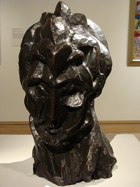
http://en.wikipedia.org/wiki/File:Womans_Head_Picasso.jpg
PIcasso’s Head of a Woman looks vaguely like a woman. It also might remind someone of a mountain, Medusa, or an artichoke (thanks Antonio). Most interestingly, Head of a Woman looks like rock. A lot of sculptures use their medium as merely a tool to represent their subject. The wood, marble, or clay is not important in and of itself. But Picasso carved his piece so that the rock was just as significant, if not more significant, than the woman it portrayed.
It’s easy to imagine the confusion of those who encountered Cubism in its infancy. Isn’t the point of a sculpture to make it look like something? If you focus on the raw material, how is that even a sculpture? Why would you take a nice painting of a man and distort it so it looks like shattered glass? The works of Picasso and Gleizes have shock value. That shock is most potent when you realize how different Cubist works are from typical paintings and sculptures.
(Sorry if I butchered the quote in the introduction. I can’t find the original.)
By Emily Urgiles, Tamar Lichter, Sarah Hussain
Why is there no head or face pictured in Duchamp’s Nude Descending a Staircase?
“Picasso and Braque wanted to represent the fact that our knowledge of an object is made up of all possible views of it : top, sides, front, back. They wanted to compress this inspection, which takes time, into one moment – one synthesized view.”
How can any painting give you more information than reality? It is doomed to be a two-dimensional representation, no matter how alive the “illusion” is.
Tamar Lichter
One of the coolest things about the Chelsea Galleries is that the art is everywhere. For example, this piece is visible from the High Line:

There are two things I love about this artwork. First, it is not entirely clear what it is “supposed” to be. Is it a blue check mark, a yellow Teletubby and Pac-man? Does it spell the word “LOVE”? Is it a group of colorful, misshapen balloons? Lots of interpretations pop up in my mind when I see it.
The second thing I enjoy is the location and context of this sculpture. Directly to its right is a dirty building with graffiti on it. This raises a question we have discussed in class: What qualifies something as art? Just like graffiti, the sculpture uses bright colors, forms rounded shapes, and is in a public place. They don’t seem that different! But they are. When I said “this piece” in my opening sentence, it was immediately clear that I meant the sculpture and not the graffiti.
We perceive graffiti as ugly. Painting over that wall would be considered “beautification” of the neighborhood, and I’m not sure I disagree. The sculpture has an artistic element that distinguishes it from the graffiti, but it is hard to define exactly what that element is. For some reason, the sculpture is good art, and the graffiti is bad art. Even without knowing why that is, it is fun to appreciate the contrast between the pieces.
Tamar Lichter
Is Sir Toby “Belch” a not to his crass nature?
Tamar Lichter