
Archive for 'MoMA'
Something New
My visit to MoMA was planned, delayed, postponed, and then rushed. Safe to say, scheduling conflicts left me with less time to really let MoMA sink in. Also, going alone made the experience all the more difficult. I would have to come up with interpretations on my own. Having never been to MoMA before, at least not that I can remember, I was a little bit worried that I would not find anything to my liking, and I wouldn’t come up with any decent interpretations.
I decided to mix things up a little bit, find a way to keep myself entertained. I decided that I would not go and see any abstract expressionism from the period we talked about in class. I wanted to find something that I really liked that was something new and unexpected.

Mapps by Alehigro Boetti
It didn’t take long. Boetti’s Mapps immediately piqued my interest. I think that as a history and geography nerd, I was initially drawn to the representation of the landmasses of the Earth though the use of flags. However, when I looked at this for a longer period of time, I thought it had a real chance to make a political statement. What the artist does with just the map as seen here is alter our perception of the countries of the world. For example, a powerful country like Germany might get lost in the shuffle, dwarfed by bigger countries. Countries like Mongolia, Kazhakstan, Indonesia. Not the most powerful, but large in scale. It redirects your eyes. I was intrigued also by the possibility of warping the shapes of the countries and continents, maybe depicting countries’ contributions to pollution, or maybe a different social problem. Needless to say, I saw this idea as having very high potential for flexibility and adjustment. I really, really, REALLY liked it.

I’ll talk about one other piece that really caught my attention while I was there. I’m starting to think I’m sucker for any type of art that makes a political statement. This piece really made me dig into my knowledge of history. When I saw this piece, like many others, the first thought that came into my mind was Vietnam. I thought about escalation of the war during LBJ’s presidency, the dividing of the nation, and the emergence of the counterculture and the hippie movement. I thought about the massive change in the country’s culture as many people turned against the idea of war and American dominance, and turned towards peace and equality. The sadness depicted in the portrayal of LBJ speaks volumes to the pressure and the suffering that he went through every day as he tried to balance the needs of the government with the desires of the people. Then also the artist depicts LBJ as, literally, a blockhead, which reminded me that this work was not unbiased. I thought about that as I walked around, the relationship between art and bias, but didn’t really make much of it.
I started to notice as I walked around EVERYONE focusing around on Van Gogh, Picasso, etc. It was interesting to see how some works got so much attention based on reputation when there is plenty of other unique and fascinating work in the museum. Maybe it’s just me, but I felt almost saddened by the congregation of people.
All in all, I really enjoyed my trip to MoMA. I came out happier than I thought I would be, despite the terrible weather. I managed to see all of floors 2, 4 and 5, and there were some really eye-catching pieces there. I still have a lot of problems drawing any kind of conclusions from Dada and abstract works! Hopefully that changes sooner rather than later. I won’t rule out a possible return to MoMA over a different weekend or a holiday. I think there’s a lot more to see.
-Ben C.
Posted: September 19th, 2012 under MoMA.
Comments: none
An Afternoon in the Museum
 The past week I have visited MoMA for the second time in my life, after a year or two long “break”. Back then, as a high school student, I was practically forced into going by my parents and their friends who were visiting NYC from Canada. I remember feeling confused while looking at the randomly splattered paintings which people refer to as “works of art”, a confusion that essentially led to frustration: “Am I stupid for not getting this???”
Two years later, after discussing in class and reading upon abstract art, as well as learning more about artists such as Jackson Pollock, Willem de Kooning, and Mark Rothko, I felt more willing, and possibly a tad bit more excited about seeing their art up close, and perhaps trying to gain a better understanding of their art, as well as seeing if it is true that abstract paintings are “felt” better in person.
I convinced my friend to go with me, and in order to save him $25, I agreed to go on the “Free Friday” (we went around 6pm so there were not even that many people, nor did we need to stand in a line to get in!). I told him that I just want to focus on finding Pollock, de Kooning, and Rothko paintings, so we rushed up to the fourth floor…
When I finally found what I was looking for, I began taking pictures, reading what was on the plaques next to the paintings, and started closely examining and trying to “feel” each work of art. When my friend came up to me to see what exactly got me so intrigued, he began saying things like, “What is this? I can draw this for you if you want” and “I don’t get this. Why don’t I get this? Am I too stupid?” which made me laugh quite a bit. He reminded me of what we said in class, how this is a reaction people typically have, and to be honest, it’s the reaction I had the first time I saw abstract paintings, such as the ones with splattered paint.
 After discussing abstract works of art, and after gaining a better understanding about how paintings made using techniques such as splattering colors all over the canvas are made, I had a slightly different experience looking at it all up close, almost like a different perspective. It might not have moved me to the point of crying, like some artists aim to achieve, but I tried imagining how the artist might have felt while making certain moves with the brush that were reflected in the painting; I also tried seeing how their choice of colors might reflect their emotions. In abstract works of art, I believe it is not the shapes and objects that the viewer is supposed to focus on, but rather the colors and the strokes of brush (or the way the paint was dripped on the canvas, in the case of Pollock). Abstract expressionism allows artists to literally portray their emotional state on canvas, in the way they imagine it looks like. This would explain why people say certain artists use darker colors towards the end of their lives/careers, because they might feel themselves getting darker, older, melancholic on the inside. I think this is what I was able to realize better after visiting MoMA, though I could not explain it verbally (to my friend in particular) until I sat down home and started writing my thoughts down.
 It was a very interesting experience, as I never imagined going to a museum would actually be, somewhat, fun. I guess what I found entertaining more than anything was seeing people’s reactions to certain paintings – some would seem more sophisticated and entranced, discussing certain parts of the work, while others (mostly younger people, such as my peers) would have a different outlook on it, and seemed to have had a instilled attitude of “I can do this, it’s so simple, how is this art?” Art definitely brings forth a different outlook on life, and has a mind of its own; inside NYC yet completely otherworldly.
Posted: September 19th, 2012 under MoMA.
Tags: MoMA
Comments: none
simple, yet complicated
Museums are never really my thing. I’ve been to a few, but I never liked any of them and I don’t even recall the names. Anyways, I went to MOMA this past weekend. I met up with my friend, and he took me directly to the abstract section, which we are supposed to look at. The first thing I saw was by Barnett Newman, and it’s called “The Voice” (1950). It’s basically a white canvas with a light yellow line. It is like one of those pieces that “regular” people would say, “oh really? That’s art?” To me it looked like just an empty canvas that happened to have a light yellow line or one of those old handkerchiefs. So, I went closer to read the label text. It says, the medium is egg tempera and enamel on canvas. I thought maybe the white that I see is egg white and the light yellow is the yolk since there is nothing on the canvas, except the light yellow line, that was described as an off center “zip”. There was no action, not even any traceable signs of the artist hand. It was titled as “The Voice”. Is he trying to say that it is silent and mute?

As I was still wondering about it, I saw another work by the same artist. It is titled as “Vir Heroicus Sublimis”, which can be translated as “Man, heroic and sublime”. It is about twice as big as the first one and it is oil on canvas. Similarly, there are “zips” as well, but this time the background is red. The size and the bright color caught everybody’s eyes as well as mine. I stared at it for a while, and went up to take a closer look.

The Latin title of this painting can be translated as “Man, heroic and sublime.” It refers to Newman’s essay “The Sublime is Now,” in which he asks, “If we are living in a time without a legend that can be called sublime, how can we be creating sublime art?” His response is embodied in part by this painting—his largest ever at that time. Newman hoped that the viewer would stand close to this expansive work, and he likened the experience to a human encounter: “It’s no different, really, from meeting another person. One has a reaction to the person physically. Also, there’s a metaphysical thing, and if a meeting of people is meaningful, it affects both their lives.” (MoMA)
It looks real simple, but at the same time very complicated. I felt like I have absolutely no connection with it. But, it is really interesting how certain artists express themselves in such a way that looks very simple with a deep, complicated message.
Posted: September 19th, 2012 under MoMA.
Comments: none
“A picture is a secret about a secret, the more it tells you the less you know.”
I visited the Museum of Modern Art on a disgustingly rainy Tuesday afternoon. It wasn’t empty, per se, but I’ve definitely seen it more crowded.
In retrospect, I probably should have gone in there with a plan of action or something. I got there and didn’t really know where to begin, so basically I picked a random person and followed them until they lead me somewhere cool. I ended up on the third floor, in the Edward Steichen Photography Galleries.
I went from room to room, just looking for something interesting. The first photograph that caught my eye was Eddie Anderson; 21 Years Old; Houston, Texas; $20. It’s part of a series by Philip-Lorca diCorcia, in which the photographer seeks out homeless, prostitutes, drifters, addicts, etc. to pose for him. At first, the subject in this particular photograph, struck me because of his haircut. He has this weird David Bowie thing going on.
I also thought the angle from which the photograph was taken is interesting. DiCorcia – and subsequently the viewer – is looking at Eddie Anderson through the window of a diner, but Eddie’s attention is elsewhere. His mouth is parted like he wants to say something, and his gaze is averted. The look in his eyes is disconcerting; it’s like he’s in the middle of some deep and profound inner struggle. The boy’s got some demons, I bet.
I’m wondering if the window between the photographer and the subject is a metaphor for something. Maybe diCorcia was trying to say that Eddie is on the outside looking in. Perhaps the out-of-focus jukebox, the hamburger, and the cup of coffee represent social norms and conventions. The glass window of the diner might be a barrier between two different sides of society.
Next to Eddie was Marilyn; 28 Years Old; Las Vegas, Nevada; $30. Marilyn is a prostitute who came to Hollywood chasing a pipedream, and ended up working the Sunset Strip instead. Marilyn in the photograph is possibly emulating Marilyn Monroe. His lips are painted a pretty red, he’s wearing the black eyeliner, and he even has the beauty mark. However, Marilyn’s wig is black while Marilyn Monroe’s hair was blonde.
Marilyn’s lips are parted so that he’s showing his teeth. I believe he was going for something pouty and seductive, but the teeth make it so that he looks a bit like he’s snarling at the camera. Additionally, he seems to be slightly dazed. The look in his eyes suggests that he’s coming to terms with who he is and what he’s doing with his life. Thought I don’t think Marilyn is particularly happy about what it is that he has within himself.
Behind Marilyn is an out of focus young man, sitting with his back against the wall. He watches Marilyn from behind, like he’s trying to figure him out. But the thing is, in my mind, Marilyn doesn’t want to be found out. He hides underneath a caked on layer of make-up for a reason. It’s a facade, but all facades shatter underneath the weight of a camera.
I really liked both of diCorcia’s pieces, and was disappointed to find that they were the only two of his works on show in the gallery. A photograph is supposed to capture a single moment in time, but if it’s a really good photograph then it captures so much more.
– damla
Posted: September 18th, 2012 under MoMA, Reviews.
Comments: none
Art = Creativity


Honestly, I was never a huge fan of art museums. When I’d walk up to the paintings I would feel a bit confused as to how certain pieces could be considered “art.” I always wondered if I was missing something- and why certain people were fascinated by art as it was some Holy object. Surprisingly when I visited the MOMA today I didn’t feel like a foreigner. I think this is because I have a new understanding of abstract expressionism and I really looked at the art- I wasn’t quick to dismiss it if I didn’t understand it at first.
The first piece of art I saw was “Untitled” by Mario Merz. It is a sequence of photographs that show an increasing amount of people in the same restaurant. The number of people in each photograph is written on top of each photo in a neon light. The really cool thing is that all the numbers are Fibonacci numbers! (when you add the previous two numbers you arrive at the current number) I got excited because it reminded me of my middle school and high school days when I did math fair and studied Fibonoci numbers. This is the first real time I have seen math directly applied in art. I think it’s amazing how they can co-exist together to make an interesting piece of art.
Another piece of art I saw was “Crumpled Map” by Sol Lewitt. The interesting thing about this was that the art piece wasn’t a painting, it was literally a map of Chicago crumpled up. The fact that it was 3 dimensional and colorful made it stand out to me. It reminded me of frustration. It reminded me of when I was on vacation reading a map of St Thomas. I got so frustrated to the point where I crumbled the map up and threw it away because I couldn’t read it.
When I rounded the corner of floor 4 I came across “Punch &Judy 2 Bith & Life & Sex & Death by Bruce Nauman. My mouth dropped at the sight of this drawing. It is the most provocative piece of art I have ever seen and I felt like I was doing something wrong by even looking at it. In the picture there are 6 people intertwined. One guy is shooting someone while getting a blow job from another guy. My first thought was “Is this allowed to be on display?” But then it hit me. Art is truth. Often times art portrays life naturally and there are no boundaries to what is appropriate if it represents aspects of reality.
When I saw “Acadamy” by CY Twombly my first thought was “My four year old sister Sophia could have done a better job.” This huge canvas is filled with pencil scribbles. Yes, pencil scribbles. It looked like the work of a toddler holding a pencil for the very first time. After looking at it some more I realized that maybe the true art was in the process of the artist making this drawing. Scribbling isn’t a structured art form- with scribbling you can literally draw out of the lines and do whatever you want. Maybe the artist wanted to feel freedom from confinement and thats what his work represents.
Another painting that really stood out to me was “Full Fathom 5” by Jackson Pollock. It was the first abstract expressionalist painting that spoke to me. I realized that the real art in the painting was in the process of the painting being made when Pollock used his drip technique. Pollock poured his emotions out with every splatter and color he used. Looking at the turqouise and silver painting masked with black, encrusted with buttons, nails and coins evoked the emotion of helplessness from me. It reminded me of being pulled into a tide that I couldn’t get out of. It reminded me of drowning, and death. Like something as beautiful as the ocean even has the dark power of destruction.
As i was headed out of the museum I saw “Mapa.” It is definitely my favorite thing that I saw today. It is a map of the world with every countries boundaries being filled with its ethnic flag. It portrays that the world is filled with so many different cultures, but when we all come together we make up a beautiful diverse world. Every country is a part of something bigger, but every part of the world is important and unique in its own way.
I really enjoyed myself at the museum today and I am happy Macaulay has given me the opportunity to visit the MOMA.
Posted: September 18th, 2012 under MoMA.
Comments: none
Catching my Eyes
Catching my Eyes
This past Saturday I visited the MoMA with Selina, Mahum and Susu. I originally planned to only stay for a short while and only long enough to see the paintings we had to. That changed after Selina and I got to the second floor and saw the art that was made completely by textiles.

Everything was sewn together, and there was even a piece called “Everything”. This piece actually made me think of abstract expressionism because of the large canvas that took up the entire wall. It also seemed, at first, that the different shapes were all random and ad no real shape but upon closer inspection it becomes obvious each different blotch has a specific shape. There were watering cans, people, animals, plants and various other everyday items. It made sense that the piece was titled “Everything” it basically contained, within it, everything a person could possibly see in a day and more. The idea I got from the tie-dye wall was a sense of chaos. Every color was bright and seemed to share the spotlight equally but it seemed so random and overwhelming. Even the shapes seemed to be sewn on randomly; they didn’t seem to be organized anyway to tell a story, and many of them were upside-down, slanted, backwards and the like. The type of chaos wasn’t bad though; it wasn’t the type that would be associated with destruction or depression, it was the everyday chaos – what is experienced everyday by a regular person. That’s my take on it at least.
 Another piece that caught my eye was the piece “Vir Heroicus Sublimis” created by Barnett Newman. I first saw this piece after Selina and I had finally managed to find the abstract expressionism section of the museum, after being given false directions from a guide. I’ve seen this part of the MoMA many times, and honestly none of the paintings really caught my attention until this last trip. This piece was the only one that successfully made me feel any emotion; the instant I saw it I almost gasped. I knew that they weren’t actually there, but upon my first look I saw flames and I was
  reminded of the dream that used to haunt me in middle school. It was like having a flashback of a nightmare, and in that dream the entire world around me was burning down. What’s weirder is that after looking at it more the whole idea of the painting having any relation to such a depressing thing seemed laughable, because the colors were actually vibrant and warm. It started making me feel satisfied and relaxed unlike my first impression of it.
 After that Selina and I parted ways and because I had some time to kill before Mahum and Susu arrived I decided to wander around. I found quite a few interesting places. There was a photography exhibit that I went to, but I didn’t really like the thought of taking pictures of pictures. But there was one other item that really interested me. It was a light, it’s supposed to be pink but my camera changed the color, and behind it the wall was yellow tinted because of the light, even though it was pink.
I also couldn’t visit the MoMA without visiting one of my favorite paintings. 
After Mahum and Susu arrived, I led them to the abstract expressionism area and talked about the works for a little while. After we finished looking around we decided to go to the terrace café and had a light lunch. It was really good and worth the money. I was surprised about my experience this time. I’ve come to the museum many times, and I’ve never really enjoyed my experiences there, partially because of overcrowding. This time, however, I had a really good time and wouldn’t mid going again at some point, and try out the first floor restaurant and gelato stand.
![]()
Posted: September 18th, 2012 under MoMA.
Comments: 1
My Exploration of the MoMA
 Upon entering the MoMA I felt like I didn’t belong there, as though I was walking into uncharted territory. However, within a few minutes of beginning my exploration I came upon the Alighiero Boetti: Game Plan exhibit. I admired the hand-woven rug in which the artist had used every country’s flag to mark their respective borders. It made me think of every nation having its own culture that makes it unique and different, but in the end every nation is just part of something bigger. We all have our differences but together we make up the world. “We may have different religions, different languages, different colored skin, but we all belong to one human race. We allshare the same basic values.”~Kofi Annan
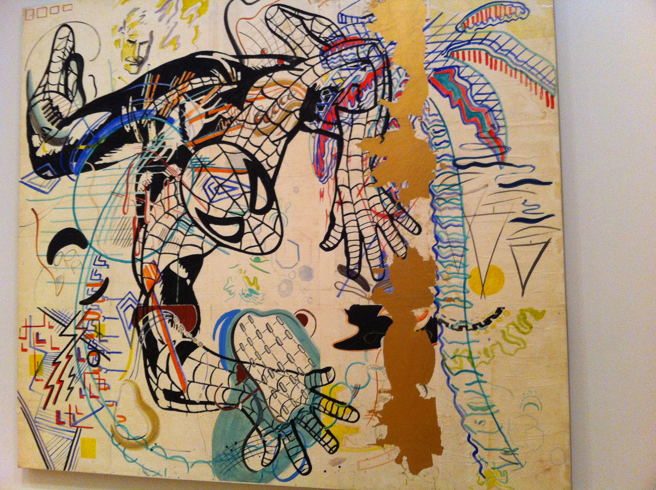
The second piece of art which intrigued me was Spiderman by Sigmar Polke. When I saw this I immediately took a picture and texted it to my friend, a huge spiderman fan, who loved it. We both acknowledged that it was a bit different to our preferred comic art style but it was a welcomed perspective. We figured Sigmar Polke wanted the viewers to look at icons, such as Spiderman, in an abnormal and distinct way than they usually do. It’s true that after seeing something so many times that one can get easily tired of it.

After that I roamed the rest of the museum just glancing at artworks here and there. However, I had my mind set on viewing Starry Night by Vincent van Gogh. As soon as I stepped onto the fifth floor and saw how crowded it was I knew that it was there. There was a cluster of people surrounding it. As I stood there I recalled every time I saw this one painting and the many cultural references there were (such as episodes in Spongebob and Doctor Who -“Vincent and the Doctor” to name a few). Even the day I visited the Brooklyn Museum the ITF for my group showed us a picture of Starry Night to make us talk about art. At first I had very mixed emotions about Starry Night. I was disappointed because it seemed so familiar to me. However, when I moved close enough to see all the brushstrokes it looked so vivid and bright. The amount of paint every brushstroke carried amazed me. I can only imagine what was going through Vincent van Gogh’s mind when he was working on this. No reproduction or photograph could include those details that can only be seen in person. I also saw another painting by van Gogh called The Olive Trees which had a very similar style to Starry Night. Once again the brush strokes were a prominent feature along with the colors. If you stare at it for a while you feel like you’re in a surreal world….or maybe it’s just me.
I’m glad that I was able to see Starry Night and visit the MoMA. I’ve learned that I can’t judge a piece of art just by seeing a picture of it because that limits the experience. Art was meant to be seen in person the way the artist intended it.
Posted: September 17th, 2012 under MoMA.
Comments: 1
“The Three Musicians” Review

When I went to visit the Museum of Modern Art this past Friday, I was surprised at how many paintings caught my eye and caused me to take a closer look at detail. I saw paintings by Pablo Piccasso, Edward Munch, Paul Cézanne, and other illustrious painters, but out of all these fine exhibits, there was one that really captivated my attention. “The Three Musicians” created by Fernand Léger and originally drawn in1924, depicts a trio of jazz musicians getting ready to perform. They are all dressed up in nice suits with fedora hats, and two of them are staring out into what I interpret to be a crowd while the lone performer behind them shields his eyes under his hat with a mischievous look on his face. When I first noticed the painting, I thought about how maybe the third performer was the “black sheep” in the trio, since he cannot show his face to the audience. He might feel like he is placed in a lower class in regard to his talent or physical appearance, so he hides his face from the spectators who paid to watch him play because he cannot stand to be treated like a second-class performer.
Furthermore, I think the color scheme featured in Léger’s work is a true representation of the time period. The painting was produced at a time in France where there were many citizens (specifically young people) who were trying to eradicate all their perceptions of the world prior to World War I. All of society’s teachings about the world were proven to be false due to the many causalities and destruction from the war, and the mood in France (and America) was one of societal revolution and change. I believe this new attitude and uncertainty is seen with the red and yellow color combination in the background of the painting. I first interpreted the dark red at the bottom to symbolize all the bloodshed in the war. I think the fact that the red is placed at the bottom is significant because it conveys to the viewer that the war has concluded, and it is not the focus of the world anymore. Additionally, I think the golden yellow tinge at the top of the portrait is emblematic of how society is now confused about whether to stray away from societal standards on which it has always operated, or venture off towards “the sun” into a new mindset post WWI.
Overall, Léger’s painting, “The Three Musicians,” is a riveting piece of art when looked at without any medium. Between the physical looks seen on the musicians and the color coordination, I think Léger does a wonderful job in catching the viewer’s attention. I truly feel like it is one of the most interesting works I have ever seen, and I am grateful to have had the opportunity to go and witness it in person.
Posted: September 17th, 2012 under MoMA.
Comments: none
Exploring the MoMa
Going to the Museum of Modern Arts (MOMA) was quite surprisingly a thought provoking and enlightening experience for me, because I have never really been a fan of museums or paintings. Therefore, I had decided to only walk through the 4th floor where the paintings on abstract expressionism were kept, the only topic that I had a little understanding of.
The first painting that I saw was a Mark Rothko one. To be able to see his paintings in real life was an altogether different experience than on camera or through the Internet. I remember the first time I saw a Mark Rothko painting on my computer, I thought anyone could make these rectangular blocks, but yesterday I realized that his paintings are more than just rectangular figures.

For example this painting seems to be mere blocks of different colors, but watching the painting in real life gave me a new perception on how to penetrate and understand those paintings which normally I wouldn’t really notice. With an orange background, the painting had rectangular blocks of other colors such as purple, black, green etc. Standing right in front of the picture actually transported me into another world and to some extent I began to understand what Rothko actually meant when he said that people break down when they see his paintings. For me this painting was not just about how perfectly he blended the colors or how seamless his technique was. Our life is full of ups and downs and these colors represent the different phases in our life. I saw the painting from a personal view, like the painting was actually made just for me. The black was all those parts which reminded me of my failures, the parts that I did not want to remember, the parts I wanted to eradicate from my life. The green seemed to depict the happy moments, the lush moments in my life, the ones that I wanted to repeat. Within a moment I could visualize different scenes from my life according to the colors that the painting exhibited.
 The next painting I saw was a Jackson Pollock. As I approached the painting, I saw a pack of people already there listening intently to a museum guide who was explaining how Pollock’s technique was different from those of other abstract expressionists. The museum guide kept talking about how he didn’t use any kind of brush for his paints but just dribbled it on the canvas and this fact turned out to be really intriguing for me because in my stereotypical approach paintings are something which need to be worked on critically and with lots of scrutiny. Before coming to the museum, I was worried about not understanding the meaning of the paintings, because like most regular people I didn’t really discern a particular meaning in the art. However, yesterday I realized that it was not about knowing the real meaning of the painting, or of knowing what the painter felt when he was making the painting, but actually it was about what I felt, about my feelings and the emotions that I get when I look at a particular painting. There are no right or wrong perceptions about the paintings; they are just hung there for the viewers to look at, to relate to, to make them feel that they are not alone in this vast world of apathetic people.

As I moved further in the museum, I saw this painting, and it instantly caught my eye. My first reaction was that these were two celebrities, not wanting to show their faces to the public, but as I gazed in the painting the next thought that popped in my mind was that they were no celebrities, but normal people like us wanting to hide their flaws, not wanting others to see or hear their dark secrets. Everybody has two sides, one that is shown to the world, to the people around them, and one that is hidden, that the person does not even want to identify with his own self.
Overall, my experience of MOMA was definitely one that broadened my perspective of how I saw and interpreted art, and this realization has helped me to shun my fears of visiting museums, and hopefully next time , I will not only focus on one form of art and try to discover other forms as well.
Posted: September 17th, 2012 under MoMA.
Comments: 1
Abstract Expressionism
Hello Everyone!
Besides Jed Pearl’s “Going to the Modern,” please take a look at this link from the Metropolitan Museum of Art for our discussion on Tuesday, September 11.
And here’s an Abstract Expressionist painting from Willem de Kooning:

Enjoy your weekend!
Posted: September 6th, 2012 under Abstract Expressionism, MoMA.
Comments: none