At our exhibit visit just last Tuesday at the International Center of Photography, I was amazed at the amount of complexity in a few art pieces. Most of them were very interesting but confused me, to say the least.
We came across Elliot Hundley’s piece called Pentheus, which consisted of extremely detailed figures attached to a canvas with long, thin steel nails. Hundley put a lot of his time and efforts into this single piece. Pentheus had hundreds of nails, individually holding its own letter, number, or human being. The collage also had words and photographs that bring the canvas to life. There are nude figures of both women and men. The background of the canvas isn’t blank, it has another picture of what appeared to be a man in a forest. There was also a single white bone sticking out near the edge. The magnifying glasses certainly gave it an even more unique touch to Pentheus. I wonder what it was meant to signify, maybe, the complexity of life itself. The little things in this canvas made it a unique treasure for many people to marvel at.
Pentheus- Elliot Hundley
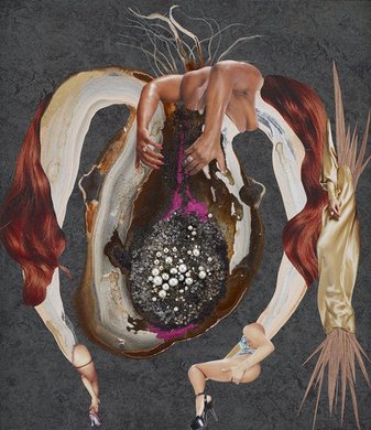
There was also another interesting piece in the same area. Originally from Kenya, Wangechi Mutu created Girl Specimen Series, which consisted of ten pieces of artwork. Like Pentheus, each individual piece connected with each other to form one piece of artwork. In my eyes, I felt like each of these pieces were body parts, but in most of them body parts were included as well. For example, a frame of what appears to be lungs consisted of hands, legs, snakes, and animal skins, which were all interesting. Cut-outs of women in sexual positions were also included as well. There were pearls in some frames, which probably symbolized the fertility of women, thus making the title Girl Specimen Series a logical choice. The description says, “identity has been blown apart, now subject to input and bombardment on every level, from every direction.” This combination of pieces/body parts probably meant that both animals and humans make up of one organism. Below is one out of the ten frames that were in the complete artwork.

Girl Specimen Series- Wangechi Mutu
Overall, it was an amazing experience. It definitely opened my eyes about museums. I hoped you enjoyed reading this, as I did writing this.


