Gateway into Japanese Culture

I have always been fascinated by Japan and its cultures: its exquisite dishes, religious practices, environment, flowers, buildings (temples), technology (animations), and art (manga). This project was inspired by the torii I saw earlier this year in Brooklyn Botanic Garden. A torii, as many might have known by now, is a traditional gate standing at the entrance to a Shinto shrine. Hence, it is the mark of the entrance to a sacred place and holds a special place in Japanese culture. With my collage project, I thought it would appropriate to use the idea of “entrance” as evoked by the torii and applied it as the “entrance” to more than just Japanese Shrines but to the Japanese Culture as a whole.

Playing off the theme of Japanese culture and idea of entrance, the torii stands in the center acting as the gate. And of course, the Japanese flag—the rising sun—is placed directly on top of everything, indicating that everything below is a portion of Japan. On the sides of the flag are koinobori, a paper kite of a koi fish. They give Japan a lively feel as shown through their movements. Then I thought the first thing anyone who visits Japan would do is to try out its great variety of food. Hence, inside the gates of the torii are popular food that can be found in Japan, ranging from sushi, udon, sashimi, tea, tempura, pocky, to things found in vending machines. Why vending machines? It is because vending machines are everywhere in Japan. It sells not only drinks and food but also (and not limited to) clothing and underwear.

Immediately under the Japanese flag are Hatsune Miku and Megurine Luka, two Vocaloids that are currently internationally famous (Miku is much more well-known compare to Luka though). In a matter of a few years after the release of the Vocaloid program of Hatsune Miku, it has become a widespread phenomenon. Everyone in Japan knows Hatsune Miku. She is not only a virtual idol but also the epitome and representation of creativity in Japan. Hence, I naturally thought it would be a great idea to put them under the Japanese flag to indicate Japan’s progress as well as introduce everyone to Vocaloid.

To the right of the torii is a beautiful Japanese garden with a drawing of a tokugawa shogunate and cherry blossom edited in. Originally, Japanese gardens are created to represent an ideal and aesthetic environment that the emperors and nobles use for pleasure. Therefore, I thought it would be appropriate to imagine a shogunate sitting in the garden enjoying the view and sightseeing cherry blossoms (although cherry blossoms are not usually planted near ponds). Monks also use the Japanese garden, but as a place of meditation. Instead of monks, I thought placing a few Miko (Shrine Maidens) there would look much better. Since both Miko and monks are servants of shrines or temples, the substitution isn’t too illogical.

Since I’ve include a building in the garden, one might wonder about the appearances within Japanese homes. Above the garden on the right is what inside of a Japanese room looks (although many in cities are modernized to have a more western look). Instead of elevated beds, traditional Japanese beds called futon are on the floor.

On the left of the torii is actually a variety of things that Japan is known for, other than its food and garden and shrine-related subjects. On the bottom left is a set of actors dressing up as Shinsengumi members. Above them to the left is a drawing of one of the leaders of the Shinsengumi group, Hijikata Toshizou, and to the right of that is a cosplayer dressing up as Hajime Saito (also a member of Shinsengumi). The history of Shinsengumi goes back to the end of Edo period; the group known as Shinsengumi was formed to maintain the Japanese tradition and samurai code (bushido). They fought bravely to their bitter end. Their efforts, however, was recognized and honored much later after their defeat. Nowadays, the group became a symbol in Japanese’s pop culture. And so, I include and position the different forms of Shinsengumi to show the influences on modern Japan culture. One of which is a movie, another is a TV anime series (art), and the last is cosplay. Next to the famous Shinsengumi group are Cloud from the internationally popular game Final Fantasy and a full-scale figure of the Gundam RX-78-2 (still standing today in Odaiba, Japan). Further up those on the left are Japanese brands that many of us would recognize, such as Nintendo, Uniqlo, Panasonic, Sony, and Toyota.

Since Japan’s international involvement, its cultural has integrated, modernized, and evolved away from its tradition. Hence, to know Japan, I introduced one the old and new culture that Japan endorses. The old being the traditional rituals, food and clothing, and the new being the rising popularity of anime, cosplay and collectable figures (of various sizes). The end result was like a poster or travel guide that unifies many diverse photos representing different aspects of Japan by blending them together, hence, creating a dynamic overall feel.

Initially, I had thoughts of creating a 3D collage by taping or gluing photographs into a torii to make it symbolize more than its traditional function as the gate to a Japanese shrine—it would be the gate into Japanese culture. It seemed like a wonderful way to visually represent that theme because the product would actually look like a gate. The downside to that would be the incredible amount of color ink I must use even if I did shrink the photos. I had over thirty photos, each representing some aspects of Japan (although some photos repeat the same aspect a bit differently). I didn’t own a printer and knew no one who had that much spare color ink. And so, when I started digitally using Photoshop to make a 2D collage image with torii as a base, I realized that it was much more advantageous to stick with it. First, Photoshop was very flexible in that I could change the orders of my photographs however I wanted. Second, it would save a lot of ink. And finally, it wouldn’t be as messy as a 3D model when the time comes for me to glue the photos onto it. I could blend the photos together without much trouble using the magic wand tool, feather tool, eraser, and drop shadow (for layer style). That way, the overall final image looked very clean instead of the roughness compared to a 3D model. The only negative of a digital collage, for me, would be that it wouldn’t illustrate the concept of a gateway (literally) as well as a 3D model would. However, the benefits supplemented for the detriment, which was why I decided to stay with a 2D collage.

Using the digital platform, I was able to organize the photos that I wanted easier because I could pick which photos I wanted and which I didn’t want to use without having to waste materials if it was printed. Additionally, it was much easier to move photos, figure out and execute on a design for the collage. By doing this project digitally, I was able to focus on the details and layout, thus exploring Japan digitally as I had been doing bit by bit over the years. I was able to remember much more of the traditional practices and icons of the Japanese culture because I had to refer to it again and again when I was cropping, resizing, and moving photos. This project certainly helped solidified my understanding of Japan. Just the pleasant immersion to it further encouraged me to visit Japan one day to see its beauty with my own eyes. And with it, I hope you would too.

Posted in Collage Project | Leave a comment

Waterfalls- Real vs. Fake

Earlier this year, I went on a 4-day road trip with my friends to Tennessee. We chose this state because it would be a different experience compared to the city-life we were all accustomed to. I didn’t know what to expect besides the fact that we were going to visit caverns and travel in a bus for several days.

When we arrived at Ruby Falls Cave near Chattanooga, Tennessee, the sight inside the cavern was amazing. The beautiful waterfall is lit up by neon lights that constantly change colors. It reminded me of an artificial waterfall that can be found in Chelsea Market in NYC. There are times when NYC tries to emulate various aspects of nature and place them in an urban environment (i.e. the waterfall in Chelsea Market). However, Ruby Falls is so much more natural. The sound of water splashing against the caves, the eroding of rocks, and the smell of the air in the cave is so unique that it’s unlikely that NYC would be able to replicate it.

What made this trip more interesting was how we had to travel through various passageways of different sizes in order to get to this destination. For example, there were paths where we found ourselves slowly inching sideways as our backs lied against the walls of the cave because they were very narrow. During the entire trip, I tried to think of times when I would be able to experience the same thing in NYC, but I never thought of one example.

This tourist attraction may be simple because everything is natural. The only artificial part of it may be the lights that were fixed to brighten the paths. At the same time, the beauty of this cave is different from what NYC has to offer. The cultural difference between NYC and this town in Tennessee is very apparent. While NYC fosters a fast-paced environment and new, breathtaking discoveries through technology, the excitement behind this cave is tracking how Mother Nature erodes and shifts it.

chelsea market


Ruby Falls

Posted in Cultural Encounters | 4 Comments

Double Happiness

.prezi-player { width: 550px; } .prezi-player-links { text-align: center; }

Posted in Collage Project | 2 Comments

The Occupations of New York

The collage project is one of the opportunities we have in this class to really describe our point of view on a specific aspect of New York. I chose to focus my project on the different occupations of the city. It has always amazed me, what weird things people will do in general and the weirder things people do for a career. In New York, we have such a large variety of backgrounds and resumes that I wanted to capture how they all come under one roof.

While some of these jobs may be common in other cities, New York is one of the rare places where they are all centralized. It is that aspect of the boroughs that keep them so interesting. Nothing seems boring because there is always something new to discover.

One day I was in Times Square and I met a man with a sign that read “NEED MONEY FOR WEED. HEY, WHY LIE?” First I thought he was seriously asking for money with that sign and was confused to whether it was a genius publicity stunt that will help this man get money and attention or whether this person was just incredibly straightforward. After telling some friends about it I learned that many of them heard about “the man with the weed sign.” I decided to look him up and discovered that the person I saw holding the sign is a member of a charitable organization. The charity uses the sign to gain publicity and donate to the less fortunate.

It captured my attention. When we were assigned to create a collage, I knew I wanted to capture some of New York’s eccentric jobs. However, I also wanted to balance that off with some of the daily jobs we all seem to interact with on a regular basis but rarely recognize for it’s importance and uniqueness. It helps emphasize my point of how we hold so many jobs in the same city.

Throughout my collage, I’ve gathered the naked cowboy, beekeepers in the middle of manhattan, subway crews, and so many more. I even managed to include a New York Knick. Which other city will offer these icons?

One of the purposes of focusing on occupations is that many people realize that New York is diverse, and they realize it is diverse in various aspects. Yet, no one pays attention to the different jobs in the city. I was hoping my project could help put a focus on that and help others appreciate it when they next come across any such people.

Posted in Collage Project | Tagged , | 1 Comment

What Was Your Name Again?

I intern at a finance office near the UN. Usually when I am going up or down in the elevator, I am alone. However, last Wednesday was different. I had just left for the day after running a couple of errands (picking up the mail, getting coffee, all interns know this drill). A man with a sweet little bowler hat and a scarf very politely asked me about what I was wearing on my head. The conversation went something like this.

Man: Hi, would you mind if I asked you a question? (Without waiting for a yes or a no), Why is it that you wear that turban? I know it is a part of Sikhism, but what is the reasoning behind it?

Me: (Sighing because I have answered this question what feels like a million times) Well this turban symbolizes uniqueness. My religion requires that we wear it as a symbol of respect to God.


Man: You’re from India, correct?

Me: Yes.

Man: OOOOHHHH I LOVE INDIA! I go there for two to three months at a time for work and I absolutely love it. It’s just so much more organic, don’t you agree?

Me: Well, organic is one word for garbage on the streets haha.

Man: I guess we just have different views on it then…

Me: Well don’t get me wrong, I love it there, I was born there, and all my family lives there, but I see the negatives along with the positives.

Man: Makes sense, oh well I better be on my way.

Me: Nice meeting you, see you around.

Man: You too.


At this point, I looked around to see where I was. I had walked in a completely wrong direction, and needed to run in order to get to class on time. As I got on the subway, huffing and panting, I couldn’t help but laugh. Only in New York would you have a twenty minute conversation with a complete stranger about your faith, walk in the opposite direction of where you are supposed to go, and not even ask the man his name.


Credit: Olivier Perrin

Posted in Cultural Encounters | 4 Comments

So Common that We Don’t Notice it

For the collage project, I chose to photograph the different types of headwear in New York City. People wear things on their head for many reasons, whether it is to stay warm, religion, or some sort of sports affiliation. In my experience, a large amount of New Yorkers sport some sort of headwear. The different reasons why New Yorkers wear headwear are interesting though.

All of these photographs were taken at night, some indoors or outdoors. I tried to gather a wide range of photographs, capturing many different types of headwear. Some photographs were taken in Central Park, some on the subways, and others in the more suburban areas of New York City, such as Lefferts Boulevard in Queens.

The inspiration for this collage comes from within. My religion requires me to wear a turban, and thus I tend to notice different types of headwear people are wearing wherever I am. I like to think of different reasons why people wear the headwear they do, and why what they chose is the best for them. For example, if I see someone wearing a beanie, I think it serves them the purpose of keeping warm and making a fashion statement.  If someone is wearing a simple cap, I think t symbolizes one of his or her favorite teams or organizations. I am not right all the time in my assumptions, but it is still fun to think of the different possible reasons.

This collage is organized in a very simple manner. All the photographs that have the same “reason” for why the person in them is wearing that specific head covering are grouped together. Going counter clockwise from the top left, the reasons go from warmth, religion, support for an organization, and jus plain old fun. These are the most prevalent reasons for people to wear headwear that I have found.


Headwear is something that many people own and wear on a daily basis. However, because it is so common, it is not noticed that often, and my goal was to simply point out the ordinary in order to show exactly how extraordinary and unique it is.


Posted in Artistic Endeavors, Collage Project | Leave a comment

NYC ABC’s

My Collage Project

New York City is already diverse in its culture. But what is culture? How broad could the term “culture” be defined? No one would think of typography as a subsection of the dissimilar cultures in New York City, and this is why I chose it. Typography comes in all different shapes and forms; I figured Serif, Sans Serif, and all the rest should be considered as distinctive cultures.

Typography in itself involves the selection of various aspects, such as: typefaces, point size, line length, and spacing between letters. And where else would perfect examples of the diversity in the art of typography be but on storefronts all around New York City.

My Collage Project therefore focuses on multiple typographic designs found all over the Big Apple. To make things interesting, my collage is on Prezi and each frame zooms into a letter of the alphabet, each with an example of a word that begins with that letter. I faced some minor challenges in choosing one picture over another of two different examples, because they both display amazing artwork. In the end, I had to go with the more unique one.


Posted in Collage Project | 1 Comment

Alone in a Pew

Christmas-time in December is my absolute favorite time of the year. I love the cold weather and how the air actually feels fresh, quite an event in Manhattan. I love seeing the evergreen trees spread out on the sidewalks all around the Upper East Side near my dorm.

However, what I love most is stopping in my local church to just sit and think, pray, meditate, whatever word you want to use. I love sitting in a church pew in an empty church with the lights turned down low. The 4 candles symbolically circumscribed by an evergreen wreath stand as reminders of the rapid approaching 25th of December. 2 large evergreen trees stand guard on both sides of the altar, and white branches scattered in glass vases sit in front.

I honestly felt ashamed to take a picture of the scene. In some ways I felt I was depicting something that shouldn’t be captured. In fact, I knew it couldn’t be captured. My lens could only capture the concrete, not the spirit or emotion of the experience. There I sat alone, one of the few places I can get away and be by myself. Some people hate to be alone, but for me it’s one of the best experiences I know.
IMG_0613

IMG_0640

IMG_0615

Posted in Cultural Encounters | 1 Comment

House (and Opinions) / Divided

I do believe that history repeats itself. If we don’t learn and apply the new knowledge we acquire from historical events, then we will keep making the same mistakes. Marianne Weems’s “House / Divided”, a play inspired by Grapes of Wrath, focuses in on this idea.


The play is divided into two sections and is constantly shifts between the two. The first section deals with a family during the Great Depression. They can’t afford their home due to the Dust Bowl and as a result, they move to California. The second section deals with Wall Street and the banks before and after the 2008 recession.


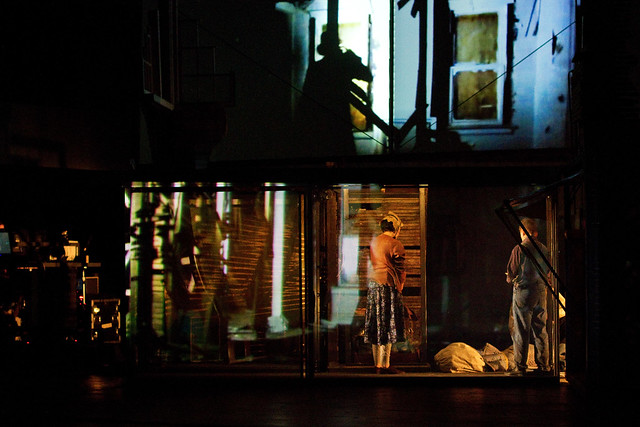
Interestingly enough, the set was very resourceful. The same house was used in both eras of time. When the play shifted to the Depression, one can really understand the problems that family was facing. But as we shifted to Wall St, one sees almost no focus on the individual. It was only focused on the corporate and banking side of homes. By juxtaposing the two, the audience can clearly see the differences.


The acting and costumes were superb. The stockbrokers from the present day era showed a certain corporate culture through the use of multiple computer screens, fast-talking, and profanity. The performers, through the use of accents, the clothing, and the banjo playing, brought the poor Midwestern family to life.

Credit goes to http://i.tm-cdn.com/photos/70773.jpg

Moreover, the recent era focused more on the pre-recession. Everyone in the audience knew that eventually, the fall would come. It was very self-reflexive. It always is. We as humans look at all of our mistakes from a retrospective point of view. The Depression era focused more on the aftermath. Unlike the recent era, there was a certain mystery. Where does the family go after this? You just had to stay and watch to see what was going to happen next.


In all, the play was good and relevant to many of us since we all lived through the 2007 financial crisis.


Lucky for us, this play had a talkback. The producers and the director set on the stage and explained their work. It was very helpful. As they were speaking, I better understood many of the play’s themes and sub-themes. Then came the part where the audience can ask any question they want to the people on stage. Many of the questions that were asked were that of praise of the play. But then the famous old lady came on stage. She stated to people on the stage that, “YOU BLEW IT”. The entire audience—including me—experienced a moment of aporia. No one expected it. At first, I thought the lady had no decorum, but on the train ride back home I thought of something else. The lady seemed to be in her late seventies to early eighties. If you were to do the math, you can say that she was born around the 1930s. That decade was what I would like to call the time of harsh truth and when children became adults. There was no sugar coating of issues. They were presented as is. So, I don’t blame the old lady for making the comment. I do blame the era in which she was born for influencing her.

Credit goes to http://www.soxfirst.com/wp-content/uploads/1936__great_depression.jpg

Still, Marianna Weems could have handled the situation better. Instead of ignoring the lady down, she could have gave her a rebuttal on why she chose to do this and say that she values her opinion. Instead, she sounded a bit like a child by saying “Well, you go make a play and I will come review it.” She should have acted more professionally. Luckily, that episode didn’t diminish my view on the entire play.

Posted in Critics' Corner, House/Divided (BAM) | Leave a comment

A Traditional Chinese New Year

My collage takes different aspects of a traditional Chinese New Year and puts them all together in a way that shows the range of things that apply to the holiday. Everything on the board has a meaning and is used during the celebration of the New Year. My cultural encounter came when I first celebrated the holiday. My family is Chinese-American so when we first celebrated Chinese New Year, I learned many new traditions and customs about the holiday that I shared on the board.

The board itself is the backing of a calendar. The word fook (the red marking) means prosperity and can be seen all around during the New Year celebration. But with the way I arranged my collage, the word is actually upside-down. By hanging the sign upside down, it symbolizes that good fortune will fall into and stay here in the house.

Starting from the upper right corner, the red envelopes are called lai see and are given traditionally to unmarried children by married relatives, usually with money inside. Being married or single is the dividing line deciding if you get or give red envelopes. You give from the prosperity you have had in the past year and it will come back to you many times over in the New Year. Even among the Chinese, there are different customs for lai see giving. The first one displays a small Chinese zodiac, important for knowing what animal the year represents. The Chinese follow a lunar calendar so it does not match up exactly to the American calendar, but as of late January 2012, it is the year of the dragon. Each animal has its strengths and weaknesses and you are associated to those characteristics by the animal year you are born on. On February 10, 2013, it will be the year of the snake. The other zodiac is just a bigger version so that the viewer can clearly see al the animals.

We use the firecrackers and the noisemakers displayed on the board to scare off evil spirits. The tradition is that the loud sounds these items make drive away any bad spirits, which may cause us bad luck. The bars of gold on the top of the page show the wealth and good fortune that we hope for in the New Year. The incense on the board represents the tradition of paying respects to the ancestors. Traditional Chinese people have shrines in their homes and burn incense and light candles there. Others will visit the cemetery before Chinese New Year, burning incense and candles at the graves of their loved ones.

The foods displayed all have meaning to the Chinese as well. The noodles are supposed to be uncut, but I had to cut them to get them on the board. The length signifies longevity and long life. The whole chicken symbolizes togetherness and completeness and it must be served head, tail and all. The spring rolls represent gold since they look like gold bars. The scattered Swedish fish play a dual role in the collage. One, they are red, a lucky color for our culture. And two, it is a whole fish, symbolizes prosperity and surplus. The red “Now and Later” candies are just an example of they kind of things that would be in the traditional candy dish laid out for a “sweet” New Years. The picture of the oranges is there because people give each other oranges as gifts on the New Year for good luck.

Making the collage by hand, there are plusses and minuses to the form. The plusses are that you can see the vibrant red and gold colors that are traditional for the celebration. The elaborate textures and overlapping can be felt and seen close-up and the items seem to pop out at you. Another plus was that I could rearrange items any way that I wanted to, reducing the amount of background space that was left. Some of the minuses involve transporting my collage. It will be harder to bring it to class. It was also messier to make with hot glue and tape, even though I tried to use as little tape as possible. I think that making it by hand gave me more creativity, because I could display the whole project and visualize the final product in front of me. I could rearrange items in the slightest bit so that everything would end up exactly where I wanted it.  Overlapping and bringing texture and vibrant colors out are also important to my collage. To accomplish that, a hand-made creation was better. I also felt that because I was physically interacting with all the pieces, the whole project was more intimate and I got a better sense of the meaning behind my cultural encounter.

Posted in Artistic Endeavors, Collage Project | Leave a comment

Meta

Posted in Collage Project | Leave a comment

NYC Call Box

http://prezi.com/qllbacwtamtt/call-boxes/

We walk past at least one every day. They are always there when we need them for an emergency. They never move and they stand out in their red coats. I am not talking about a British Royal Guard. I am talking about call boxes!

Call boxes are remarkable. During the middle ages of America when no one had an IPhone, people used this to get into contact with police or the fire department and the response was almost instantaneous.

But where does one get this inspiration to make a collage for a simple city utility? Well, one day I was reading up on the murder of Kitty Genovese and in the police report, it mentioned she tried to go to the call box. That lit an incandescent light bulb in my head and I was inspired. I walked a five-block radius around my house and saw how many call boxes are still there. Some were working, while others were broken. It didn’t matter. I took pictures of both of them.

Viola! I get my collage. Instead of the central image being that of a call box, I have it of a street light with an orange bulb on top. The bulb was on at night and was used to let someone know that on any of the four corners of the street, there is a call box. With that in mind, I made the collage design with four corners in order to show the same idea.

In the first corner I have pictures on when call boxes were practical. I honor Kitty Genovese because she is the reason I am doing this project. I found pictures of a man in the 1950s, but the point of the picture is to emphasize on the call box in the box. The last image in this corner is a functioning one two block away. I always walk on that avenue to get to school, but I never really paid any attention to it.

In the second corner, I focus on the decay of non-functioning call boxes. It was rather sad. Some of them had garbage stuffed into them, but the day I went to take pictures, it was cleaned out. Still, there is extreme paint damage, graffiti, and rust on many of these structures. I found one with the number 1929, the year when it was established. To know something this old exists in my neighborhood and that it is going through such negligence, really did tell me that we should preserve the history that we have.

In the third corner, I have images explaining the cause of this decline in call boxes. First I have a functioning call box with the sticker “False Alarms Kill”. That was always an issue with call boxes. A lot of pranksters would call for help and run away. The police couldn’t just ignore them. It was common protocol to check if everything was okay. Doing this diverts emergency resources from where actual emergencies were happening. The second image is that of a cell phone. Honestly, I believe that the cell phone killed the call box. A cell phone in a sense is a miniature call box. The final image is the side picture of the call box with the sticker. Why I picked this picture is because it looks as if there is a noose around the “neck” of the device and it reiterates my belief that the call box is dead.

The last corner represents the first step of urban renewal. It is only one picture of a call box in Woodside where someone painted over it.  Sadly, I didn’t get to see this work of art. I found a blog and copied it on my collage. As a result of this mysterious painter, he or she created something aesthetic. This represents a hope that one day the local government would recognize the important of these devices by sponsoring artists to re-paint them. Thus, creating something pleasant to the eye as we walk on the street.

Posted in Artistic Endeavors, Collage Project | 1 Comment

Revival of Board Games

Growing older, everyone seems to forget about the things they used to enjoy as a child. For me, one of my favorite things to do was play board games. At summer camp, other campers and I would play games like connect four and monopoly for hours. It introduced me to a lot of new games that I got my parents to buy so that we could play at home. I got really good at these games, up to the point where my family won’t play monopoly with me anymore since I get too competitive. But besides that point, board games have been dying down for a while now, but that childhood feeling was revived last Tuesday night.

In the dorms, I didn’t expect anyone to have a board game. But someone had, “The Game of Things.” It was a game actually made for people our age. After someone reads a category, for example: things you wouldn’t give as a gift, everyone else writes down something for that category. The person who read off the category has to try to guess what response came from what person. It started off slowly, but warmed up once everyone started making inside jokes and getting creative.

With about 7 friends, it turned out to be a lot of fun. We ended up playing for a few hours, and enjoyed ourselves with the responses to random categories, some weirder than others.

“Things you would do as a dictator.”

Responses: mandatory dance parties, exterminate the poor… and so on

So here we were, 7 teenagers sitting around laughing hysterically, playing a board game that was actually made for our age. I didn’t even think they made board games for teens. But at the end of the night, we all wanted to play again another time.

I was thinking that the age of board games has passed me, but it was revived the other night and I am really grateful for that. It brought back all of the memories from summer camp and created new memories, shared over a simple board game with friends. It reminded me of when I used to play scrabble and cards with my family at home at night. All those feelings came back and I really hope that we continue to play board games, even if we are a little old for them.

Posted in Cultural Encounters | 3 Comments

The Real NY Burger

Posted in Collage Project, Cultural Encounters | 1 Comment

Street Art/Graffiti

If I went around asking people what “art” was to them, I would receive an array of diverse answers.  After taking this course, I have been exposed to many forms of art that I never would have thought to explore.  IDC has opened my mind to the various forms of art that exist in our world.  With that being said, I decided to delve into an often forgotten form of art: Street Art and Graffiti.

Street Art and Graffiti does not always have malicious intent.  Often times, street artists use their art as a means to express their ideas about a certain social or cultural issue.  Because there is an infinite amount of graffiti all over the city, I decided to limit my collage to one specific location. “5 Pointz” is located on Davis Street in Long Island City, Queens.  For ten years, it has housed the creations of countless adept street artists.  It has been a place for artists to go and express themselves, without having their work filtered by a museum, or a gallery.

Street Art and Graffiti is often overlooked because of the negative aura associated with it.  The purpose of my collage is to show that different forms of art have unique ways of displaying their beauty.  I wanted to shed a positive light on these disregarded paintings.  I photographed all the images in my collage; however, 5 Pointz holds all rights to their original paintings.

Starting this project digitally ultimately changed my thoughts on the actual structure of my collage. When creating it, I decided to use Prezi.  I figured an online collage, rather than an 8×11 handmade one, would be more effective in the classroom.  With Prezi, I am able to show the collage as a whole, in addition to focusing on each individual image that I took.  With a handmade project, I would probably have to pass it around for everyone to see each individual picture.

There were, however, downsides in choosing to make this presentation through Prezi.  As a child, I made many collages by hand but this was the first one I’ve ever made on the computer.  As a result, this may have limited the potential of my presentation, particularly because I’m not familiar with the program.  Another problem I faced with the online presentation was the amount of creativity I was able to incorporate.  Other than transitioning from picture to picture, I was very limited with my visual effects.  Even though a handmade collage would have been more appealing, I think creating it digitally better suits this assignment.

Posted in Artistic Endeavors, Collage Project | Leave a comment

Body Language

Prezi Presentation

When someone is speaking to a group of people, it is important to look confident. Not only will this give the person more credibility, the audience will also be more willing to listen to the presenter. In completing this collage, I explored a culture that is not apparent—body language. Body language consists of small, slight motions that portray our inner thoughts. For someone who is presenting, it is important for he/she to look confident. Knowing the body language of a confident person allows one to “fake it till they make it.”

In this collage, I analyzed each part of the body, specifically the face, arms, hands, legs and feet, of a confident person. Each category consists of two to three photos that illustrate the position of the body part. In the first slide, I focused on the face. A confident person always has a smile and keeps eye contact with the audience. Nodding shows that an idea is approved. Because it is related to positive emotions, nodding can also boost one’s confidence. In the next set of slides, I focused on the positioning of the arms. When a person’s arms are taking up space, the person is dominating his/her surroundings. This is why it is natural for athletes to raise their arms in the air when they win a race. Our hands also reveal how confident we are. When giving a handshake, one should have a firm grip. In the second photo of this set of slides, the man is sitting with his hands behind his back. This is the sitting version of hands on hips. This position portrays the person as someone who is ready for anything. In the final sections of this collage, the positioning of the legs and feet reveal even more about what the person is thinking about. The natural position of the legs is when they are staggered. Although crossed legs may be comfortable for many people, it shows that the person is defensive. Finally, the direction of our feet reveals where we want to go. A confident person should have their feet pointing at the inside of the circle to show that they are engaged and interested in the conversation.

I chose to use Prezi for this collage because I can zoom in on each photo using different frames. The template looks like a stick figure with several arrows pointing at the center. This is to depict how all of these small details combine to form a confident person. One major difficulty I came across when creating this collage is how Prezi is unable to support .GIF files. For example, I could not show how someone would nod during a conversation or how people shift their stance slightly when their thoughts change.

Although body language is silent, it plays a part in our conversations. Most importantly, it shows how confident we are with what we say by revealing our inner thoughts.

All photo credits to their owners.

Posted in Collage Project | 1 Comment

Confusing? — Well, it’s worthy.

For someone like myself, who is not familiar with American history at all, the show House Divided at BAM was merely too confusing. It required too much background information. Even with a little research beforehand, I could not keep on track until a friend of mine kindly whispered reasons into my ears—then I only figured out the most basic part—it was a story showing two time periods, the Great Depression and the Housing Market Crash.

For some reason, before I went to the show, my mind was set on this lie that the whole story took place during the Housing Market Crash only. Thus, during the whole show, I was wondering why people were dressed up as if they were in the Great Depression, so take my advice for this: either do as much research as one can, or don’t do it at all; half way in between can only cause one pain.

Even without my mistake on my own account, however, the House Divided was complicated. Switching between two time periods was a risk that could either ruin the performance or shine a spotlight on it—for me, the experience was somewhat negative. The attempt was understandable. The stage was literarily divided into two in the beginning, one presenting the Stock Exchange and the other setting in John Steinbeck’s novel Grapes of Wrath. Nevertheless, as the story went on, the division became obscure. Sometimes the whole stage was entirely one scene, but within a blink of an eye, it changed to another with the previous scene unfinished. Although the overall storyline was clear, if the audience hadn’t read the novel, it would be hard for them to track the details in both stories—which could only result in confusion in the end.

http://farm8.staticflickr.com/7277/7024467805_f2e1b5a288_z.jpg

It was still worthy. Even with the complication of merging stories, the production itself deserved a pet on the shoulder. The performance still had some highlights to it, and this is from someone who struggled through the entire play. Although puzzling, the visual contrast between the two brought a completely new experience to the audience. The busy transitions, including the lighting, projection and music, allowed people to dissolve into either mood quickly to my surprise (maybe that was the weird part for me, since my mood was transferred but my brain was still processing the previous information). Moreover, the idea of adding projection was fascinating. Within such a tiny stage, the projection enabled a faster and more effective transition of setting, at the same time added a modern taste to the whole production. Only if they could think about the angle of the projection, bacause from where I was sitting, the stage looked broken from the middle sometimes.

Speaking of modern taste, the addition of angled cameras was innovative. House Divided was the first theater play ever I saw that used cameras on stage, and I can be certain that it is not the last time. Since the stage was so tight, it was almost impossible for the actors to face the crowd all at once, but the camera helped them to do so. Also, since there were several scenes involved telephoning, without the cameras, it would have been two people talking to each other across the stage. However, with this technology installed, a much more realistic act became available.

http://images.nymag.com/guides/fallpreview/2012/theater120830_anticipating_560.jpg

I have to say, House Divided was a difficult play. Although the necessary details were basic for most people, without which the play could be somehow troubling to understand. However, even solely for the digital effects, the play is worthy to see, not to say the educational value of the production surpassed its challenging plots. By the end of the show, even if one were struggling like me, it won’t be hard for one to realize the impact of this performance within—just like what it felt like for people during the Great Depression and the Housing Market Crash—a feeling of concern, uncertainty and anger.

Posted in House/Divided (BAM) | Leave a comment

Struggle Between Cultures

Growing up, I have always been told that I have to learn an instrument, specifically the piano. I remember sitting on the stool for hours every week trying to play a symphony by Beethoven. I could not understand why I had to practice for hours. Other children in my neighborhood were always outdoors playing sports and simply having fun. I wanted to be part of that culture. I remember asking my parents, “Why do I have to learn an instrument?” They responded with, “Many people play the piano, so you should too.” I could not understand this. Overtime, I began to realize that this was their response for every question I asked. When travelling to a relative’s house, I would ask, “Why do we have to take the subway?” They told me, “Because everyone who is going is taking the subway also.” At times, it would be frustrating to do what everyone else is doing because that was the general consensus.

On the other hand, I remember my teacher telling me to “find something you like to play” during band class. This response was so strange to me that I spent a long time trying to decide which instrument was the right one to choose. Ultimately, I chose to play the flute simply because I liked the sound of the notes coming from the instrument. This time, my decision was not based on what everyone else did. Rather, it was because of my interests.

In school, teachers often fostered the notion of creativity. Whereas, at home, being unique was the wrong. There was this constant struggle between individualism and doing what was better for the entire group. Fortunately, I was able to find a balance between these two cultures overtime. I would still play the piano occasionally, but they would be pieces that I enjoyed listening to.

Posted in Cultural Encounters | 2 Comments

The Holding of Hands

The Holding of Hands on Prezi

All photos credit to their owners.

With the theme “bonds”, I was having a hard time putting together a collage that can represent all the different aspects of my theme. So when my professor suggest us to choose a specific topic, I immediately apply it to my project. I thought to myself: what do people think of when I say ‘bond’? I immediately thought of marriage. Then I thought of the ring changing process. Well, people have to hold hands to do it, right? That’s it! My topic is going to be “The Holding of Hands”.

However, I didn’t want to make it all about lovers. So I did a little research online, and realized that there could be many different meanings for a simple gesture like this. The subtext of “two or more hands coming together” could vary from a show of love, to regret, to success and much more. So in my collage, I tried to include as much of these as possible. Also, from my research, I realized that many cultures had their own meaning for “holding hands”, so I wanted to include them as well.

It wasn’t until I finished the project that I recognize how powerful something as simple as this could be. I’m glad that this collage project brought me such an epiphany on people’s body language.

Posted in Collage Project | Leave a comment

Apartheid: From the photographer’s Point of View

In our IDC class this semester, we have talked a lot about Apartheid. We even saw a play about it. But, we never had the chance to “see” what was going on. That all changed when we visited the Apartheid exhibit at the International Center of Photography (ICP). Out of all the pieces there, only two had a lasting impact on me.


The first to hit me was a photo of the aftermath of the 1976 riots in Soweto taken by Peter Magubane. It was a picture of a dead body. There were many images of the deceased, but this one affected me in a powerful way. In order to cover the dead male someone put a newspaper over him. It just shows how poor the nation was. No one had a blanket to conceal the corpse. Adding insult to injury, if you were to see what was written on the newspaper, it was an op-ed article talking about how long Blacks would fight for freedom in South Africa with the news caption as, “What would you die for?” I don’t know if Mr. Magubane planned on using this irony or if it was just a coincidence.


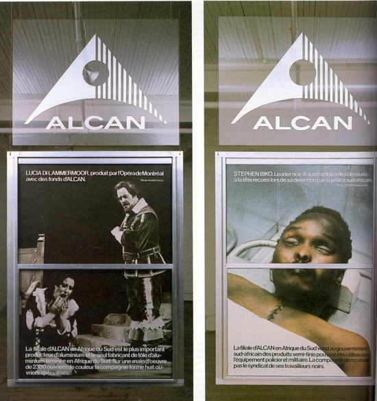
The second piece wasn’t a photograph. It was a sculpture by Hans Haacke. It was used to criticize Alcan, an aluminum company that still had mines in South Africa. During Apartheid, many companies and corporations pulled their operations out of South Africa in fear of public backlash. Alcan remained and according to Professor Bernstein, they said they promoted the arts in South Africa. So, Mr. Haacke used that idea to make an aluminum piece with the Alcan name on top. It composed of three parts. The outer edges have pictures of opera and a play. The middle shows the dead body of Stephen Biko, an activist. By juxtaposing the three segments, Haacke successfully ridicules Alcan’s dealings with South Africa.


ICP was an interesting experience. It really showed me how photojournalism was different back then. There was no Twitter or Facebook. These brave photographers needed to go to magazines to get their pictures published so that the whole world would know what is going on in their country. These men and women deserve credit because they helped exposed the problem that was going on in their country and this exhibit is a way of appreciating the work they have done.

Hans Haacke creation

Posted in Critics' Corner, ICP Exhibit | Leave a comment

The Remaking of Our House

The Builders Association outdid themselves at the Brooklyn Academy of Music, Harvey Theater, with their new theatrical play using multimedia. Recounting the history of the financial crisis of the housing bubble, “House/Divided,” directed by Marianne Weems, magnificently weaved together the past and present through intricate technology and a creative set. The play was inspired by John Steinbeck’s The Grapes of Wrath and motivated by discussion of Henrik Ibsen’s The Master Builder. The story was told through two intertwining perspectives: first, from families suffering environmental or financial difficulties that forced them to leave their homes, and two, from brokers and banks that were the forces that made the families leave.

Brooklyn Academy of Music – Harvey Theater. Photo credits to BAM.

Integrating technology and lighting masterfully, the play switched between the Dust Bowl (past) and the housing stock brokers (present). Although consecutively alternating the time frame did initially create confusion, it was not difficult to understand the effect of the technique. The scene of the Dust Bowl was projected onto a house-like platform in the center of stage while the stock brokers were on left stage. Using lights, our attention was focused onto the screening in which we learned how a man-made ecological disaster drove a family out of their homes. Such was juxtaposed with the banks and stock brokers who, in the same way as the Dust Bowl, forced a man to be evicted from his house. The bank was said to be “the monster[; it] has to have profits all the time. It can’t wait. It’ll die.”

A scene in House/Divided where effective image projection and acting on the left side combined to create this new form of multimedia theater. Photo credits to Jay LaPrete.

The most provoking aspect of this would be that Builders Association really emphasized the emotional pain the evicted tenants were when they were forced out of their homes–a place filled with history and memories–rather than provide extraordinary numbers to illustrate a point. The music contributed heavily to such effect, creating high tension with fast techno beats and sorrow with slow paced sounds. We could only watch as workers “trash out” the man’s belongings in his former house. The old saw no future and could only hope that their children could create one.

The actors effectively brought out the complexity of the financial crisis and what led to the great economic downfall. In many parts of the play, there would be non-linear conversations. Multiple people would concurrently speak, making it very difficult to concentrate on their conversations. However, the audience could make out that the workers paid no attention to their superiors, like the stock brokers from Bear Stern ignoring their boss’s executive speech. The actors all spoke clearly and quickly, as if they were in sync with their role as businessmen. The use of overlapping conversations did not create incredible confusion; rather it was used to illustrate the chaos and ignorance that ultimately led to the stock market crash in 2008.

The set was especially impressive and efficient when combined with projection technology. With the help of projection technology, the sides and back stage was able to alternate through the different time periods with ease. At the heart of the stage and play sat a house-like structure. When appropriate images were projected onto it, it was initially used as a screen. Then when the families living in homes were introduced, it became a house. What was even more amazing was that inside the house were the musicians playing instruments. It was difficult to see through the screens that acted as the outer layer of the house but they were there, along with the casts outside, performing on stage. Toward the end, the crew took apart the house, which took very little time, brought out a podium and shown bright lights on its center. And so, the house transformed into an auction center. Once the auction platform had performed its role, it was quickly taken apart and removed from stage to make room for a table in which Alan Greenspan was questioned.

The main set seen in House/Divided. As shown, the house appearance is created by projecting an image onto the movable structure. Also, musicians are inside the home playing instruments for this theatrical piece. Photo credits to BAM.

Simplifying the complexity of the housing bubble was no easy task but Builders Association pulled it off marvelously. It was stunning that the first comment during the Talk Back session by an elderly woman was, “YOU BLEW IT!” She criticized the play had failed its purpose to engage the audience and leave them with feelings of anger or emotion. It was not wise for director Weems to shut her down and ignored her criticism. She could have responded in a friendly manner, even if it was to move on to the next questioner. That said, what the elderly woman said was not accurate. The play was provoking, but in a subtle manner. It left the audiences with a good grasp of our financial crisis and exhibited the emotional pain and sufferings the evicted tenants had to face. We might not leave wanting to eradicate banks all over the nation, but we should leave thinking how we would “[remake] a house that is undone physically and economically.”

Posted in House/Divided (BAM) | Leave a comment

The Queen of Description

Screen Shot 2012-12-18 at 3.33.47 PM


Katherine Vaz, the 29th writer in residence of the Harman Writer program, came to Baruch to speak about her 5th book, but also her writing in general. Her writing was full of imagery and metaphors. Speaking of “eating music”, she described the mother pleading for help in a dignified way. The character in her new book is described as “consuming the birds song” from within the jail; an extremely fresh and vivid metaphor describing the woman’s distress.

She told the story of a family moving to the Midwest. “In the beginning was New York. The Midwest would be a haven of jobs and shelter. Here praising God is action.” Her writing flows beautifully well and invokes and incites the reader’s and audience’s imagination and memory. Vaz confesses the difficulty she had when writing the war scenes. However, the reader would be totally unaware of her clumsiness as her writing flowed beautiful even in her war writing. She describes the men “crying out for their mothers, always their mothers.” The savagery of war is illustrated by her portrayal of wild animals eating and attacking the bodies of men. She depicts the battle horses as “dreams of flight”, with their sleekness and regality saying, “any horse, after all, is evidence of God’s artistry.”

During the Question and Answer session Vaz was asked many questions by aspiring writers. Some of her advice included, “There is not good time to start [writing]. Commit to writing, 15 minutes in the morning.” This advice mirrors the same advice I’ve received from almost all my English teachers. It seems that by habitually forcing yourself to write something down each day, we eventually come up with something that we want to pursue and refine.

Katherine Vaz also spoke of different words of wisdom she tries to keep in mind every time she writes. The first quote she spoke of was by Gabriel Garcia Marquez, “People tire of magic and want the real.” I especially enjoyed this quote. The simplicity, yet veracity of the statement resounded within my very being. We don’t want to be fooled, but told the truth. Humans don’t like be tricked.

She also tried to follow the advice of Percy, “The feel of the place on your skin”, especially in describing the wind of Jacksonville. Vaz stressed the importance of research in developing a character’s persona. Her Portuguese roots and Catholic background helped form a strong foundation for all her writing. Katherine Vaz’s unbelievable ability to take an audience through an experience was absolutely wonderful.

Posted in Katherine Vaz | Leave a comment

Say Cheese.

Say “cheese.”

Go to another country and they might know what you’re talking about, if you’re lucky. Obviously what you are trying to do is take a picture and need everyone to smile.

Apparently many cultures have different sayings to get their photo subjects to flash those pearly whites. In France, saying ‘cheese’ is acceptable enough that people will know what you are referring to, so it’s not a big issue there. But upon further questioning, many French children also use the word ouistiti, which means ‘marmoset’ (below.) My high school French teacher explained it simply, “It’s a kid thing.”

Fair enough. But that is a similar theme in America. I would bet a couple bucks that most of you aren’t waiting for your friend to snap a picture while yelling cheese. Here, it’s mostly a ‘kid thing’ too. It seems to have dissolved the older we got, not that I’m complaining. I hated it when I was little.

Now according to the wonderful world of the Internet, the Chinese say qie zi (which means eggplant), the Spanish say patatta (potato), Mexicans say ‘whisky,’ Iranians say sib (apple), Greeks with pes tiri (translates to say cheese), Germans say Käse (cheese), Korea has kimchi (a common food that is eaten there), and the Japanese sayチーズ (chii-zu which sounds like cheese.)

It is interesting to see all the different ways that people take pictures. I wonder why most of these words/phrases are foods.

Well at least now if you travel to one of these countries, you won’t look like a total fool saying cheese in front of a camera. You’ll just look like a fool in general.


Posted in Cultural Encounters | 4 Comments

Reflection on the Medium: What it Means to Photograph.

The two most interesting pieces to me were by Berenice Abbot and Larry Sultan. After reading the persuasive argument made by Abbot, I could not enjoy Ken Light’s piece as much.

Starting with Abbot’s piece on the ‘reality’ of photography. She says, “I believe there is no more creative medium than photography to recreate the living world of our time.” I’d have to agree with her. A photograph is a snapshot of a certain moment in history and no other picture captures the same moment and perspective. A photo can be influential or meaningless. Log onto ‘Instagram’ and see pictures of people’s dinner, people’s cats, and the ‘outfit of the day.’ None of these pictures influence me in any way. On the other hand, some Instagram accounts take real pictures. Pictures that exhibit reality and influence people.

Abbot then goes onto say how certain historical events call for a need of ‘real’ pictures to document the event. But she argues that simple documentary photography is the plague of photography and pictures need to impact a person. They need to be a ‘penetrating statement.’ I agree with that; without a statement, a picture is nothing more than a disconnected perspective of something we may (or may not) care about. Simply put, pictures aren’t good without the ‘magic.’

Now onto Larry Sultan’s piece on why he photographs his family. Sultan uses photography as a way to ‘find’ himself. But how can anyone find himself or herself through taking photos of other people? Well firstly, he very much enjoys taking pictures. He would work his father’s garden for hours if his dad would let him take a few pictures of him. That’s dedication. But, Sultan tends to make his parents and his other subjects seem more “despairing than [they] really feel.” Sultan wanted to capture an objective reality of his subjects. Something that bothered his father or, as Abbot would say, penetrated him. His father felt something because of Sultan’s work. I think that is the point of photography, something that Abbot feels as well. Photography should be real and impacts a person, for better or for worse.


5 terms of Photography:


BLUR: Unsharpness because of the movement of the camera or subject during exposure. Blur can be used for many creative effects. In computer imaging, the use of Blur controls to selectively soften parts of the image.

DEPTH OF FIELD: The zone, or range of distances within a scene that will record on film as sharp. Depth of field is influenced by the focal length of the lens in use, the f-number setting on the lens, and the distance from the camera to the subject. It can be shallow or deep, and can be totally controlled by the photographer. It is one of the most creative and profound effects available to photographers.

FOCUS: Causing light to form a point, or sharp image on the image sensor or film.

SHARPNESS: The perception that a picture, or parts of a picture are in focus. Also, the rendition of edges or tonal borders.

WASHED OUT: Jargon for seriously overexposed slides, or overexposed highlight areas within slides and prints. It’s as if the colors have been diluted to the extent that all pigments have been “washed out.”

Definitions from: http://www.ritzcamera.com/static/articles/research/photo-terms.html

Posted in Cultural Encounters, Street Photography | Leave a comment

Max Flatow: Photography Boss

“If you have an IPhone, you can be a photographer.” That’s a pretty bold statement Max Flatow makes, considering the fact that his career revolves around being a photographer.


Flatow is based in Brooklyn and has been doing this for seven years. His love for photography stems from a 7th grade program. In order to better his skills, he worked by and taught himself. In college, he found a darkroom and taught himself the techniques. Still, he didn’t know what he wanted to do with his life. All that changed after his study abroad trip to Spain. When he came back to America, he showed his pictures took a local café and they decided to hold a gallery for him, where he sold the pictures.


From that, he worked for many set designers, which led him to be exposed to famous photographers. He even got a job in video production. But he didn’t like it so he quit to become a full-time photographer.


After he created his business, he needed to build clientele. The only way he saw he could do this is by using Facebook and doing work for free.


He likes to take wedding pictures, but he is versatile. In these shots, he doesn’t like the standard picture where the bride and groom stand in the middle. Instead, he creates a more dynamic image by applying the “rule of thirds”. He does have his preferences. He “doesn’t use flash”. It’s either natural light or his assistant would create an artificial light. Flatow likes shooting in black and white because it gives “classic taste, but only when appropriate”. Still, he loves to shoot silhouettes.


Besides weddings, food is another area where Flatow enjoys. He isn’t a fan of the pretty product. He rather see the backstory on “how it’s produced and caught”. Before he goes on a vacation, Flatow would call the restaurants and ask them that when he is there if he could take a picture of their meals. According to Flatow, “Chefs love when people take pictures of their creations”.


In all, Max was an interesting guy. As a young Brooklynite, he runs his own business and he is “his own boss”. He knows the classical techniques of working in a darkroom as well as the modern skills of Instagram and Photoshop. Most important is that his pictures are amazing!

Credits goes to Max Flatow

Posted in Max Flatow | Leave a comment

Endless Violence: The Rise, Fall, and Rise Again of Apartheid

Heading into the International Center of Photography (ICP) felt like entering a regular museum, not one filled with photos documenting the tragedy, bloodshed, cruelty, and violence of the apartheid in South America. The reality of the apartheid felt distant on words but with the graphic photographs, it became very difficult to stay indifferent to the situation. Putting their very lives on the line, the photographers such as Leon Levson, Earnest Cole, Graeme Williams, Kevin Carter, and Greg Marinovich, and many more, achieved that effect with their photographs.

The Rise and Fall of Apartheid Exhibit at the ICP. Photo credits to DLKCOLLECTION at http://dlkcollection.blogspot.com/2012/12/rise-and-fall-of-apartheid-photography.html

Of the very first photographs I saw, the one by Leon Levson took struck me the most. In his photo called Sleeping Quarters at Miners’ Hotel, Consolidated Gold Roof Mine, taken at Johannesburg, 1946, I could sense the harsh living conditions of South Africans. The miners sleep on rows of eight beds adjacent to one another with barely any space in between or to move around in their bed. In the picture, it also showed a person eating at a very small round table (the only one in the room). He was dressed very lightly with a plain white shirt and pants. There were shoes in a messed on the floor and a bicycle hanging next to the beds. The others in the room looked very skinny and tired, with grim faces that revealed no signs of enjoyment or satisfaction.

Moving along, photographs themselves seemed to evolve as written words were incorporated along with people. Viewers no longer had to guess what the photographs meant; we might not appreciate it presently because it’s so common in our age, but at the time it was revolutionary for apartheid photographers everywhere. Using written words to convey a message on photographs was clearly endorsed by Earnest Cole. He took photograph of signs from 1958 to 1966 showing just how segregated South Africa was. Some of those signs said, “Separate entrance for non-Europeans and tradesmen’s boys,” “Black woman scrubbing whites-only stairway,” “Segregated bus station” and “Bus for non-Europeans only.” In sum, what Mr. Cole and the photographs were revealing to us literally was an openly bigoted society.

In addition to verbal abuse and racial isolation, there was brutal violence, often resulting in the deaths of Africans. Towards the end of the exhibit in the basement, there was a photograph of Nelson Mandela with his hand raised up in a fist to show victory after his release from Victor Verster Prison in 1990. The photograph was taken by Graeme Williams. That photo of Mandela, however, was juxtaposed with many other photos illustrating the continuation of bloody violence in the same area. One of which was taken by Kevin Carter of a scene in 1994; it was called “Press photographer James Nachtwey takes cover during a street battle between ANC supporters and Zulu miners loyal to the Inkatha Freedom Party. The photograph showed some white camera men and a black woman taking cover from gun fire. One African was holding a submachine gun to shoot against the other party. By placing these photographs in the same area, the organizers for this exhibit effectively convey to the viewers that the conflict (apartheid) still exists even though “victory” has been declared.

Nelson Mandela with Winnie Mandela as he is released from the Victor Vester Prison, 1990. Credits to the photographer, Greame Williams.

The photos were well organized in the exhibit on the ground floor, placing them chronologically in terms of events and groups. The gallery not only included photographs but also videos and news announcements about the relevant event in that specific part of the exhibit. All images and videos had some text next to it to show the photographers (some were labeled unidentified), copyright, type of print, and courtesy message. As we walked in and saw the gallery from the right, then circling around to the left, we could tell that there was an increase in the tension level of apartheid (rise). To reach the end (in name, officially, anyway in 1994) of apartheid, we must travel downstairs to the basement of the exhibit (fall). With this layout, the organizers wonderfully portrayed the rise and fall of apartheid both chronologically and physically (our movements). And although there was a fall or official end to the apartheid in Africa, the violence between different parties carrying views of segregation and integration still persists. Perhaps the organizers might not have intended this, but I certainly felt the message that the violence did not cease as I was walking back up the stairs (rise) to exit the exhibit.

Posted in ICP Exhibit | Leave a comment

A Love for Photography

Being a professional doesn’t necessary equate to a formal education in school. For Max Flatow, his professionalism in photography is essentially self-taught. It is the result of practice and experience. One would expect a well-established photographer who was self-taught and had built his own career to be somewhat haughty; Mr. Flatow, however, was very friendly and appeared to be easygoing during his class visit to Baruch College on November 6th.

Mr. Flatow’s interest in photography began in 7th grade and persisted to his college in Vermont, where he took advantage of a fallow darkroom. Because no one was using it, he had full control over the room, experimenting with lighting and chemicals, and eventually compiling a photo journal. He lightheartedly said, “You have got to start somewhere.” Although advancement in camera technology has nullified the effectiveness of a darkroom with Photoshop (Mr. Flatow playfully called it “digital darkroom,” or otherwise the “light room”), he quickly adapted to digital cameras. Reflecting upon his own decisions as he told us his story, he was very cheerful and seemed to smile quite often. He was never sure whether or not he wanted to become a professional photographer as he was discouraged by the people he knew, saying that it “isn’t tangible” because of very portable cameras and iPhones.  It wasn’t until his study abroad in Spain where he sold some of his travel photographs in his first gallery showing at a local café that inspired him to become a full-time photographer.

Working with Mary Howard, Mr. Flatow’s career took off at a great start. He was able to get exposure to how professionals work. He eventually quit the job and started his own business. Although he is an optimistic person, in both speech and the work that he does, he never expected to be immediately successful. Instead, he offered to do much of his work for free knowing that he wouldn’t get customers right away. He explained quite frankly that it was an effective way to build relationships, networking, and even to learn how to run a business. One of the many other ways to get publicized was, of course, through web services. And I think many of us would agree with him when he said, “Facebook works wonders!”

Mr. Flatow takes photos of a variety of subjects, of weddings, food, celebrities, travel, buildings, and corporate portraits. In particular, there were two fields that Mr. Flatow was really interested in; they were weddings and food. From the slideshow of photographs he showed us, I could tell that he especially liked to play with light, depth of field and angles. The first photo of a newly married couple standing on the meadows was incredible. The couple was set toward the right side of the image while the bride’s veil stretched across to the left. The positioning of the subjects forced the viewers to not only look at the beautiful couple but also at the amazing scenery.


Credits to Max Flatow


In another wedding photo, set in a church, Mr. Flatow used the light effectively to capture a gorgeous silhouette image of the couple. His silhouette photo of two children dancing had a similar effect, differing only because the silhouette shot of the two children used a staged light. He, however, told us that he never used camera flash.

Silhouette Shot of the Couple – Credits to Max Flatow

Silhouette Shot of Kids Dancing – Credits to Max Flatow

His food photos were so clean and sharp that it almost appeared to have been edited using Photoshop! Particularly, he took photos of almost all his subjects, including food, at a slightly tilted angle. One could tell that he loved his work when he added, the tilted angle in his shots “creates a little bit more excitement.”

Credits to Max Flatow

Why does he love his work so much? It is because, as he puts it, “I’m my own boss.” He is able to do what he enjoys. He travels, gets in touch with chiefs, eats wonderful food, and encounters many cultures. Max Flatow is certainly a talented photographer with a sense of fulfillment and playfulness.

Posted in Max Flatow | Leave a comment

Eating Songs, a Story of Brilliant Magical Realism

I was honored to have Katherine Vaz, the 29th Harman Fellow at Baruch College, as the guest reader for a very special reading of her soon to be published new novel, Below the Salt, on the evening of October 23rd. It was a peaceful evening of joy and reunion. Miss Vaz seemed to be enjoying herself as she conversed with her friends and perhaps new acquaintances before the reading. Clad in an elegant yellow dress, she gave off an aura of grace and friendliness.

Katherine Vaz – Credits to Baruch College

After a light snack, the room seemed to be filled with anticipation for Miss Vaz’s reading of Below the Salt, a book that she had been working on for the past eight years. Her previous works followed a similar theme of mother, love, sadness, and share Portuguese ancestry; and so it was no surprise that this book, Below the Salt, and the one we read, Our Lady of the Artichokes and Other Portuguese-American Stories, also shared those themes. Below the Salt is set during the Civil War period, a time of tumult and breaking bonds between families in the North and South. The breaking of bonds, shared sadness and music are but some of the magic ingredients that help shaped the tragic yet loving story of John Olives, the protagonist. Although the pace of the reading was slow, it gradually gained momentum. The story’s tension and beauty vacillates as Miss Vaz builds the context through her firm voice, increasing speed during tension and slowing down as climax approaches.

Miss Vaz’s use of metaphors of music and songs add a spectacular effect to her story. Particularly in the beginning, John and his mother are starving in prison as they are not given food. Having nothing but air for her son to eat, John’s mother offers her son a kind yet cruel reality, “We’ll eat some songs, John …, eat the chattering of little birds.” More to John’s cruel fate, he was ultimately separated from his mother after being both rescued by Americans from prison. And when John finally found a lover, Mary, Civil War broke out and he had to leave to war. The battle scenes were incredibly detailed and the realities of war, all too vivid. Due to starvation, he ate a man and a horse. He couldn’t escape reality by eating songs like he did with his mother. And when he returned after the war, Mary was already engaged to another man.

John’s tragedy seemed to be boundless and too real; yet at times, it feels like a fantasy. That is the magic of Miss Vaz’s novel. She is able to tie closely through vivid descriptions and soothing metaphors to create a sense of magical realism. Of course, as she explained after the reading in the questions and answers section, she did not come up with those metaphors and descriptions on a whim. She did a lot of research that focuses on what might apply to the characters and their personality/history, sitting in libraries and living in the towns that John was in. She, however, was hesitant to write this novel. She playfully explained, “I don’t want to do that much research.” But before she knew it, she was reading and writing a lot about her topic; after a year, she finally found the determination to write the novel. To future aspiring writers, she told us that her motto was, “No one knows where to start, simply put anything down.” To start, it’s about finding “the heart of the material and character.”

In the questions and answers session about Our Lady of the Artichokes, it was clear that stories greatly impacted Miss Vaz’s life and writing style; she grew up hearing stories about saints, religious rituals and death. Some of the stories included a particular practice of Latin Catholicism where people were allowed to be angry at status if something bad happened and should thank the statues by decorating them if it helped them. Hence, she integrated those stories into her book. It made perfect sense then that the book, Our Lady of the Artichokes, was composed of several stories about.

Cover of Katherine Vaz’s book, Our Lady of the Artichokes.

This was the first time I attended a public reading of a book. Frankly, I used to think all public readings were boring because it made me think of lectures. Katherine Vaz’s reading, however, spirit away that thought. The detail and meticulous effort dedicated to her works is admirable; her enthusiasm and pace of reading made the story of Below the Salt extremely enjoyable.

Posted in Katherine Vaz | Leave a comment

Great Show, Disappointing Q&A

I very much liked “House Divided” at the Brooklyn Academy of Music. I think the show was very successful in portraying the crisis through a particular lens. As evidenced by the Q&A session, there was much frustration and almost disdain for the producers and directors of the program. I think the program depicted Wall Street’s role in the crisis very vividly, especially when the mortgage processor was told it wasn’t her place to question the firm’s decisions. The moving stock tickers above the stage were an excellent touch. The young man who played one of the stock traders was excellent. He showed his role versatility and far outshined all the other actors/actresses in the show.


Screen Shot 2012-12-18 at 5.05.02 PM Screen Shot 2012-12-18 at 5.04.41 PM Screen Shot 2012-12-18 at 5.04.07 PM Screen Shot 2012-12-18 at 5.03.48 PM

From Google Images


The audio was very clear; especially considering how high and far back we were sitting. I believe the use of props and scenery was very well done. The house that was able to allow the audience to see inside was magnificent, nothing I’ve ever seen before. The juxtaposition of the Dust Bowl and the displacement of a family with the foreclosure of a home were very vivid.

During the Q&A session, one member of the audience voices her very negative opinion of the program very clearly. She almost needed to be pushed away from the mic, and the Q&A couldn’t shake the negative tone brought on by the first question/statement. It was truly a disappointment.

While the play was very good, I was very disappointed that the Q&A was not more of a view into the minds of the actors, producers, and directors.

Posted in House/Divided (BAM) | Leave a comment

Practice Makes Perfect

As you now know, I was out of power for 13 days with no power. During the day, when there was ample light for board games, reading, etc. Being that I have three siblings, it still wasn’t terribly boring. But I am the oldest, and consequently the smartest. So none of my siblings, whose names (in age order) are Arianna, Tom, and John, really gave me a challenge with the games that we played. I happen to think chess is a fun game so none of my siblings were able to beat me at it. I am probably not ‘good’ by any standards but I can hold my own in a friendly game. All three of my siblings wanted to play me for some reason; I figured it was for bragging rights. “Haha, I beat Joey” would have been ringing in my ears for a few hours but I wouldn’t really have minded. If they can beat me then good for them.

However, none of them could. But that’s when we found a bunch of old checkers pieces. Instead of chess, we decided to fire up a game of checkers. It is important to note that I’ve always hated checkers for some reason. I was never really good at it, even though it is much simpler than checkers and I never understood that. So I had to be reminded of the rules and how to set the board up. When the board was set up, I played each of my siblings. Arianna was first; I shut her down pretty quickly. Then was Tom, where the same thing happened.

But then I played John.

The kid smoked me. He’s only a freshman in high school. Needless to say, I was surprised but happy for him. Apparently he has some Checkers app on his iPod and if he can’t fall asleep then he loads up the app and plays until he falls asleep. He must have had a few restless nights and figured the strategy out. It solidifies the idea that “practice makes perfect,” even if it’s unintentional. Before he got too much of a big head, I downloaded the app on my phone.

Now the poor kid can’t beat me anymore (but I still let him win occasionally… He really loves to win.)

Posted in Cultural Encounters | 2 Comments

Different Opinions Left this House Divided

For four consecutive evenings, the Brooklyn Academy of Music put on House/Divided, an original production inspired by John Steinbeck’s Grapes of Wrath.  The show itself smoothly transitioned back and forth between two distinct settings.  The first is inside a brokerage firm, which allows the audience to see the large scale, economic effects of the Great Depression.  The other half of the performance follows the Joad family, the main characters of Steinbeck’s novel.  This setting follows them on their difficult journey westward and highlights the individual struggle for families during the 1930’s.

The set of this production is very confusing at first, but it allows the audience to see the opposing sides of people during the Depression quite effectively.  Stationed on the left are two brokers, who seem to be exchanging stocks within their firm.  In the middle, there is a run down home that emphasizes the hardships of the Joads.  All the way to the right, there is a single man constantly playing music that adds to the emotions already being portrayed.  Lastly, there is a projector in the background, along with a stock market ticker.  At first, I thought the transiting was going to be awkward, considering everything was crammed on stage.  However, Jennifer Tipton and her crew did a superb job with the lighting, allowing the audience to focus their attention on certain cast members.

Photo Credit: James Gibbs

If someone wanted to attend a show for quality acting, this was the production to choose.  Throughout the evening, the audience has a sense of all the emotions that many families dealt with during the Depression.  The Joad family experiences many hardships in such a brief period of time.  Within a few months, they are evicted from their home, they are out of work, their grandfather dies, and Rose of Sharon delivers a stillborn baby.  But the actors who play the Joads magnificently provide the viewers with the necessary sense of fear and distress.  In a similar way, the music only adds to the theatrics of the night.  When the stock market crashes, the music goes from serine to hectic.  It progressively gets louder during the evening, and the crowd becomes one with the Joads.

Overall, the BAM Harvey Theater displayed an excellent rendition of the Great Depression. However, some people begged to differ.  A seemingly harmless, elderly woman took to the microphone during the post-show talkback.  As soon as she got to where the microphone was, she exclaimed, “YA BLEW IT!”  Silence fell in the room, as this out of whack viewer rambled on about the poor quality of the production.  Rather than calmly responding to the lady, one of the female producers immediately jumped on her case to shut her down.  To me, both of the women did not handle this situation properly; luckily it did not take away from the actual main event.

After that whole instance, the producers went on to discuss their reason for making this show.  “It’s about making the invisible, visible,” said one of the producers.  I found this statement to hold some immense value because often times, people do not notice the inevitable forces of nature that are affecting their lives.   For those who stayed for the talkback, they gained insight about making a theater production in addition to the stellar production that preceded it.

Photo Credit: Richard Termine, NY Times

Posted in Critics' Corner, House/Divided (BAM) | 1 Comment

Sandy

Now Sandy was about a month ago. And now seems the perfect time to reflect on what happened to me.

I live on Long Island. All of Long Island was affected differently. I was fortunate enough to be in an area that was hit hard, but not devastated. Devastated, what a word, but there isn’t one powerful enough to describe what happened to some families. Sandy was the real deal.

Now back to my story. Before she hit, she was on every news station. Everyone and their brother was covering the ‘Frankenstorm on the east coast.’ They made her sound bad, like they always do with storms like this. I figured it was a strategy to get more viewers to their channel. Being that hurricanes don’t hit Long Island very often, and the ones that have (or at least the ones that I was alive to experience) haven’t been too bad. Here I was thinking that Sandy would show up to my front door, huff and puff and try to blow my house down, then run away with her tail between her legs to try her luck on another town.

I was wrong.

Welcome to my front yard and the cause of my outage.

The power went out the night of the storm. Even though I was getting ready to go to bed, it was a wake-up call. Maybe this storm is going to be a tad worse than expected… Nah, I bet we’ll get power back tomorrow. Guess I’ll just have to tough it out until then.

I got power back on Day 13 after the storm.

Now, during my freshman orientation for Baruch, I was let in on a little insider information: like my high school, Baruch tends not to close too often. If the subways are down and the weather is exceptionally bad, then the school may decide to shut down for a day. But essentially, don’t get your hopes up because it rarely happens.

School was cancelled for a week.

So let’s get this straight. School was closed for a whole week, and I had no power for 13 days after the storm. Which obviously means that I had no power during the time school was closed. What did I do you ask? Well, besides the cold showers, morgue showers (I worked in a hospital, and when it got power, I went to the morgue and used the shower that they had in it), lack of internet, no electronic devices, no cell phone signal, no freezer, spoiled meats, gas lines, no ice, barbequed foods each night, nothing in grocery stores, trees down, power lines lying lifeless in the street, and lots and lots of darkness; something pretty profound happened to me.

I picked up a book. ‘Wait, you picked up a book, who cares…?’ Well let me explain.

I never read books. Never. A teacher would assign one, and I’d look up the summary. I hated reading and reading hated me, we had a mutual relationship. So why did I pick up a book in the first place? Frankly, I was bored. Boredom like you wouldn’t believe. So I went to my basement, picked out a nice 600 page Stephen King book and got crackin’. Bag of Bones was the title and I couldn’t put the damn thing down. It was the most interesting experience of my life. I loved reading it. Now I don’t love many things, but ‘reading that book’ made the list. The story, the characters, the horror, It was amazing and I was hooked.

This overweight fella changed my life.

I’ve read three other Stephen King books after the incident. I can’t stop. I don’t plan on stopping either.

I’ve filled a little void in my life and, despite everything, I thank Sandy for this.

Posted in Hurricane Sandy | Leave a comment

iPhone Photography

“You don’t need thousand dollar equipment, last year’s photo award was made with an iPhone.” Max Flatow embedded in our minds that anyone could be a photographer, and we don’t need a pricey camera to be one. He shares that even as a professional photographer, he uses his iPhone to capture the moments he wants to keep.

Flatow tells us that his love for photography started in seventh grade. “I’m self taught. I spend a lot of my free time honing my skills.” He had motivation, which made the art of photography more the interesting for him to discover techniques on his own. He took over an unused darkroom in college and started studying photojournalism. After his study abroad trip to Spain of his senior year, he decided to hold a gallery at a local café, where he gained some attention and were able to sell some of his artwork. He worked for a set designer, Meredith, by painting sets, which gave him great exposure to photography.

What exists everywhere, no matter where in the world? Food. Flatow works mostly on wedding photography, though he also photographs food on the side. On his job, he actually does a lot of travelling, and at every new location, he tries to contact local restaurants to have their dishes be photographed professionally. One couple had him travel to India. He describes that trip to be the most interesting wedding he’s ever been able to photograph. The couple walked onto the scene on elephants! The vibrant colors he captured allowed us to peer at what amazing time and experience he had on the job.

Going through his slideshow, he would also stop to tell us the techniques he used for each picture. He gave us pointers on how to create a depth in field effect, perfect a silhouette, and more. He inspired me to take photos of my own to capture everything around me. He was self-taught, and it only takes practice. Maybe I can get there some day.


All taken by Max Flatow

Posted in Max Flatow | Leave a comment

A Glimpse of the Struggle

Apartheid was a time of terrible inequality in South Africa filled with violence and passion. The ICP exhibit on Apartheid captured that passion and struggle through a variety of different pictures. The photographers of the time such as Peter Magubane and Ken Oosterbroek risked everything and snapped the emotional pictures that filled the halls of the exhibit.

Credits to http://lostfoundremembered.com/2012/09/29/international-center-of-photography/

When you first walk into the exhibition, it seems like a normal museum. There are plain hallways lined with photos and magazines to look at and not touch. Taking photographs of the pictures was prohibited. But as you walk further down the hall, the story develops chronologically, in a well-organized display of the struggle of Apartheid. The themes in each room are evident and clearly brought out, with helpful descriptions on the walls. The writing adds context and gives the information that the vivid pictures could not provide. The photos surrounding you are graphic, and when you see up-close and personal the terrors that were Apartheid, you empathize with the struggle no matter what race you are.

Some of the pictures like Peter Magubane’s “Sharpeville Funeral” just leave you with a sense of despair and sorrow. The black and white image of a row of coffins, casualties of Apartheid, and all the sad faces just display the emotions people had during the time. It emphasizes the theme of violence, but at the same time shows the determination that the Africans had to gain their liberties. No amount of illegal handcuffing and searching (as seen in many photos of the exhibit) would deter these people, even when they could trust no one. The police, as seen in Magubane’s “The Notorious Green Police Car” would shoot at innocent passersby. But a dangerous and cold environment where even the police couldn’t be trusted would not stop the struggle for equality.

Sharpeville Funeral
Credits to Peter Magubane

Numerous photos depict the dead bodies covered by newspapers and the segregation that plagued the area. In photos of the Soweto Uprising, you can see how people used anything from rocks and garbage can lids to protect themselves from the violence. Graphic images capture the crying faces of people carrying dead bodies through the streets. A main focus of the exhibit was Steve Biko’s funeral. Many pictures show the crowds of people that attended his funeral. He was a hero to them. He stood up for rights but was beaten and tortured to death by police. Black and white images of his body fill a section of a wall on the upper floor, leaving you with the image of his face as you walk down the stairs. There were even some virtual photo albums about the funeral in this section displayed on the available iPads. These iPads had themed albums and added a creative technological touch to the exhibit.

But while documenting the graphic violence of the time period, some photographs also displayed the theme of life going on. Jürgen Schoenberg’s “Township Shuffle” was in the section showing that despite all the violence, people carried on their culture. This was one of many photos that showed dancing, jazz and fashion during the period of Apartheid. There were Drum magazines in cases that showed uplifting and new fashion and models, keeping up hope. Through the struggle, the Africans persevered with the knowledge that life continues and they must go with it – a powerful and uplifting idea in a time of chaos.

Credits to http://lostfoundremembered.com/2012/09/29/international-center-of-photography/

The exhibit was very well organized, going chronologically and showing the rise and fall of Apartheid. But although the walk-through is chronological, actual rooms had different themes that sometimes did not flow from one to another. It was challenging to follow what the curator wanted me to see. Descriptions on the wall of each time period were very helpful in determining the themes of each room. However, the labels of each photo were hard to follow since it was done as a group, not individually by photo. But the exhibit left me thinking about the graphic images of Apartheid and with the well-crafted theme that throughout the struggle, life goes on.

Posted in Critics' Corner, ICP Exhibit | Leave a comment

When Divided Parts Come Together

Taking two different time periods and weaving them together masterfully, “House/Divided” was a very inventive production. The first component of the play was inspired by John Steinbeck’s “Grapes of Wrath” and told a narrative about a family struggling through the dust bowl and having to move out west. The other component was a more recent one, bringing up the worries and the fear of the current mortgage crisis. Bringing these two periods together with videos and technology, the play was creative in idea and even better in production.

The Dust Bowl component featured American history about a family struggling to pay for their land. The Dust Bowl ruined their crops and they are forced to move out west. The video screen in the back plays the haunting images of despair and dry land, leaving a hopeless mood for the family. It also zooms in on the actors sometimes, mirroring their well-done actions and allowing the viewer to see close-up that the family can do nothing to fix their problems. Except for their song that was hard to understand, the actors all display the feeling of hopelessness and deliver clear, powerfully written lines. The dark narration voice tone deepens the sadness and offers eerie details of overgrown grass, and how the abandon houses have become hunting grounds for wild cats chasing mice. We follow the family as they move to California looking for work and hope. But despair follows them as they cannot afford a funeral for the grandfather, and are cursed with a stillborn child.

Credits to James Gibbs

The current component of the production focuses on Wall Street and the crisis. The bankers curse like Wall Street bankers do, making the acting realistic in subtle ways. They are rude on the phones, but suck up to the bosses, everything that a banker has to do to get the job done. Featuring real videos of people speaking, this part of the production showed the fear and worry that many people had about foreclosure. This play also revealed the shocking truth that the ones who spoke out and questioned the securitization system were reprimanded and ignored. Speeches by the CEO of Lehman brothers and the questioning of Alan Greenspan also showed how confident people were in the system, but how it ultimately failed and bankrupted many.

Credits to Richard Termine

The set consisted of a medium sized, two-story house in the middle of the stage that played a role in the Dust Bowl family’s life and roles in the current crisis. What was fantastic about this was that it looked so simple, yet it was very complex. As the play progressed, parts of the house would turn and come off, and the house would give a different look to the scene as it was used for a different purpose. It started off as a home, then transformed to look like a garage, then it was eventually taken down to just a table, where Alan Greenspan was questioned.

Technology played a big role in the play. In the very beginning, a projector shined on the set, and displayed boards being placed on top of each other, like the building of a house. It created a hologram effect that captured attention from the start. The projector would continue to display different images to emphasize points as the play progressed. The house itself would allow viewers to see the inside at some points, and then cut them off from view at others, making the house very versatile and effective in intriguing the audience. Using the video screen to create emotion and a setting was very creative. Despite the video screen messing up and showing part of a clip twice, the use of technology and interviews with real people added to the power and believability of the play. Even subtle changes like the ticker in the background changing from green to red helped create emotion and carry on the message.

Credits to James Gibbs

The playwrights wanted the audience to walk away with the complexity of the problem and reflect on it. While one woman felt that the there was no plot, feeling, wrath, and bad music and overall the play just blew it, she is wrong. The play brought the audience into a familiar story, made us feel and reflect, and put on a creative and innovative work.

Posted in Critics' Corner, House/Divided (BAM) | Leave a comment

The Big Apple

What really sets New York City apart is that anything can happen anywhere. The only constancy in New York is change. A walk down any street or avenue will lead to some sort of interesting experience, and I can say so from personal experience.

Over summer break, I went to visit my dad at his office. I really just wanted to get out of the house so I thought why not visit him? After a ride into Manhattan, I went to his office and realized I had wasted my time and reach a whole new level of boredom. I didn’t actually know what I expected to do, but I just sat there watching my dad do business. People would come, people would go. The computer was too slow to keep up with my attention span, so I told my dad that I would be going on a walk. He was hesitant, but knew I didn’t want to be there.

I left the office and started walking up 5th Ave. I figured I’ll go to the Apple store, since it’s a desirable distance and a great store. I went in and out of random stores and by the time I reached the Apple store I was thankful for boredom.

When  I finally managed to pull my eyes away from the big stores I looked infront of me and saw a throng of people coming towards me, but a face stood out. I had to study it for a moment, and when it clicked I sprang up. I had always wanted to meet a celebrity, so you could imagine my excitement when I saw Ray Romano walk by. He was walking in a huge crowd so I didn’t know if it made sense or if it was that much weirder that I was the only one to notice him. I ran up to him to say, “Hi!”

He looked at me, smiled and said, “Hey, how’re you doing?”

The words came running out of my mouth. “I’m a huge fan of Everybody Loves Raymond! Can I please get a picture?”

In a friendly voice, but trying not to attract too much attention he said, “Here let me get that for you.” He took my old flip phone and tried to get a good picture. A few years ago front facing cameras were unheard of.

I thanked him and he went his way. A part of me wanted to follow him but the smarter part thought it was better to stay put. I was ecstatic! It led me to think of how in this large city there is so much going on at once that most of it seems insignificant.


P.S. I lost the picture when my phone broke. Sad life.

Posted in Cultural Encounters | Tagged | 3 Comments

Max Flatow: Photographer and Entrepreneur

Max Flatow’s career as a photographer began in the dark room during middle school.  As he continued his education, his interest in photography grew.  After high school, Flatow enrolled in Southern Vermont College, where he was given complete control over the school’s abandoned dark room.  Much of his time was spent in here, and he said that he “essentially taught himself.”  During his final year of college, he spent the entire year abroad in Spain.  When he came back to America, Flatow had some of his travel photos displayed at a local café, and this is where his career began to take flight.

Fresh out of college, Max held a few jobs before becoming a full time photographer.  He worked for Mary Howard, a renowned set designer, and for a post-production video editing company.  After working these jobs, he realized that this was not his scene, and he made the decision to become a photographer officially.  For the first 1-2 years, he did a lot of his work for free to get his name out there.  He worked for another famous photographer in addition to taking his own snapshots.  “He taught me not only how to run a business, but also how to network myself,” Flatow said about his employer.  He values the importance of being both a professional and an entrepreneur.

With the transition from film to digital, his photography was revolutionized.  Flatow effectively applies the principles of “Depth of Field” and “Rule of Thirds” to his work.  When using depth of field, the subject is focused, whereas the remainder of the backdrop is blurred.  In order to obtain this effect, one must open the shutter and allow light to enter.  He said, “I try to be as versatile as possible with my lighting,” and it should be noted that he never uses a flash on his camera.  As for applying the rule of thirds, Flatow tries to put his subjects off to the side because it “creates a more dynamic image.”  To top off his techniques, Flatow has picked up a slight tilt to his photography.  “A lot of these photos, I’m just capturing a moment,” he said, “And adding a tilt creates more excitement.”

This Brooklyn-based photographer has been quite successful for being in the business for just seven years.  He has photographed a wide array of subjects from weddings to desserts.  He has even shot portraits of celebrities such as Harrison Ford, Cee Lo Green, and Steve Nash.  But what I enjoyed most about his presentation was his mindset as a photographer.  “I am my own boss,” he exclaimed towards the end of his presentation.  While Max Flatow realizes there are many difficulties to being an innovator and an entrepreneur, he focuses on the positive light and attempts to let it shine through his photography.

Photo Credit: Max Flatow. Here he uses lighting and depth of field, along with his “signature tilt” to capture the perfect wedding photo.

Posted in In the Spotlight, Max Flatow | Leave a comment

House/Divided (BAM)

Just added House/Divided (BAM) under Critics’ Corner.

Prof. B.

Posted in Critics' Corner, House/Divided (BAM) | Leave a comment

Chinese Thanksgiving

Everyone’s excited for their Thanksgiving feast of turkey and stuffing, mashed potatoes and gravy, apple pie and pumpkin pie, and of course, the five pounds of weight gain afterwards. While among Chinese families, it isn’t a holiday we normally value and celebrate, at least not to the level of extravagance of most American families. It is a holiday when companies and schools have a day off, so we use this time to have a family gathering, not to celebrate the essence of Thanksgiving, though just to spend some time together and see each other.

My large family, grandparents and cousins included, came over to my house to have dinner. So this Thanksgiving and like my other Thanksgivings, we had roasted duck instead of turkey. We had bok choy and other Asian vegetables. We had cold-dish jellyfish, sautéed tilapia fish, and cocktail shrimps. What part of this sounds like a Thanksgiving dinner?

This isn’t just our family though. Turkey just isn’t a popular food item among Chinese people. They say, “turkey doesn’t taste good, it tastes bland.” Oh well. At least we won’t have to fight for the last turkey at the supermarket, or the last baked pumpkin pie on the shelf. So we just had ice cream cones for dessert. Watched some TV, talked about each other’s families, and we called it a night.

I’m sure “Thanksgiving” is celebrated differently at other non-American families too.

Happy Thanksgiving!


http://farm4.static.flickr.com/3039/2828659614_02451c10f6.jpg

Posted in Cultural Encounters | 2 Comments

Below The Salt was Above The Standard

I have never been to a public reading before. I didn’t know what to expect. But Katherine Vaz, 29th Harman Writer-In-Residence, did a stellar job!

Vaz read excerpts of her work in progress, Below The Salt. The story revolves around John Olves before, during, and after the Civil War.

In the prologue, the audience learns that John as a three year old was in prison with his mother in a different country. The prison guards were holding the son as “collateral” and they tried to starve them. But the mom appealed to the guards by telling them “I’ll go hungry, but feed my son.” In addition, the parent and the son sang with the birds. As Vaz describes, “They eat with songs.”

In my opinion, the most powerful scene had to be when John was in the Civil War. After the Union victory at Shiloh, the battlefield is described as gruesome with the “sameness of death.”

During the question-and-answer session, Vaz revealed that she did extensive research at the Library of Congress (LOC) on the Civil War. This transitioned to one of her anecdotes about LOC when she asked if she could look at specific documents on John Olves. The librarian was relived because she looking at research and “not checking if they are somehow related to Abraham Lincoln.”

As stated before, the main character was a real person. Vaz took the historical evidence, but spinned it to create the story. In addition, it was interesting to know that she “needed to feel the setting.” She spent six months living in Jacksonville, Mississippi. It just shows me how difficult it is to write a book. It took Vaz eight years to compose this masterpiece.

Her voice was clear and powerful. When I closed my eyes and heard her, I could picture myself standing there with John as he is surveying the dead bodies or as he is drinking his first hot chocolate. It was magical and surreal to visualize all this.

I do have one regret though. It is that I should have given her a question. It was my first book reading so I didn’t know what kind of question was appropriate to ask. I am hoping that next time, I will be braver to go up to the microphone!

Katherine Vaz

Katherine Vaz


Posted in In the Spotlight, Katherine Vaz | Leave a comment