Category Archives: Blog Assignment

Chelsea Galleries

The Chelsea Galleries is truly an immersive art experience. From the innovative High Line to the enclosed galleries to the brick nooks-and-crannies of the streets lined with graffiti, art is virtually everywhere. One of the pieces that really stood out to me was the 18 gold karat chains with the 24 gold karat Lenin pendants on display at the Lambard Fried Gallery.

It was not like many of the other pieces of art I was used to. Usually art works displayed on are canvas or in frames or monotone statue pieces. I think I was more used to graffiti art than the pure opulence that stood before me. However, I was able to rationalize that this was certainly art. Jewelry could be art, so why not this? I guess it was the sheer amount of lavishness. It did not help that this particular work was not exactly “out in the open,” compared to the statues (“Group of Teachers”) at the Matthew Marks Gallery, the High Line gardens where you could literally sit within the art, the graffiti you could lean against on the street walls, or even the photographs where you could inch closer and closer to.

The craftsmanship of the piece was masterful. The chains were done beautifully; the gold was absolutely stunning; the bust truly did capture Lenin very well. It certainly did look special. But then again, I think any shiny object made out of 18 and 24 karat gold would look heck of a lot of special.

The over the top lavishness did manage to add to the humor of the piece. Lenin and his Communist comrades threw out and exposed of the Romanovs for the same luxuries they kept for themselves and the poorer conditions they left the people in. They had fought for the poor and to have equal distribution of wealth. Yet they ended up with it all while the people again had to shoulder the few and their very expensive needs and wants. It really did capture what the lead Communists really were doing and what they really were all about (although Lenin is to have said to been a lot more genuine in the Communist philosophy and cause than his successors like Stalin). I think the artist did a good job of depicting this particular historical figure in choosing an interesting, but appropriate, medium.

The Armory Show at 100

The Armory Show (at 100) is still turning heads after one hundred years. Although significantly smaller than the original showcase, the 100th anniversary was still able to capture what the original organizers intended: to show the progression of modern art to the controversial works of abstract art that had made the first Armory Show (in)famous.

Originally, the Armory Show was set up in a way to show the progression of the then well accepted “standard” of  “good” art, that is the classical style of art. This led to the final section, which was filled with what was then very nouveau art. Many of the first publications of the Armory Show referred to it as the “Chamber of Horrors.” Many of these works, such as Nude Descending a Staircase (No. 2) by Marcel Duchamp and Blue Nude by Henri Matisse, were received with intense negativity, as they did not conform to the standards of the established art world back then. Some called it ugly; some flat out refused to call it art. However those pieces were confined in “Chamber of Horrors,” which was only one section of the exhibit that was located at the end.

While The Armory Show at 100 is much smaller than its predecessor, I think the organizers did a good job in selecting and gathering pieces to successfully reflect what the original exhibit was about. For example, two of Wilhelm Lehmbruck’s work, the Standing Woman and the Kneeling Woman, I feel were both great and smart pieces to put into the show. Wilhelm Lehmbruck was originally a hardcore traditionally trained classical artist, which is clearly obvious in the Standing Woman. His Kneeling Woman however shows his later development as a progressive and modern artist and his rejection of the traditional expression of art. The Kneeling Woman’s pose and shape, though still beautiful, was very different in that she was very exaggerated, elongated, and distorted. She nowhere near resembles Standing Woman, who was formed with traditional technique and realism in mind. With these two statues, Lehmbruck himself is an example of the radical art movement, the ever-changing art trends, and the fluidity of art itself.

The Armory Show, both then and now, were both also smart to include The Beheading of Saint John the Baptist by Pierre Puvis de Chavannes. This piece was included to show the earlier forms of artwork leading into the progression of the emerging modern art. It looks like a typical, run-of-the-mill classical painting. The irony of it being shown in the Armory Show as an example of accepted traditional art is that, when Pierre first completed the piece in 1869, it was considered unappealing for its rather stiff and weak composition. Later in 1913, it was praised for the same reasons it was frowned upon when it was revealed to the public. So, it is another beautiful example of progressive art and how art is always progressing.

While I enjoyed nearly every piece of art featured in the exhibit, the one I personally enjoyed was Young Girl by Jacques Villon. Visually, it was stunning, especially since it was displayed next to a much duller piece [Man on a Balcony (Portrait of Dr. Theo Morinaud) by Albert Gleizes]. The center of vibrant orange surrounded by light greys and green and blue hues as brighter shadows helped it shine against the beige monochrome pieces that of Man on a Balcony (Portrait of Dr. Theo Morinaud) and Nude Descending a Staircase (No. 2) by Marcel Duchamp. At first, I saw it be some profoundly intricate portrayal of a young girl transitioning out of her girlhood. Later I found that this was not the case.

Very much like his brother Duchamp’s Nude Descending a Staircase (No. 2), Villon had literally painted what the title implied, a young girl. The subject was the brothers’ sister sitting in an armchair. When I became aware of this, I immediately saw it, how she sat poised and rested, and I could point out where her head and dainty feet were. Then it hit me. Like wow, it is just another painting, another glimpse into the eyes of the artist and how they wished to see things. They were not trying to baffle and confused the audience, but reveal and introduce a new way to view the world. I also later learned that there was an exact science behind how he painted the piece. Villon had used the triangles and colors in the mathematical proportions of the Golden Section. Maybe these abstract pieces were not so abstract at all.

Final Blog by Brian Rivera & Sarah Hussain

Video editing and Prezi done by Brian Rivera

Written Blog done by Sarah Hussain


Throughout the semester, we attended several events; each event provided us with an “Aha moment,” or a moment where we came to some sort of conclusion or understanding about art. A collective “Aha moment” we had was at Fall For Dance at New York City Center. We both felt this was a thought-provoking performance for both a dance expert and novice. A dance novice, such as Brian, was thoroughly entertained by the variety of dances being performed as it encompassed tap, hip hop/contemporary, ballet, and modern. The simplicity of the entire performance and the absence of dramatic lighting and backdrops allowed the audience to solely focus on movement.  This performance enlightened newcomers as to how dance appeals to emotions. Not only can tap dance create its own music, but dance can also be used to tell stories. Someone familiar with dance was able to critically analyze the choreographic elements of each dance and note the differences and similarities. I was able to form an opinion about choreography after watching this performance. I decided that dance movement is an art form in itself, and no additional music and lyrics are necessary to drive the dance. In fact, I believe sometimes the music can overshadow the music as it did in “Mo(or)town/Redux” choreographed by Doug Elkins. This piece had brilliant choreographic elements included such as tempo change, level change, partner work, breakdancing, and stillness. Yet, I believe the well-known ‘60s music and storyline of Shakespeare’s Othello overshadowed the dancing for audience members that did not understand the technicality, difficulty, and athleticism of what was being performed. It was too dramatic in both of our opinions.

We preferred The Royal Ballet performance entitled “Fratres” and choreographed by Liam Scarlett. Brian admired how the duet partners melted into one another and appreciated seeing the fluidity of ballet live. I admired that there were no lyrics, gimmicks, or props driving the choreography. It was thought provoking to see Scarlett, as a choreographer, create both feelings of unison and disjoinment within the movement. We both agreed that the emotions coming from the performers seemed real and genuine. The movement was powerful enough to speak for itself. We realized no theatrical elements are always needed in dance performances if the performers have enough passion and energy. After comparing the two pieces, we came to the conclusion reasons why we preferred “FRATRES” over “Mo(or)town/Redux.” It was because we liked the fact that there was no set storyline for the ballet. We believe dances should be ambiguous and left up to interpretation for the audience. That is what essentially makes dance an art. Mere movement can evoke emotions within people and allow viewers to connect with it in any way they choose. After attending this performance, we decided that when art is vague, it is more powerful.

Our other overall “Aha moment” was at “You Never Can Tell” at the Pearl Theatre. After seeing this play, I had a new appreciation for theatre since I was avidly looking for scene changes, smooth transitions, backdrops, and character interaction. As an avid theatregoer and performer himself, Brian came to realization about how necessary character development is and how difficult it is to have mannerisms of the characters unfold. In both “You Never Can Tell” and “Twelfth Night,” we came to conclusions about written plays and performed plays have a completely different deliverance. After reading “You Never Can Tell” and watching it, different emotions were evoked from us. When watching the play, characters delivered lines quickly, driving the plot, and keeping the audience entertained from beginning to end. When reading “Twelfth Night,” the Shakespearean literature was at times difficult to understand. When watching “Twelfth Night,” jokes were delivered in a very straightforward manner and there was much comic relief. After reading and attending both plays, we came to the conclusion that they are both obviously forms of art, but it is easier to interpret themes when we have a visual.

The Brooklyn Museum was a great introduction to the seminar because it forced students to collaborate, analyze, and interpret painting and portraits. We agreed that the different European sculptures and even household and common daily items presented in the museum were thought-provoking and helped set the tone for the entire seminar. Going to this event and collaborating ideas with others helped us form opinions about are and decide how/if it affected us and how/if we could connect with the piece. To us, the discussion of art should be valued.

Visiting the Louis Armstrong House, which was right in Corona, Queens gave insight into the personal life of Armstrong . We came to the conclusion that whether consciously or subconsciously, learning about an artists influence how we view his/her work.  The area surrounding Chelsea also influenced the way we viewed the galleries. It was exciting to be immersed within the Chelsea environment with all of the graffiti, purposely placed street art, and High Line.

After attending the opera, “Rigoletto,” we both had a new outlook on opera. It was not a boring, dry, upscale event that we had once perceived it as. The third act was incredible and kept us entirely entertained despite it being in Italian. Not only was the singing incredible, but also the acting and scenery were captivating. We now have a new appreciation for opera as an art.

Armory Show at 100: “Man on a Balcony” and “Head of a Woman”

“There is art that looks like something. There is art that sort of looks like something. And there is art that looks like nothing but itself.” –The Berenstain Bears

http://en.wikipedia.org/wiki/File:Albert_Gleizes,_l%27Homme_au_Balcon,_1912,_oil_on_canvas,_195.6_x_114.9_cm,_Philadelphia_Museum_of_Art.jpg

Man on a Balcony, by Albert Gleizes, sort of looks like something. It is definitely not a realistic portrait, but there is no doubt that it depicts a person leaning on a railing. The man is distorted by a chaotic array of shapes and colors. This “sort of” realism is a theme that I noticed in a lot of the Cubist works at the Armory Show.

Creepy, right?

http://en.wikipedia.org/wiki/File:Womans_Head_Picasso.jpg

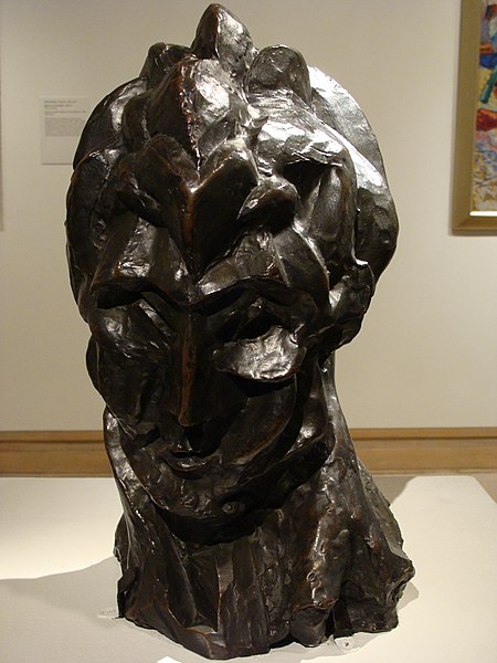
PIcasso’s Head of a Woman looks vaguely like a woman. It also might remind someone of a mountain, Medusa, or an artichoke (thanks Antonio). Most interestingly, Head of a Woman looks like rock. A lot of sculptures use their medium as merely a tool to represent their subject. The wood, marble, or clay is not important in and of itself. But Picasso carved his piece so that the rock was just as significant, if not more significant, than the woman it portrayed.

It’s easy to imagine the confusion of those who encountered Cubism in its infancy. Isn’t the point of a sculpture to make it look like something? If you focus on the raw material, how is that even a sculpture? Why would you take a nice painting of a man and distort it so it looks like shattered glass? The works of Picasso and Gleizes have shock value. That shock is most potent when you realize how different Cubist works are from typical paintings and sculptures.

(Sorry if I butchered the quote in the introduction. I can’t find the original.)

The Armory at 100: Modern Art and a Revolution

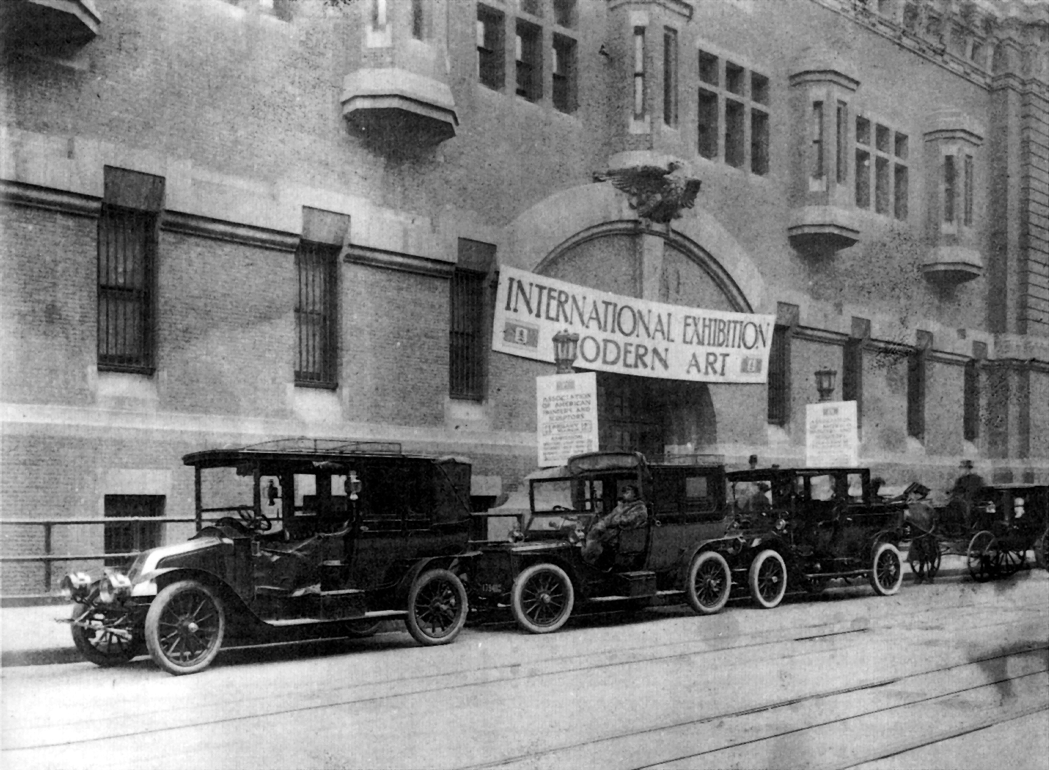
The original Armory Show was brought by the International Exhibition of Modern Art and presented at the Lexington Avenue Armory (hence the nickname “the Armory Show,” February 17th, 1913 thru March 15th, 1913; its original organizers gathered in an effort to show the progression of modern art leading up to the controversial abstract works that have become the Armory Show’s hallmark. At the time, the nation was in the midst of the end of the Progressive Era, which was a defining era of change, and, as New York was one of the capitals of the new, works of the Armory Show found inspiration through the latest movements in politics, social reform, progressive thought, developments in communication, and modern architecture.

The Armory Show at the New York Historical Society, which revisits the famous New York Armory Show of 1913, is a twenty-first century display of over one hundred works (works by Duchamp, Matisse, Picasso, Cézanne, Gauguin, Van Gogh, etc.) of one of the  acclaimed avant-garde movement of twentieth-century Europe, as well as some various historical works. This particular avant-garde movement, due to its increased use of bold color and the “new” primitivized forms of the Fauves, changed the way Americans look at modern art.

Walking around the exhibition, I felt compelled to focus on the works of The AshCan School, which had its own section. The AshCan School began as a circle of realist painters centered around the artist Robert Henri; they were known for their depictions of the “raw, unvarnished” life of the city, particularly that of the working classes. Henri wanted to be a part of the exhibition only to clash with Arthur B. Davies (the principal organizer) and his supporters, worried that this European movement would overshadow the work of American artists.

File:John French Sloan Studio.jpgThese two factions represented the competing visions of modern art and its future in America, which came from late nineteenth century ideas about subject matter, focusing on urban life and pressing social problems. The new European works brought a new sense of modern being about art itself, questioning standards through experimental use of form and color.

One work, Circus by George Bellows, kept my attention for most of my time at the Armory Show. The painting displays a circus of some kind taking place, with the usual things one would find at a circus: animal-taming, trapeze artists, and various spectators. In this painting, however, the spectators are not regular circus-goers, but are various social classes. Looking closer, you notice seperated blacks and whites, aristocrats, middle-class, the royals, and the poor, all together in one gigantic, chaotic circus.

Adept at playing both ends of the political spectrum, Bellows seemed ambivalent about the Armory Show, though he helped organize the exhibition, noting, “The cubists are merely laying bare a principle of construction which is contained within the great works of art which have gone before.”

The Armory Show

Another battle of what is and what is not art was ensured in the opening of the Armory Show in 1913 at the 69th Regiment Armory on Lexington Avenue. The show was the first to display European avant-garde art in America but some people were not ready for the “puzzle pictures,” bold colors and primitive forms of the cubist paintings from Europe. The show was held from February 17th to March 15th and was considered the most important exhibition ever held in American History. During the time it was on display, American was going through changes, and New York was the capital of change. Just like many of the other movements in New York history, the Armory Show brought changes to the rest of the country as well and became a turning point in the nation’s cultural history.

One of the paintings thats I really liked was Third Class Carriage (Un Wagon de Troisième Classe) by Honoré Daumier. In this painting we can see how much darker the inside of the carriage is compared to the outside. Through the windows, we can see how bright it is, while the carriage appears dreary and gloomy. The faces of the passengers also seem frigid and even a little detached from their surroundings. They don’t look at the people around them and are in their own world. The colors of the painting also show the mood of the people. The colors are not bright and they are shades of gray, brown, creme, blue and a little of red without much life.  This attracted my attention because it reminds me of riding the train. In the train, you see people of all ages, just like you see here. Everyone also keeps to themselves and almost ignores the other people around them.

32.4-Daumier_ThirdClassCarriage-FAMSF-SFA3032811-300x228

Another piece that attracted my attention was Parau na te Varua ino (Words of the Devil) by Paul Gauguin. This was interesting to me because it reminded me of the story of Eve with the serpent. The colors are also eye-catching because of all red found in it. It contrasts greatly with the forest green background and helps it stand out. The red can also signify the evil that is there because of the presence of the demon in the form of a man. The waves that are on the floor can be the power that the malevolent being has over the woman and that is trapping her in with no way of escaping. The demon also stands out because he is the only blue found in the painting. The color brings attention tot him and we are able to notice his importance. The woman’s face shows her panic and her fear of the demon and since she can’t move, she moves her eyes towards the demon, in a way that almost seems to be pleading him to let her go. There is also a serpent in the forest that has half his face red while the other one is green which can signify hidden evil. I liked this painting because it signifies the evil in the world, and shows that mankind itself can be evil.

Paul_Gauguin_GAP024


The Armory Show

As the industrial revolution modernized the people’s life, the Armory Shows in 1913 also introduced modern art to the public.  Throughout the Armory show, artists presented numerous groundbreaking painting skills and new perceptions to artworks.  One century later, when the New York Historical society presents the Armory Shows again, the people in the 21st century are still surprised by the painters’ creative ideas conveyed from their paintings.

5_6-MacRae_Battleships-Biggs-2004_4043Elmer MacRae in his artwork Battleships at New Port, employs color to represent the light reflection.  For example, the painter randomly uses yellow brush strokes to tell people that it’s dusk already. Also, by controlling the scale and clarity, the painter shows us whatever he perceives from closer to further.  The woman and the kid is relatively more clear than those factories which is on the other side of the river.


12_6-Dimock_Florist-BGFA3MacRae shows a new painting skill in his artwork, but Edith Dimock brings a new painting style to the public.   With his unique loose brushwork, Dimock does not draw every single detail intentionally,  but the audience can still distinguish what the artist wants to present.


 In Edith Dimock’s loose brushworks, we still can recognize every individual character, but in the Armory Shows there are some paintings in which the character outline is obscure.  Instead of constructing with perfect shapes, the painting The Man on a Balcony, still presents a man’s general outline.  From the painting, we can see that the man’s eyes are closed, and he seems to think something.  If we look carefully, we find that there is a women’s image in the painting too.  As a result, we seem to understand what that man is thinking. As a result, in order to understand the painting, the audience needs active eyes to find out all the hiding messages on the painting.

man-on-a-balcony-portrait-of-dr-th-o-morinaud-1912


The Armory Show

“Ugly, vulgar, crude, monstrous, brutal, savage,  hideous,  grotesque” are only some of the words art critics of the 1900’s used to describe the 1913 art exhibit now on display at the New York Armory. The exhibition began in New York City’s 69th Regiment Armory and lasted from from February 17 until March 15, 1913. Being the first exhibition of modern art in the United States, the reaction was to be expected. At the time the nation was moving towards the end of the Progressive Era; an Era The New York Historical Society website explains “was an era of change and New York was the capital of the new; drawing the latest movements in politics, social reform, progressive thought, developments in communication, and modern architecture.” Although critics of the past such as Kenyon Cox viewed the art shown as “the total destruction of the art of painting”, critics now view the paintings as remarkable pieces.

http://armory.nyhistory.org/category/artworks/

One art piece that immediately caught my attention was Vampire by expressionist Edvard Munch. Although originally named Love and Pain many at the time only saw the scene that would be repulsive to many people of the time; a woman sucking a mans blood. Vampires usually represent evil, blood, sin, and even a bit of chaos. The choice of using black for a background adds to this evil mood. The idea of such a monstrous creature being a female I’m sure also added to critic’s disgust.  The idea of a woman possibly having this type of control over a man would have been such a foreign idea to New Yorkers at the time. However while I look at the painting I see more thank just a vampire and a man. I see two lovers showing how painful love can really be. I see a man who sacrifices himself for his lover. He gives her what she needs to stay alive because it’s the only option she has. The painting shows how love can be both pure and evil; a truth many New Yorkers in the 1900’s wouldn’t have accepted.

http://armory.nyhistory.org/category/artworks/

Another piece I also found myself fascinated by is Madonna by Edvard Munch. In this painting, Munch focuses on a woman which he shows by using such a light color against a dark background. The woman in the painting seems to have her arms up to her ears possibly silencing her from the darkness surrounding her. Her facial expression reminds me of when I try to be oblivious to everything around me so that I can find peace. As Sarah Hussain wrote in her blog post, “the portrayal of the victimized woman could relate to how women were feeling around [the time]”. At the time women still had little to no rights so Munch may have been trying to portray that through his painting.

Whatever it be that the artists were trying to portray through the Armory Show, they definitely made an impression. All of the art works brought something new into the art world and who knows what art would be now without the Armory Show.


Armory Show

As I stood in awe of the diverse artwork at the Armory Show I overheard a couple discussing the art pieces; the husband pointed to a Cubist painting and dismissed it saying, “A five-year old could draw this!” then he turned his wife’s attention to a European traditional piece and exclaimed, “Now that’s a painting!”.  This dismissal of modern art brings to mind the kind of reactions that plagued the Armory Show when it first opened in 1913.  At that time New York had not yet experienced the European experimental types of art like Cubism for example.  This show had both traditional and experimental pieces and that became a heavily debated issue.  Some critics like Kenyon Cox, an American painter and writer among other things, said that the art was “heartrending and sickening”.  Others like Stuart Davis, an early American modernist painter, thought that The Armory Show was “an experience of freedom”.

Many paintings caught my eye while I gazed at the numerous paintings and sculptures displayed.  One that was especially interesting was Vincent Van Gogh’s Mountains at Saint-Remy.

Mountains at Saint-Remy

Mountains at Saint-Remy

This painting was done by Van Gogh during the late 1800’s as Paris began to industrialize heavily.  Van Gogh, like his good friend Paul Gauguin, sought to move away from the unhealthy, polluted theme of industrialized cities and urban environments, and embraced rural landscapes.  The paint strokes flow through the painting and make it alive.  Not only did the painting move away from the norms of Impressionist painters of the time, but it also represented the experimental painting style that would shock New Yorkers at the Armory Show a few decades later.  Maybe not one of the most “Modern” pieces of artwork at the armory show, yet it still was far from the realistic and traditional artwork associated with European Art.  A better example of the type of art that received much criticism is The Young Girl by Jacques Villon.  Fun Fact: Marcel Duchamp’s brother, Gaston Duchamp, changed his name to Jacques Villon in honor of the medieval French poet Francois Villon.

The Young Girl

The Young Girl

This piece also captured my attention because of how different it looked from European paintings that focus on detail.  Jacques Villon explored Cubism since he discovered it in 1910.  His attention to the space and shapes in this particular painting enraptured me when I saw it.  Unlike other Cubist art, that sometimes leave something to be desired in terms of color, The Young Girl is an explosion of color.  Not only do its variety of colors give life to the painting, but it helps the the viewer distinguish between the “girl” and the background behind her.  All in all, it was artworks like this that drove New York critics like Arthur B. Davies, an avant-garde American artist and advocate of modern art in the United States, to proclaim that “New York will never be the same again.”  Art would now change in America, as a result of the experimental European art being showcased at the Armory Show.  As American painters began to see the new art styles they helped make Modern Art a popular thing and ushered the world into a new age of art.