Daily Archives: September 26, 2013

23rd Street Subway Station Art

When I was going home today after a long day of class, I followed my normal routine and walked to the 23rd street subway station to take the train home. When I was waiting on the subway platform, I grew increasingly restless and looked all around for things to stare at. My eyes rested on a curious tile on the subway wall. It said “Marie Curie, Physicist.” I thought to myself, what does this tile mean? It was then that I realized the tile corresponded to the hat mosaic above it. I’ve always noticed the hats floating around all throughout the subway platform wall, but this was the first time that I noticed their meaning. I started to look around at other hats and who they corresponded to, and that task got me walking up and down the platform to look at all the mosaic art on the wall. Other famous people whose hats are shown include: Gertrude Vanderbilt Whitney, sculptor and art patron; Fay Templeton, vaudeville actress; and suffragist Maud Nathan. I was actually really surprised that out of the past month that I’ve been going to this station, I only realized this today. It made me think about what I can notice about the world if I just took the time to look and observe.

As soon as I got home, I searched up the subway art, and it turns out that this was the art installation titled “Memories of Twenty-Third Street” by artist Keith Godard. It pays homage to all the regular patrons of this very neighborhood in the 20th century. Once a center of culture, fashion, and entertainment, the Flatiron area was once bustling with actresses, dancers, and people of all backgrounds. It tells a story of times long gone and the people who lived it. After learning the meaning and the reason behind this art, I appreciate it much more than when I only passively glanced at the tile mosaics on the wall, thinking that they were just for decoration and that they didn’t have much meaning. This really proves that in New York City, you can find art in the everywhere, even in the most quotidian of places.

——Joanna Huang

23rd Street Tile Mosaic

photo 4 Marie Curie, Physicist

From top to bottom: Subway station mosaic, Gertrude Vanderbilt Whitney’s hat, Marie Curie’s hat. (Photos by Joanna Huang)

Irving Penn

IMG_0493-1IMG_0495-2IMG_0494-2IMG_0492-1


Out of everything I saw in the Irving Penn Gallery, I felt like these are the portraits that screamed out at me. These four intricately connect with each other because these are all features on a face.

  1. I wonder why Penn & the makeup artist decided to make the model’s skin very white. It certainly made the makeup on the first model in the first picture stand out. I wonder what Penn was trying to accomplish when he photographed the model with eight vastly different lip stick colors.
  2. The contrast between the dangerous bumblebee and the lips definitely stood out to me. At any moment, the bee could potentially sting the model’s lips. On the other hand, the model’s lips can kiss the bee as well. There is a slice of unpredictability in this portrait. Both love and danger are incorporated in this one portrait and I admire its simplicity as well. I wonder what inspired Penn to mix nature and make-up together, because nature and make-up are two opposite things.
  3. Wow, I wonder how the model felt when the splash of cold paint (or liquid)hit her face. I admire how detailed the drops of paint are when they hit her face. When I first looked at this, I was shocked, yet I admired the beauty behind the purity of this portrait. I wonder what Penn was trying to achieve behind this portrait.
  4. I saved the best for last! This portrait is my favorite out of the four above. The whiteness of the skin contrasted well with the redness of the eye. I believe this portrait represents the moment when a young woman puts makeup on for the first time. It can be painful if any of the makeup goes into the eye, thus making her eye red and somewhat swollen. This portrait reminds me of Black Swan, the movie. The red eyes, the white skin, and the exaggerated makeup really brings out the reference. I wonder if the movie’s make up artists were inspired by Penn…


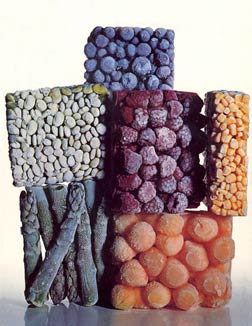
Frozen Foods

Irvin Penn had taken a picture of foods that appeared to be nothing more than a couple of blocks of frozen fruits and vegetables all stacked on top of one another. This, although being the actual display held such an immense amount of meaning for me. When I took a moment and pondered at the possible reasoning to have taken a picture of frozen foods it immediately occurred to me that one of the biggest ideas trying to be conveyed by the image was the idea of change and progression. Thinking back to other paintings that I had seen, there always seemed to be a handful of paintings using fresh fruit and vegetables as the center of the work. I’m sure everyone can relate to those paintings having food such as fruit and bread in a basket, but the main difference between those paintings and Penn’s photograph was the fact that his were frozen as compared to being fresh. Relating back to the idea of change and progression; society has progressed and shifted in such a way that anything frozen is as natural to us as it being fresh. Looking at the image with this idea in mind it isn’t too different than all of those generic paintings with the fruit and other foods in the basket in the sense that in both cases the food itself serves as the main center of attraction and is often organized in a specific way. Before the foods would lay scattered throughout the display in a neat but not necessarily organized manner as compared to the frozen food Penn had taken an image of, being in rough edged box like shapes. It could be possible that the image also represented our society’s change in order and conduct over the years where it use to be more relaxed as compared to now where it could be viewed as being cold, extremely rigid, and in a way almost lifeless much like the frozen foods. The fact that the work of art is also a photograph as compared to a painting could also further support the idea of society’s evolution with time because rather than being painted it was taken with a camera showing how art and expression in themselves are also changing aspects of our society as time continues to pass. While art was often viewed as being a painting or sculpture it has now become subject to many different forms of expression defining it in such a unique way.

-Shujat Khan

Photograph by Irvin Penn                             Painting by Barbara Wells

The Graffiti

I take the 7 train quite often in order to go to Manhattan. I have seen this building several times after the stop from Court Square. This building has many graffitis on it. When I first saw it, I was amazed by the beauty. I knew that this was art. It was a once of a kind building. I haven’t seen the graffiti in a while until last week. It was rush hour when I came across this building once again. It was beautiful and I realized it’s been retouched and added then the first time I saw the artwork. I’ve noticed that it was different than last times. For example, a picture of the woman was added on and some words had other touches on it. It was so beautiful. I wondered who the woman was? A celebrity? A lover? That was when I realized that some art pieces could be never finished. The different perspectives add to the beauty of this artwork. That’s the art of the art piece. It could always be retouched, added, modified, and changed like this graffiti. This graffiti will never have a finishing touch but that’s the art, the beauty of this artwork.

photo 1


Irving Penn at Pace Gallery

Morocco, Vogue 1971

This is written next to these two photographs. Vogue. I thought to myself, what a strange title to a piece that’s appears the complete opposite, but perhaps it’s an expression, a way to make you think – or perhaps in Morocco this was the embodiment of vogue, that this was their fashion. I later learned that the gallery entitled it Vogue because it was featured in the famous fashion magazine. This still came as a shock, these pictures do not seem in the style of Vogue, they in fact it seem far from it. For a fashion magazine that normally idolizes models in revealing clothing and make-up, it seems strange to feature women in full length, head-to-toe traditional clothing, with their accessory as bread.

picture.aspx                                                             Untitled

As we study and attempt to understand the women in these photographs, it can be difficult. These women’s bodies are hidden, specifically the most expressive part – the face. The women have become indistinguishable and seemingly emotionless, these women can be anyone – their expressions can range indefinitely. It’s saddening, but it seems as though these women have been simplified to sheets, likened to mute statues. However, despite this simplification, by looking at the photograph, I can almost feel their pain. The black and white filter creates an eerie quality and an overall gloomy tone. All I can do is try to feel and surmise their thoughts or concerns. And what I feel, is their oppression: their constriction of clothing, their lack of breath and perhaps, lack of free speech. The social implications presented in these photographs are vast, and the insight they provide into Morocco in 1971 is perhaps far greater than we realize. I believe that with these pictures, Irving Penn gave these women a voice, and perhaps what each of us will hear, will all be quite different.