The Arts in New York City
Currently viewing the category:
"Caribbean Art Objects"
My trip to the Museo Del Barrio in and of itself was an adventure. What started off as an arranged 2pm meeting last Saturday between Paul, Patrick, Michelle, and I, otherwise known as the “Staten Island crew,” was clearly not going to go as planned when I woke up to a hectic morning in my house that didn’t end up clearing up until around 1:30 – a mere half hour before we were supposed to meet.
I was relieved however, when I found that at least one other member in my group was also running late.
I finally met up with Michelle on Lexington and 104th street at around 3:30 pm. Patrick had already made it to the museum about an hour earlier. Michelle and I set off down 104th street until we reached Central Park and eagerly entered the museum. The wrong museum. Thinking that perhaps the exhibit itself was what was named “El Barrio,” Michelle and I completely overlooked the actual museum, across the street, and instead entered the Museum of the City of New York. Reassured by the fact that this museum was listed on the back of our cultural passports, we showed our Macaulay IDs to the receptionist. She informed us, however, that the Museum of the City of New York was no longer affiliated with Macaulay, however we could still enter at the discounted student price of $6 each. We paid and picked up floor plans. We were eager to see an exhibit on Staten Island, being from the “forgotten borough” ourselves, however peruse the map as we might, we could not find an exhibit remotely related to the Caribbean at all. Walking back to the reception table, we asked the same receptionist who had admitted us previously where we could find the Caribbean exhibit. She thought for a moment and then realized that we were in the wrong museum. She told us that the Museo del Barrio was across the street and was kind enough to refund the money we had paid.
Laughing at our mistake, Michelle and I proceeded to the Museo del Barrio, imagining how angry Patrick must be by now for waiting this long. We found him close to finishing his notes on a painting. We proceeded to split up to find our own pieces to write about, agreeing to meet later.
I originally thought I would be immediately attracted to paintings of serene landscapes, and although these were wonderful, I was surprised to find myself extremely drawn to a video piece. Walking past it, I didn’t initially look back until I heard a familiar crunching sound that brought me back to my summer in Egypt. The piece was entitled “Trata” meaning “Try” and was created by David Perez Karmadavis in 2005. The piece consisted of two videos. The first depicted a Haitian man peeling/shucking sugar cane and the second showed a Dominican man eating sugar cane. Each video was only a few seconds long and was placed on repeat. There was no dialogue, just the sound of the slice of the knife shucking the sugar cane and the crunch of the man eating it. Getting past my original nostalgia associated with my experience in Egypt last summer, I began to realize another connection I had to the piece. Thinking back to the limited knowledge I have about the region depicted in the videos, I realized that the two races shown had a lot of tension between them that is often fraught with racism. The Haitians in the Dominican Republic are often illegal immigrants, and hold low-paying jobs and often live in poor living conditions. It amazed me to see something like sugar cane bring the two groups together despite these racial tensions. It reminded me a lot of the period of time here in NYC when there were Islamophobic ads put up in subway stations. One of the counter-ads I saw had to do with halal food carts and said something along the lines of “how could you call the creators of such deliciousness savages?” Continuing to stare back and forth between the two videos in the set, I realized more and more that peace was attainable simply because as humans, we have too much in common: love, enjoying good food, etc. to continue hating each other.
My strong connection my home country, Egypt, is what also drew me to the second piece of art I chose. This piece was entitled “Pasaje Con Burro (Las Indians Occidentales Danesas)” and was a painting utilizing oil-based paints on hardboard created by Dutch artist Hugo Larsen in 1906. The painting was relatively small and depicted a man on a donkey and a woman balancing a tray of fruits on her head. Both subjects were dressed in all white: the man is wearing light-wash jeans and a white t-shirt and the woman is wearing a long white skirt, a white fitted t-shirt, and a white scarf wrapped around her hair. They both have a caramel-like skin tone. The scenery looks very dry and hot, and viewers can easily tell that the sun must be glaring down. There is a small line of what I take to be water shown on the horizon and a few very thin palm trees. The scenery reminded me very much of a scene I would see in the farmlands of Alexandria, Egypt. Over the summer, I visited this area and had the opportunity to ride a donkey and spend a day with a family there, learning that true happiness could be achieved with simplicity in the process. Staring at the painting, my memory took me back to those sunny days spent working the fields and learning the trade of life from the people of the land. The only difference, however, was that the scenery in Egypt was much more lush and green, and although it was hot and sunny, it wasn’t as dry as the scene depicted in the picture. Staring more at the painting, I began to grow thirsty, and thought about how the painter’s technique was clearly excellent because I not only saw the scene but could feel the warmth and dryness of the scene depicted by it emanating from it. The painter’s purpose could be an infinite number of things but the one that made the most sense to me was that he was just painting a scene he remembered on a visit to a Caribbean country. I didn’t see any specific symbolism in the painting, but merely a conveying of something he had seen and felt while on a journey. Taking into consideration that the painter is from Denmark, I realized the importance of conveying the temperature and sense of dryness through the paint, since his audience would be from a totally different climate. He did this quite successfully: the day I saw the painting, 106 years after it was created, was far from hot and dry, yet I could feel the climate, and I was awed by the skill of the painter in recreating perfectly every aspect of the scene.
Our day at the museum ended just as eventfully as it started when Michelle and I met up later. She explained that Patrick had left to get lunch so I suggested we do the same. Set on getting a gyro platter, we walked down Madison Ave in search of a cart. Thirty blocks later, finding none so far, we decided we might as well continue walking to Carnegie Hall for the performance we were seeing that night. And so we did. We walked about 50 blocks in total, and still managed to arrive at the theater early. So, we went to a Subway store nearby, settled for subs instead of gyros, and proceeded to watch a wonderful performance at Carnegie Hall with the rest of our seminar class.
Object 1: Untitled (1988,) Malika Cosme
As I strolled through the galleries of EL Museo del Barrio, I found many of the art objects compelling – but not in a way that I could capture in words. Their colors, rhythms, and symbols possessed an abundant and moving character. They spoke of a living culture and history that I could behold and appreciate, but not one capture and define – I who was looking in from the outside, a suburban New Yorker, little familiar Caribbean history and life . It was an untitled photograph by Malika Cosme that first elicited deeper reflection, whose wordless compulsion gave rise to words. Cosme was raised in a small, rural village on the Island of Puerto Rico. As a young girl, she taught herself photography, later emigrating to New York City and beginning a career as an experimental photographer. This work in particular was a chromogenic photograph from a series called “Dreams”. I felt that there was something significant to be understood, not only about Caribbean culture, but also about the human condition , in the “dream” that Cosme presents . Taken in Puerto Rico, in a place of her childhood, its double-exposure technique presents the dark, indistinct outline of some country woods contrasted with the bright white figure of a dog. The dog’s face is turned away, with features obscure, but its coat glows hauntingly in the pale moonlight. For Cosme, this photograph must have said something about the Puerto Rico of her childhood. For me its faint, resonant shapes spoke of no particular location, but of a condition of memory that we all share as human beings. The countryside is a remembered landscape, viewed through the prism of Cosme’s decades in New York City and a new language, culture, and pace of life. It is, in this, very much the like the countrysides that we all must carry somewhere in the dim and cavernous vaults of our memory. In the landscape there is the unmistakable quality of the dream, of the transient and insubstantial. In the featureless dog, there is a sense of moving away, of perpetual, unremitted loss. But in the radiance of the coat, in the persistence of the wood as contrast, there remains something indelibly moving. We see, in the simple outlines of the photograph, the way in which memories fade, yet persist, the paradox of memory that eludes all attempts to recapture the past, yet constantly animates the present. The work is a remarkable example of the personal in art becoming universal.
Object 2: Crop Time (Version 2, 1955), Albert Huie
Albert Huie, born to a poor family during Jamaica’s colonial period and raised in the town of Falmouth, Trelawny, was considered the “father of Jamaican painting”. Much his work celebrated the land and the people of Jamaica. Crop Time, which spoke clearly to me from across the room, presents a sharp contrast between artistic subject and artistic vision.
The subject of the painting is industrial degradation of the landscape and agriculture. Faceless laborers toil in the mud, stooped over, enervated, dejected . The bare fields are overshadowed by a complex of industrial buildings. A smokestack rises toward the cloudless sky, spewing dark clouds into the atmosphere . One sees a native people broken and bowed by industrial imposition, a landscape ravaged, a culture suffocated and nearly extinguished.
Yet, this is only the subject of the painting, and not its animating principle. The coloring of the work transforms and creates the possibility of redemption. The delicate greens of the landscape, the old spirit of land and people, radiate outward from the tree-lined mountaintops, infusing the bleak scene with a new visual life, permeating and transfiguring even the industrial smoke that mars the horizon. Pinks and blues brighten the tattered garments of the field workers, bringing out the subtle power of their gestures. The sky becomes a sensuous mixture of earthy green, ethereal blue, faint, tantalizing pink. The whole image is alive in light, deep, natural colors that do not obscure the the brutal subject matter of the panting, but reanimate it in the substance of a new vision. The scene is transformed, not by some starry-eyed hope or insubstantial vision of the past, but by the living culture preserved and nourished in the hearts of Jamaicans. Through the spiritual vision of this culture, any physical degradation can be redeemed. There is still dignity in work, beauty in nature. There is still unity, joy, and tradition, even as the weight of industrial servitude crushes the physical body – in the coloring of one’s vision, in the archetypal motions of the harvest.
Caribbean Expedition to El Museo Del Barrio
Having limited knowledge of the Caribbean and its artists’ works, I was doubtful that I would find anything intriguing or noteworthy at El Museo del Barrio’s Caribbean: Crossroads of the World exhibition. However, to my surprise, I found countless pieces that not only piqued my interest, but enabled me to see commonly accepted themes revealed through an innovative perspective. What especially struck me was the widespread influence of agriculture and slavery throughout the pieces—surely, plantation life and stories of the harsh workload Caribbean natives endured create a major portion of the rich tale these people can offer society today through their art and oral tradition.
Two pieces that especially resonate in my mind, even weeks after visiting the museum, are Consalvos’ mixed media collage, “Uncle Sam Wants Your Surplus Fat,” and Lam’s “The Dream,” a work created with oil on canvas. Despite the differences between the two works, each one represents a unique portion of the Caribbean culture and its people’s values.
As someone who loves to inspect multiple perspectives, I couldn’t help but stifle a grin at Felipe Jesus Consalvo’s “Uncle Sam Wants Your Surplus Fat.” Although the exact year in which his artwork was created is not known, it was circa 1920s-1950s. Referred to as a mixed media collage, the medium-sized artwork (around two feet by two feet) consisted of clippings from all different kinds of sources, including, but certainly not limited to, newspaper clippings, photographs, advertisements, and magazine clippings on .

At first, I found it difficult to discern the cacophony of images that I was being bombarded with, ranging from heads smoking cigarettes to cut-outs of the typical American girl holding beer bottles. However, once my eyes adjusted to the pandemonium, I was able to see the perversion of capitalism within Consalvo’s ingenious artwork that promoted satire and criticized the American way of life. Don’t be fooled by the seemingly playful images! They were actually representative of the sarcastic and demeaning tone of the piece! Consalvo personifies the anti-American sentiment that characterized the Caribbean region, Cuba in particular, as he highlights the consumerism America emphasized—this becomes prevalent through his repeated attachment of images and advertisements for cigarettes, liquor bottles, and Campbell’s soup cans. In addition, he mocks America’s forefathers George Washington and Abraham Lincoln, ultimately creating foolish spectacles out of both of them and placing clown heads upon men that were otherwise dressed in sailors’ outfits. Consalvo’s media collage belittles American politics and reduces it to a state of disorganized child’s play. Considering America’s role as the head of international politics, being a world leader in multiple negotiations between European nations during the time periods of World War One and World War Two, it was interesting to see the country being portrayed as else wise in this collage. On the other hand, the other works of art within the museum viewed Caribbean culture from related countries in the particular region in question.
Wilfredo Lam’s 1947 oil on canvas painting,“The Dream,” was another noteworthy work at El Museo del Barrio that not only challenged my senses, but created an ominous mood. The ambience brought on by Lam’s work was foreboding and frightening in some aspect as the dark colors created an abyss within my soul. The purple and black shading worked effectively to pique fear within me, immediately bringing to mind the thought of failure and death simultaneously. The painting consists of abstract creatures and shapes, each comprised of a triangular head and undefined features, like scraggly lines, for the body outline. The dark creatures looked as though they were feeding off one another, resembling the common perception of vultures feeding off human flesh in the depths of hell.

To me, the painting was an artistic rendition of Lam’s perception of hell and the destruction it would render upon its inhabitants. The undefined features of the creatures especially led me to consider the uncertainty of hell, a location that no one has returned to reveal information about, despite all the literature, artwork, and media published in relation to it. Hell remains an obscure and taboo concept that many scurry from in an attempt to avoid its negative nature—taking this into consideration, its abstract nature is completely appropriate and well-fitting. However, the fact of the matter is that Lam mustered up the courage to tackle the subject in his inspiring rendition of the place and successfully portrayed an abstract, yet effective depiction of hell. The abstract quality of the faces within the painting also made it relatively simple to relate to the figures. Whereas the other paintings and works of art within the exhibition portrayed darker-faced figures of Caribbean descent toiling in the fields, this painting displayed creatures that did not look human at all. Yet the irony of the situation lies in the fact that I was able to identity with these unidentifiable creatures more easily since they could have represented the common man—anyone with darkness in their lives, or something they had an innate fear of. This abstract quality is exactly what enticed me to look at the painting, despite all of the other visual stimuli with a more diverse, colorful palette prevalent within the very same room of the exhibition.
Overall, the experience at El Museo Del Barrio opened my eyes to a completely new culture and diverse history that I had previously had very limited knowledge on. Although I have come to learn more about the emphasis of plantation life on the people’s morale, I have much left to learn. The trip to the exhibition promoted not only a greater appreciation for the arts in my own life, but also sparked a hunger within me to learn more about other cultures and become a more multifaceted individual that can embrace diversity and appreciate innovative knowledge.
The second piece of art that appealed to me was called El Exodo Cubano or the Cuban Exodus. This painting was made in 1963 by Asilia Guillen, who is from Nicaragua. This painting was made of oil on canvas. It is a moderately sized painting, about two feet in width and a foot in height.

I liked this painting because of the intricate detail in the vast landscape of Cuba and detail of the tiny people fleeing. There were several paintings in the museum that caught my eye; this was one of them because it sort of just popped out at me. It popped up at me because of the various colors utilized in the painting. I thought that the water in the painting was so blue and clear. Guillen uses so many eye catching colors; they are vibrant and full of life. There’s green and brown in the middle; blue in the ocean, and yellows, reds, oranges, grays and whites in the whole painting.
I believe this painting depicts the serious nature of the Cuban exodus. It is evident that the people in the painting feel an overwhelming sense of desperation. Cuba in the painting, is still evolving; it is still has its basis in agriculture and farming, something that doesn’t seem to satisfy the people and their needs. People want to leave; one group is even leaving on a barrel. The desperation is also seen in the people waiting at the edge of the shore while others leaving are waving white rags. The seriousness of the painting is also evident in the scene on the bottom left hand side where there is, what I think, cannons firing at people. This fits the desperation of the people to flee the country. Overall, the painting delivers a message of great sadness as the people in Cuba flee from its terror.
One of the first pieces that I really liked at El Museo del Barrio was a piece called The Prize, or in Spanish, El Premio. The Prize was created in 2007 by artist Hew Locke. Locke is a British artist of British and Guyanese descent.

The actual object itself is not too large, a little over two feet in height and a little over a foot in width in my estimation. For the main body of the piece, he uses golden pieces to mimic the coloring of a trophy. Several of the pieces are lion heads and circular pieces with a sort of face on them while others say ‘Get Well’. There are some plastic green plant fronds and different plastic colored flowers: pink and yellow. There is even a wand, some tinsel with stars on it, and several strings of small golden beads that wrap around the entire piece.
I thought this was appealing because it was just mix of everything. It had bits and pieces of objects that seemed to be scraps. It reminds me of the left over pieces and scraps that we place in the art bin for future use. I thought it was cool how Locke used a bunch of seemingly unrelated objects and put them together into one cohesive piece that, for me, makes sense. I also thought it was cool how he made flat pieces come alive into a three dimensional object. For me, the title also shows how we may “prize” the bits and pieces in our lives, the small things that other people may not think are important but are important to us. The fact that one can make things from little scraps and bits and pieces, things that we may even “prize” and cherish.
I think this piece is playful in that it uses different things like flowers and beads and a wand even, to make something whole. I think it shows us how seemingly unrelated things can be made into something beautiful. It shows how bits and pieces that one would normally throw away can come together to make something unique. Overall, I think this piece begs the question, what can one make from leftovers?
In my recent visit to the Queens Museum of Art’s Caribbean exhibit, two pieces of art stuck out to me.
The first of those pieces, Abate Antonio Jose de Cavanilles, was made my the columbian artist Salvador Rizo (1768- 1816) in 1801.

This oil on canvas displays the abbot examining a botanical specimen while taking down notes- perhaps of a scientific nature. The portrait as a darker tone, and is pretty average in most respects, giving the work a feeling of solemnity.
The painting is based on true occurrences. The abbot pictured was, in fact, the namer of countess plants and substantially contributed to early floral understanding of the Americas. Fascinatingly, the abbot later named the specimen he is examing Rizoa- after the artist himself.
What stood out to me about the seemingly ordinary piece was the scientific nature of it. The piece provides an insight into the start of discoveries in new lands and how important these discoveries were. The artist also managed to beautifully capture the thoughtfulness of the abbot.
The second piece I chose is The Goat With Two Heads by Georges Liautaud, a Haitian artist who lived from 1889- 1991. The piece is a wrought iron created in 1961.

This interesting piece depicts a two-headed goat standing on its two legs, much like a human being. What attracting me to the piece is the plain iron which leaves so much open to interpretation. The goat can be taken as being festive, mournful, angry- almost every emotion can be seen within the piece. The piece also hints to a conflict of sorts, as the heads face in opposing directions.
One possible interpretation of the piece brings back Dionysian themes. The piece causes one to recall a Satyr- the Greek representative of the wild nature of man. The two heads can be taken to be a rendering of man’s struggle with his very own mind- the fight to control ones wilder side. Man is in constant struggle to control his will, emotions and actions and become an educated, refined being. This two headed goat can be see as a depiction of the nature of such struggles- man is, in essence, fighting against himself.
This weekend, I visited the El Museo del Barrio for its Caribbean Arts exhibit. Among the many pieces I saw, two in particular piqued my interest.
The first object is a piece by Milton Rosa-Ortiz titled “Olaja!/Hopefully!” from Puerto Rico. Made in 2005 Olaja! is a structure made of pieces of arranged glass. The piece resembles a small chandelier in size and appearance. Each shard of glass is translucent and reflective. Olaja! hangs high from the ceiling and is connected and kept together by thin wires. One side of the piece is highly dense, but towards the other side, there are less and less glass shards bundled together.
I chose Olaja! because it was aesthetically pleasing and because it stood out to me in the exhibit. Most of the other objects in the exhibit were paintings so Ortiz’s shiny, three-dimensional work pleasantly surprised me. The way the glass and its reflection worked with the lighting of the room particularly grabbed my attention. According to its description, the pieces of glass were found on the beaches of Guánica which highlights the American landing on those beaches during the Spanish-American War. Initially, I had thought that Milton’s piece was made to illustrate the beauty of ordinary things and to highlight the idea of parts of a whole coming together. Upon obtaining some background information, it was clear that Olaja! is recalling the hope felt by the people at the end of the Spanish-American war and its transition from a dense object to a subtler one conveys the fleeting nature of such hope.
The second object is “Vue de Base-terre, Guadeloupe” by Emile Goury made in France in 1839. Vue de Basse-terre Guadeloupe is an oil canvas piece. As its title suggests, it is a landscape of Guadeloupe. The picture shows a boy standing along a pathway. The sky is a deep blend of orange and purple and an orange-purple shaded layer envelopes the whole piece. The sun has just begun to set and the shading of the boy and his surroundings reflect this. Mountains can be seen in the background and fresh greenery is abundant. To the boy’s right is a placid lake.
The colors of Goury’s piece were what called out to me. The color of the sky dictated the palette used for the whole piece and the prominent orange and purple shade seemed like the perfect blend between warm and cold colors. Using these colors, Goury depicts the peaceful and naturally beautiful life in rural Guadeloupe. Although it seems as if nature is the focal point of the piece, the boy’s presence seems accentuated. He only takes up a comparatively small portion of the canvas, but his bare feet and wrinkled clothes add a human element to an otherwise nature-filled landscape. I found myself asking what the boy’s story is and where he is heading. Is his appearance reflective of a low social standing, or is it just the cultural norm? Did he stop in the middle of whatever he was doing to take a look at the beautiful scenery, or is he accustomed to the view and just going about his day? The landscape, if it were by itself, would be incapable of generating such questions and Goury uses the boy to illustrate a kind of connectedness between people and nature.
The second painting I chose is Cane Fire. It is a 20 by 24 inch oil and watercolor on canvas and was painted by Leslie Lounsbury in 1941. This piece is mostly made up of reds and browns and depicts a Barbados cane field on fire. There are three central columns of fire as the focus of the painting, with smoke billowing around them and smoldering sugarcanes toppling in all directions.
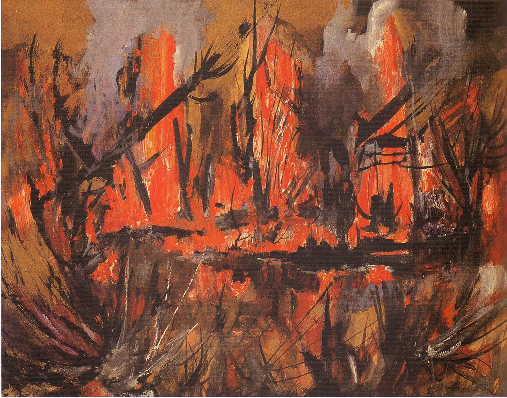
What initially attracted me to this painting was its vivid colors. The bright reds and oranges of the fire in contrast to the deep browns and grays of the sugarcanes create a powerful display. The strength of the colors in this painting accurately depicts the mesmerizing, yet terrifying power held by these blazing flames. Additionally, there aren’t any real identifiable shapes visible, only hazy dark objects, which adds to the general feeling of chaos and confusion that accompanies fire. All these components lend themselves to the mystique of the work and the conflicting emotions that it triggers.
When I was looking at this piece of art, I didn’t know whether to feel sorrow for the livelihood that was being destroyed or pleasure for the beauty of the piece. Obviously these two emotions aren’t in any way mutually exclusive. However, there is a certain guilt involved with finding beauty in something that has caused others devastation. In the end I made peace with myself, concluding that this conflict of emotions is probably what makes this a piece of art to begin with. If it had not been so contrastingly beautiful than I would not have given it much notice, and it would not have been able to effectively convey the mourning of a livelihood reduced to ash.
Emergia Caracas by Miguel Rodriguez Sepulveda (2007) , Colombia- -DVD Video, El Museo del Barrio, NYC
In this small, approximately 15” X 15” video, we are given an 8:00 minute clip of what seems to be a tattoo starting to fade away through the sweat that perspires through the tattooed person’s body. By running in place in front of a white backdrop, this ink begins to fade away. What is inked into the Afro-Caribbean (You can tell from the color of the skin) displayer’s back is a picture of what seems to be the face of a white upper classmen, probably European, during the colonial era of his area. After almost 5:00 minutes of what seems to be a complete waste of time, the ink fades and smudges this face. Towards the end of the video, one can barely recognize the face of this unknown colonist. Finally, to end the video, photographers and audiences of the artwork take pictures and applaud the artist on his ideas and unique approach to the concept of slavery and colonialism.
As one may have guessed, the idea of an 8:00 minute video may seem very boring and tedious to watch, especially if nothing interesting is happening. I literally watched the video hoping that “interesting” something would occur. “Where was the art? I can’t see it!” However, what really caught my attention was the detail in which the colonist’s face was inked into the displayer’s back. I couldn’t help but notice the true details, such as bone structure and pompous features that this probable European had. In addition, my mind kept contemplating, trying to figure out what was on his back. Was it ink? Sweat? Marker? All of the above? Regardless, I respect this innovative idea that Sepulveda was aiming to portray. Through this sweat and hard work, the displayer can break free of their past, almost socially working hard to their status, while also sweating or “removing” the remnants of their colonized heritage of slavery. However, I must also note that the smudged face is still there towards the end of the video. This last note probably symbolizes the fact that this enslavement period of colonialism will always be with the people of, no matter what. I think this piece struck me as compelling just because of its idea and concept, which I believe is true. No matter what you do, there will always be some sort of history or past that comes with you to your present or future.
Here is the link to the video:

By Herve Bueve (2009), El Museo del Barrio
Martinique 2 by Herve Beuze (2009), Martinique – Metal & Synthetic Materials, El Museo del Barrio, NYC
No larger than a regular TV, this 3’ by 5’ structure shows the island of Martinique, made of some type of cork in an orange color, hanging on the wall by a black web like metal structure. The island of Martinique seems almost rugged and crooked with the topography of the island jaded, almost natural and similar to that found on champagne cork pieces. The black web behind the island stems asymmetrically and definitely sticks out, contrasting from the orange island.
In the midst of all these Caribbean inspired paintings was this large structure hanging on the wall. Sticking out like a sore thumb, it was only natural that I checked out Martinique 2. Behind the metal structure was this interesting idea of the country as a magnet, almost web like atmosphere. The concept of the spider web seems to symbolize the attraction of imperialistic countries to the region due to what the country offers, usually labor, pride, and a base, which increased European influences in the area. By portraying the island as a rough area through it’s topography and texture, I believe Bueve was also trying to note the difficulties of the country, including slavery, similar to all of the other countries in the Caribbean region. Again, I believe the artist’s concept was very compelling and thought provoking which led me to choose this piece. It’s always interesting to see how someone portrays an idea or theme in an artistic style. Although this imperialistic ideology is not present within today’s society, the idea of magnetic webs in the world is seen today in all places as countries have been assimilated or transformed into many diverse cultures, which was something we talked about English class the other day. (Probably another reason why it stuck to me)
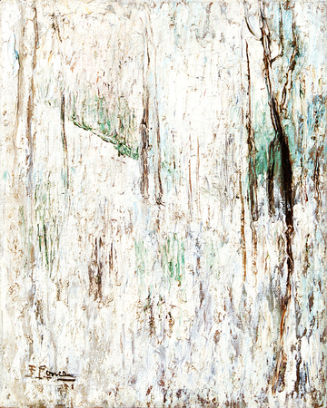
The first painting I selected in El Museo del Barrio was Paisaje (Landscape). This painting is a medium sized, 24.25 by 19.75 inches, oil on canvas which depicts a weathered, grungy white background with various globs of brown, green and grey streaks painted on it. The painter, Fidelio Ponce de Leon, lived in Cuba and is considered by many to be the most authentic Cuban painter of his time. Unlike many other Cuban artists who portrayed an idealized Cuba, Ponce painted scenes of poverty and sickness which characterized the life of the average Cuban in the 1930s.
This piece caught my eye mostly because I visited Cuba around a year ago and had my eye out for Cuban art. The dullness of this piece coupled with the title Landscape may at first seemed very abstract, and perhaps Ponce meant it to be, but something eventually clicked within me and this piece became an instance of Ponce’s authentic depictions. As I continued gazing at this piece, it became clear that this artwork could have no other title because I had personally experienced this Cuban landscape.
 Although Cuba has some of the most beautiful beaches in the world and tourists can vacation there in luxury, the average Cuban lives in total poverty. Walking down the streets of Havana takes one to narrow alleys with dilapidated, crumbling buildings on either side. Small shirtless children play soccer or tag while neighbors sit on cracked steps talking and watching passers-by. To my eye, Ponce’s painting is an exact portrayal of the beaten stucco walls that make up these Cuban buildings. For the average urban Cuban, their landscape isn’t a beautiful beach or crisp mountainside, but the wall of the building across from where they sit and watch their children play.

Prayer is a mahogany sculpture carved by Edna Manley in 1936 and is the second work of art I found particularly captivating. Considered the “Mother of Jamaican Art,” Edna Manley created Prayer similar in form and idea to her better-known sculpture Negro Aroused. It is a rendering in brown wood of a black man kneeling, with his hands clenched and raised to the heavens. The nude body of the man is rounded in contour and slightly disproportionate in relation to his limbs. In the emotions that it portrays, Prayer is meant to be representative of the civil outrage directed at the colonial system present in 1930’s Jamaica.
The powerful emotions inherent in Prayer are the aspect of the artwork that I found to be the most fascinating. During the 1930’s, Jamaicans active in their country’s civil rights movement were often forced to confront their own helplessness head-on, as they strove for autonomy and suffrage. Perhaps these men turned to G-d in their search for control, and it is this relationship that Prayer seeks to depict. The vulnerability and desperation implied in both the nudity of the wooden man and in his positioning are emotions that anyone who has turned to prayer in a moment of need can identify with.
Of the few pieces that truly caught my eye at the Queens Museum of Art, El Colombia stood out the most. Painted in 1968 by Noe Leon of Colombia, this oil on canvas seems to feature only the most extreme shades of the various colors it exhibits. Its color palette is a display of mostly primary colors, and so the painting was inescapable, striking in its vividness. El Colombia depicts a steamboat, chugging leisurely down a broad river. Only the colorful passengers standing on the steamboat’s deck can rival the vibrancy of the greenery lining the riverbanks. And a dash of deep red among the riverside vegetation contrasts sharply with the dark and light greens of the plants, elevating the scene to an almost Garden of Eden-like state.
It is this heavenly, paradise-like quality that I find compelling. El Colombia comes across as a painting portraying the idyllic, gentle, and relaxed lifestyle that so often comes to mind when one imagines the Caribbean. As a child, it was often paintings depicting similarly sublime and perfect scenes that I found so irresistible. Just like those representations of the serenity to be found in nature’s beauty, El Colombia captures the eye, making it almost impossible to look away.

Basic Facts: “Un mercado de line con un kiosko de lino y vendedor de verduras en las Indias Occidentales” is an oil painting on canvas by Agostino Brunias (1728 – 1796). The title translates to “A linen market with a linen stall and vegetable seller in the West Indies”. Brunian is an Italian painter who eventually settled in Dominica. This painting is in El Museo del Barrio.
Description: “Un mercado…” is a traditional painting, with realistically portrayed subjects and a traditional medium. There are many components to this painting; it depicts a market scene, which includes people of various races and ages. There are black women wearing European influenced Caribbean dresses, looking like petit fours, very pretty. They sit in the linen tent, talking to two fancy-looking mulatto women. Then there are some Caucasian red coats flirting with native women next to the tent. Farther in the background is a topless woman carrying a basket on her head. Beyond her a small crowd gathers to watch two teenage boys, wearing nothing but white knickers and headbands, engage in hand-to-hand combat. In the right foreground, a woman breast-feeds her naked baby as those around her tend to vegetables such as corn. A green mountain looms in the background, with a faint blue ocean in the left background.
À mon avis: Brunias’ painting is a traditional painting, but, for his time, it did express a unique acceptance of the mixing of peoples. He portrays Europeans, natives, and mulattos interacting without tension.
The painting exhibits a traditional sense of beauty (realistic features, chiaroscuro, traditional medium of oil, et cetera); however it is the diversity Brunias presents that captured my attention. It reminds me of Haiti, all the blends we have. My own family, my maternal side, is a mix of white and black and mulatto; European and African and native Haitians, all living a country where you can munch Caribbean sweets from street vendors or relax in your bungalow or walk on dirt roads, all while surrounded by different sorts of people. The painting is not urban in reality, but its concept is urban in the sense that there is a huge spectrum of things going on, involving different groups of different people. I wish I could be there – or should I say, it makes me wish I could be in Haiti, even though it is not. But it has mountains like Haiti (for which the country was named), and Dominca is also a francophone Caribbean country. This painting gives me nostalgia and pride for a land to which I have never been.

La famille de Renards
(My maternal family in Haiti a couple of generations ago.)
The Basic Facts: “Caripito Village” is a watercolour painting on paper by Rainey Bennett (1907 – 1998), an American painter. It is in El Museo del Barrio.
Description: The painting is of medium size, a little bigger than the front cover of a textbook. Its subject is a small village, near a river of sorts. A rectangular cluster of huts, slightly towards my left. A dirt road coming down from the left of the painting and past the middle, until it is cloaked by trees and underbrush. A woman with a conical hat – a witch’s hat, almost – walks down the road. Past the plant life is a small, vibrant river or lake, seemingly uninhabited. A little isle is in it, not far from the banks. A pregnant woman, naked, stands on the shores of the isle, gazing at the town. Her hut is behind her.
The colours are bold, bleeding, and inky blues, more blues, blacks, and greens. The village and a tree have some browns, and the road is sunset yellow and amber. The “witch” wears a dark cayenne-coloured dress. The colours are simultaneously soft – due to the brushstrokes and the bleeding nature of watercolours – and vibrant. Bennett’s painting reminds me of an East Asian ink painting, with its slender brushstrokes and forms.
À mon avis*: I hated the painting for its deception at first, but as I kept writing I fell in love.
The ambivalence of the brushstrokes – their decisiveness and fragility – is stunning. The paradox is part of the painting’s beauty; the vivid colours further add to it. But there are also the details: the stick fence hidden in the bottom left bushes, the sparse cotton ball clouds, the pregnant woman longingly looking over the village… I could write stories about this place, stories about rain and desperation and mythical narwhals and that fungi-yellow Asian tree and each of the women and voodoo and the story of the fence. For every two houses there is a story. The painting’s beauty wooed me, but ‘twas the serenading of the expectant stories made me fall in love.
Now why did I hate the painting at first? For misleading the viewer.
“Caripito Village” is not a traditional Western painting; it seems to be influenced by East Asian art. The painting depicts a Caribbean village in an unrealistic manner. The village looks nice, quaint, lush. It’s probably not. Bennett depicts the natural beauty and truth, but not the social economic or emotional realities. The artist does her subject injustice by begetting its problems. Or is that my responsibility? I wonder. Maybe she’s just being an artist, and I’m the one who should enjoy the illusion while knowing the truth.
*À mon avis – French – in my opinion
The second piece of art that I selected is called Supervivencia (Survival), 1910.
This work by Juan Ramón Bonilla (Costa Rica), and featured at El Museo del Barrio, is a bronze sculpture, the only of which I recall encountering at the exhibit. It is approximately two-and-a-half feet in height and over a foot in greatest width. The sculpture itself is of several different people –quite possibly intended to comprise a family—huddled together around a central seemingly messianic figure. Of the eight characters represented in this work of art, there appears to be a significant diversity of age—spanning from young children to mature adults with a few adolescent stages in-between. While not explicitly stated, it seems as though these people cling to one another as well as this elevated central character for a sense of protection or at least comfort from an oppressing force. Moreover, this sculpture adds to that effect by not clearly delineating where one person ends and another begins; this artistic decision forces one to realize the unity of those in the sculpture.
While not enormous in size, this work is profound in meaning. Initially, I was struck by this work’s simplistic yet powerful design; as one who has little experience with assiduous analyzation of sculptures, I was amazed at how impactful such a simple design could be visually. Once my amazement with the medium itself was overcome, I noticed how nonspecific both the title and the work itself are as far as irrefutable meaning; with a title meaning simply survival, my imagination immediately sprang into action to try to figure out what exactly was intended by this model. Was it trying to show Darwinism in action and say that only the powerful have the means to overcome adversity while the poorly adapted for survival cling to their side? Or, alternatively, was it trying to say that by clinging to a higher power (represented by the Christ-like figure in the center who rises above everyone else) we all have the means for survival? Or, was it trying to say that we are all one entity (displayed by the numerous physical connections present in the work) that are interdependent on one another for survival, despite the fact that certain individuals may have advantages over others? Ultimately, I resolved to accept sort of a consolidation of these ideas into one significant idea. Certain individuals are certainly more suited for survival than others. However, there is little meaning in life if we purely attempt to survive on our own, isolated from the many necessary connections required of human society. This realization often comes about as a result of turning to a higher power, forcing us to realize that we are not the epitome of creation and must therefore help those around us if we wish to receive support from that (or whom) which has power over us.
The first piece of art that I selected is called A Blue Hole, Jamaica (Un Agujero Azul, Jamaica), 1866.
This work by Fritz George Melbye (Elsinore, Denmark 1826—Shanghai, China 1896) is made by oil on canvas and was located in El Museo del Barrio. It is a landscape painting of—as the name suggests—of the Blue Hole Mineral Spring located just outside the city of Negril in Jamaica. It is a painting, honestly, of underwhelming proportions and in fact is dwarfed by many of the other larger more ostentatious pictures in the area. Its measurements are Height: 76.2 cm (30 in.), Width: 111.76 cm (44 in.) and as is typical of landscapes it is rectangular in shape. The color palette consists of many greens and blues to represent nature, contrasted with the transition towards light as the picture moves upward to the sky. The features of the landscape that stand out do so as a result of this stark contrast. Ultimately, I believe this results in the waterfall garnering primary attention with one’s eyes at last straying to the periphery to view the man on horseback accompanied by an attendant and the beauty of the rest of the natural world (including the impeccable foliage and the divine sky).
The main reason that I selected this painting, however, was the clear resemblance that I believe it exhibited to another of my favorite paintings, A Storm in the Rocky Mountains, Mount Rosalie by Albert Bierstadt.

Not only do the two possess a very similar palette of colors—focusing on the greens while transitioning to light towards the center of the painting—but both clearly portray a transition to beautiful, heavenly white light as they transition towards the sky. Additionally, they both intend to show the majestic grandeur of nature by comparing a few, seemingly insignificant humans to the immense wilderness that abounds; while Biersadt’s landscape is much larger in size, the scale of human representation to nature is very similar in both. As I looked even more closely, I realized that both of these paintings were in fact created in the same year, 1866, by artists of Western European origin—Bierstadt from Germany and Melbye from Denmark—who each were born and passed away within a few years of each other. The similarities stop there, however, as one attempted to portray the Rocky Mountains while the other was focused on accurately depicting Jamaica’s natural beauty.
Melbye’s painting, I believe, is seemingly traditional and straightforward without any real attempt to push the boundaries of representationalism; it is fairly obvious that he attempts solely to show Jamaica for what it is and no more. However, I believe that Melbye was very successful in doing so because ultimately, though its likes have been done numerous times before, this work of art was still beautiful and well-crafted. This is not the type of art work which strives to revolutionize the world through profound meaning but rather to simplify the world through orderly perfection; it seemingly aims not for the brain but rather the heart and hopes, but does so extraordinarily well. In the end, I believe that it is necessary and sublime because in a world full of violence and corruption, oftentimes we require some agreeable art.
