professor uchizono

Author: jsebastian719 (Page 1 of 2)

Response to Ariella Caminero on Analytic Post-Modern Dance by Jerry Sebastian.

According to Sally Banes, Post-Modern dance refers to a group of choreographers in the 60s and 70s who sought to upend traditional dance forms like ballet and ask questions about the nature of dance as an artform. Some questioned whether dance required musical accompaniment : others questioned whether dance had to convey meaning and narrative: and still others questioned what was and was not dance, breaking down the barriers between choreographed movement on a stage and pedestrian movement on a street. Coming out of this strain of thought was the Analytic Post-Modern Dance movement of the 70s, which stripped elaborate costumes for everyday attire. The plain aesthetics of analytic post-modern dance marked a focus on pure movement as opposed to using dance to convey thoughts or stories about something else, an emphasis that requires the viewer to focus on the minute details of the dancers’ movements.

Ariella mentioned the political/social connotations of Steve Paxton and how dancers in Contact Improvisation had to trust and support each other, but I think it would be better to focus on how Contact Improvisation forces each dancer to be intimately aware of the other dancers’ bodies and their movements, since this connects Contact Improvisation with Analytic Post-Modern Dance in general. Obviously all dance requires its participants to know their performance well, but improvisation prevents performers from “autopiloting” movements they’ve rehearsed, forcing them to pay close attention to the performance as they perform it. By requiring its performers to be intimate with their movements, Contact Improvisation joins the tradition of analytic post modern dance in making us look deeply at every motion of a dancer.

Trisha Brown’s work also deals with the concept of forcing oneself to look deeply at each and every motion in a dance. In “Accumulation”, this is accomplished through the use of repetition and iteration. By structuring the dance so that simple motions are repeated and then added upon, Brown gives the audience a lot of time to think about each little movement before she adds the next one. Each new iteration makes the audience think about how all the little motions in that iteration fit together before they can look at the next motion and how it fits with all the previous ones. Basically, the viewer is forced to look at each motion individually and look at all the motions holistically, giving them deep understanding of the dance on multiple levels once everything is said and done.

Snapshot Day by Jerry Sebastian

I took this photo while I was walking along the western side of Central Park looking for good snapshots. I incorporated the Rule of Thirds by placing the building on the left third and the truck on the bottom third, and I made sure that the truck had a bit of space to move into. When I was taking pictures in Central Park, I was frustrated by the shadows cast by all the trees. It made it difficult to get a shot of an object and its shadow like I mentioned in my previous photography post. But now, I see that I accidentally used the shadows to my advantage. The building, which is the focus of the piece, is in direct sun, while the truck and foliage are in shadow. The lighting contrast is pleasing to the eye and helps to emphasize the building further. You could even go so far as to say that the dark foliage and well-lit building give off a nice contrast between the natural and the artificial However, the foliage in direct light works it against this somewhat. The way in which the branches extend offscreen help to capture the expansiveness of the forest and act like a natural frame. I’m not sure if white, blue and green is considered a good color combination, but I think it looks pretty good.

Side note: I have no idea what this building is or what it is for.

Response to Harry Callahan’s “Detroit” by Jerry Sebastian

Detroit


I was drawn to this image by how confusing it was. It took me a moment to realize it was composed of several overlapping reflections, and I’m still not sure how many people there actually are. Complexity can be a powerful tool in visual art, forcing the viewer to examine every square inch of space closely to understand all the little details. However, it can backfire and have the opposite effect: overwhelming the viewer with so much complexity that they ignore the details of the image in an attempt to tune out the visual noise of an image. I think the complexity works out here because the array of reflections effectively combine multiple slightly different angles into one image, capturing the objects in greater depth.


Similar to the multiple reflections in Chicago, I’m interested in how multiple shadows from the same object intersect and form umbras and penumbras. It would be interesting to try to capture this in an image, but I’m not sure how to go about doing that. Shadows are obviously dependent on the angle of lighting, so I would have to plan a shot based off the sun’s position in the sky and by extension the time of day. The photography websites mentioned using the rule of thirds to create point-counterpoint pairs, so perhaps I could make a point-counterpoint pair out of an object and its shadow.

Response to “Folk-s, will you still love me tomorrow?” by Jerry Sebastian

Re:Jaimee

-I agree that the performance got a little repetitive- I found it a bit difficult to pay attention during the whole thing. Still, we cannot discount the enormous amount of effort put into doing a show like this. I’d find it hard to do once, let alone rehearse it multiple times!


I read the dance as a tale about how folk dances are gradually ignored and displaced by modern culture. Folk dances are symbolized by the man with the hat and his accordion, who leaves first. Without him, the rest of the dancers are left to their own devices, and adapt their dance to modernity by pairing it with contemporary music. But without the cultural identity provided by the accordion, the group loses their soul, and eventually drifts apart. This is echoed by the title, which implies that peoples’ tastes are fickle and we may discard traditional cultural forms in an instant. On a personal note, I am disappointed that the performance did not end with the first man returning to play the accordion and reunite the group.

Response to Gia Kourlas’ Review of “Tape” by Jerry Sebastian

In ‘Tape,’ Performers Move Fluidly and Whimsically About a Grid begins by discussing the performance’s titular motif, comparing the use of tape on the ground to crafters who put tape on a Ziploc bag and call it “a dazzling neon zebra pouch”. This unfavorable comparison gives way to complaints about distractions like the tape grid and the costume designs, punctuated with the seemingly-sarcastic interjection “Ah, whimsy!”. As Oliver states, the backbone of dance criticism is description of the performance, and Kourlas brings in details to give an overview of “Tape” and support her thesis that the performance is a non-cohesive mess. Though short, the review gets its point across adequately.

Rothko and Matisse Comparison Opening Paragraph by Jerry Sebastian

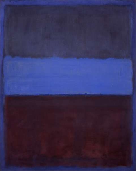
Both Matisse’s Woman with a Hat and Mark Rothko’s No. 61 eschew realistic imagery and coloring to use colors to express emotions more purely. Matisse rejected realistic coloring, but Rothko rejected concrete objects altogether to express emotions through blocks of pure color. When looking at No. 61, there is little that the viewer can do except ponder the meaning of the colors alone, stripped of all context. In this way, Rothko stands among the Abstract Expressionists who used pure, simple forms to communicate ideas. Woman with a Hat, on the other hand, uses its bold colors to enhance the expressiveness of its subject. Here, the colors, while being very eye-catching, serve to complement the woman rather than overshadow her. This stands in stark contrast to No. 61, where the colors are the primary- indeed, the only – thing for the viewer.

Comparison of Two Works at the MoMa by Jerry Sebastian

Re: Jessica Ng

It’s interesting that one painting requires some careful observation before you can understand what it’s depicting, while the other instantly communicates that it’s a painting of some people. Odd to think that two pieces that are very abstract can differ in such a way. Can it be said that Ma Jolie is “more” abstract than Les Demoiselles d’Avignon? What does it mean to be more or less abstract, anyway? I’ve also chosen two abstract works that have differing levels of abstraction – Matisse’s Woman With a Hat and Rothko’s No. 61. Matisse’s work seems much more concrete than Rothko’s, but they both eschew traditional colors in order to express emotion in a more abstract manner.

fancy hat

Woman With a Hat was an example of Fauvism, which stressed bold, unconventional color schemes.

Rothko’s piece is much more extreme in its reliance on color and only color to express emotion. In doing so, it asks, “How much can plain blocks of color, without context, make us feel? Can they make us feel?” Frankly, that’s a question that I’m still not sure how to answer.


No. 61 (Blue and Rust)

What does this image make you feel?


Applying Berger and Barnet to MoMA by Jerry Sebastian

One of the concepts, perhaps the core idea of John Bergman’s Ways of Seeing is that the context and perception of a piece of art may be just as important as the work itself. In a sense, The Last Supper that we see is not the same that Da Vinci and his contemporaries saw- they had a different visual vocabulary than we modern viewers, and so would have had a different way of seeing it. Even the most carefully preserved painting will never be the same as it was when it was created: we can preserve an object, but we cannot preserve society’s position in relation to that object.

To some extent, modern art’s use of abstract visual forms sidesteps this problem. To “get” a painting like The Last Supper, you need to study Christianity, Renaissance symbolism and lighting techniques, know what perspective it was created and the significance of that perspective, and so on. To “get” a Rothko work, all you need is an eye (and perhaps a basic understanding of color theory) By eschewing any sort of setting or object that could grow outdated, abstract artists hoped to make universal paintings that could evoke emotional reaction in any viewer. I am not trying to say that no piece of modern art does not need context- indeed, Fountain would become pointless when removed from the context of an art gallery or museum – but I do think that abstract art is actually more comprehensible to everyone than more traditional art.

Why, then does modern art get derided by the masses who say, “My 3-year old could draw that!”. Again, it is a matter of context. If I hang up a Pollock in my house, people view it differently than if I place it on a pedestal in a museum. Museums have an atmosphere and a price that primes people to expect “high art”. And of one the ways in which most people define “high art” is the difficulty in producing it. Anyone can look at the Sistine Chapel or Michelangelo’s sculptures and know they required skill, finesse, and many hours of labor to produce. The same can’t be said of blobs of color or pictures of soup cans. But if these images were displayed in a less pretentious setting – say, on the street or on a bedroom wall – I think we all could see them in a way that would let us enjoy them.

« Older posts