One of the works I have chosen to analyze is Picasso’s Ma Jolie. The reason I chose this particular work was because of what happened to my perception the first time I saw it. When I first saw Ma Jolie, I thought it was just a bunch of geometric shapes and lines, with no discernible subject. The portrait was right next to Braque’s Man With a Guitar, which had a very similar style, but which at least hinted at a masculine figure. It took a comment from Eli and a literal step back to realize that Ma Jolie really did have the distinct shape of a female figure. It was almost a stereograph-like effect, in that I suddenly saw something that I couldn’t see before. It was a really cool effect, and I thought that I really wanted to write about this work.

Ma Jolie (Picasso 1914) – Can you see the woman?
I am considering Picasso’s Les Demoiselles d’Avignon for the second work, although this may change. I would like to see the new Cubism sculpture exhibit as well, and see if there were any pointillism or impressionist paintings I missed. I kind of want to compare Ma Jolie to a pointillism painting, because there are some elements that I feel are surprisingly similar, but I can’t recall a specific one at the moment. I went with Les Demoiselles d’Avignon because it’s one of Picasso’s earlier Cubism works, and you can definitely see similarities in style but it’s also very, very different from Ma Jolie. Also, it’s probably the most famous of the Cubism era, which makes it interesting to pit it against something less well known.
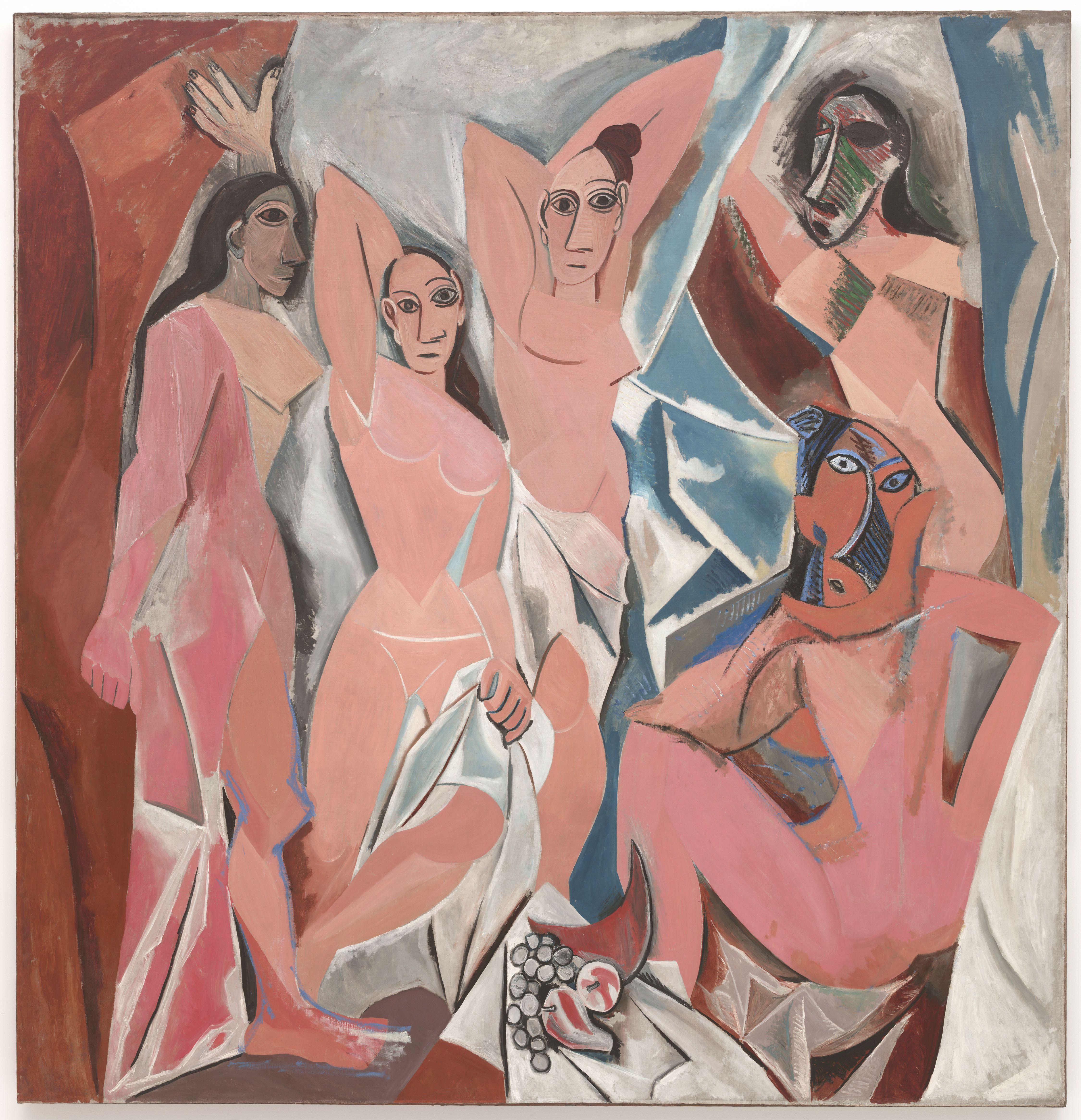
Les Demoiselles d’Avignon (Picasso 1907)
I haven’t really gone back to MOMA since the last post, so if you want to read my thoughts, that’ll be here. I suppose when I go again, I would be thinking more about analysis and historical/outside context, as well as meaning and perceived audiences, that sort of thing. I might go about it by imagining a mental audience in my head with art snobs from different eras. Might be fun.
-Jessica Ng
Interesting. I agree that Ma Jolie really requires to look at it for a bit before you can recognize the woman, as opposed to the Picasso work where you can immediately recognize that it’s depicting people. It’s interesting to think how one abstract painting requires you to think a bit before “getting” it, while another abstract painting instantly communicates its subject matter.
I really enjoy this comparison; it’s always really interesting to see an artist compared to himself, especially someone as famous as Picasso. Based on these paintings, one can see the evolution of Picasso’s artwork throughout his Cubist phase. Ma Jolie really shows Picasso’s skill at subtlety, which is a skill I respect greatly. To hide something like Picasso did in Ma Jolie (to the point that it can be unrecognizable to some) is hard to do effectively, and it makes the piece more memorable. Les Demoiselles d’Avignon, on the other hand, is just as artistically impressive even though the figures are clearly portrayed. Being able to make a comprehensive scene through cubist images is also an incredible and, at the time, innovative technique.
The works I chose, Rothko’s No. 10 and Klee’s Fire in the Evening, echo the influence of Picasso’s cubism. They both use blocks of color to convey some sort of message, although very different. Rothko’s piece is meant to convey emotion, while Klee conveys society. I see a similar comparison in the Picasso pieces above. Rothko relies on the subtleties of the colors and layering to evoke emotion so that it is not a direct portrayal of anything definite. Likewise, Ma Jolie relies on the subtlety of a hidden figure for its effectiveness. Klee’s painting is not purely abstract, so it does vaguely portray something (a fire in the evening). It is meant to speak of the society in which it was created in through the depiction of a real image in an abstract sense. Les Demoiselles d’Avignon , as well, definitely depicts something that actually exists in a manner that changes the image and catches the eye. That contrast between the two is a major reason why I chose these works.
-Jaimee Rodriguez