professor uchizono

Author: Jessica Ng (Page 1 of 2)

Blog A: Ralph Lemon’s The Scaffold Room

I honestly have no idea what to say. Mostly because I had not a single idea of what was going on.

Did that art installation have anything in the beginning have anything to do with it? There were books on gay sex and carved wooden figures and t shirts. I don’t know. What was the point?

Then the actual performance was in this interesting room. A pitch black room with a metal frame cube at one end and a white screen beside it. It was a really interesting stage. There were three distinct parts of the performance it seemed, with one woman each for the first two and three men dancing in the last. Actually there were a lot of interesting elements. Such as utilizing the top of the cube for the mattress and breaking the wall of the back, the moving of the screen, the moment when they decided to hand out chairs instead of setting them in the beginning, and the usage of wigs in the performances of the women. I liked how the moved the stage from the ‘front’ of the room to the ‘back’ of the room too. What I don’t get is how anything fit together. Was there any meaning at all in the performance? I guess I could find some meaning in how they were all African American performers, but I don’t know what that means. I suppose anal sex was mentioned a lot too. Was it too shock the audience or something? Rebel against societal conventions of what was acceptable in conversation???? But in that case all the other stuff should have been shocking too. But mostly it just didn’t make sense!!!!!

As as you can see by my usage of punctuation marks, I am really frustrated at this performance. Why?????????????? That’s my question for this performance. Am I missing some cultural references???? Is there some underlying meaning? Was it meant to shock the audience? Mostly I was really bored and sleepy. If that was the point, surely there were less intensive ways to go about it. I want to try and analyze this but mostly I can’t make any sense of it. If that was the intention, then good job. This was worse than the last one with the endless folk dancing, I didn’t think it possible.


Jessica Ng

Blog B Response

So I’m actually blog A but I got confused because of the syllabus so.


I feel like that in post-modern dance, dance is being established as an art form independent of other art forms like music or literary ideas. Dance does not need to have a story or be accompanied by music to be dance, but rather it is simply movement for the sake of movement. The post modern dance aesthetic explores and goes beyond past boundaries, and encourages experimentation in vastly different direction. Some make dance question its own purpose and meaning, some incorporate political themes, etc. One of the ideas in post modern dance is repetition and time. Repetition emphasizes the passing of time. The usage of time in dance can also be a physical passage of time, not an artificial meter. Movement and time can both be more relaxed. Other directions include the idea of dance for the performer, not the viewer, and dance being imperfect and transient, that a performance can be a performance if improvised and with mistakes.

Trisha Brown is a famed choreographer associated closely with post modern dance and contributed greatly to its ideas and development, such as thought about movement. Some of her early works provoked thought on the different perception of perspective, space, time and orientation to gravity. One of her works Walking on the Wall, revisits the most basic of movements, walking, but (as the name implies) on a wall, opposing gravity. Another idea that she developed is accumulation and repetition. She uses accumulation in her dance style by increasing one element at a time, as one becomes two and two becomes three and so on. Her style draws heavily from the everyday movement and repetition.


-Jessica Ng

Snapshot Day Photo

There Lurk Secrets Here

There Lurk Secrets Here

I was walking along this basement at night and I was really entranced by the pipes on the ceiling above me. It was a really long hallway, and there was no one around, so I got this sense of isolation and abandonment. It kind of reminded me of a horror genre video game, so I wanted to capture that cross between horror and isolation when you’re looking at something the right (or wrong) way.

I tried to compose my shot along the rule of thirds. The pipes take up primarily the top two thirds of the photo, and the line of the hallway moves from the upper left intersection to the bottom right. For extra creepiness, I made my shot kind of shadowed and dark and kept the ‘exit’ sign just within the frame.


-Jessica Ng

Photo Analysis

Helen Levitt, “New York”, c. 1940


The photo I chose to analyze is Helen Levitt’s “New York”. The reason I chose it was because it gave me the feeling that it was just so quintessentially “New York”, even 70 years ago. The thing about living in a huge city with millions of people is that it is impossible to know everyone. You could be surrounded by more people than a small town and all of them could be strangers. You could go spend an entire day wandering New York and not encounter a single person you know. The dichotomy of New York is that the more people you live amongst, the less people you really know. In “New York”, subject is in the foreground, seemingly isolated. It is hard to distinguish whether they are male or female (though I would guess make going by the hat). He is isolated on the foreground, but the background is bustling and full of people. It really gives me that feeling of the dichotomy I spoke of earlier. Also, it’s just so 1940s New York in terms of style and architecture and technology. I don’t know, it’s kinda nostalgic. I just like it.

In terms of composition, the rule of thirds is pretty obvious here. The subject is along the third line dividing the image vertically. The street takes up two thirds of the bottom while the buildings and people, the background take up the upper third. The lines of the street are also running to the bottom left intersection of a thirds grid to the upper right, which also makes your eyes focus on the subject. Levitt also gave the subject some room in the foreground to walk to, and angles it so the street and the background doesn’t go through the subject itself.

This photo made me think about my ideas about New York and how my photo is going to reflect that. I’ve lived here my entire life, so I may or may not be biased in one way or another. Anyways, in terms of framing my shots… I knew about the rule about not having your subject disturb your subject, but giving them space to move and the rule of thirds was interesting and new. I think it’s something I try to do unconsciously sometimes (having a photographer as a dad has to rub off a bit of skill, right?!), but you don’t always get the chance and time to position something exactly right.

Also, to Macaulay – October 11 is a Sunday, not a Saturday, update your summaries and emails before you copy/paste them, jeez.


-Jessica Ng

Blog A: Response and Review of Alessandro Sciarroni’s Folk-s will you still love me tomorrow?

I liked how Eunice Hew pointed out specific moments of humor in the performance as well as the music to support her evaluation. Her descriptions also gave the reader a good sense of the image of the performance. I agree with her about how the moments of humor gave it a break from the two hour long repetition, but I’d also like to bluntly add that not those moments could have detracted from the sheer monotony of the entire piece as a whole. Like Eunice, I really did enjoy those moments, such as “I’m Giving Up On You”, or the interactions between the performers, but for the most part it was just intensely, incredibly, completely and overwhelmingly boring. Thus I will not be so kind as Eunice in my critique.

At first it started out very promising. The dark lighting, six barely visible figures beating out a rhythm with their body that can be felt on the floor through your feet. As the lights came on, you saw that all but one had their eyes taped over and still they were moving in a circle, slapping their bodies in sync without mistakes. They yelled out names and one was always left to hit out the beat. In the beginning, I was really entranced.

After this introduction, the performers removed the tape. One of them then said that anybody is free to leave any time, but neither the performers nor the audience is allowed to return once they have left. And then starts a two hour long rendition of the SAME EXACT RHYTHM. Seriously, it was the same pattern of slaps and jumps and hitting the body. The only difference was where they did it and the background music.

And that’s my main problem. A rhythm isn’t engaging unless it changes, develops, evolves. Themes in classical music would develop over a piece. Even modern pop songs have different lyrics. But for all it looked physically exhausting, I wasn’t engaged. They didn’t even have an underlying beat that connected them. I couldn’t make any sense of their movements– the only pattern I could see was that usually one person was doing something different. Ultimately, you could see as everyone was getting tired, they started dropping out one by one. Sometimes the others looked like they wanted to leave, but then another would start up the dance again. Who knows, maybe it’s some kind of social commentary on herd mentality. With the comment on anyone being free to leave at any time, I wonder if the performers left and choreographed times, but I feel like I should have taken advantage of it and left myself first.

‘Tape’ Review Review

The following is my review of Gia Kourlas’ review of ‘Tape’, as based on the concepts in the Oliver reading. 

In their review of “Tape”, Gia Kourlas makes their opinion on the performance very clear, and supports it with details of the performance. In this sense, their thesis is very obviously presented. However, their definition is lacking, and does not describe the performance well to give the reader a sense of the action, nor do they give the context or background in the which this performance is meant to be in. At the very least, they have the basic information: location, time, choreographer, etc. Kourlas uses metaphors and similes well, and sticks with a single tense and voice that that is able to display their visible affront to the reader. But while they make their evaluation of “Tape” come across very clearly, the reader is unable to grasp the meaning or an image of the performance in Kourlas’ review. Moreover, Kourlas does not provide an interpretation of “Tape”, being too busy disparaging it. By Oliver’s standards, this review is somewhat incomplete. Ultimately Kourlas is able to communicate their thesis and evaluation, but is unable to clearly convey the action or meaning behind the performance.


-Jessica Ng

Intro + Thesis

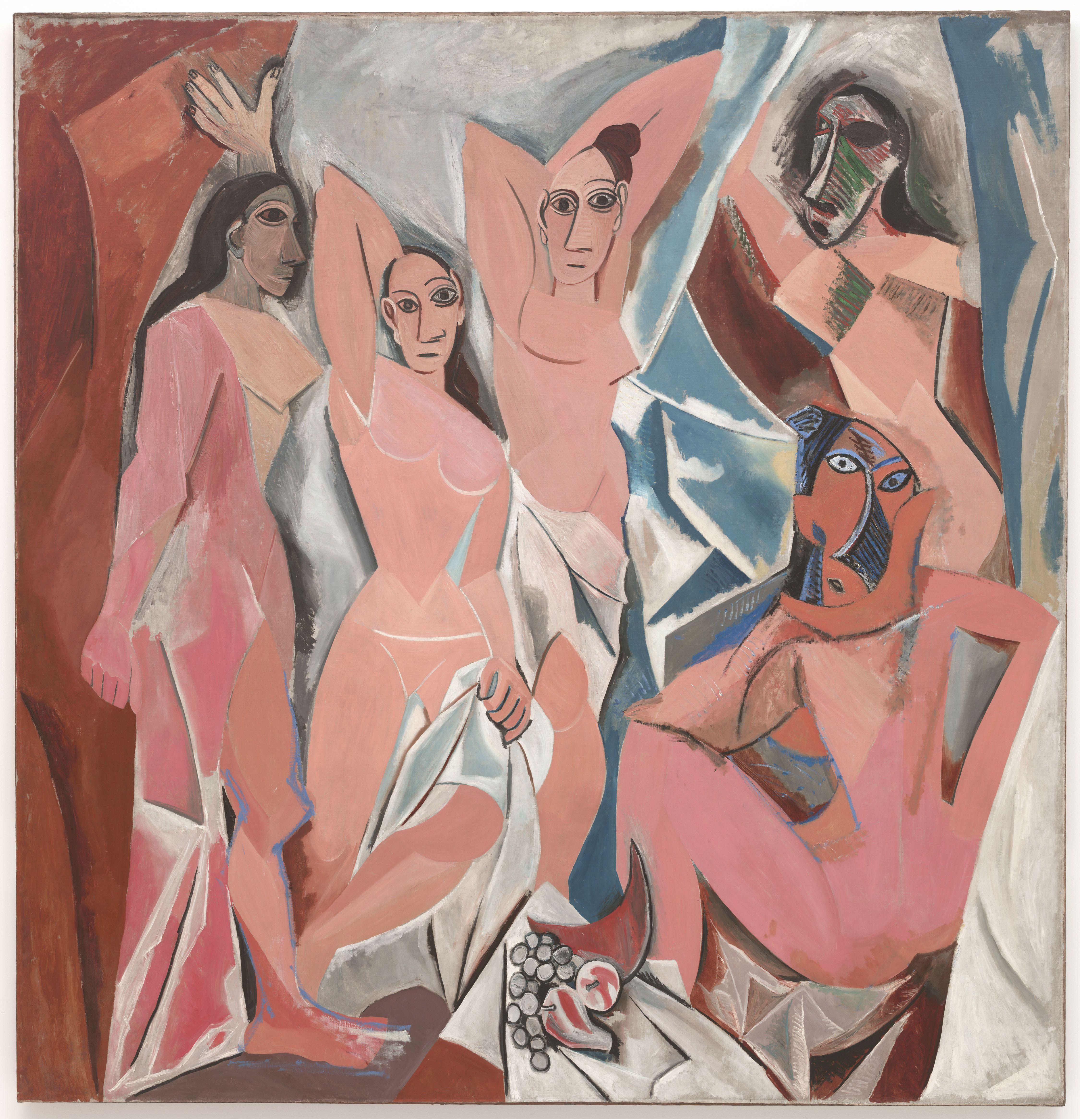
Cubism is the era of art that inspires the incredible diversity in modern styles of art. It was incredibly influential, and within itself developed and changed rapidly in a few short years. Perhaps the most well known artist of the Cubism era is Pablo Picasso. Though the general trend of the era runs in the opposite direction, Picasso’s art style shifts from the colorful and fractured to the gray and divided. Picasso’s earlier Les Demoiselles d’Avignon is the most well known work of the Cubism era, but his later Ma Jolie is more representative of Picasso’s matured style and his ideas of Cubism.

Though each era in art is revolutionary in its own ways, Cubism is the first era that breaks out of perspective that is seen literally. Everything that came before is a vision that could exist in reality, but Cubism breaks out of that mold. Its defining art style is paintings that portrays subjects in multiple perspectives in one dimension. Its defining principle is to present its subject in a greater context. While Les Demoiselles is well-remembered as the start of the Cubist movement, people often don’t recall its later developments.


-Jessica Ng

Blog A

One of the works I have chosen to analyze is Picasso’s Ma Jolie. The reason I chose this particular work was because of what happened to my perception the first time I saw it. When I first saw Ma Jolie, I thought it was just a bunch of geometric shapes and lines, with no discernible subject. The portrait was right next to Braque’s Man With a Guitar, which had a very similar style, but which at least hinted at a masculine figure. It took a comment from Eli and a literal step back to realize that Ma Jolie really did have the distinct shape of a female figure. It was almost a stereograph-like effect, in that I suddenly saw something that I couldn’t see before. It was a really cool effect, and I thought that I really wanted to write about this work.

Ma Jolie (Picasso 1914) – Can you see the woman?

I am considering Picasso’s Les Demoiselles d’Avignon for the second work, although this may change. I would like to see the new Cubism sculpture exhibit as well, and see if there were any pointillism or impressionist paintings I missed. I kind of want to compare Ma Jolie to a pointillism painting, because there are some elements that I feel are surprisingly similar, but I can’t recall a specific one at the moment. I went with Les Demoiselles d’Avignon because it’s one of Picasso’s earlier Cubism works, and you can definitely see similarities in style but it’s also very, very different from Ma Jolie. Also, it’s probably the most famous of the Cubism era, which makes it interesting to pit it against something less well known.

Les Demoiselles d’Avignon (Picasso 1907)

I haven’t really gone back to MOMA since the last post, so if you want to read my thoughts, that’ll be here. I suppose when I go again, I would be thinking more about analysis and historical/outside context, as well as meaning and perceived audiences, that sort of thing. I might go about it by imagining a mental audience in my head with art snobs from different eras. Might be fun.


-Jessica Ng

« Older posts