Category: Architecture/Place/Memorial (Page 2 of 2)

Time On The High Line

I had never been on the High Line before and didn’t know exactly what it was. To my surprise, it was a “park” that was built on a subway rail. That seemed like a cool concept but when I got there, I didn’t consider it a park. It had no space to run around and was crowded. But, it had a nice view and some interesting art.

Continue reading

The High Line- Little Manhattan

LilMan


My favorite piece on the  High Line was a sculpture called Little Manhattan. Before I knew it was a sculpture of Manhattan, I knew right away it was some major city and the detail in the sculpture was what really caught my attention. You could see every building and bridge distinctly. The sculpture was about nine feet, but the details were tiny (the picture really doesn’t do it justice). When I was looking at it I kind of felt like I was a giant looking down on an entire city. When I got home, I wanted to know more about this sculpture so I googled it and this came up:

“A fantastic feat of meticulous carving, the sculpture includes every bridge, pier, and building found in Manhattan at the time of the sculpture’s making.”

I think I like the sculpture more now that I know that every single building, bridge, and pier is included. The time and attention to detail that it must have taken in order to make this sculpture makes it even more interesting.

High Line Art

20150924_174525

When I saw the mini image of the graffiti art on the paper that Prof. Ugoretz handed out, it was hard to see that it was actually physical graffiti rather than graffiti on a wall. I chose this picture because the graffiti art was my favorite and it’s still a little hard to tell that this isn’t actually on the wall, besides the art being in front of the black sign on the upper left.

A Photo from the High Line

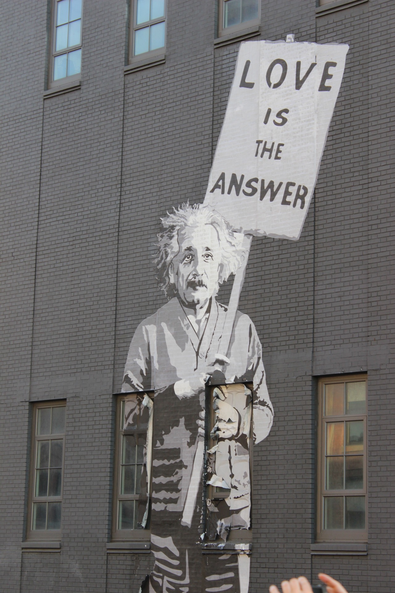
Although this work of art wasn’t on our list, I chose to upload this photo because I think it’s pretty awesome. The art has a powerful message from an influential person, and I love how it sort of blends in with the grays of the background while managing to stand out.  It adds life to a rather dull building, don’t you think?

Newer posts »