Monthly Archives: September 2013

Happy (Belated) Mooncake Day!

photo


Just this past Thursday was “Mooncake Day” or also formally known as “Mid-Autumn Festival.” It is a traditional holiday for Chinese people to eat moon cakes on this day. There are different flavors and types of mooncakes and just recently, I began to wonder what the symbols on the cake itself meant. Ever since I was little, I didn’t question the food that was given to me. Inside the cake is usually made of red bean or lotus seed paste. The texture is thick and usually has a yolk in the center.

According to kaleidoscope.cultural-china.com, the imprints on top of the cake “symbolizes a family get-together and reflects the family culture and the special importance Chinese people attaching to the family reunion. The moon cake is not just a kind of food, but more of a cultural element deeply penetrated into Chinese people’s hearts, symbolizing family reunion and embodying spiritual feelings.” The cake was meant to be shared by a group of people, and thus is always a symbol for family union. I never knew that mooncakes had actual meaning behind just being food. It meant being part of a family and part of Chinese culture.

What other foods do you know have meaning behind it?

NYFW- Street Style


 “Fashion is the most powerful art there is. It’s movement, design and architecture all in one. It shows the world who we are and who we’d like to be. Just like your scarf suggests that you’d like to sell used cars.”

–       Blair Waldorf (Gossip Girl)

Perhaps it could do without the last condescending line, but the Queen Bee has the fundamentals right: Fashion is art. The last week epitomized this fact with Mercedes-Benz hosting the bi-annual New York Fashion Week where designers from all over the world showcased their latest collections for Spring 2014. Famous designers like Marc Jacobs, Alexander Wang, and others unleashed into the world their eccentric designs and trends for 2014. While Lincoln Center hosted a plethora of these interesting outfits, the streets around it also became a runway.

Celebrities, magazine editors, bloggers, and just regular fashion fiends plagued the streets with their own unique outfits—their own unique work of art. Some of them incorporated trends seen on the runway (black and white and retro prints) and many took it as a chance to showcase their own creativity. After all, art is what one makes of it.

From bold prints to detailed jewelry, all NYFW goers were dressed impeccably.  I think that it is interesting to see absurd but definitive outfits not just reserved for the runway. Many people are taking that leap and defining fashion for themselves. Fashion is all about self-confidence and being able to express one’s self or creativity, not through a piece of paper, but through wearable fabrics, silhouettes, and textures. Showcasing your sense of style is a work of art in itself. That is why I believe that New York Fashion Week and just fashion in general, is critical to sustaining the art in our lives.

people in pictures

Life is very complicated. In every person’s life, s/he has to juggle dozens of different things competing for attention. Although the lives of most people would make pretty boring movies, there certainly is drama. In fact, most good movies use situations like disasters and monsters to highlight the drama that regular people face every day. When I think of photography as an art form, I think of the phrase “a picture is worth a thousand words.” A photograph, or a still, is an attempt to take a scene form real life, and capture it one, still image. For example, this picture of Santonio Holmes catching the game-winning catch of Super Bowl XLIII captures all the drama of the back and forth of a close Super Bowl fourth quarter, in a single frame.

Santonio Holmes game-winning catch http://www.pitt.edu/~tas143/catch.jpg

With this in mind, there were a few different collections in the International Center of Photography that were really tremendous. One was Gideon Mendel’s collection of pictures from a waterlogged village in India. Each of the images capture’s the struggle of the regular, ordinary people to keep going even though they live in several feet of water. Another was Sohei Nishino’s Jerusalem Panorama Map, which showed the wide spectrum of different people in one of the world’s most controversial cities. But by far the collection that showcased simple humanity more than any other were the Ponte City light boxes by Mikhael Subotzky and Patrick Waterhouse. These three light boxes show images from the fifty-four-story Ponte City building in Johannesburg. The images from show the TV sets, doors, and windows from each apartment. The picture were then organized by floor and apartment number into these three towering light boxes.

ponte city Mikhael Subotzky and Patrick Waterhouse

ponte city
Mikhael Subotzky and Patrick Waterhouse

As you look at each one, the tiny images that are on every set, the people standing in some of the doors, and the view from each window, who really start to wonder about all the lives going on in those rooms. What did each of these people think as they looked out of the window? Who was watching each of these shows? What did the residents think when a man knocked on their door asking to take pictures of their homes? These questions, and the faces and lives that flash across these panels are photography at its best.

Marcos Chin on the 6 train

While taking the 6 train this morning to school, I noticed a familiar painting sitting directly in my sight on the wall. The “cartoonish” feel of the painting was created by Marcos Chin and, upon first glance, depicts the Grand Central walkway. The famous clock tower standing in the middle supported my guess, and the gates in the back did as well. Thus it makes sense that the entire population of New York City is depicted, in all their colors, shapes and forms. With that said, I found it interesting that almost every basic color was used; purple, black, green, grey, blue, red, orange, yellow, and so on. Every person is outlined in black and the dominating color of either the people or their belongings is a pinkish-red. I wonder if this is the case because New Yorkers have a cut-throat, fast moving persona about them; it certainly looks like everyone in the painting is in a rush. Also, only one person in the entire image is not looking straight ahead into the “future”; she is the girl on the mid-left side in pink headphones, sporting a pink bag. It seems as though every person pictured has a quirky touch to them and encompasses what the city is about – the guitarist, the shopper, the happy couple. The last detail that stuck out to me was the time; at first I couldn’t tell the difference between the minute and hour hand, but upon closer examination, it seems to be 7:15. Yet the city is always vibrant and energized, so the question becomes: are these people fresh and starting their day, or exhausted from work and happy to head home?

MTA

Hi class! Its me Lubna

Hello everyone,

I just wanted to remind everybody that NYC is a very cool place and there is a lot that we need to learn about our city. Its time to explore with the help of Macaulay! Im just really excited because I finally figured out how to work this blog, and hopefully I’ll post something more informative next time. Thanks for reading my post.

Installation by Rabih Mroué at ICP

While roaming around the International Center for Photography, you must have caught a glimpse of the Installation by Rabih Mroué. The first thing you will think of is that the room is dark. Indeed, it is quite dark! The room is only dimly lit by a video of Mroue speaking, projected onto the wall at the front. At first glance, you would think it was just like any other dark room in the museum. However, upon entering, you are greeted warmly with a pixelated photograph of a man… pointing a gun straight at you. As you look around, you will see similar pixelated photographs, some of men carrying guns and some of children. All of these photos are titled “Blow Up,” with a different number attached.

This was by far my scariest encounter with a two-dimensional gun. When I watch movies that involve gun violence, I always know that no one is actually shot, or if someone did, I do not have any knowledge about it. Despite the fact I am not a fan of violence, I am typically just entertained by the scenes, as the produces intended to do. In this room though, I know the guns aren’t just used as props. They are meant to cause harm. These photos were taken by Syrian activists during the country’s civil war. Many of them were taken by mobile phone cameras. They took these photos and shared them on the internet with social networking sites to show the world what the Syrian media can not. It is said that one of the men in the installation shot his photographer.

Mroué did an amazing job at bringing this installation to life. Every aspect made me think or feel some sort of emotion. First, the dark room made it eerie and mysterious. Then, the first photo I see upon entering is just a shock. How many times in your life do you see a photo of someone pointing a gun directly at you as the first thing you see when you enter a room? After I enter and look around, I see blurry pictures. They may be low quality, but the messages were clear. The children, the murderers, the soldiers; I could see the fear, anger, and envisioned the violence. I could see the chaos. I felt fear just looking at the guns surrounding me. If I feel this way by simply looking at photographs, I can not begin to even imagine the fear that the activists felt. They were there right in front of the gun barrel, about to be and many times shot. It really makes me wonder, what it is like to be in Syria right now in the midst of their civil war? What gives these photographers the courage to go into such dangerous territory to record and photograph the events?

These pixelated photos answers many questions about Syria but leaves so many more to be answered. How did you feel after you saw Mroue’s installation?

Photo taken from: http://www.artexchange.org.uk/exhibition/rabih-mroue-the-pixelated-revolution

Photo taken from: http://www.artexchange.org.uk/exhibition/rabih-mroue-the-pixelated-revolution

Proof (2013) – Jim Goldberg

What caught my attention the most was the section of different photographs that covered a whole wall, titled “Proof.” The pictures consisted of a mix of different types of photos such as Polaroids and inkjet prints. According to Jim Goldberg, it was his “attempt to assemble a ‘family album’; a catalogs raisonné of all my (Goldberg’s) photographic encounters during the past nine years…”
In almost all of the photos, Goldberg captures a different person’s face. Each of these people come from different places. I noticed that many people had quite sad or hopeless expressions. Some photos even had writing on them, which talked about the person’s life story. For example, one photo that struck out to me was a photo of a girl. On the photo was written her life story: she was beaten up and drugged at age 14 in Turkey and was later sold as a sex slave in Greece but she is currently free. This is only one story out of many others. When I see the expressions on these people’s faces, I can detect the pain and suffering many of them went through. Even though I may not know what exactly they have gone through, I think the saying is true; a picture is worth a thousand words. From each of these pictures, you can see that many of these people lived completely different lives from the lives we have here.
I think the point of this group of photos is to make us aware of what is happening around the world. I think Goldberg wants us to know that people like them exist, hence the title “Proof,” since these pictures are proof of these people’s existence. These photos made me aware of the different tragedies around the world, but also at the same time, the hope that this world has, such as the freedom the girl mentioned above obtained, “thanks to good people.” It made me feel very fortunate for the environment I live in today and the many opportunities I had.

Why do you think Goldberg named his piece “Proof” and how did these photos make you feel ?
Proof - Jim Goldberg

International Center for Photography-Windows, Ponte City, 2009

I was shocked and amazed by this photo. This photo had the most impact on me. First of all, I never saw a photo so big before! The size surprised me at first since I never saw so many photos displayed in a massive rectangle. However, the frame was the thing that amazed me the most. It is a simple back frame but the color and the simplicity helped me understand the big picture of the photography. It helped me get the “click” in my head. Although people might not think that the frame has a big impact on the photo, ironically, it is very significant. It can influence someone’s interpretation differently like how it affected me.

The frame helps emphasize the mini of the many pictures as well. As I observed the photo from the bottom up, it shows the development of the city, which I see as Manhattan, from my perspective. It shows the process of the land developing into a city. The different windows show the different perspective and angles of different people from the same building. Not all windows show an image of the city though. There are closed curtains and people closing the curtains. I interpreted the curtains as people rejecting the city life or not wanting to see the development. The windows showing the city shows the beauty and the art of the city. Even some curtains show the city a little bit which shows how people can’t reject the beauty of the city. Like the professor said, it does look like a skyscraper which symbolizes manhattan. The way the pictures are put together creates a Manhattan image. The bottom part of the picture creates a Central Park image as well as showing the develop into the city. The water shows the water surrounding Manhattan as well. The pictures gives off the different perspectives of manhattan. I wonder what the photographer felt as he took the picture. Maybe it’s because I’m in New York, I see Manhattan.

What do the rest of you see?


International Center of Photography – Untitled (Predator Drone) by Trevor Paglen

“Untitled (Predator Drone)” by Trevor Paglen

Art/Exhibition Review

By: Stephen Ng


To be perfectly honest, if this photograph wasn’t in a museum setting, I would have simply disregarded it entirely. Unbeknownst to the common person, “Untitled (Predator Drone)”, by Trevor Paglen, costs anywhere from $10000 to $15000 [1]. This is an immense amount of money for something that just looks like a gradient of colors. From a very light brown transitioning to a very light blue, I assumed this to be a photograph of a sky. It’s quite hard to tell exactly what time of day this image captures; I’d guess it’d be sometime during the early hours. There is no sun present, just the endless sky and the seemingly endless ground below.

What this predator drone captures is actually quite astounding; it’s the actual embodiment of peace. There’s nothing happening in the picture: no wars, no conflicts, no life, nothing. It’s quite disheartening to think that only predator drones, or rather any unmanned vehicles, can see this scene. Humans must always place themselves in some kind of machinery or technology to get anywhere near this setting, let alone see it with the naked eye. Quite rarely do we ever think about what machines see or what they capture.

It’s quite an ethereal photograph, isn’t it? When I look at it, my mind just clears. The emptiness of the picture starts to fill my mind, to the point of making time slow down.

How about you?


[1] – http://artsy.net/artwork/trevor-paglen-untitled-predator-drone


International Center of Photography: Pentheus & Girl Specimen Series

At our exhibit visit just last Tuesday at the International Center of Photography, I was amazed at the amount of complexity in a few art pieces. Most of them were very interesting but confused me, to say the least.

We came across Elliot Hundley’s piece called Pentheus, which consisted of extremely detailed figures attached to a canvas with long, thin steel nails. Hundley put a lot of his time and efforts into this single piece. Pentheus had hundreds of nails, individually holding its own letter, number, or human being. The collage also had words and photographs that bring the canvas to life. There are nude figures of both women and men. The background of the canvas isn’t blank, it has another picture of what appeared to be a man in a forest. There was also a single white bone sticking out near the edge. The magnifying glasses certainly gave it an even more unique touch to Pentheus. I wonder what it was meant to signify, maybe, the complexity of life itself. The little things in this canvas made it a unique treasure for many people to marvel at.

Pentheus- Elliot Hundley

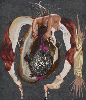
There was also another interesting piece in the same area. Originally from Kenya, Wangechi Mutu created Girl Specimen Series, which consisted of ten pieces of artwork. Like Pentheus, each individual piece connected with each other to form one piece of artwork. In my eyes, I felt like each of these pieces were body parts, but in most of them body parts were included as well. For example, a frame of what appears to be lungs consisted of hands, legs, snakes, and animal skins, which were all interesting. Cut-outs of women in sexual positions were also included as well. There were pearls in some frames, which probably symbolized the fertility of women, thus making the title Girl Specimen Series a logical choice. The description says, “identity has been blown apart, now subject to input and bombardment on every level, from every direction.” This combination of pieces/body parts probably meant that both animals and humans make up of one organism. Below is one out of the ten frames that were in the complete artwork.

One out of the ten frames of artwork

Girl Specimen Series- Wangechi Mutu

Overall, it was an amazing experience. It definitely opened my eyes about museums. I hoped you enjoyed reading this, as I did writing this.