Author Archives: semona

Fuerza Bruta


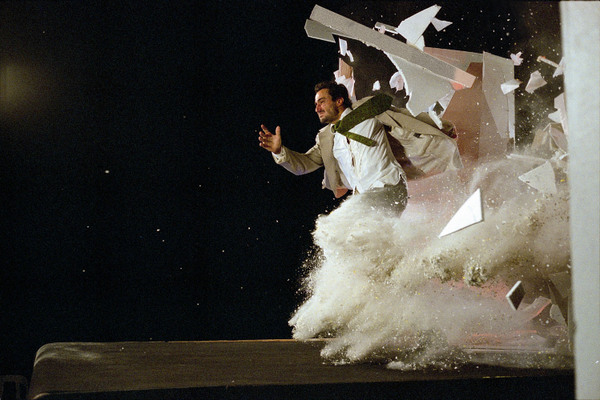
Over Thanksgiving break, my mother and I saw a show called Fuerza Bruta. It was a show that I have never even seen something similar to. First of all there were not seats and the whole show is done while you stand around the moving “stages”. The first stage was a treadmill that used a conveyer belt affect to show the mundane routines of everyday life. Then the staff redirected out attention to the walls and rolled out a foil curtain with dancers hanging from the curtain pole. While we were being told where to look, the treadmill was moved out of the room. Another stage looked like a box and the performers danced inside of that. Fuerza bruta literally translates into brute force. The dancing has a lot of loud bangs and heavy footwork. Nonetheless, it’s unimaginably amazing. I would recommend this show to anybody. If you go, try to get the rush tickets 2 hours before the show because they are much cheaper than the original priced tickets.

Buddha

Seated Buddha Shakyamuni

I went to the Rubin Museum with my art class last week and we went on a tour that described Buddhist art to us. I want to share the iconography I learned about that is seen in all depictions of Buddha. There is always a top knot which is said to hold his curls and it is called a ushnisha. The gem in between his eyebrows is called an urna and it symbolizes his third eye. The positioning of his fingers and hand convey messages and his hand symbols are called mudras. He has elongated earlobes because he used to be a prince and wear heavy earrings. Lastly, his feet are usually crossed and that is called the lotus position. Now you will be able to spot a Buddha before even reading the title of an artwork!

P.S. Baruch students get free admission into the Rubin Museum and its only 15 minutes away from Baruch.

Magritte: The Mystery of the Ordinary at MoMA Review

René Magritte’s exhibition titled “The Mystery of the Ordinary” at MoMA was my favorite exhibition of the semester. I’m really intrigued by surrealist painters and their visions. Salvador Dali was one of Magritte’s largest inspiration and this is see in the artwork. The Menaced Assassin shares a common characteristic of Dali’s paintings, which is the melting affect. The dead body on the read sofa, the black jacket on the chair, the spine of the chair, and elongated legs of the man next to the music player all look like they are very heavy and are being pulled down by something unseen.

The Menaced Assassin

My favorite painting in the exhibition was The Lovers. A man and a woman are exchanging a romantic kiss but with white cloth over their heads. This painting reminds me of a forbidden love that has been exposed. I interpreted the painting like this: Maybe these two lovers were being unfaithful or maybe these two lovers couldn’t be together because of their families. Whatever the reason, they weren’t supposed to be together. Someone exposed them and the white clothes remind me of what is put in people’s heads before they are hung. The man and the woman will be killed because of their forbidden love. Even though death awaits them, their love doesn’t stop. They are sharing a kiss as intimate as it would be without a cloth dividing them.

The Lovers

Another interesting paint was Not to be Reproduced with featured a man looking into a mirror. The mirror give a reflection of the back of his head instead of the front of his head, which is what is supposed to be seen. The mirror gives the proper reflection for the green book in the right corner because the text appears backwards. For some reason this man doesn’t have a face or maybe he just doesn’t want it seen. After all, the title is Not to Be Reproduced for a reason.

Not to Be Reproduced

UPDATE: Beyonce’s video for “Mine” has scenes with lovers coverings their heads with white cloth, like in “The Lovers”. Link for video below.

http://www.hiphopdx.com/index/videos/id.15063/title.beyonce-f-drake-mine-

Complexions Review

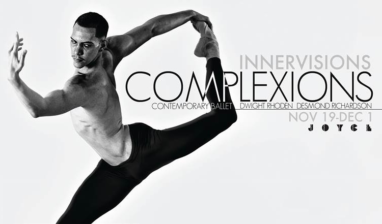
Complexions Contemporary Ballet at Joyce theater showed me a side of ballet I was oblivious to. Instead of appearing soft and delicate, these dancers were stomping their feet and used the dancing techniques we learned about in class. While I found it difficult to follow the storyline of the acts, I was still able to form my interpretations of their dancing.

The dancers wore nude costumes during the first act which I thought symbolized a type of birth. They were revealing themselves to us in this performance. Instead of focusing on the colors or designs of the costumes, I focused on the dancing since the costumes were minimalistic. This scene had a dark atmosphere which I had not previously experienced at a ballet.

I thought the second act had something to do with a heart beating. Everyone was in skeleton costumes and the background music was just one beat being repeated. As the beat sped up, so did the performers. Their bodies also were pulsating in synchronization with the music. It was an innovative way to show the conscious movements, the dancing, of the human body with the subconscious function, the heartbeat, of the human body.

The final act was my favorite because it was dedicated to happiness. The music was had lyrics for the first time in the show and was upbeat. The dancers pranced freely around the stage and wore bright colors to show their cheery mood. There was also a part where they had couples dancing together but I think they would switch partners. I’m not sure if this was supposed to a statement or just a way to create more movement but I interpreted it as a statement. The dancers found joy dancing with each other and interacting.

I was excited to have such great seats. We were so close that I could see the sweat coming off the dancer’s bodies and hear them breathing. I think even seats in the back would’ve been good for this performance. Since it was a group performance, seeing the dance from a distance would allow a better perception of how the group functions and effects each other.
Tosca Review


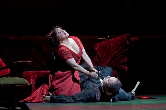
Tosca was the first opera I ever saw and I have mixed feelings about it. We had seats that were close to the stage which kept me paying attention since I could see the actors’ emotions. Following the plot was fairly simple once I remembered to turn on the translations, but I do think it alters the experience. I find that translating art, in this case lyrics, from one language to another changes the meaning. The emotions are lost in translation and English has a lot of filler words which distract from the point. Regardless, at least I was able to follow along with the show.

The sets were really beautiful throughout out the show. The first set was supposed to be the Church of Sant’Andrea della Valle. I thought that the huge painting was a nice visual element to look at since most of the stage was empty. The second set was Scarpia’s apartment which looked just like I envision a classical Italian apartment; lots of reds, dark colors, and a painting. The hidden door on the right side of the stage was really cool since it shown extremely bright when it was open. It was a clever idea to have it look so icy since it was a torture room. The final scene was supposed to be the Battlements of the Castel Sant’ Angelo. The building  on stage gave a realistic depth to the stage. All the set designs were enriching to the context of the play and set the mood for the scenes.

The actors in Tosca were super talented and must be dedicated to their careers. the notes that they are able to reach can only be reached with a lot of practice. Each actor commanded the stage with their voice even though the stage was big enough to swallow them. Tosca has a simple storyline but the delivery of the actors made the show. Although they were a bit overly dramatic for me, it is the opera afterall.

Style is to Fashion what Graffiti is to Art


20131003_204549

Last weekend I went to Urban Outfitters with my friend and while I waited for her to try on clothes, a book caught my attention. The book was called “Street Fashion Photography” by Dyanna Dawson. This book was full of photographs of random New Yorkers that the author/photographer encountered and found interesting because of their outfits. All the participants had a street style that which I can’t really define. Street style can range from sneakers to heels and from Iooking preppy to looking really cool. I think street style is to fashion what graffiti is to art. its that underground movement that changed the common perception.

20131003_204537


Spontaneuous Trip to the Met

hb_50_145_66 hb_50_145_66_av1

I’ve been to the Met many times but every time I go, I see something I hadn’t seen before. This small sculpture of a baby caught my eye because i have a strange obsession with babies and dogs. The marble sculpture is named Sabine Houdon and was made by her father  Jean–Antoine Houdon in 1788. From the intricacies of the carving, the relationship between artist and subject is sensed. The details of Sabine’s softly tousled hair and the gentle folds of skin around her armpits show that the artist knew every detail of her little body.  He understood the fragile skin of an infant and carved the hard marble bust in a way that the viewer can imagine how Sabine’s gentle skin really was. I think it’s a very interesting concept that when you look at something, you can  tell who made it by the details seen.

Fun Home Review

When I found out we were going to watch Fun Home I wasn’t too excited. Audiences watching books turned into movies, plays or musicals are often left unimpressed. I was nervous that Fun Home: The Musical would ruin the great and funny memory I had of Fun Home, the novel. I’m really happy to say… IT DIDN’T! I usually don’t like musicals; I find them corny and exaggerated. But Fun Home was well directed and all the songs added to the storyline instead of just being filler songs. The way the stage rotated was a genius way to transition between time periods of her life. Seeing a comic book played out by a group of talented actors changed my perception of the novel a bit. Looking at humans versus cartoon characters made the words of the story heavy with emotion. While reading the book, I honestly forgot it was based on a true story since it was a comic. I realized just how young Bechdel was when her father was living a secret life and how it must’ve affected her.

The children in the play were so good that they stole the attention away from the adults at times. The disco themed scene where the kids, the gardener, and the parents were singing something was one of the most entreating scenes in the play. It was a great way to lighten the audience’s mood and have a happy scene since the story is a tragicomic after all.

The set design was breathtaking. It made the theater seem much taller and bigger than it was. Allison’s home seemed strangely big for a small family. This may allude to her father’s desire to have a perfect home so people would think the people inside are perfect too. In such a huge home, emotions can get lost and secrets can hide. The family often spent time alone, and when they were together there was tension. When it was just a parent with the children there was a great relationship but when both parents were together, it seemed like they both knew the secret.