Data Visualization Activity #2: Venn Diagramming the Work of the Software Studies Initiative
Our final in-class activity on February 18th was this Venn diagram exercise–basically, an attempt to cull and visualize data from the data visualization projects of the Software Studies Initiative. (How meta!) After taking a look at the Initiative’s Projects page, we divided up the six categories (Social Media; Art and Design; Film, Video, TV, and Motion Graphics; Video Games and Virtual Worlds; Magazines, Newspapers, Books; Comics), and each member of the class chose two projects to examine–one from each of two assigned categories.
In writing this up, it strikes me that the projects of the Software Studies Initiative are organized on this page not by methodology but by the origin of its source content–this may account for the varying results of this exercise.
In any case, the “data” I asked you to cull wasn’t necessarily objective or even numeric–instead, you performed the kind of judgment-of-relevancy we found in Blatt’s article and chose “keywords.” I suggested that you look at both the topic and the methodology of your chosen projects, and the chosen keywords were quite varied as a result. Once you had your data, I asked you to visualize it using a predetermined tool–the Venn diagram. With two options, LucidChart and Visual.ly, you had options for both organization and presentation–though in hindsight I’d say that the power of LucidChart outweighs the ease of Visual.ly.
Given all of the random constraints on the “research” conducted in this activity, it shouldn’t be surprising to see that there is no consistent pattern in the results. Colby’s comparison of YouTube remixes and changes to the Google logo had very little overlap–after reading and examining her post, I’d suggest that there’s only a tiny, tiny, tiny level of connection between the two projects she examined, largely in the arena of visual creativity, and remixing or refining a single idea. It’s the sort of Venn diagram where the two circles are only slightly touching.
-

- Colby

-

- Laura

-

- Kerishma

Laura’s two source projects both came out of Japanese media culture, which may account for the overlap in her Venn diagram–but one of these projects seems to be more about the experience of play (i.e., the literal experience of playing a video game), and the other seems to be about the results of play (the kind of linguistic play found in “scanlation”). I feel like that got a bit lost in translation in the original Venn diagram–that the keywords chosen ended up being so large that they were difficult to explain visually?
Kerishma found overlap only in the way the results of each project were presented (visualization, that is, the primary goal of the Software Studies Initiative to begin with), and saw them as otherwise being disparate, given that one analyzed a single novel and the other over 1100 feature films. Are these datasets so different? I’m not entirely certain. In any case, the difference in breadth of these sources again skewed the results somewhat, leading to keywords that were perhaps difficult to place in productive relation to one another.
When we revisit this project on the 25th, I want to tackle the following questions:
- Did we collect the best data? If not, what data could we collect here instead?
(One idea would be to investigate the size of the data sets for each project category, for example–or the methodologies across a single category, or the visualization choices made for each project–what variables were introduced to each data set, and why?) - Can we create uniform and objective rules for data collection across categories or projects?
- What if we considered overlap not between projects, but between ideas, subjects, or methods? How would the resulting Venn diagrams differ?
- If we can determine a meaningful dataset from the projects of the Software Studies Initiative, what would be a better way of visualizing that dataset?
Come to class next week ready to revisit this project–we’re going to try and figure out a way to improve upon our first attempt!
Data Visualization Activity #1: Wordles
Visualizing word frequency in each thesis draft netted the following results:
-

- Kerishma’s thesis (topic: George R. R. Martin)

-

- Laura’s thesis (topic: Hitchcock and Poe)

-

- Colby’s thesis (topic: David Foster Wallace)

As a second step, we used Wordle to generate data about word frequency in source texts related to each project:
-

- Wallace’s commencement speech at Kenyon College

-

- A chapter from A Game of Thrones

-

- Poe’s “Berenice”

Resources for Week #4: Textual Analysis & Data Visualization

Textual Analysis Ideas
- Open Google Doc (Lindsey’s notes)
Today’s Tools
Reading
- Tooling Up for Digital Humanities (Stanford)
- The Data Journalism Handbook (see especially Chapter 7, “Using Data Visualization to Find Insights in Data”)
- Lev Manovich, “The Algorithms of Our Lives” (The Chronicle of Higher Education, December 2013)
- What is Data in Literary Studies? (Arcade: A Digital Salon; Stanford)
Sample Visualizations & Textual Analysis Projects
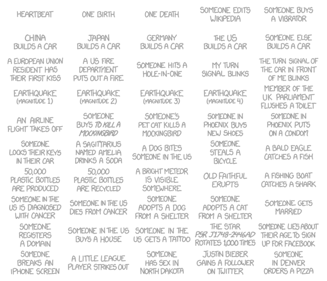
xkcd, “Frequency” (February 2014)
- David McCandless, Information is Beautiful (August 2009–present)
- Stanford University, Mapping the Republic of Letters (February 2011–present)
- Josh Begley: “The Subject of the Dream” (December 2012)
- Dennis Mansker: “Jack Kerouac’s On The Road Interactive Maps” (January 2013? Best guess according to the Wayback Machine)
- Nadav Hochman, Lev Manovich, and Jay Chow: “Phototrails: Instagram Cities” (July 2013)
- Josh Begley: “Empire.is” (December 2013) [see this article on Mashable for more information]
- Kiln, “Flights Interactive” (January 2014) [produced for and hosted by the Guardian]
- Josh Begley: “Metadata+” (February 2014) [watch the video demo, or download to iPhone/iPad from the App Store. Read more about the creator’s effort to get the app approved by Apple.]
- Trevor Paglen: “Overhead” (February 2014) [created in partnership with new awesome/scary mostly NSA-related news site, The Intercept]
- Maya Eilam, Kurt Vonnegut and the Shapes of Stories (February 2014)
Writing Goals for the Next Week

This week’s writing goals
Today we revisited our goal-setting from last week’s class, and set a new round for this week:
- Colby: Outline new outline, start writing second draft (add more on performance, “fill in the gaps”)
- Kerishma: Outline Danaerys section and have most of it written. Mail what’s finished to Dr. U by Friday. Work on edits of previous sections. (Still thinking about audience.)
- Laura: Improve Hitchcock sections, analyze scenes from both films. Meet with Lee to choose section to discuss at NCUR.
- Lindsey: Comment on any drafts that are e-mailed to her; write 7-10 more pages of intro chapter to dissertation
Next week we will set our final round of writing goals. Please remember that if you start to procrastinate or feel anxiety about this process, Jenny and Lindsey are both available via e-mail (and will gladly talk you down off of any metaphorical ledges…). Good luck to all this week!
Class Mural.ly on This Week’s Sociology Reading
This digital mural (made using Mural.ly) had “analog” origins. We first sorted the core ideas of each of this week’s three readings onto notecards…
-

- Hookway (2008)

-

- Marres (2012)

-

- Edwards et al (2013)

…and then mixed it up, building a map of all notecards that looked at where our source material was in alignment:

Notecard Mural (Analog Version)
After we collaborated on our physical web/map/mural, we used Mural.ly to collaborate in real time on a digital version, one that could be enhanced by the addition of related material from across the web.
Resources for Week #3: Digital Ethnography (& Digital Social Research)
Watch
…see more at Mediated Cultures
Read
- Open Google Doc for Week #3
- Lindsey’s Notes on This Week’s Reading
- Inspiration: Projects from the Digital Ethnography Research Centre
- What’s New in Digital and Social Media Research (January 31, 2014)
- Blog of the Digital Labor Working Group
Respond/Create
Writing Goals for the Next Week

Week 2: Setting Writing Goals
Just a reminder! Today we decided on the following writing goals for the next seven days:
- Colby: Edit whole thesis draft, based on Lindsey and Steve’s comments
- Kerishma: Edit thesis draft, write Arya section (possibly write Danaerys section, if time/interest allow)
- Laura: Finish writing Part 1 of thesis, develop main argument for Part 2
- Lindsey: Comment (by Monday) on any drafts that are e-mailed to her by Friday; write 7-10 pages of intro chapter to dissertation
We’ll check in next week to see how this went, and set new goals for the following week.
Notes on Privacy From Today’s Class
Here’s a quick recap (posted on the blog for everyone’s convenience) of today’s discussion of student privacy. This discussion occurred, as I noted in my previous post on the subject, because I read a blog post from Josh Honn this past weekend, and that post made me rethink my own teaching habits.
Everyone said that they were currently comfortable with the public-facing course materials we have created together thus far. We talked about why, and some part of that comfort was due to the fact that all of your thesis projects are on topics that already have a large presence online: Colby’s working on someone whose work is widely disseminated across the web, Kerishma’s writing about a series of books that are basically responsible for half of Tumblr even existing to begin with (sorry, I had to go there!), and Laura’s project is engaging with some perennially popular films and stories. There is a sense of safety in being part of a digital crowd, I think; as I said in class, your projects aren’t likely to come up in the first two million search results on any related keywords. Our privacy concerns might be different, were any of you working on topics that appeared online with less frequency.
We also decided, however, that we will not publish your written thesis projects online in their totality, be that in PDF or as pages of a web site project. That’s partly because we want your written theses to serve as material for digital projects, and partly because it seems to all of us to be a relatively ineffective way to present your content, but it also seems to be where we have drawn a line, in terms of what is acceptably public to us and what isn’t. We should revisit this “digital publication question” when it comes to your presentation materials. I would prefer to include your PowerPoints or Prezis (or whatever else we decide to use) on this site, but we can decide upon that after you’ve actually produced said materials.
We also touched on your own work from earlier Macaulay classes that is still visible on our eportfolio system and/or indexed in Google; the general consensus was that some of the stuff you blogged about in the first two years of college wasn’t material you necessarily wanted to share with a potential employer. I suggested that we look at those instances on a case-by-case basis, in individual meetings that we were already going to have this term. My hope is that we can decide together, in each case, what to leave up and what to take down. But I am sensitive to the thought that who you were when you took your NYC Seminars is not who you are now, or who you intend to be going forward. You are members of one of the first graduating classes to have been using the eportfolio system for your entire time at Macaulay; it’s only natural that your 18-year-old self and your 21- or 22-year-old self don’t perfectly align. Frankly, I’d be worried if they did! But we decided that at least for now, we were proud enough of the work we were doing in this class to stay public–with the caveat that we may change our minds in ten years.
I spoke briefly as well about using this site as a calling card–something I’m consciously showing off to potential employers as I seek a new job. It’s important to me to be upfront with all of you about that, so that you know that your writing may be read by people who are looking at this site out of interest in my teaching career. (Not that I don’t love working with all of you! I totally do. But times change, and so must I…)
Finally, I hope it was clear to everyone that the topic of privacy is not a one-and-done conversation. I would like to revisit this question whenever any of you think it is appropriate. And, in the interest of full disclosure, Josh Honn (writer of the original blog post) was curious to hear what came of our conversation; I am going to point him towards this post. Don’t be afraid to comment if I missed anything, or if you have more ideas!
Recent Comments