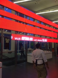
 “Beautiful,” “large,” “amazing” were all words my friends used to describe the Bloomberg building. But when I turned around the corner and saw the building with my own eyes, the only word I could use to describe it was “wow.”
Yesterday, I, along with about 50 other students from CUNY colleges, had the pleasure of going to Bloomberg L.P.’s headquarters on 731 Lexington Ave. for an informative session and a tour.
 Aside from the important information I gained about potential opportunities at Bloomberg and the connections I made during my visit, I learned about how a professional business can use architecture to support its mission.
Similar to how the high stairs at the entrance of the Metropolitan Museum of Art symbolizes that  the artwork and the information in the Museum is exclusive to those who have money, the internal architecture of Bloomberg emphasizes its mission to make dynamic networks of information available. The architecture is almost exclusively white, a color that symbolizes clarity. I
 nformation ranging from current stock price changes to what floor a person is on is made easily noticeable.
Other pictures of the building:

I probably have seen a Picasso before, in one of my many museum trips in grade school and since. But ever since our first IDC class, when Professor Eversley stressed that we will get up close with Picasso paintings in our adventures, I’d been thinking about art more and more. So when we went to the Metropolitan Museum of Art, one thing I really looked forward to (more than the Amie Siegal exhibition, in fact) was getting up close with a Picasso.
Picasso’s La Coiffure (1906) caught my eye for one particular reason. I read on the little museum label that this painting was the result of four different paintings, layered on top of one another. When I looked further into this, I found out that Picasso had painted three finished paintings in one canvas and then rotated the canvas 180 degrees to get this final look. Frankly, this amazed me because at first glance, one would have no idea that this was the case. I feel like this painting was a reflection of Picasso’s determination to display only the best of his work.
You can read a more in-depth explanation of this painting here.

Visiting Tom Smith’s Heavenly Bodies exhibit at the ROX gallery gave me an insight on the life of an artist and how they work. The first thing that captured my attention was the bright colors in almost all his artwork. The colors he used made his paintings stand out from the white walls, making such a stark contrast as if they were glowing, making the atmosphere of the gallery bright and lively. On each side of the wall, there are different sets of artwork, each with a different style. He explained to us how one set of his artwork led him to create the next, building on each style.
This is my favorite piece from the exhibit:

I love the colors used here, the layered effect, and the splattered paint, which all make it very unique. There are painted strips overlapping each other that made me feel like I was looking through window blinds. Tom Smith explained that he cut similar paintings into tiny strips and glued them all together to create the collage. Even he didn’t know exactly how the painting would turn out! I thought that was interesting because I always thought artists had a clear idea of what they were going to create and how it would turn out.
When I first saw his 3-D works, the effects of the carved wood reminded me of a landscape map and the bright red color he used reminded me of fire. This makes sense since he later said that he worked on it in Iceland, where there are a lot of volcanoes.


I also learned from this experience that artists usually take on another job while they work on their art. This makes sense since it’s hard for emerging artists at first.
In conclusion, I’m really glad I was able to visit this exhibit and see the artist, Tom Smith, and learn from him through his experiences.


Recent Comments