The Architecture of Bloomberg L.P.
 “Beautiful,” “large,” “amazing” were all words my friends used to describe the Bloomberg building. But when I turned around the corner and saw the building with my own eyes, the only word I could use to describe it was “wow.”
Yesterday, I, along with about 50 other students from CUNY colleges, had the pleasure of going to Bloomberg L.P.’s headquarters on 731 Lexington Ave. for an informative session and a tour.
 Aside from the important information I gained about potential opportunities at Bloomberg and the connections I made during my visit, I learned about how a professional business can use architecture to support its mission.
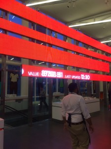
Similar to how the high stairs at the entrance of the Metropolitan Museum of Art symbolizes that  the artwork and the information in the Museum is exclusive to those who have money, the internal architecture of Bloomberg emphasizes its mission to make dynamic networks of information available. The architecture is almost exclusively white, a color that symbolizes clarity. I
 nformation ranging from current stock price changes to what floor a person is on is made easily noticeable.
Other pictures of the building:


Aaron, I definitely understand what you’re saying about the “wealthy, higher class” art that we experience in major institutions such as the Bloomberg building. I agree with you that a major staple of the art is to show the exclusivity that the higher class may experience as opposed to what the average person has access to.
This is just another example of the rich flaunting their wealth. But it is so inspiring and the architectural design is so complex it makes me want to stare at the blue prints for days. This was an interesting tour and way to get some art knowledge out of it as well.