
The following tables come from the NYC Independent Budget Office: “A Statistical Portrait of New York City’s Public School Teachers”. The statistics are based upon 12 years of data.
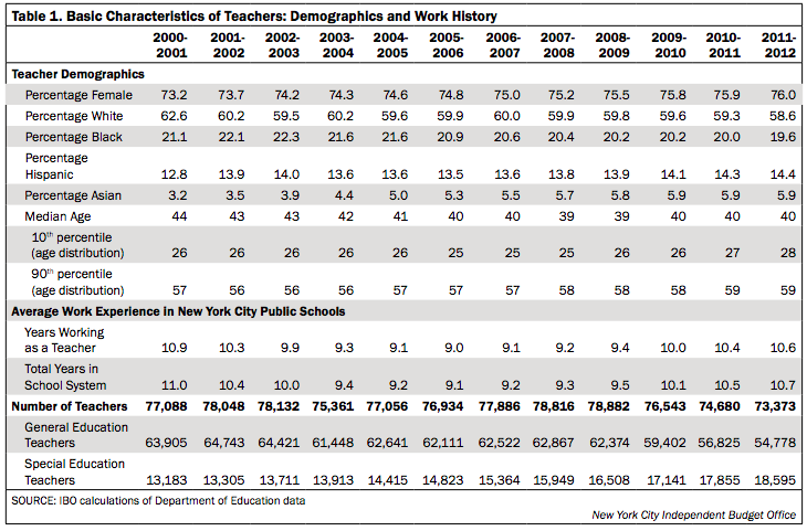
- The female teaching population has steadily increased
- Teachers have became less white and more diverse
- On average, teachers spend 10 years working in NYC public schools
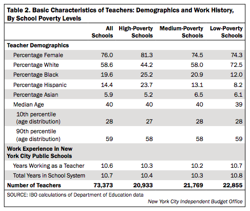
- This chart breaks down the previous statistics and puts it into context of school poverty levels.
- Within high-poverty schools, 81.3% of teachers are female in comparison to the 74.3% female teachers in low-poverty schools.
- High poverty schools have more of a diverse population within the teaching demographic
- Teachers working in low-poverty schools have slightly more experience than their high-poverty counterparts.
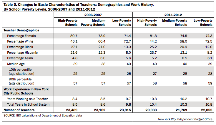
- This chart uses the same information as the previous charts but breaks it down by year.

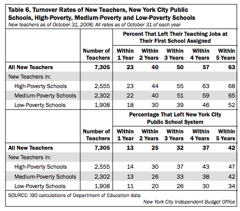
- This chart is particularly interesting because it breaks down the turnover rates based on poverty levels of schools.
- Most teachers don’t leave their school or the NYC public school system within the first year but after two years, the number of teachers leaving nearly doubles within high-poverty and medium-poverty schools.