The Arts in New York City

professor uchizono

Page 10 of 15

Intro and Thesis Post

Paintings from centuries ago, have gained tremendous amounts of praise and attention based on specific elements the artist has incorporated into their work. People come from all over to crowd around the timeless paintings of Monet and Van Gogh hanging on the walls of various museums. Both artists, from different movements in art, have a way of connecting with their audiences through their work. Monet’s “Water Lilies” and Van Gogh’s “The Starry Night” attract hundreds of people each day at the MOMA in New York City. These two landscapes showcase very different styles and periods of artwork yet continue to obtain much fame throughout many years.

Comparison of Two Works at the MoMa by Jerry Sebastian

Re: Jessica Ng

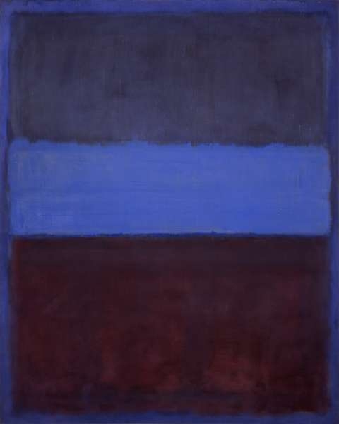
It’s interesting that one painting requires some careful observation before you can understand what it’s depicting, while the other instantly communicates that it’s a painting of some people. Odd to think that two pieces that are very abstract can differ in such a way. Can it be said that Ma Jolie is “more” abstract than Les Demoiselles d’Avignon? What does it mean to be more or less abstract, anyway? I’ve also chosen two abstract works that have differing levels of abstraction – Matisse’s Woman With a Hat and Rothko’s No. 61. Matisse’s work seems much more concrete than Rothko’s, but they both eschew traditional colors in order to express emotion in a more abstract manner.

fancy hat

Woman With a Hat was an example of Fauvism, which stressed bold, unconventional color schemes.

Rothko’s piece is much more extreme in its reliance on color and only color to express emotion. In doing so, it asks, “How much can plain blocks of color, without context, make us feel? Can they make us feel?” Frankly, that’s a question that I’m still not sure how to answer.


No. 61 (Blue and Rust)

What does this image make you feel?


How Do You View the World?: An Analysis of Two Paintings

(So I got really confused about the commenting and posting situation, so I’m writing my blog post portion separately from my comment. I’m in the Blog B group.)

When Nureen and I walked through the MoMA’s collection of Surrealist artwork, the first one that really caught my attention and stuck out to me was Joan Miro’s “The Birth of the World.” Sure, I wanted to see Dali’s work and Magritte’s “The False Mirror,” but they didn’t capture my attention the way Miro’s painting did. I didn’t understand it, but reading the plaque opened my eyes more to what the painting was and what it was about. I still don’t have a very clear idea, but I just found it so fascinating. To be honest, it’s now one of my favorite paintings because there are so many layers to it that I didn’t know about before. The geometric shapes are drawn without context on the large canvas, which was prepared for the purpose of allowing Miro to more effectively display his subconscious thoughts, which characterizes the movement.

I was originally very unsure about which other painting to write about in my essay. Originally, I was going to use Monet’s “Agapanthus,” but I found it difficult to use it to talk about the aspects of Miro’s painting that I wanted to discuss–mainly his use of paint and his depiction/view of the world. I then remembered Georges-Pierre Seurat’s “Evening, Honfleur,” a classic example of his use of pointillism. Though Seurat and Miro had very different painting styles, they used their unique styles to depict their view of the world. Whereas Miro believed in seeing reality through the subconscious mind, Seurat saw the beauty that makes up the world. It isn’t always easy to see the whole picture, but when we do, we see how beautiful it is. Up close, paintings utilizing pointillism look random and incomplete. You can’t tell what you’re looking at because the image is broken up into small pieces. Only from afar can you piece together the image and see the whole picture come together. This has always fascinated me, from the first time I saw a pointillism painting until now. Thus, though the two paintings and artists are very different, I wanted to discuss how they use their styles to show different views of the world.

Jessica Sun (Blog B)

The Birth of the World: http://www.moma.org/collection/works/79321
Evening, Honfleur: http://www.moma.org/collection/works/79333?locale=en

Picasso’s Two Portraits.

Picasso is well known for his abstract paintings from the cubism movement however this is only a small portion of his work. While visiting the MoMA it was clear that Pablo’s geometric abstract portraits and landscapes were extremely different than his other works. I decided to work with two paintings that were both portraits of women. With differing color schemes and compositions each painting depicts the woman in an intriguing way. I thought it was interesting how the two paintings were so different yet both projected this idea of youth and beauty onto the viewer.

In Woman Plaiting Her Hair (1906), Picasso uses a cooling blueish gray background to create a sense of peacefulness. The solitary woman in the center of the piece sits with a sense of longing on her face as she twists her hair. The warm tones of her skin radiate out of the canvas and fill the room in which she is hung. This painting was created during Picasso’s Black Period in which he incorporated a lot of styles from African art into his work. The face of the woman strongly resembles the shape and depth of the popular African masks with the eyes and nose protruding from the rest of the flat face. The face contrasts with the rest of the body. The body is created with many curves that give the the arms, torso and thighs a sense of three dimensional roundness and fullness. In the lower half of the portrait the woman’s legs are wrapped in a sheet. In the sheets creases the viewer can see some geometric shapes, some of which look fairly similar to the shapes that create the Girl with a Mandolin.

The Girl with a Mandolin (1910), is created with a variety of geometric shapes. Many of these shapes have varying highlighting and shadowing points as if many different viewpoints of the same object were brought together. The colors used to paint the body are very similar to the hues used in the background. This flattens the piece, blending the woman into the space behind her. When viewed from up close, it is sometimes difficult to differentiate between the subject and its surrounding areas. If the viewer steps backs and views the piece by trying to unfocus the eyes on particular aspects, the shapes and lines begin to connect. Picasso uses a few curved lines in this piece that contrast the rest of the blocky constructions. In this piece of art, the theme of youth and beauty is portrayed by the use of wavy done-up hair and rounded breasts.

Picasso used a variety of different styles and concepts as he moved through multiple modern art movements. His ability to create such a wide array of works truly shows his incredible talent and imagination. Because his works are so different in composition, there is plenty of contrasting information between pieces.

-Eli McClain

2 Works for Analyisis

The two works I have chosen to analyze for my first paper are Pablo Picasso’s Flowers and Vincent Van Gogh’s Irises. The reason I chose these works and they intrigue me so much as a pair to analyze in this compare and contrast fashion is the fact that they share so many similarities, yet are so different. Van Gogh created Irises in 1889 in southern France, Picasso created Flowers in 1901 in Paris. Both works focus on a small bunch of flowers and share a similar vibrance and depth in color palette. Despite these extensive similarities the works are inherently unique. What happened in the 12 years and few hundred miles between these two artists that led to paintings that are so alike and yet so different? Did the culture of their respective areas influence them? Was it the painters they surrounded themselves with? Or is it possible that Van Goghs impressionism influenced Picasso to reinvent the quintessential painting of flora and fauna in his own style? These questions are ones that I hope to answer in my paper and are the reason that these paintings have entreated me to make them the focus of our first in depth art case study.
Picasso's Flowers
Van Gogh Irises

Analysis of Two Artworks

The two art works I have chosen to analyze are Claude Monet’s “Bridge over a Pond of Water Lilies” and “The Japanese Footbridge”. I chose these two works because I found it interesting that although they are both by the same artist and are supposed to depict the same subject there are so many contrasts between the two. It is easy to see that “Bridge over a Pond of Water Lilies” painted in 1899 exhibits a short and seemingly narrow footbridge over a pond that is flourishing with water lilies. Using many shades of green and different brushstroke techniques Monet fills the background of the painting with many different kinds of trees and shrubbery, almost enclosing the area to give it a more private feel. Monet also mainly sticks to greens, yellows, whites and blues in this work. I found the painting to be very pleasing to the eye and I thought it was exhibiting a serene and beautiful landscape. On the other hand I interpreted “The Japanese Footbridge”, 1920-22, to be more of an angry and confusing painting due to its strong use of warm colors and indeterminate structure. I was first drawn to it because it was so different from Monet’s typically more calming paintings such as his water lily series. Monet’s style, more specifically his brushstroke technique seems to change drastically in the span of twenty years. In this painting Monet loses all attention to detail and rather paints with thicker strokes and in a more fluid manner. It is obvious that “The Japanese Footbridge” requires a more interactive viewing process in order to try and see the scenery in the way Monet saw it at the time. I admit that it was very hard to understand what the painting was trying to illustrate without reading the title at first first. However, once I read it the pieces slowly began to come together and I could make out some resemblances of the footbridge that Monet had painted twenty years earlier.


Ariella Caminero

Art Comparison

The works of art that I have chosen to analyze for my first paper are “Agapanthus” by Claude Monet and “Abstract Portrait of Marcel Duchamp” by Katherine Sophie Drier. I chose these two paintings because of the vastly different ways in which the viewer can perceive the beauty of the respective paintings.The paintings are entirely different even when one first views them, one being very obviously a painted depiction of a beautiful flower, and the other being a painting that makes almost no sense without historical context. The painting by Katherine Sophie Drier requires a more active viewing process because it involves a little bit of contextual understanding as to who Marcel Duchamp was and his impact on the art community. This painting is not as easily appreciated as “Agapanthus” is to the general public. “Agapanthus” is a painting that is very pleasing to the eye itself, without much needed strain or thought about the meaning or context of the situation or subject. “Agapanthus” can be more passively enjoyed by people who are not the most avid art viewers. The painting by Drier is to a certain extent subject to interpretation to the viewer, while the depiction “Agapanthus” is not really up for debate.


Glenn Collaku- Blog A

BLOG A – Monica Huzinec

I have chosen to analyze The Starry Night by Vincent Van Gogh and Water Lilies by Claude Monet. The Starry Night is a timeless classic made up of thick brush strokes and vibrant colors to create a wondrous well known masterpiece. Framed on a small wall at the MOMA, hundreds of different people from all over crowd around just to get the smallest glimpse of the painting. Water Lilies is a huge 3 panel piece of artwork covering an entire wall of the MOMA consisting of light colors and small thick brush strokes. At first glance, the landscapes appear to be polar opposites. However, both are extremely well known. I want to know what makes these two completely different paintings so famous. Which similar qualities do they both possess or what makes them different that people love? Although Van Gogh and Monet come from different time periods, both had such an affect on people with the work they created. I am drawn to the beauty of these paintings and I am curious as to how the artists were able to successfully reach out to their audience. In the reading Barnett says, “such things as the size of the work, the kinds of brush strokes in a painting, and the surface texture of a sculpture – is part of the meaning (52-53)”. My goal while analyzing these two famous paintings is to look deeper into all of the previously stated elements and see how they affect the meaning of what the painter was trying to portray. After the readings of Barnet and Berger I was able to question these elements while looking at the two landscapes. I wasn’t just another person at the MOMA trying to upload a “snapchat” of the work on their Iphone just because it was famous. I was able to stand there and question as to why these people were so drawn to the work and even ask why I was drawn to it.

Screen Shot 2015-09-20 at 4.18.06 PM

Screen Shot 2015-09-20 at 4.17.53 PM

Blog A

One of the works I have chosen to analyze is Picasso’s Ma Jolie. The reason I chose this particular work was because of what happened to my perception the first time I saw it. When I first saw Ma Jolie, I thought it was just a bunch of geometric shapes and lines, with no discernible subject. The portrait was right next to Braque’s Man With a Guitar, which had a very similar style, but which at least hinted at a masculine figure. It took a comment from Eli and a literal step back to realize that Ma Jolie really did have the distinct shape of a female figure. It was almost a stereograph-like effect, in that I suddenly saw something that I couldn’t see before. It was a really cool effect, and I thought that I really wanted to write about this work.

Ma Jolie (Picasso 1914) – Can you see the woman?

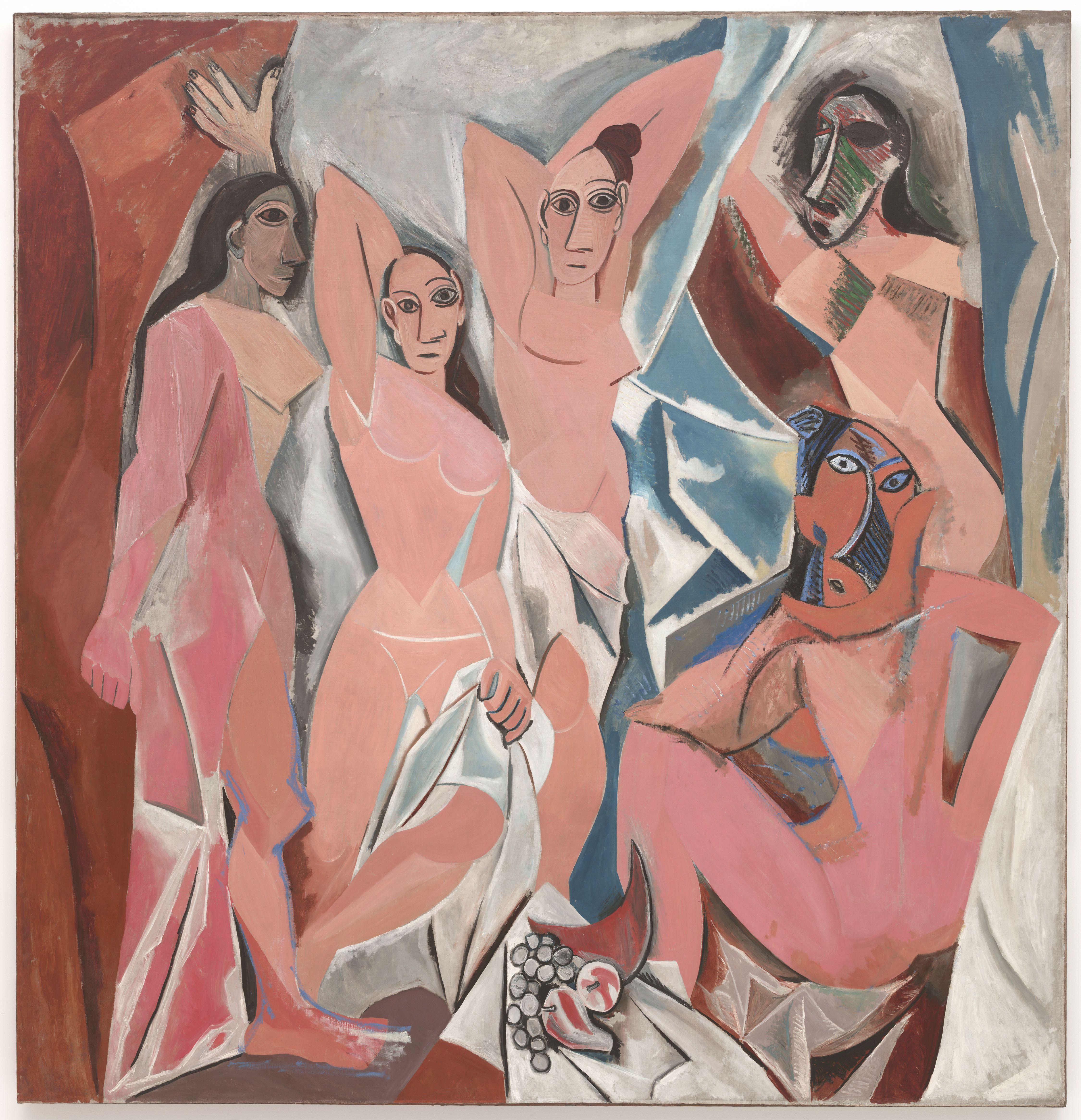
I am considering Picasso’s Les Demoiselles d’Avignon for the second work, although this may change. I would like to see the new Cubism sculpture exhibit as well, and see if there were any pointillism or impressionist paintings I missed. I kind of want to compare Ma Jolie to a pointillism painting, because there are some elements that I feel are surprisingly similar, but I can’t recall a specific one at the moment. I went with Les Demoiselles d’Avignon because it’s one of Picasso’s earlier Cubism works, and you can definitely see similarities in style but it’s also very, very different from Ma Jolie. Also, it’s probably the most famous of the Cubism era, which makes it interesting to pit it against something less well known.

Les Demoiselles d’Avignon (Picasso 1907)

I haven’t really gone back to MOMA since the last post, so if you want to read my thoughts, that’ll be here. I suppose when I go again, I would be thinking more about analysis and historical/outside context, as well as meaning and perceived audiences, that sort of thing. I might go about it by imagining a mental audience in my head with art snobs from different eras. Might be fun.


-Jessica Ng

Two Works for Analysis

The two pieces of work which I have chosen to analyze for my paper would happen to be Leonardo daVinci’s Mona Lisa and Marcel Duchamp’s L.H.O.O.Q. My initial reasoning for choosing these two specific pieces of art are pretty obvious, considering the blatant relationship between the two. I would say to take a look at the Mona Lisa, but it is such a well known piece of art that the image of it has been engraved upon our collective consciousness as a society. It is a famous image of that enigmatic woman, which is seen as beautiful, traditional art. L.H.O.O.Q. is the same picture with a goatee and mustache drawn on and titled with a rude, French pun. To put it simply, I find the latter work pretty funny and am interested in it; when you have to analyze something and write about it, I feel you cannot be bored with it, otherwise those who read your writing will be as bored as you were writing it.
In addition, it’s only fair to mention that comparing the two can lead to interesting ideas being drawn. The Mona Lisa is a timeless and classic work of art, whereas L.H.O.O.Q. was spawned by an art movement meant to spit in the face of traditional ideas of art, or at the very least make people question what it is that we consider to be art. An original and a mockery of it, the accepted and the revolutionary, the Mona Lisa and a postcard with a doodle on top: two pieces that are so aesthetically similar and yet so far apart in meaning.


Mary Yanez

« Older posts Newer posts »