Real Art in New York

I think that the best “art” in New York is not made by people at all. The natural beauty of the world is so much greater than anything that any person can create. I’d much rather take a walk through central park and experience the natural beauty than go into a museum and find works of art made by people trying to copy natural beauty, or specifically not trying to copy natural beauty because they are too “modern” and “progressive” for that kind of thing, and making ugly works of art is considered cooler.

What I think is the best sort of art is when natural beauty and man-made ingenuity come together into a cohesive whole. There’s a reason why the Hanging Gardens of Babylon was considered one of the seven wonders of the world.

I took this picture a few months ago, and I think it beautifully synthesizes the man-made and the natural world.

NY Sunset

NY Sunset

The Future of Media

I can’t believe it, but there is a second article in the December issue of Gameinformer that applies to my the concepts of art that we have talked about before in this class. “I remember how I felt when I first played Final Fantasy VII. I suspect my reaction was not unique–I came out of that game feeling, for the first time, like I’d played a movie. I think that’s the first inkling I had of what was to come, what is still coming. More and more, it seems that traditional lines between entertainment media–film, book, game, song–are bleeding together. I think that video games hold the future of what we might call the “uber-media” form. The combination of all traditional arts into a single experience, mixed with the new art of the 20th century–the art of guided participation.” After reading through this editorial, I was curious as to who wrote it. It’s often that the editorial for the magazine is actually written by one of the staff, presumably because nobody writes in anything worth publishing–if they send in anything at all. However, the level of writing for this editorial seemed higher than normal, so I checked to see who wrote it. Brandon Sanderson wrote it. He is an accomplished author, who is currently in the process of completing the Wheel of Time (one of my favorite book series) after the original author, Robert Jordan, died.

It was extremely interesting to see somebody who works in a different media of art to discuss the merits of video games. Sanderson goes on to reference two other games as examples of “the future of art”. This has been a theme in many of my posts, because I am very intrigued by the evolution of art. While I do not like many of the new forms of art (especially in music), I do respect that they are art. However, I have played a few games that I would call art. They were able to sustain a story that kept me interested in the characters–like a good movie or book–with appropriate music, believable voice acting, and amazing graphics. However, rather than praising these games, they make me look to the future and think how amazing games will be in a few years. As Sanderson says, the “art of guided participation” seems like it is the art of the future. Since I draw, play music, write (both english and music) the possibility of being able to create art that combines all of these different facets of art is very tantalizing.

“What Is It?” “I don’t know…”: De Kooning At MoMA

Discussing Williem de Kooning and seeing the exhibit of his work at the MoMA was my first time ever hearing of and experiencing his work. Overall, I felt that our visit to this exhibit brought our Arts in NYC class full circle, for our first major class outing was to the Jewish Museum to see the Cone Sisters exhibit, featuring works by Picasso and Matisse. While looking at the de Kooning exhibit, I couldn’t help but feel that I had seen these paintings before. I soon realized that I was comparing them to my memories of the Picasso and Matisse paintings we saw at the Jewish museum.

If I had to describe de Kooning’s paintings in this light, I would say that he takes Picasso and Matisse to the next level. Like Picasso, de Kooning did do lots of pantings depicting the female form, and like the both of them, de Kooning is definitely an abstract artist. Of the three of them, however, de Kooning is clearly the “craziest” – he takes the Picasso woman and the Matisse bold colors and swathes his women (and other subjects, still life and all) in a practically unintelligible swirl of scribbles. That’s just the thing: is it unintelligible, or is it supposed to have a hidden message? Walking through the exhibits, my colleagues and I would look at particularly “messy” paintings- those covered in scribbles as opposed to his cleaner, later works – and we would try to find the “subject”, particularly for the Untitled works. We found an assortment of faces, animals, phallic symbols, etc., but looking at these paintings was like looking at clouds in the sky: these pantings literally can have anything and everything in them. A lot of the time, de Kooning doesn’t say what is supposed to be seen in these paintings- even the clearly titled ones seem misleading – so you are left doubting whether your interpretation is “on the right track” or not.

While I usually like to try the meaning in all art, while walking through this exhibit I felt that a lot of de Kooning’s work appeared to be “art for art’s sake.” It seems to be a dirty word in the art world, but as an artist myself I find that I often don’t think of the “intention” or “message” of my work. A lot of the time, I just sing or write, and I’m not trying to make sure my audience sees a certain thing. In this sense, de Kooning’s work is very freeing. If you can believe that he wants you to interpret the art your way, you’ll have no trouble letting your mind roam, as freely as say, his piece Merritt Parkway. 

Underground Moving Art

On Saturday, December 10, 2011, on my commute over to the American Museum of Natural History, my peers and I were lucky enough to come across a vintage train running on the F line. We were on the E train when we got off on the 53rd and Lexington Avenue stop, when we came across the green, vintage train going the direction we came from. It did not stop us from spontaneously running across the track and getting on the train, despite the direction it was heading towards.

Every year, the MTA expresses its spirit during the holiday season by releasing 1930s trains during the holiday season, every Saturday in December!

The train interior had a very 1930s feel. The seats were some sort of straw-like material that was ironically firm, but cushioned. The seats, themselves, were only wide enough to sit three people at their max. The doors read “Keep Hands Away From Doors,” which I found really funny because I pictured someone getting their hand getting chopped off if their hands did manage to get stuck (sorry for the gruesome image). If you looked up you would see a clean column of ceiling fans along the train cars, which you have to admit, is pretty awesome. The thought of having fans to circulate the air in the hot summer days inside the New York City subway system is pretty refreshing, being that not all current trains are consistently air conditioned. The windows were also allowed to be opened more than today’s trains!

However, out of all the cool features that the 30s train had, the advertisements were the most fascinating, for me. From used cars and cigarettes to Coca-Cola and Gerber, the variety of the ads are astounding for the confined space they had to be placed in. I would like to estimate and say there were about 30 different ads on one side of a train car whereas today, are ads are enlarged and reproduced in the same train. I like how most of the advertisements were colorful and drawn rather than a collection of photographs; it almost seems like ads were subtler and simpler.The little catch phrases like ” Say ‘Luckies’ are less irritating” and “You can’t have my number fella if you’ve dull white teeth!” within the advertisements were really cool to see because they were so authentic to the time period, which makes them all the more interesting. In the end, it was a great experience seeing the artwork of the 1930. It was interesting to see how advertisements have changed since then. I’m so excited to visit the New York Transit Museum again after that experience because it reminded of how much we can learn about our history in the art that is found in places we see as “everyday,” like trains, for example. Make sure to catch one of these vintage trains. Find out when and where here!


Cultural Sensitivities and Art

Recently, I came across an article describing an interesting design for two towers connected by what would be meant to look like a pixelated cloud. In this “cloud” would be public gardens, a pool, and other services for the two buildings. The idea sounded fantastic until I saw a picture of the design. It looks almost exactly like the twin towers being hit by planes on on 9/11.

Despite the fact that the designers are based in the Netherlands and the towers are to be built in South Korea, these designs have caused quite a stir. The designers have come out with an apology to those who are made uncomfortable by the towers, but they have no intention to prevent it’s construction. Which raises an interesting question: Should artists and designers be constantly worried about cultural associations that may arise from their art?

On the one hand, 9/11 was a very big deal. The entire world has heard of it and even now, 10 years later, the wounds are still fresh in our minds. But neither the Netherlands nor South Korea have any particular connection to 9/11, and the connection of their towers to the attack would not be made. It’s a really nice design and concept if you don’t have those terrible associations. Does it make sense that they should sensor their work because it has bad connotations in other contexts?

This isn’t the first time that cultural contexts has been a problem for artists. For example, the swastika was an ancient east-asian symbol of good luck before it was used by the Nazis in World War II. Because of this, no one thought it would be a problem to have the symbol on a Pokemon card back in 1999. Pokemon didn’t just stay in Asia, and in fact became very popular in the US. The card incited a major stir, causing Nintendo to discontinue that card in America, noting that what was acceptable in one culture may not be acceptable in another. In 2002, a similar incident occurred with toy pandas that came with christmas cookies. The Chinese oriented company meant no harm and immediately apologized for their cultural mistake.

You can read a bit more about the towers and it’s controversy here.

New York by Gehry

There are very few architects that create real art through the design of their buildings.

Frank Gehry is definitely one of the few.

Most New Yorkers know him for his design of the spiraling Guggenheim Museum structure, but he recently completed the tallest residential tower in the Americas. The project is entitled New York by Gehry.

As a unique take on the developing genre of the high rise residence, its undulating facade has virtually guaranteed it a place among the great classics of architecture.The Pantheon has nothing on this stuff.

I hear the lobby is the nicest in the city. Someone should tell the OWSers.

Shane Truly Understands Art

I can truly respect the idea of merging art and science together. I love the idea! In our Arts Seminar, we are always discussing art that makes us think, so if science can’t make that happen, I’m not sure what can!

Shane Hope has created a hollogram-like experience with photographs that presents them as three-dimensional objects. On a wall within the gallery, there is a grid of 160 squares that are all a part of this intricate machine. In addition, there are homemade machines in the gallery called RepRaps. These machines are on wheels, and they produce three-dimensional representations of objects scanned by it. Basically (which is a poor word choice, considering the perplexing complexity of these machines), these machines are all assembled by the same parts and one machine could potentially be turned into one of the other ones in a “Matrix” style. His exhibition is called “Transubstrational: as a Smart Matter of Nanofacture,” which clearly doesn’t hide its inclusion of technology in this artsy experience.

Since the piece can be assembled in many different ways, it requires human interaction in a certain way, which adds an entirely new side to art in my opinion. I think that he really has a unique experience to offer (and not just because his name is Shane) in that when you look and analyze each piece, it teases one side of the brain that’s saying, “This piece is technically the same as the other one, because it’s composed of the same pieces.”  Honestly, I would demand a demonstration, because quite frankly, I’d have a hard time grasping the idea when it’s right in front of me.

I believe that the moment we start to incorporate technology and new inventions into art, it’s a clear sign that art is moving forward and in sync with interests of the current decade. Notice how the word “growth” wasn’t used here, because I would argue that it may not necessarily be growth, as we talked about in class. However, I would argue that art has to keep the general public’s interest, just like other forms of art. I think artists like Shane encourage others to push the limits even further.


A Desire for Game Changers

Throughout the year we have been discussing the intersection of money, politics, and art. We have observed giant, expensive spectacles without much political influence, as well as smaller, cheaper expressions of political perspectives. It’s taken us all around the different styles of art and the different people who make it.

This article tries to look at the year in art through the same lens. The author observes how, despite the larger amount of galleries and shows than there were before, it has become more of a rehash of old trends and spectacle than it is an expressive medium. People want to cash in on older ideas instead of trying new things or making a statement. He points out that there were still some great things to come out of this year, including the Islamic art exhibit and the de Kooning retrospective (both mentioned in the article). But they were few and far between, while most of the quality was mediocre at best.

What this article really praises is the combination of art and politics, praising the Occupy Wall Street movement for producing deep, thought provoking art without the monetary ambitions of most of todays artists. The article also mentions two galleries, “Bye Bye Kitty!!! Between Heaven and Hell in Contemporary Japanese Art” and “Ostalgia”, which were all about the political and social issues that the art was addressing. Though the technical techniques were nowhere near as advanced as those of a modern artist, the expressiveness and point-fulness of the art is what makes it what it is. It requires no spectacle and impressiveness to be excellent. It finds that within the art itself.

Over the year, I’ve started to appreciate this idea a lot more. Like John Cage’s 4’33, the message and poignancy of the art can be more impressive and more important that the means used to create it. It is important to appreciate, not just what makes up the art, but what the art is.

the Art of Light—A Building Transforms to A Pinball Machine in A Second.

I would not have discovered so many interesting art stuff if I did not come to Macaulay and take Art Seminar in Queens College. I feel thankful to this program because it exposes me to so many amazing art and brings me the great experiences that I could never have imagined; it also motivates me to discover art news in the Internet.

I find a interesting news about the huge pinball game which is projected onto the facade of a building. During the Festival of Lights 2011 in Lyons, France, “Carol Martin and Thibaut Berbezier, who form the experimental art collective CT light, made the installation, called “Urban Flipper” which create the projection. It utilizes every single element of the exterior of the the building of Celestins Theater and presents these elements as the obstacles of the pinball game. It allows the onlookers the opportunity to play the most spectacular pinball game in the world. That is really stunning; I wish I could have been there and play it or at least witness it.

When I saw the video for the first time, I was astonished; I was thinking that how could this be possible. But, Martin and Berbezier  just made it; their imagination is incredible. This is a great combination of art of light and game. The art of light seems like is developing and progressing rapidly. A couple of months before, I read the news about the Ground Zero Ceremony during which the the twin towers were “rebuilt” in the form of two straight blue light, which also amazed me. Usually, we only see light as an element accompanied to the performance on the stage, but now we see more and more light performance which is displayed independently. The magic of light, I believe, will continue to entrance us.

Just recall what I have written before about the art of firework, I feel that, today, multifarious arts are swarming throughout the world. Art is not restricted to paintings, sculpture, music, dance anymore; it has developed into new dimensions and it is absorbing more elements that will bring us more novel experiences.

Doesn’t that look familiar? The 3 Davids

One of my most favorite things about this class is my recently developed knowledge of history’s art and my new ability to make connections between pieces across time periods. When I recently visited the Met, I found myself experiencing this very feature. On display in the European Sculpture and Decorative Arts exhibit is an exquisite oil-gilded statue of David titled David with the Head of Goliath. Sculpted out of bronze by Italian artist Bartolomeo Bellano in the 15th century, the sculpture immediately made me think of Donatello’s famously bronze David (1425-1429). I was pleased to learn that Bellano was indeed one of Donatello’s disciples. Looking at the two together it is evident that Donatello set the path for Bellano’s later sculpture.

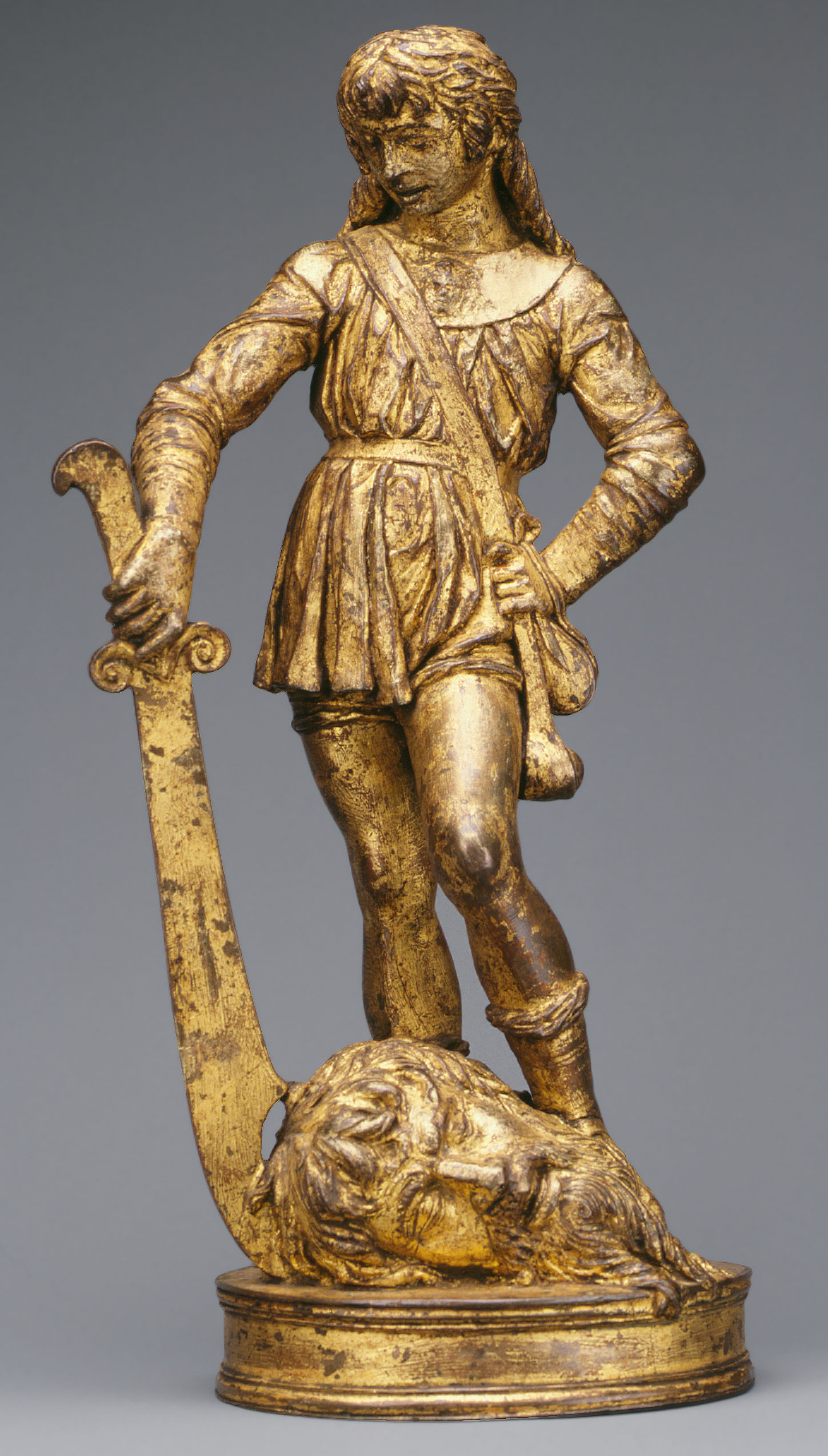
Bellano's David, David with the Head of Goliath, (1470–80)

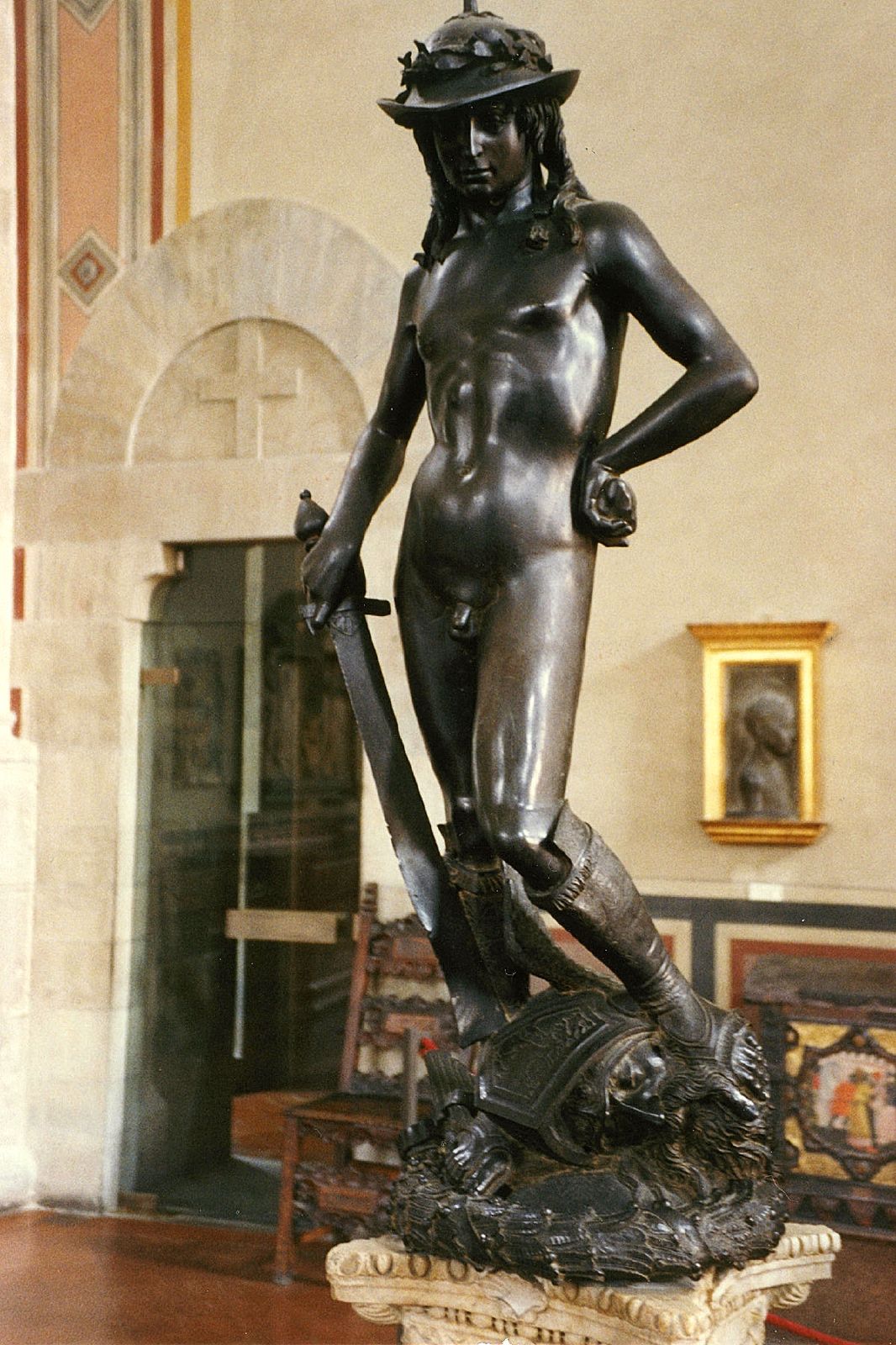
Donatello's David, David1425 -1429


But Donatello and Bellano are certainly not the only artists who have attempted to depict David. Michelangelo and Bernini, amongst others, created magnificent portrayals of the biblical figure. What is interesting to learn, though, is the effect of each artists’ respective time periods on their depictions. Looking into these artists’ history explains some very important aspects of their work.

Italy was flourishing in the 15th century. As the Italian Renaissance continued to shape the culture of Florence, much of the art produced was commissioned by the civil government, courts, and wealthy individuals, most notably the Medici family. Around 1430, Cosimo de’ Medici commissioned Donatello’s David. The first freestanding nude sculpture since classical antiquity, David is evidence of Donatello’s revival of ancient Greece and Rome’s love and respect for the body. The Middle Ages was a period when the focus was on G-d and the soul, so artists rarely represented the nude. David’s contrapposto position, originated by the ancient Greeks, gives the sculpture a sense of movement, unlike the stance of the traditional male figure. David’s right leg is pushed up, causing the wing of Goliath’s helmet to ride up his left thigh. The beginnings of Humanism are apparent, as Donatello forms David’s body with his pioneered shallow relief technique. Donatello’s choice of bronze, the nudity, and contrapposto pose emulate the Humanist antique.

Donatello’s novel young figure of David embodies the ideals and concerns of 15th century Italy. At about five feet tall, David symbolized the Republic of Florence. Donatello stressed David’s victory as a sole result of G-d’s influence; David’s youth, slender physique, boyish expression, and rock in his left hand portray the slaying of Goliath as a direct result of Divine Intervention. The Florentine people saw their success in defeating their enemy, the Duke of Milan, in the early 15th century as the hand of G-d. Florence was a mercantile republic, as opposed to Milan, which was a military power and autocracy. David became the symbol of the Florentine Republic and peace, while Goliath took on the role as the Duke of Milan.

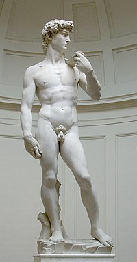
Michelangelo's David, David, 1504

At the height of Humanism in the High Renaissance, Michelangelo created his David. Michelangelo’s David  differed from Donatello’s in its adolescent physique and absence of Goliath’s head. David’s marble face, tense and ready for combat, bulging veins in his right hand, yet contrapposto pose suggest that David is portrayed after he has made the decision to fight Goliath, yet before the battle has actually begun. David’s  serenity of conscious choice prior to dangerous action is consistent with Renaissance ideals.

Michelangelo’s David embodies the fully developed Renaissance idea that man is G-d like because he is created in G-d’s image. David’s perfectly chiseled tendons and uninterrupted contour depict strength and wrath, Florence’s two most important virtues, as it had just cast the ruling of the Medici family. The Florentine people immediately identified with the colossal David as a shrewd hero over superior enemies.

Bernini's David, David, 1623-1624

Bernini's David, David, 1623-1624

There is no time for contemplation in Bernini’s David. Actively fighting Goliath, this David challenges the conventions of time and space. Michelangelo and Donatello’s Davids are serene and pensive; Bernini captures David in his moment of action. The path to G-d during the Renaissance was through the mind; Michelangelo and Donatello’s Davids ask the viewer the contemplate the beauty of man, G-d’s greatest creation, which will lead the viewer to an understanding of G-d. However, in the Baroque era, the path to G-d was more direct, emotional, and bodily. Baroque art dares its viewers to relate to the image in our bodies, not just our minds. Bernini’s David is actively involved in its surrounding space.  The viewer must walk around it on all sides to experience its full effect. David’s toes literally step of the plinth. The contour of his body is crossed by his twisting cloth, the line of his neck, his bending arm, and the sling across his chest, heightening the spiraling of his body. Bernini forms David like a wound spring, while paying attention to the realism of the body. The visual tension creates deep shadows and intense illumination, typical of Baroque style.

Nowadays, we tend to think that art is only good if it is new and innovative. But these artists attest to the timeless artistic practice of learning from others and perfecting their work.

Art’s Progress is in its Process

As a final reflection, I’ve decided that as our Arts in New York City Seminar explored the arts and subsequently, current events, both political and cultural, we’ve learned that the process of an artist is just as important as the final product. Arguably, innovation as an artist is not easy, and even much harder than it used to be. There are claims that everything has been done before. The box has been filled. So, the contemporary artists who maintain vision learn to work outside the already filled box.

I saw a pattern in the art that we looked at and experienced as a class; much of contemporary art seeks significance in the process of creating it. Many artists claim that the importance and value of their piece is during the creation and rendering of it instead of the final product. I believe that aesthetic is not as stressed as it once was and as artists are testing new boundaries on abstraction and unconventionality, art has more than a surface meaning.

To name some examples, Pontus Lidberg’s Faune, which we saw at Fall For Dance wasn’t something I liked at first. It wasn’t conventional and it wasn’t easy to understand. Traditionally, we tend to like things that are easy to understand because the unknown is frustrating especially if we can’t wrap our minds around it. But, innovative artists want to show that art is not easy. That it attempts to explain what we cannot understand and that there is more to it than its presentation or end product. Another example is Aaron Young’s Greeting Card which possessed the ‘wow factor’. Young’s piece proved innovative because of the display of its process. The end product wouldn’t have proven valuable if emphasis wasn’t placed on the process. Contemporary art has proven that there certainly is more than what meets the eye.

Polish Art – The Forgotten Culture

This Art in New York City semester exposed me to many different types of art that were worth taking the time out to see and study, however, once again I’m disappointed that my culture was forgotten. Students constantly study Italian and American art, sometimes even art from other cultures such as that of the Islamic lands. But, what about Polish art, why is it constantly overlooked? Art historian, Andrzej Szczerski, tells us that Poland “had an extremely difficult history, but its been fertile ground for culture, even under communism, when it flourished illegally”, and he’s correct in saying so. Poland is definitely making its way into the art scene.

We can see many examples of Poland’s recent art success through various artists, venues, and works of art. Famous Polish artists include Miroslaw Balka, Wilhelm Sasnal, Marcin Maciejowski, and Edward Krasinski and famous Polish art venues include the Zacheta National Gallery and the Ujazdowski Castle. My favorite among those listed would have to be Balka for his exhibition The Unilever Series. His “box of darkness” may creep some individuals out but it is well suited to my liking. The experience of the visitors of the exhibit having to trust the organization representing the traveling immigrants and their journey is, to say the least, mind-blowing. Other aspects of the exhibit represent other historical occurrences in Poland’s history, such as the trucks that took Jews away to the camps of Treblinka or Auschwitz. Personally, I find art like his, art that is interactive and representative, much more interesting and worth visiting than some of the pop art that is so widely known in our times. Perhaps, that is only my opinion. Why don’t you check it out for yourself?

http://www.artnews.com/2011/09/27/hidden-no-more/
http://www.tate.org.uk/modern/exhibitions/unilevermiroslawbalka/default.shtm

“Unexpected twists and thought-provoking turns”

For as long as we can remember, women have been fighting for equality with men, and although women seem to have achieved a lot within the past decades, it is definitely not enough to stop.  Perhaps we won’t start a new movement or create protests in the streets, but we will create art and share it.

Sanja Ivekovic has believed in the idea of promoting female equality through art for a long time and her works, now being displayed at the Museum of Modern Art, are a retrospective covering over 35 years.  Her work is being referred to as full of “unexpected twists and thought-provoking turns” because it is saturated with shocking images that create an unforgettable message of the importance of women’s rights.

Sanja Ivekovic's “Women's House (Sunglasses),” from 2004.

For example, Ivekovic’s most recent works focus on violence against women.  “Women’s House (Sunglasses),” which is a continuing work, combines images of beautiful fashion models wearing sunglasses with short, first-person accounts from abused women who often wear sunglasses to cover their bruises.  The images are unforgettable.  Similarly, for the “Paper Women” series (1976-77) Ivekovic took images of models from magazines and scratched, tore and defaced them in shockingly effective ways, in order to imply acts of violence.

Sanja Ivekovic's works at the Museum of Modern Art include “Lady Rosa of Luxembourg,” (2001).

The biggest, most overpowering piece of them all is “Lady Rosa of Luxembourg,” a sculpture in the MoMA’s atrium that consists of a life size statue of a pregnant Greek goddess displayed atop an obelisk.  At the base is a “jarring combination of epithets and historic catchphrases (Whore, Kitsch, La Résistance).”  It was initially exhibited in Luxembourg in 2001 fairly close to a similar statue that was “unpregnant,” therefore it created a lot of anger, arguably taking away from its purpose of increasing awareness of abuse of women and children.  Its efforts, nonetheless, are extremely vital in our society.  Female equality cannot be forgotten– so go see the exhibit…

… and check out this article to learn more:  Venus Rising From Her Pretty Prison.

A Macy*s Christmas

Has anyone realized how powerful Macy’s Inc. is? It wasn’t until recently, when I wrote a six-page paper on the Macy’s Thanksgiving Day Parade (I still don’t know how I got six pages out of that one), that I understood the power Macy’s has on the economic prosperity New York City. Granted, it’s been at it for a long time. However, just the Thanksgiving Day Parade alone shows how powerful it is; millions of people around the world tune in to watch the Thanksgiving Day Parade every year. The message of the parade is to celebrate the history of America and blah, blah, blah… No one is being fooled; every one knows that the Parade exists to start the shopping season… I mean, the “holiday” season. So, what does this have to do with art?

Let’s use the example of the famous Macy’s holiday window displays. People from around the world visit New York City during the holiday season to see/visit the Rockefeller Tree, Times Square, and Macy’s in Herald Square, “the largest store in the world”.  And this is where they’ll find Macy’s holiday lane and the renowned window displays that take approximately half a year to create and fully develop. In this article you learn the steps taken to create these intricately beautiful and “jolly” displays. They are meant to tell a story within six windows (this year it is, “Yes, Virginia…”). More than 7000 people pass by them a day, during the peak of the season!  This form of artwork requires 14 paper artisans, 4 carpenters, 6 electricians, and the designers. If it weren’t for Macy’s these displays wouldn’t be as popular; if they weren’t in the famous Macy’s at Herald Square, this beautiful form of art wouldn’t be regarded with such high esteem. It’s interesting to see how a department can do so much for New York City and the artwork within it, even if it’s just holiday display.

New Renaissance Exhibit at the Met

The Metropolitan Museum of Art is opening a new Renaissance exhibit this coming Wednesday. It will hold 160 different pieces and promises to be quite unique. Keith Christiansen, chairman of European paintings at the Met, says that one of the most unique things about this exhibit will be the sculptures, which will be placed in the center of the room as oppose to against the wall so that viewers can  get a good look at the very fine details from every angle. Many of the details in the sculptures have gone unnoticed for centuries.

Mr. Christiansen also said that “the 15th century is the first great century of portraits”. Before this time period,  it was only aristocrats or royalty who had them, and most were made for tombs. (This could very well be where Frans Haals got the idea to start painting for the upper-middle class.) Mr. Christiansen also said that these portraits experiment with “portraiture, and the age-old notion of identity. This is the foundation on which European portraiture is based.” Paintings and sculptures from masters like Donatello, Filipo, Lippi, Boticelli, Mantegna, and Bellini will be displayed, among other artists.


Our class this year has talked about the relationship between society and the arts. It seems that this exhibit at the Met will do a similar thing. They will try to give the viewers a functional understanding of not only 15th Century European Renaissance art, but also an understanding of European society and culture through paintings, sculptures, and other artifacts from that time period. Together, it can possibly tell a good deal more about European Renaissance history than a standard textbook. And it’s a lot more interactive.

A link to the article about the exhibit can be found here.