Chicago: Up to Par?

On my birthday weekend, my friends treated me to the long-running Broadway musical, Chicago. Having grown up listening to the soundtrack and watching the movie consistently, I found that the live version had both ups and downs of course, as most live shows do.

As a start, I was blown away by the live band! Now, I’m no musical expert, but my good friend, Melaina, is a musical performance major with a wonderful reputation as a horn player, and she assured me that the it was phenomenal. The trumpet sounded identical to the soundtrack, which is actually a huge compliment, because an album is thought of to be perfected by a sound studio. Another aspect that I enjoyed from the band is its interaction with the cast. The unique placement of the band in the center of the stage showed how important the big band style music is to the show. When a character entered, he or she would gesture or make a witty comment to the conductor. And it didn’t end there. The conductor was given lines in the play! If you’re familiar with Chicago, you know there is a voice that introduces each musical number, and on stage, it wasn’t the same voice every time. I thought this was an interesting decision, because it’s a fun risk that paid off.

One of the main downs for me was the choreography. For a production with such lively and flashy music, costumes, and characters, I was expecting some outstanding dance moves. However, as much as I still enjoyed what was there, none of it really blew me away. I felt that the majority of it was too subtle of movements. It doesn’t go unnoticed though that the stage space was limited due to the band.

Not that it’s my place to say (although one day, it would be great), I feel that the band could have been placed in a different spot on stage, while maintaining the center of attention. This way, there is more space for some eye-catching choreography that will help bring the “BAM” factor that Chicago deserves. A show-stopping number will help guarantee a memorable musical.


Shane Truly Understands Art

I can truly respect the idea of merging art and science together. I love the idea! In our Arts Seminar, we are always discussing art that makes us think, so if science can’t make that happen, I’m not sure what can!

Shane Hope has created a hollogram-like experience with photographs that presents them as three-dimensional objects. On a wall within the gallery, there is a grid of 160 squares that are all a part of this intricate machine. In addition, there are homemade machines in the gallery called RepRaps. These machines are on wheels, and they produce three-dimensional representations of objects scanned by it. Basically (which is a poor word choice, considering the perplexing complexity of these machines), these machines are all assembled by the same parts and one machine could potentially be turned into one of the other ones in a “Matrix” style. His exhibition is called “Transubstrational: as a Smart Matter of Nanofacture,” which clearly doesn’t hide its inclusion of technology in this artsy experience.

Since the piece can be assembled in many different ways, it requires human interaction in a certain way, which adds an entirely new side to art in my opinion. I think that he really has a unique experience to offer (and not just because his name is Shane) in that when you look and analyze each piece, it teases one side of the brain that’s saying, “This piece is technically the same as the other one, because it’s composed of the same pieces.”  Honestly, I would demand a demonstration, because quite frankly, I’d have a hard time grasping the idea when it’s right in front of me.

I believe that the moment we start to incorporate technology and new inventions into art, it’s a clear sign that art is moving forward and in sync with interests of the current decade. Notice how the word “growth” wasn’t used here, because I would argue that it may not necessarily be growth, as we talked about in class. However, I would argue that art has to keep the general public’s interest, just like other forms of art. I think artists like Shane encourage others to push the limits even further.


The Unfortunate Closing of a Historical Art Gallery

Knoedler & Co., in the upper east side, announced suddenly this week on Wednesday that it will be closing down due to financial shakiness from the recession and troublesome economy. It’s unfortunate that this gallery is no longer open, because it has quite an interesting history. It opened its doors 165 years ago at a time when major museums and galleries were not prevalent in New York CIty. Not only did it become filled with significant artwork, but also it inspired the tastes and styles of homes here in New York. However, it’s not surprising to me that the corrupt business world may have played a significant role in the shut-down of Knoedler. Apparently, one day before the closing, Knoedler was sued by a man in London for selling him a possibly forged work of art for 17 million dollars! Now was this shut-down a response to this act? I’d vote “yes,” but it’s definitely too early to be making those kinds of calls at this point.

It’s too soon to know what will happen to the valuable art pieces, photographs, letters, etc., but it is a major concern, because these are pieces that date back as far as 1863. The Knoedler Gallery has occupied many homes in the past (somewhere around 13) and has helped shape the American art world. Therefore, it’s relevant to everything we’ve studied and analyzed in our Arts Seminar Class, because art may not have developed the way it has if early art galleries in New York had not progressed and persevered through hard economic times just as Knoedler has. The article I’ve provided contains more on the details of the close, but I just want to inform everyone of the significant shut down of a well-known and much-appreciated art gallery. I only wish I had gotten a chance to visit!


Martin Boyce Wins Turner Prize!

Beating out sculptor Karla Black, Martin Boyce was awarded the Turner Prize for the entry of his piece, “Do Words Gave Voices.” Apparently, the piece is an interior space that he designed with geometric, aluminum leaves on trees all around a long desk. I’ll get back to the design in a moment, but I want to take this time to discuss the award itself. It’s a fairly new award; it was started in 1984 by the landscape artist, J.M.W. Turner, who it was clearly named after. I’ve been thinking about the meaning of this award. I’m sure it was created to encourage the innovation and creativity in the art world, but I’m wondering how they decide what is the most “creative.” I’m sure there are many requirements that need to be checked off as a work is analyzed, but this is often my problem with the analysis of art. It’s simply a matter of opinion. It’s just left up to the judges that are “experienced” in art to judge and make the final decision.

Now, I’d like to offer my two cents on his work of art as an interior designer to be (as if I’m as qualified as the prestigious set of  judges). First of all, I’d have to establish which area of art I’m critiquing; clearly, this contest is for modern artist with abstract creations. I appreciated his work from the picture that I was able to view online, but I wish I had more angles to see from. Judging from what I saw, it came off very clean and thought out. However, in judging such abstract art like this, I feel that the story behind it is almost more important than the actual art, because anyone can technically throw some geometric shapes in a room. I feel that when something is thought out and executed well abstractly, it deserves some recognition! In the art world however, an artist’s recognition should be awarded with money so that the artist can proceed in his work. The average starving artist still has to pay the bills in order to maintain the innovation for art’s future. So I say “Congratulations!” to Martin Boyce, and I’ll support his work to come… if I approve of course! Just kidding. Click on the picture to view the article!


MOMA Goodness, DeKooning had Quite the Transformation

From the beginning, I knew it was going to be a great MOMA trip for me when I read that DeKooning created his paintings as decor for interiors, because I’m always looking for a stylish piece of art to cover a wall! However, while it is true that I was interested in the interior design aspect, this also allowed me to appreciate DeKooning’s transformation from that time to his future as an artist  even more so, because it inspired me and my future as an artist of sorts.

The first thing I noticed when I walked into any room of his gallery is the color schemes that he used. Each painting had its own story going on just through color alone! Clearly, they had much more to offer, but the fact that the color had such an immediate effect sets the scene for the other elements perfectly. It also helped that I checked out the telephone-like device that speaks to you about the piece that you are viewing, because I was able to really analyze the piece as I looked at it, instead of reading and looking and reading and then looking again. A museum visit is a different experience with that device, and I recommend it! The only downfall is that it only touches on certain works, but I say enjoy it on the ones you’re able to!

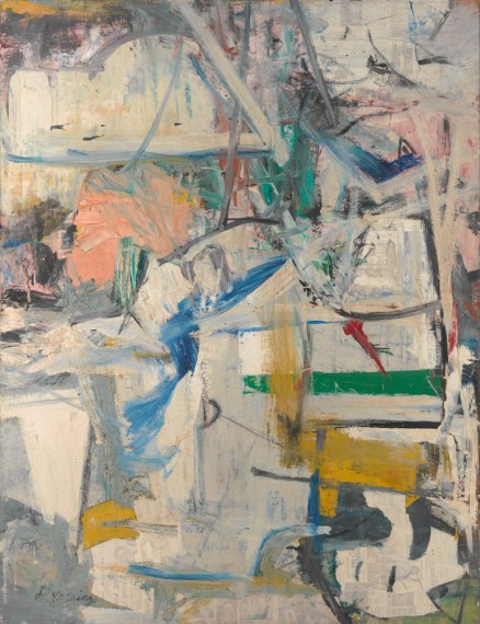
I want to point out one of my favorite pieces: “Easter Monday.”  This is one of his pieces that refers to an urban landscape, which makes sense, given that he was living in the NYC. I read (well, listened actually) about how he wanted to portray the destruction of buildings and empty lots that he saw. I definitely saw it right after that lady’s voice told me! This is also a piece that was painted on newspapers to keep it wet, and when DeKooning came to work on it the next day, the newsprint showed through, and he loved how it looked! And so did I! If you look really closely at the picture I’ve provided, you can see it. It’s much more apparent in person at the gallery. Look closely at the bottom right of the painting! Enjoy!

Gamelan is the “Bomb”-elan!

After having the opportunity to play the instruments of the Gamelan Orchestra, I was able to appreciate the Gamelan Concert  on an entirely different level in LeFrak Hall on Monday, December 5. As a class, I think we can all agree that we didn’t have any idea this music form existed! Not only do these instruments sound different, but also they have a very unique design! The deep reds and golds make them look rich and ethnic, which adds to the experience of watching a performance. Another aspect that adds to the performance is the addition of dancers! The style of dancing is very basic, and the women dancing are dressed in dresses that have the same color scheme as the drums and xylophone-type instruments. However, when I write “basic,” I don’t mean to take away the unique style that it carries. Although the moves are basic, they require the dancers to twist and turn into positions that catch your eye but don’t take away from the instrumental performance.

I also want to touch on the sounds and styles of the music created with the Gamelan Orchestra. Today, and the day I got a chance to use the instruments, when I heard them individually, they were each pleasant and catchy on the ears. For example, the gongs resonated throughout the room and gave off a rich, deep “yong.” The slenthem is the Gamelan version of the xylophone, which I am familiar with. Having played the xylophone in the past, I know the notes are read like a piano. However, the slenthem is read in a whole other set of notes. Although it looks the same, it requires a little change in understanding. Also, after each strike, the musician must muffle the bar so the sound doesn’t ring on forever, because that would cause a big mess of noise. Speaking of noise, when all of the instruments are played together, it is easy to heard just a bunch of noise. The percussion instruments definitely overpowered the slenthem and others, unless the percussion wasn’t playing. This isn’t to say  I didn’t enjoy the Gamelan, I actually loved it! I played percussion in the past, so I appreciate the beats produced, but I also enjoy the balance of sounds in the traditional band. I would definitely consider taking a Gamelan class in the future!


Queens Dance Department “Fell” as Well

Tonight, I had the pleasure of attending the Queens College dance show, “Embracing Diversity.” From the beginning of the first performance, I knew a style had appeared that I’d seen before. The final performance of “Fall for Dance” was almost identical to this one, “Embracing Diversity” as far as style goes. The style of music is a mix of sounds that have a bit of a beat and is repeated over and over again. This is similar to the part in “Fall for Dance” when the dancers were dancing to the song with counted numbers. Now, I mentioned to a friend next to me that these dancers really have to rely on each other and make sure they’re in sync. This style is more about feeling the music than counting the music, because when a song is so repetitive, it’s easy to lose track of which part the song is at.

As far as the actual movement is concerned, the dance moves are performed slowly and are stretched out. It almost looks as if they’re dancing separately from the music. There is also a lot of twisting of the body, so it draws attention to the shapes that the dancers make. The dancers perform a set of these movements and then repeat them as the song repeats. In my opinion, a performance like this makes me think, which I appreciate, but I know that it also tries a lot of people’s patience. I believe that an audience can’t walk into a dance show and have a certain standard for the show to live up to. It’s like any art form: stay open minded and give it a chance.

My favorite part of the show was the final tap number of course! My professor, Marshall Davis Jr., choreographed the piece, and he used the style of Charlie Adkins. His style of tap is classy and clean. The tappers were dressed in suits, suspenders, and and fedoras, with tastefully placed gold sparkles around the costume. I want to mention an aspect that I found interesting, because I’ve discussed this with Professor Smaldone and Professor Marshall Davis: the use of arms. In this number, the choreography included use of the arms in unison. I always appreciate when they are, but I also expect that this was part of Adkins’ style.

I’m happy to share that “Embracing Diversity” will be performed on December 3rd and 4th as well in Rauthas Hall at the bottom floor! So come down and support the Queens College dance department!

Occupy Wall Street: A Revolution or an Art Show?

After occupying Thomas Paine Park on Thursday November 17, 2011, I noticed some aspects that were significantly different from the past locations I’ve occupied. To help me explain this experience, because it’s not a very common one, I’ve found a fitting comparison that may or may not please a few folks.

Occupy Wall Street, in my opinion, is increasingly resembling the artsy experience that is Burning Man. This idea first arose when I heard a certain chant that didn’t seem to match the political movement that it’s supposed to be. “We got your back! You got our back!” was the chant that made me stop and think, and while I was pondering over the chant, a man waltzed by me screaming something about the civil war. In fact, as my friend and I circled our way around the park, there was a different group of performers (I mean protesters) every few steps. It was almost like going from exhibit to exhibit. The first exhibit consisted of a marching band making its way through the park. I was sitting on a bench when they made their debut in the park, marching behind me with a catchy beat that encouraged me to start bouncing my head. When I looked forward, the second exhibit appeared. This one kept me entertained with a circle of dancers all dressed in green, which matched the marching band. As soon as I had enough of the band tunes, I made my way to the source of the loud chanting. There were a few leaders on a mini stage with megaphones, leading a number chants from “We are the 99” to “La gente unido no puede ser derrotada!” And with everyone joining in together, the words became increasingly distorted and difficult to make out.

This may sound a bit messy, but that is what I’m attempting to emphasize. The messiness of Burning Man is part of what makes it enjoyable and artsy. However, when a revolution is trying to ground, it’s dangerous to be mistaken for a performance. My point is further discussed in a New Times article by Jillian Dunham when he touches on more “shows” that are put on at Occupy. At Berkeley, they released floating tents. And in New York, there was a bat signal that hit a Verizon building. Now, on one hand, these are great ways to make it into the public eye and gain attention through the media. However, my concern arises when I talk to people back home in Texas who only see what’s going on through television and radio. It becomes easy to bash a bunch of street performers screaming something about percentages. The 1% who run the media are skilled at making it seem like this should blow over in no time at all.

Basically, the goal should be to remain in the pubic eye while sending an organized, centralized concern that can be respected. The problem with this movement resembling Burning Man is that Burning Man is over after a few days. This is what encourages the idea that “Occupy” will blow over eventually, instead of initiating a just reform as it should. I feel like at the end of the day, some people get arrested and there’s some violence, which stands as the finale of Burning Man when the huge wooden man is burned. And this marks the end of the celebration. I support and appreciate the energy that is put into Occupy, but if we could harvest all of that energy into a single idea and get that translated into policy, then I believe we will have successfully changed the country for the better by restructuring the way firms influence elections and take risks on innocent citizens’ money.

I have provided the article by Dunham, and a video of my experience this Thursday! Enjoy! (Just click either link)


Occupy      <<< CLICK HERE                                                                                                                                      

I Fell for Dance

Since we’ve touched on most of the general observations in Arts, I’d like to share some specific observations from the tap performance.

In the Tap number, I enjoyed the simplicity of the stage from the beginning. The spotlight hit him and him only, which directed the audience’s attention to the front of the stage where he stood. What, then, excited me was the first step that he executed. I was able to identify the step quickly, because the number required him to start slowly. It was the shuffle! Which is also known as the “brush and spank.” In this step, the dancer strikes the floor with what is referred to as the “toe” part of the foot. Then, he “spanks” it back with the toe again. The end of the step involves planting the foot in two steps: toe down then heal down. Due to the fact that actions speak more loudly than words, I’ve provided a sample of the step down below.

Another aspect I appreciated was the ballet incorporation. Given that I am currently enrolled in a tap class, I found the incorporation interesting, because I’m so unfamiliar with it. What this encourages me to do is take as many dance classes as possible, so I can combine techniques in a performance like this! So yes, I fell for dance, because it has taken an even more prominent part in my life.

The Art of Thinking

“He prefers to think of them not as art objects but as “confusion machines” -Randy Kennedy of the NY Times.

In the lower east-side, there’s a new museum that has opened up, designed by Carsten Höller. His style and views fit in nicely with a discussion we had as a class regarding art that makes you think. Is it even art? Or is it just science? We decided that it was, indeed, art, but this museum seems to take it a step further. Not only do you have to sign a waiver before entering this museum, but the exhibits seem to require a lot of human participation and interaction. Now some people might say, “If I’m going to be the art, I can simply avoid the museum entrance fee and just go home to my mirror.” However, there is something about being in a museum space that is designed for art that can make even a human seem like a piece of art. There’s something about lying in a tank of water with the temperature of human skin with nude strangers that makes someone feel like he is becoming the art and experiencing it with other people. Is that at the same level as looking in the mirror? I wouldn’t say so.

What a Fitting Attraction for this Haunting Month

In the Bronx, Edgar Allen Poe owned a cottage about 160 years ago that has been under a $500,000 renovation. I wanted to let others know that it may be opening up again sometime soon, and I know I’ll be one of the first in line to visit. Perhaps by the 31st?

There’s always something very intriguing, yet spooky, about visiting the dwellings of major figures of the past, especially those owned by the author of “The Raven” and “The Fall of the House of Usher.” When I pay a visit, I focus on two major aspects: the interior design and the owner’s history. Naturally, the design catches my attention for I take quite an interest in interior design, so seeing how taste and color choices have evolved is right up my alley. I believe that the curtains, woodgrain of the floor, rugs, and kitchen setup can say a lot about a person, granted it is my first job to find out whether an interior decorator was hired, because that would interrupt my conclusions.

This leads me right into the owner’s history factor. As I learn more about the owner of the house, I can start to see why they would have certain pieces of furniture in a certain room or why they preferred to have a desk in the living room as opposed to the study. Maybe the location of writing was preferred there? Maybe there was something in the study that annoyed the writer? Poe wrote two poems that we know of in this cottage: “The Bells” and “Annabel Lee,” and the article says more.

Of course, on a basic level, it’s always a joy to be able to say, “I walked on the same floor that Edgar Allen Poe walked on!” But that’s stooping to a level that I try not to amuse too much; quite déclassé in my opinion… Just kidding! Who doesn’t love that aspect?!

Want to learn more? Just click on the picture of Poe’s Cottage!

A Queens College Faculty and Alumni Performance to Remember

To begin on an aesthetic note as opposed to a musical one, I would like to show my appreciation for the concert hall that we are lucky enough to have such quick access to here at Queens College. Each time I walk into LeFrak Hall, I notice everything from the beautiful woodgrain of the hall to the masterful, sound architecture that enhances the concerts that take place here. I just wanted to share that this does not go unnoticed any time I’m there.

Now to hit that musical note, there are a couple performances that I want to touch on specifically. The first is the two piano solos by Donald Pirone. Of course the sound and style of his playing was delightful, but I was able to relate most with the fact that he was not reading sheet music for the piece “Three scenes from the heartland” or for “Sonata.” A fellow student asked me once both solos finished how he could possibly memorize a complex piece like that. I responded by assuring him that Mr. Pirone has most likely connected with that music far beyond just a simple memorization technique. I’m sure he doesn’t go up to a fellow pianist and ask, “Aren’t you impressed at how I memorized that one?” Rather, he probably comments on his interpretation and speaks of the movements that he finds most moving.

The other performance that captured my undivided attention was the “Piano Trio in B-flat Major, D 898” by F. Schubert. I found this fascinating to watch because it reminded me of a scene from any play between three actors. It’s not enough to just know your own part of the trio. It was clear that each musician knew each other’s parts and how they all came together. I watched closely when the cellist, Miss Rosen, would close her eyes when she played, but she would open them often to look over at the violinist. When I saw them looking at each other, it seemed as if they were having a conversation through the music, which is essentially what they are doing. The violinist, Mr. Phillips, would sing his violin song, and Miss Rosen would respond back either in quick staccato notes or in long sustained ones. If this were a scene in a play, the violin’s character would be small and squeaky, while the cello would be the large and low-registered friend. In both pieces of art, this creates a lovely and well-designed contrast!

Overall, the concert was most enjoyable, and as always, I look forward to attending more events at LeFrak.

I Met the Met and the Hals Hall

As part of my first trip to the Met, I was able to explore two exhibits that, surprisingly, had much in common. The first, of course, was the Frans Hals exhibit. I found it fascinating how most of the ladies and gentlemen in the portraits were previously lower class. The piece that comes to mind is the portrait of the man who may have been named “Nicolaes Pietersz Duyst van Voorhout.”                                                                                                                                                  

            Apparently, he owned a brewery, which doesn’t seem like the kind of position that would need to be remembered through a portrait, and that, in my opinion, is the beauty of it! The fact that he wasn’t a king created a shift in societal norms that is refreshing. As I walked through the “Hals Hall,” I enjoyed the fact that these people were simply common. Because of this, a viewer is able to appreciate the true elements of the painting, rather than worshipping the subject of the painting. One of the aspects was clothing. Our tour guide informed us that Haarlem was known for its use of different textiles and fabrics and knowing this explained why Hals used such detail on clothing. 


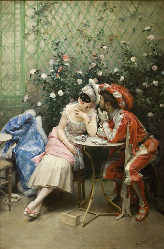
After visiting the Hals Exhibit, I paid my next visit to the Lehman Collection, which is now one of my favorites! From the moment I stepped into it, I felt like I was inside a dainty apartment going from room to room. It contained paintings from around the 14th century all the way to the 20th century! Compared to the Hals Exhibit, most of the pieces, with the exception of the portraits, were more colorful and seemed livelier. Although it’s difficult to compare because the Lehman Collection is so large and contains pieces from many centuries, I thought that the portraits of the Lehman Collection were similar to Hals’ style through the detail and color schemes. One of the pieces that stood out to me far above the others was “Masqueraders” by Madrazo of 1875. The minute I spotted this one, it stood out because of the “realness” factor. If you look at the maiden’s fair skin, it looks as if you could reach out and stroke it. And the fact that her coat is lying in a chair next to her creates a very natural feel. Overall, when I am to return to the Met, I can see myself revisiting the Lehman Collection, whereas the Hals Exhibit was more of a one-time appreciation for me. I look forward to see where my wandering eye takes me in my visits to come.

A Memorable Evening at Rockafeller’s Chapel

September 11, 2011

One of the most important elements included in a special night of commemoration is the music. I felt that The Riverside Church 9/11 and Japan Event provided a fitting and tasteful playlist to pay respect to those who were affected by these devastating events. Specifically, I want to touch on a certain song that caught my attention. One of the songs that stood out to me as a suitable and sweet-on-the-ears kind of selection was the illustrious, “Amazing Grace.” Written by John Newton, this hymn has the potential to arouse many emotions in any given listener. Throughout the song, in my experience, I felt a deep sadness that transformed into a feeling of great hope by the end. I believe that a masterpiece like, “Amazing Grace” carries the power to inspire hope in troubled minds and peace in minds of vengeance and anger.

As for the choir that performed the piece, I felt that they provided a memorable and impressive sound that resonated throughout the sanctuary. The soloist in the song has a strong set of pipes and is very talented. However, with a song like, “Amazing Grace,” I enjoy hearing the melody sung simply and just as it was written. Sometimes extra runs here and there can distract from the beautiful, straight forward melody. Overall, the performance was flawless and it left the audience with a feeling of hope for the future of the U.S. and for Japan as well. So I say, “Thank you” to all those who made the event at Riverside possible.

Now, for your enjoyment, a segment from my favorite number.