You Will Love This Jazz Trio!

As an aspiring jazz vocalist, I often am surprised at how many amazing jazz artists I’ve let slip under my nose, especially when I realize how helpful they are in my own efforts to understand and master jazz music. Saxophonist Rudresh Manhanthappa, a musician of Indian jazz, is one of them. Mitch and I seized the opportunity (extended to us by our very own Professor Smaldone) to see him at Flushing Town Hall. The two main things I learned from this concert are: 1) you haven’t heard jazz until you’ve heard Indian Jazz, and 2) Jazz. Is. Communication. Watching Rudresh and his trio “The Indo-Pak Coalition” perform was as educational as it was absolutely entertaining- it served as a wonderful reminder about how crucial communication is in jazz.

The evening began with a Q & A session between Rudresh and our emcee for the evening. He told his story of being born in Trieste, Italy, growing up in Boulder, Colorado, and attending Berklee College of Music and DePaul University for his Master’s. I wasn’t expecting him to be so down to earth; I certainly wasn’t expecting his clear American accent, or that his taste in music would be so eclectic given the specific brand of jazz that he plays. By the end of the twenty-minute session, I was so curious about what his music would sound like that I could barely stand it. It also helped that a couple of months ago I attended an Egyptian Music workshop hosted by Carnegie Hall – I recognized some of the musical terms I had learned from that workshop and didn’t expect to also find them in Indian music.

Rudresh left the stage to retrieve the other two members of his trio, and a moment later, the three of them walked out together. Aside from Rudresh, there was a drummer and a guitarist, and I wondered if the trio would sound empty with the absence of a bass player (spoiler alert: boy, was I wrong).

After a couple of minutes of tuning, the trio began playing the only song of Rudresh’s I had previously heard: “Convergence.” Within seconds, I knew the night would be entertaining. From the very first note played, the three of them were all about communication. To blink would be to miss at least three glances between the players. They were always looking out for each other, checking in on each other, and listening to what the other one was doing. Rudresh’s solos went by lightning fast, and he played with a comical bended knee stance that we said looked a bit like a videogame character. He clearly is a musician who has reached the level of expertise that he barely needs to think about soloing anymore; he just does it.

I at first thought the guitarist, Rez Abbasi, wasn’t very good because of the inattentive , unconfident look in his eye, and during much of the first song he didn’t appear to be playing much. I was soon told that the guitarist probably has the hardest part of the three of them: he is acting as a bassist and a guitarist; he is holding everybody together as the drummer and Rudresh venture into different feels and melodic ideas. The more I watched him, the more I realized he was doing. The show couldn’t have gone on without him. Of many of Rez Abbasi’s highlight moments for the evening, my favorite had to have been his lengthy guitar solo at the beginning of the second song in the set. The chords that he chose, combined with the different pedals he pressed, gave his solo such an addictive quality. I literally did not want him to stop soloing, and was internally cranky when he did. It vaguely reminded me of the style of Stanley Jordan, in that Rez was able to make his one guitar sound as if three guitars were playing at once. That is when you know you’ve got yourself a good guitarist!

My favorite artist to watch of the trio, though, had to have been the drummer Dan Weiss. I consider him to have been the coolest and most light-hearted of the group. He was constantly grinning as he played, and his presence was overall nonchalant yet sure of himself. His experimentation with different drum fills was evident throughout the night. When playing the traditional tabla drum, he sat cross-legged on the floor, occasionally contorting his leg to impulsively reach the hi-hat or bass drum pedal. In less than two seconds, he could lift himself onto his drum stool to play the kit. He made it look like so much fun! It was also quite cool that he spotted the two of us in the audience and smiled/looked at us several times. 🙂

Rudresh’s music is great for the Indian jazz skeptic. For anyone who thinks they won’t like Indian jazz, Rudresh (with this trio especially) is the artist to see. Rudresh doesn’t make his music too exclusively Indian or too exclusively jazzy. The drums are constantly rotating between swing feels and other typical jazz feels and beats found in the heart of Indian music. One can definitely tell that the songs are Indian jazz, but there are melodic ideas within Rudresh’s compositions that unexpectedly take the audience to different musical worlds: sometimes the guitar sounded rock-ish, for instance, and sometimes Rudresh’s solos sounded bluesy. This concert as additionally taught me that I like musicians who experiment!

Even if you decidedly despise Indian jazz, see Rudresh’s trio as a musician, jazz or not. The benefits or communication really show between the three of them. In my experience, it is very easy to forget to communicate to your fellow musicians, whether you’re playing in a combo, a big band, etc. For a genre that is a thousand percent more free than the rigidness of classical music, this isn’t good! Communication is key to keeping things running smoothly and producing really cool solos, and Rudresh Manhanthappa and the Indo-Pak Coalition are wonderful testaments of that. Go check them out! Rudresh is based in New York!

A Supposed Acquired Taste: de Kooning

Modern abstraction always provokes a strong reaction from me. It could be either good or bad, but nevertheless it is always a strong one. I walked into the Willem de Kooning exhibit at the MOMA with two immediate thoughts: This is a big exhibit and This looks like rubbish. Big collections can either prove to be redundant and overwhelming or lavish and extensive depending on the proficiency of the curator. I became restless as I tried to size up the entire exhibit, genuinely trying to give each piece a chance as I moved robotically along with the flow of people.

Suddenly, I wasn’t actively giving the pieces a chance, but standing in front of them because I was mesmerized. Towards the end of the exhibit were the pieces that I enjoyed most. I often scoff at the wannabe art connoisseurs who talk about the art in front of the art for all to hear, using the characteristic hand motions to convey their moved emotions. But, I found myself along with Kat, discussing the pieces, trying to interpret the meaning behind the paintings that on the surface, could just be written off as scribbles and blobs. I liked how the paintings towards the end provoked an emotion from me. And with abstract art, the emotion cannot be quickly attributed to an element of the piece because you cannot explain if you don’t understand. So, I tried to figure out why each piece instilled feeling in me and suddenly came to somewhat of an understand of de Kooning’s art.

I sometimes found myself positioned like this, pondering yet perpetually confused.

Abstraction such as de Kooning’s can have meaning. Many meanings. Everything is open for interpretation. It can also have no meaning. And that is the beauty of his work. The purpose of each work is not known because de Kooning left the interpretation to the viewer. When an artist masters this technique of leaving interpretation to the viewer, he/she has become a master. The goal of every artist, in my opinion as an artist myself, is to be able to create an intimacy between the artwork and the viewer. The artist does this by conveying emotion in the work and thus, leaving the meaning of the work up to the viewer. This suddenly makes the art very personal. I believe that this is the point of art and that de Kooning is a master. This might be arguable, some might say that anyone can do what he does because he does not display the conventional techniques of a master. I can throw blobs of paint on a canvas. Sure, you can. I don’t doubt any of you skeptics. But, with those blobs, can you invoke feeling? Can you create an intimacy? Can you give infinite meanings to your work and yet have it remain elusive? It is my turn to be a skeptic and say that most of you can’t answer yes to these questions. But, I’m sure if you can, the MOMA would open its arms to such a master.

The Book of Mormon: Politically Incorrect

Two of my closest friends are big fans of the show South Park. So, as soon as advertisements for Trey Parker and Matt Stone’s new musical, The Book of Mormon, were splayed across every MTA bus, they would not stop talking about it. The musical, which has been playing on Broadway since March of this year, has already won 9 Tony Awards among others. The profanity and blasphemy, all done in catchy numbers and joyful choreography, is very characteristic of both Parker and Stone and is perfectly up their alley. Tickets are nearly impossible to get and my friends and I have been waiting for this winter break to try to get student rush tickets after listening to the soundtrack countless times over the summer.

The story follows two young and rather naive, Mormon missionaries as they travel to an AIDS ridden and God hating tribe in Africa. The young men try and spread the word of God, but the harder their attempts are, the more futile the mission reveals itself to be. Both Parker and Stone love stirring up some religious controversy so they display the ridiculousness of the missionaries and the beliefs they so valiantly preach through songs and dance that mock the validity and conviction of faith in a modern context.

The musical is filled with profanity and crude dialogue, but all in good taste…if that’s possible to claim. The musical obviously is respected judging by how many awards it has won, but the musical is also extremely approachable and not intimidating at all. I’ve attached one of my favorite numbers, All American Prophet, so I could share the hilariousness and genius with all of you. However, viewer discretion is advised.

watch?v=LHuKr746Csw&feature=related


Cultural Sensitivities and Art

Recently, I came across an article describing an interesting design for two towers connected by what would be meant to look like a pixelated cloud. In this “cloud” would be public gardens, a pool, and other services for the two buildings. The idea sounded fantastic until I saw a picture of the design. It looks almost exactly like the twin towers being hit by planes on on 9/11.

Despite the fact that the designers are based in the Netherlands and the towers are to be built in South Korea, these designs have caused quite a stir. The designers have come out with an apology to those who are made uncomfortable by the towers, but they have no intention to prevent it’s construction. Which raises an interesting question: Should artists and designers be constantly worried about cultural associations that may arise from their art?

On the one hand, 9/11 was a very big deal. The entire world has heard of it and even now, 10 years later, the wounds are still fresh in our minds. But neither the Netherlands nor South Korea have any particular connection to 9/11, and the connection of their towers to the attack would not be made. It’s a really nice design and concept if you don’t have those terrible associations. Does it make sense that they should sensor their work because it has bad connotations in other contexts?

This isn’t the first time that cultural contexts has been a problem for artists. For example, the swastika was an ancient east-asian symbol of good luck before it was used by the Nazis in World War II. Because of this, no one thought it would be a problem to have the symbol on a Pokemon card back in 1999. Pokemon didn’t just stay in Asia, and in fact became very popular in the US. The card incited a major stir, causing Nintendo to discontinue that card in America, noting that what was acceptable in one culture may not be acceptable in another. In 2002, a similar incident occurred with toy pandas that came with christmas cookies. The Chinese oriented company meant no harm and immediately apologized for their cultural mistake.

You can read a bit more about the towers and it’s controversy here.

New York by Gehry

There are very few architects that create real art through the design of their buildings.

Frank Gehry is definitely one of the few.

Most New Yorkers know him for his design of the spiraling Guggenheim Museum structure, but he recently completed the tallest residential tower in the Americas. The project is entitled New York by Gehry.

As a unique take on the developing genre of the high rise residence, its undulating facade has virtually guaranteed it a place among the great classics of architecture.The Pantheon has nothing on this stuff.

I hear the lobby is the nicest in the city. Someone should tell the OWSers.

Shane Truly Understands Art

I can truly respect the idea of merging art and science together. I love the idea! In our Arts Seminar, we are always discussing art that makes us think, so if science can’t make that happen, I’m not sure what can!

Shane Hope has created a hollogram-like experience with photographs that presents them as three-dimensional objects. On a wall within the gallery, there is a grid of 160 squares that are all a part of this intricate machine. In addition, there are homemade machines in the gallery called RepRaps. These machines are on wheels, and they produce three-dimensional representations of objects scanned by it. Basically (which is a poor word choice, considering the perplexing complexity of these machines), these machines are all assembled by the same parts and one machine could potentially be turned into one of the other ones in a “Matrix” style. His exhibition is called “Transubstrational: as a Smart Matter of Nanofacture,” which clearly doesn’t hide its inclusion of technology in this artsy experience.

Since the piece can be assembled in many different ways, it requires human interaction in a certain way, which adds an entirely new side to art in my opinion. I think that he really has a unique experience to offer (and not just because his name is Shane) in that when you look and analyze each piece, it teases one side of the brain that’s saying, “This piece is technically the same as the other one, because it’s composed of the same pieces.”  Honestly, I would demand a demonstration, because quite frankly, I’d have a hard time grasping the idea when it’s right in front of me.

I believe that the moment we start to incorporate technology and new inventions into art, it’s a clear sign that art is moving forward and in sync with interests of the current decade. Notice how the word “growth” wasn’t used here, because I would argue that it may not necessarily be growth, as we talked about in class. However, I would argue that art has to keep the general public’s interest, just like other forms of art. I think artists like Shane encourage others to push the limits even further.


A Desire for Game Changers

Throughout the year we have been discussing the intersection of money, politics, and art. We have observed giant, expensive spectacles without much political influence, as well as smaller, cheaper expressions of political perspectives. It’s taken us all around the different styles of art and the different people who make it.

This article tries to look at the year in art through the same lens. The author observes how, despite the larger amount of galleries and shows than there were before, it has become more of a rehash of old trends and spectacle than it is an expressive medium. People want to cash in on older ideas instead of trying new things or making a statement. He points out that there were still some great things to come out of this year, including the Islamic art exhibit and the de Kooning retrospective (both mentioned in the article). But they were few and far between, while most of the quality was mediocre at best.

What this article really praises is the combination of art and politics, praising the Occupy Wall Street movement for producing deep, thought provoking art without the monetary ambitions of most of todays artists. The article also mentions two galleries, “Bye Bye Kitty!!! Between Heaven and Hell in Contemporary Japanese Art” and “Ostalgia”, which were all about the political and social issues that the art was addressing. Though the technical techniques were nowhere near as advanced as those of a modern artist, the expressiveness and point-fulness of the art is what makes it what it is. It requires no spectacle and impressiveness to be excellent. It finds that within the art itself.

Over the year, I’ve started to appreciate this idea a lot more. Like John Cage’s 4’33, the message and poignancy of the art can be more impressive and more important that the means used to create it. It is important to appreciate, not just what makes up the art, but what the art is.

the Art of Light—A Building Transforms to A Pinball Machine in A Second.

I would not have discovered so many interesting art stuff if I did not come to Macaulay and take Art Seminar in Queens College. I feel thankful to this program because it exposes me to so many amazing art and brings me the great experiences that I could never have imagined; it also motivates me to discover art news in the Internet.

I find a interesting news about the huge pinball game which is projected onto the facade of a building. During the Festival of Lights 2011 in Lyons, France, “Carol Martin and Thibaut Berbezier, who form the experimental art collective CT light, made the installation, called “Urban Flipper” which create the projection. It utilizes every single element of the exterior of the the building of Celestins Theater and presents these elements as the obstacles of the pinball game. It allows the onlookers the opportunity to play the most spectacular pinball game in the world. That is really stunning; I wish I could have been there and play it or at least witness it.

When I saw the video for the first time, I was astonished; I was thinking that how could this be possible. But, Martin and Berbezier  just made it; their imagination is incredible. This is a great combination of art of light and game. The art of light seems like is developing and progressing rapidly. A couple of months before, I read the news about the Ground Zero Ceremony during which the the twin towers were “rebuilt” in the form of two straight blue light, which also amazed me. Usually, we only see light as an element accompanied to the performance on the stage, but now we see more and more light performance which is displayed independently. The magic of light, I believe, will continue to entrance us.

Just recall what I have written before about the art of firework, I feel that, today, multifarious arts are swarming throughout the world. Art is not restricted to paintings, sculpture, music, dance anymore; it has developed into new dimensions and it is absorbing more elements that will bring us more novel experiences.

Doesn’t that look familiar? The 3 Davids

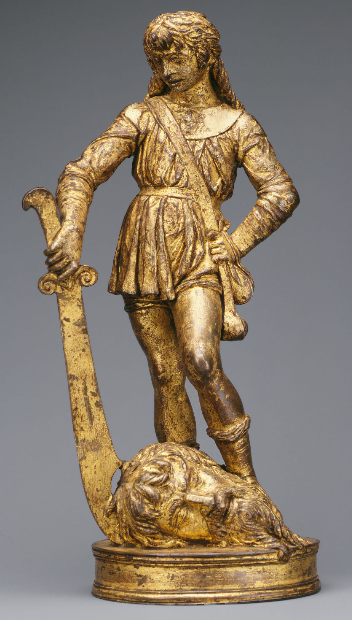
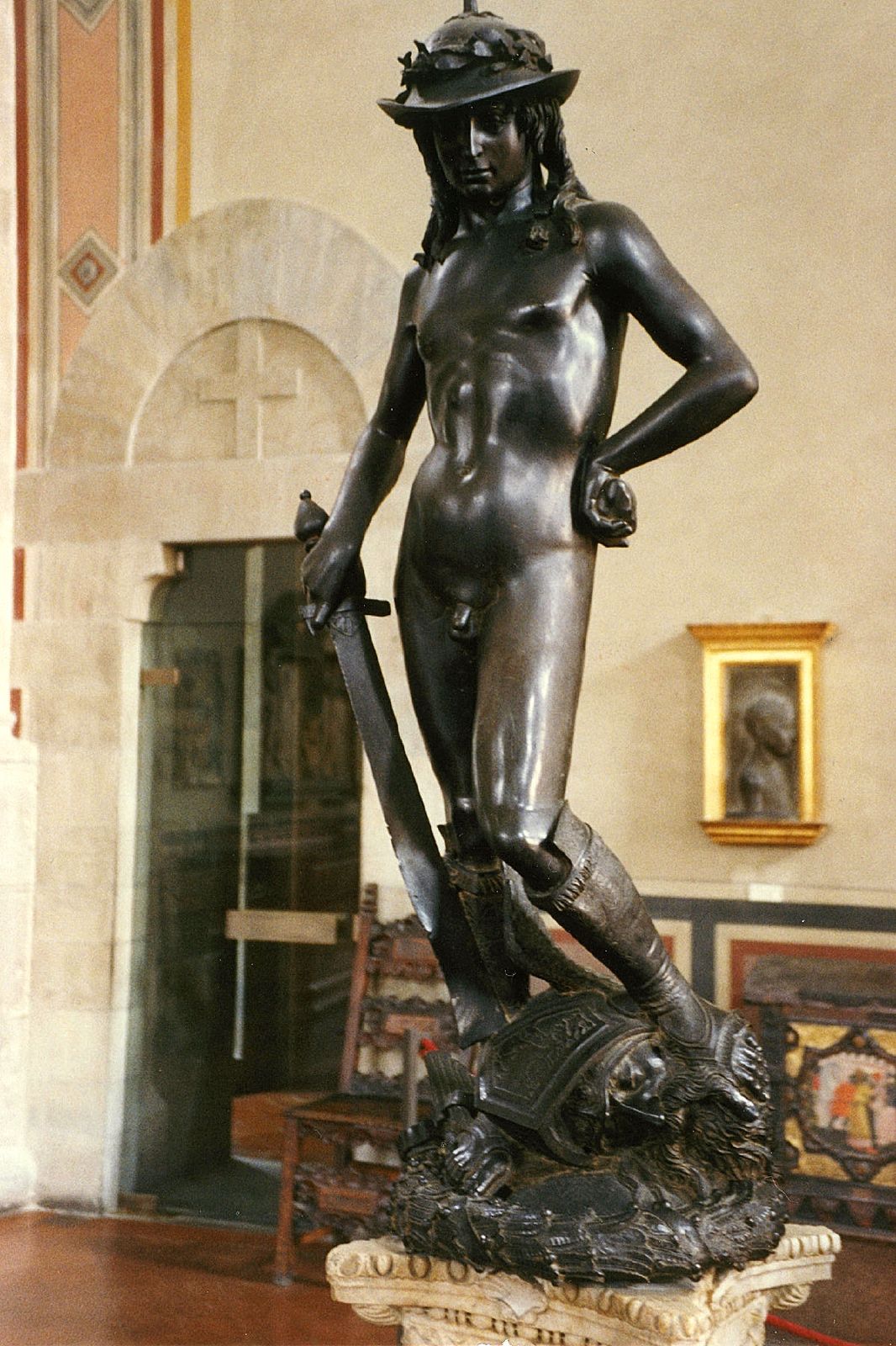
One of my most favorite things about this class is my recently developed knowledge of history’s art and my new ability to make connections between pieces across time periods. When I recently visited the Met, I found myself experiencing this very feature. On display in the European Sculpture and Decorative Arts exhibit is an exquisite oil-gilded statue of David titled David with the Head of Goliath. Sculpted out of bronze by Italian artist Bartolomeo Bellano in the 15th century, the sculpture immediately made me think of Donatello’s famously bronze David (1425-1429). I was pleased to learn that Bellano was indeed one of Donatello’s disciples. Looking at the two together it is evident that Donatello set the path for Bellano’s later sculpture.

Bellano's David, David with the Head of Goliath, (1470–80)

Donatello's David, David1425 -1429


But Donatello and Bellano are certainly not the only artists who have attempted to depict David. Michelangelo and Bernini, amongst others, created magnificent portrayals of the biblical figure. What is interesting to learn, though, is the effect of each artists’ respective time periods on their depictions. Looking into these artists’ history explains some very important aspects of their work.

Italy was flourishing in the 15th century. As the Italian Renaissance continued to shape the culture of Florence, much of the art produced was commissioned by the civil government, courts, and wealthy individuals, most notably the Medici family. Around 1430, Cosimo de’ Medici commissioned Donatello’s David. The first freestanding nude sculpture since classical antiquity, David is evidence of Donatello’s revival of ancient Greece and Rome’s love and respect for the body. The Middle Ages was a period when the focus was on G-d and the soul, so artists rarely represented the nude. David’s contrapposto position, originated by the ancient Greeks, gives the sculpture a sense of movement, unlike the stance of the traditional male figure. David’s right leg is pushed up, causing the wing of Goliath’s helmet to ride up his left thigh. The beginnings of Humanism are apparent, as Donatello forms David’s body with his pioneered shallow relief technique. Donatello’s choice of bronze, the nudity, and contrapposto pose emulate the Humanist antique.

Donatello’s novel young figure of David embodies the ideals and concerns of 15th century Italy. At about five feet tall, David symbolized the Republic of Florence. Donatello stressed David’s victory as a sole result of G-d’s influence; David’s youth, slender physique, boyish expression, and rock in his left hand portray the slaying of Goliath as a direct result of Divine Intervention. The Florentine people saw their success in defeating their enemy, the Duke of Milan, in the early 15th century as the hand of G-d. Florence was a mercantile republic, as opposed to Milan, which was a military power and autocracy. David became the symbol of the Florentine Republic and peace, while Goliath took on the role as the Duke of Milan.

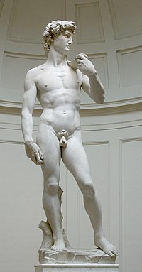
Michelangelo's David, David, 1504

At the height of Humanism in the High Renaissance, Michelangelo created his David. Michelangelo’s David  differed from Donatello’s in its adolescent physique and absence of Goliath’s head. David’s marble face, tense and ready for combat, bulging veins in his right hand, yet contrapposto pose suggest that David is portrayed after he has made the decision to fight Goliath, yet before the battle has actually begun. David’s  serenity of conscious choice prior to dangerous action is consistent with Renaissance ideals.

Michelangelo’s David embodies the fully developed Renaissance idea that man is G-d like because he is created in G-d’s image. David’s perfectly chiseled tendons and uninterrupted contour depict strength and wrath, Florence’s two most important virtues, as it had just cast the ruling of the Medici family. The Florentine people immediately identified with the colossal David as a shrewd hero over superior enemies.

Bernini's David, David, 1623-1624

Bernini's David, David, 1623-1624

There is no time for contemplation in Bernini’s David. Actively fighting Goliath, this David challenges the conventions of time and space. Michelangelo and Donatello’s Davids are serene and pensive; Bernini captures David in his moment of action. The path to G-d during the Renaissance was through the mind; Michelangelo and Donatello’s Davids ask the viewer the contemplate the beauty of man, G-d’s greatest creation, which will lead the viewer to an understanding of G-d. However, in the Baroque era, the path to G-d was more direct, emotional, and bodily. Baroque art dares its viewers to relate to the image in our bodies, not just our minds. Bernini’s David is actively involved in its surrounding space.  The viewer must walk around it on all sides to experience its full effect. David’s toes literally step of the plinth. The contour of his body is crossed by his twisting cloth, the line of his neck, his bending arm, and the sling across his chest, heightening the spiraling of his body. Bernini forms David like a wound spring, while paying attention to the realism of the body. The visual tension creates deep shadows and intense illumination, typical of Baroque style.

Nowadays, we tend to think that art is only good if it is new and innovative. But these artists attest to the timeless artistic practice of learning from others and perfecting their work.

Mozart’s “Sinfonia Concertante” Performed at Queens College

What a way to end off the Arts in NYC seminar – hearing Mozart’s “Sinfonia Concertante”, perhaps his “crowning achievement in the field of the violin concerto” (Alfred Einstein, not to be confused with Albert Einstein)! I hardly feel qualified to talk about such an extraordinary piece, but I will nonetheless attempt to do it justice.

Performed by our very own Queens College Orchestra, the piece consists of three movements: Allegro Maestoso (moderately fast), Andante (walking pace; not too fast, but not too slow), and Presto (faster than allegro maestoso). This last movement was my personal favorite. In this performance, there was a violin soloist and a viola soloist, both of whom were fabulous. A viola is slightly larger and has a lower key than a violin, and taken together the two complemented each other very nicely. The vibrato of the violins was also a very distinguishable and praiseworthy characteristic of the concert, adding to the emotion and feeling of such classic and inspiring music. Even though there were defined movements, some parts didn’t fit in to the given movement; as an example, while the presto was pretty fast, there were some slower parts embedded in it as well.

It tends to be taken for granted that Mozart and other famous European composers were the “great” composers. However, actually going to a concert that performs their music gives me a MUCH greater appreciation for just how great they were; there is something so mesmerizing about going to a famous classical music concert and hearing the music played live. For me, it gave a taste of the emotion, depth, and energy of classical music. It now seems readily apparent to me what the people in 18th century Europe loved so much about this type of concert. If only more young people would go to these concerts, they may very well add classical music to their list of favorites.


The Ultimate Love Story Coming to Broadway

The author of the The Notebook, Nicholas Sparks, has recently announced that his novel which claimed its spot as the contemporary ideal love story when it was adapted for film, is now coming to Broadway. The Notebook follows two young adults who come from different worlds and backgrounds, but fall in love regardless. It was the tear jerking romance of our generation when it came out in 2004. To keep the city relevant, he revealed that the setting will be altered to take place in Manhattan. Casting is going to be difficult considering actors will have big shoes to fill, namely Rachel McAdams’ and Ryan Gosling’s.

As popular as this love story is, it’s hard to imagine the show retaining the same level of profoundness as the movie if the actors are going to be dancing and singing about the stage. Imagine the famous “I wrote you everyday” scene set to a swooning orchestra instead of the pitter-patter of rain. That’s not to say that there haven’t been romantic dramas that retained seriousness once they enter the world of Broadway. But, sometimes it’s not always better to have a soundtrack to everything. Maybe the revamping of this classic love story will sit well with the elements of a musical or maybe some things should be left alone in their greatness. Perhaps, the phrase “if it’s not broken, don’t fix it” applies. It will not be known until critics get their seats to the much anticipated show which has not a release date yet.


Art’s Progress is in its Process

As a final reflection, I’ve decided that as our Arts in New York City Seminar explored the arts and subsequently, current events, both political and cultural, we’ve learned that the process of an artist is just as important as the final product. Arguably, innovation as an artist is not easy, and even much harder than it used to be. There are claims that everything has been done before. The box has been filled. So, the contemporary artists who maintain vision learn to work outside the already filled box.

I saw a pattern in the art that we looked at and experienced as a class; much of contemporary art seeks significance in the process of creating it. Many artists claim that the importance and value of their piece is during the creation and rendering of it instead of the final product. I believe that aesthetic is not as stressed as it once was and as artists are testing new boundaries on abstraction and unconventionality, art has more than a surface meaning.

To name some examples, Pontus Lidberg’s Faune, which we saw at Fall For Dance wasn’t something I liked at first. It wasn’t conventional and it wasn’t easy to understand. Traditionally, we tend to like things that are easy to understand because the unknown is frustrating especially if we can’t wrap our minds around it. But, innovative artists want to show that art is not easy. That it attempts to explain what we cannot understand and that there is more to it than its presentation or end product. Another example is Aaron Young’s Greeting Card which possessed the ‘wow factor’. Young’s piece proved innovative because of the display of its process. The end product wouldn’t have proven valuable if emphasis wasn’t placed on the process. Contemporary art has proven that there certainly is more than what meets the eye.

Reflection – Arts in NYC Seminar

As the semester closes, a time of reflection is called for. The questions: which event was my favorite, which event was my least favorite, and what lessons did I learn from the class, must be addressed. Each answer of course must be explained in detail and reasons for the answer must be provided. I will begin with my most favorite event this whole semester: Fall for Dance.

When thinking about this class and the events we attended, Fall for Dance, without a doubt, pops into my mind instantaneously. This was my favorite for a series of reasons. One reason being the diversity it contained. Another reason being the excitement and speechlessness that it caused me to feel. And the third reason being, the countless unique interpretations that can be made by those who observed the magic of the performance. The four sections of various dance styles and music flowed seamlessly and really captured my attention. To narrow down which sections were my favorite from the performance itself, I would have to choose the first section of classic ballet and the last section, which I call the counting dance. Many people question why I chose the first section as one of my favorite parts. My answer to them is, technique and precision. It is not easy to carry out such movements in the graceful and enchanting manner that the dancers of this ballet did. I appreciate the practice they put into it and their talents. As for the counting dance, well that one is easy to distinguish from the rest, and easy to call a favorite. It stood out because it was like nothing anyone has ever seen before. The language of the numbers, the interpretative dancing, and let’s not forget the shocking “flashing”, were put together to form one major masterpiece, and for that I applaud the choreographers and everyone else that worked to make the dance a reality.

On the other side of the spectrum, my least favorite event would have to be either the Cone Sisters exhibit or the Don Giovanni Opera. Some might attack me for saying this, but I found the Cone Sisters exhibit rather dull. The room itself being gray didn’t help either. I just didn’t see what made this exhibit so special. So, a couple of art works possessed by these two women were displayed. Okay, and? Once, again this is just my opinion. The Don Giovanni Opera was probably great to many of my fellow classmates, but considering the fact that I already saw a Don Giovanni Opera earlier in the year (which I liked much more), made it repetitive and disappointing. Comparing the two operas couldn’t be helped. The actors and staging of the second opera were just not as amazing as the first opera I saw, despite the second opera being performed at the MET. However, I still found it interesting to see how different people could take one idea and turn it into multiple productions.

In conclusion, this seminar taught me many things. It taught me how to find the information about art that I desire, how much politics and controversy there is in the art world, and best of all… it taught me how to be a “snob”. Mission complete!

Polish Art – The Forgotten Culture

This Art in New York City semester exposed me to many different types of art that were worth taking the time out to see and study, however, once again I’m disappointed that my culture was forgotten. Students constantly study Italian and American art, sometimes even art from other cultures such as that of the Islamic lands. But, what about Polish art, why is it constantly overlooked? Art historian, Andrzej Szczerski, tells us that Poland “had an extremely difficult history, but its been fertile ground for culture, even under communism, when it flourished illegally”, and he’s correct in saying so. Poland is definitely making its way into the art scene.

We can see many examples of Poland’s recent art success through various artists, venues, and works of art. Famous Polish artists include Miroslaw Balka, Wilhelm Sasnal, Marcin Maciejowski, and Edward Krasinski and famous Polish art venues include the Zacheta National Gallery and the Ujazdowski Castle. My favorite among those listed would have to be Balka for his exhibition The Unilever Series. His “box of darkness” may creep some individuals out but it is well suited to my liking. The experience of the visitors of the exhibit having to trust the organization representing the traveling immigrants and their journey is, to say the least, mind-blowing. Other aspects of the exhibit represent other historical occurrences in Poland’s history, such as the trucks that took Jews away to the camps of Treblinka or Auschwitz. Personally, I find art like his, art that is interactive and representative, much more interesting and worth visiting than some of the pop art that is so widely known in our times. Perhaps, that is only my opinion. Why don’t you check it out for yourself?

http://www.artnews.com/2011/09/27/hidden-no-more/
http://www.tate.org.uk/modern/exhibitions/unilevermiroslawbalka/default.shtm

“Unexpected twists and thought-provoking turns”

For as long as we can remember, women have been fighting for equality with men, and although women seem to have achieved a lot within the past decades, it is definitely not enough to stop.  Perhaps we won’t start a new movement or create protests in the streets, but we will create art and share it.

Sanja Ivekovic has believed in the idea of promoting female equality through art for a long time and her works, now being displayed at the Museum of Modern Art, are a retrospective covering over 35 years.  Her work is being referred to as full of “unexpected twists and thought-provoking turns” because it is saturated with shocking images that create an unforgettable message of the importance of women’s rights.

Sanja Ivekovic's “Women's House (Sunglasses),” from 2004.

For example, Ivekovic’s most recent works focus on violence against women.  “Women’s House (Sunglasses),” which is a continuing work, combines images of beautiful fashion models wearing sunglasses with short, first-person accounts from abused women who often wear sunglasses to cover their bruises.  The images are unforgettable.  Similarly, for the “Paper Women” series (1976-77) Ivekovic took images of models from magazines and scratched, tore and defaced them in shockingly effective ways, in order to imply acts of violence.

Sanja Ivekovic's works at the Museum of Modern Art include “Lady Rosa of Luxembourg,” (2001).

The biggest, most overpowering piece of them all is “Lady Rosa of Luxembourg,” a sculpture in the MoMA’s atrium that consists of a life size statue of a pregnant Greek goddess displayed atop an obelisk.  At the base is a “jarring combination of epithets and historic catchphrases (Whore, Kitsch, La Résistance).”  It was initially exhibited in Luxembourg in 2001 fairly close to a similar statue that was “unpregnant,” therefore it created a lot of anger, arguably taking away from its purpose of increasing awareness of abuse of women and children.  Its efforts, nonetheless, are extremely vital in our society.  Female equality cannot be forgotten– so go see the exhibit…

… and check out this article to learn more:  Venus Rising From Her Pretty Prison.