
One afternoon, I was wandering around Washington Square Park enjoying a beautiful weather, only to discover a statue of Miguel de Cervantes, one of the most influential and well known writers of all times. The fact is that this statue is located in a garden called Willy’s Garden on the campus of NYU, which seems to be dedicated strictly for this statue. Being a fan of Cervantes’s Don Quixote, I took a closer look.
The statue was relatively big, and its metallic structure made a strong impact, as if to represent the influence of Cervantes’s work all over the world. As seen in the picture, his left hand is holding a sword, and his right hand is holding a roll of paper. These elements definitely created a perfect representation of the man- who has a reputation of an excellent writer and a great fighter as well.
This statue, though being a form of stationary art, enables to bring Cervantes’s personality to life. It allows us to almost experience his presence by being able to approach it closely and observe it from different directions.


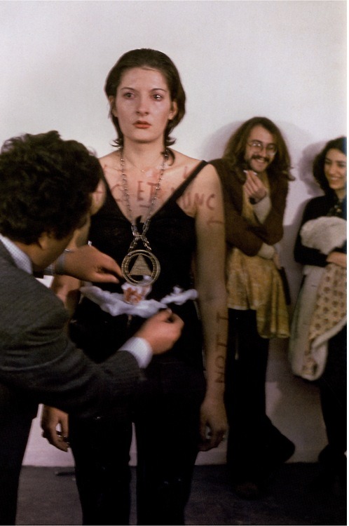
I know this is a bit late, but I wanted to devote one of my posts to Marina Abramović who we saw in “Picasso Baby” by Jay-Z. I know a lot of people didn’t know she was a famous artist at the time, but I wanted to show everyone her art since each piece is really powerful in my perspective.
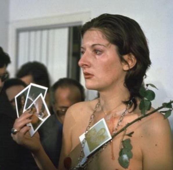
One of my favorite pieces by her was actually in 1974 called “Rhythm 0”. In this piece, she made herself the art object for 6 hours (8pm-2am) and put 72 objects on a table that the audience could use on her. The objects ranged from an apple and lipstick to a loaded gun and box of razors. I though this piece was really powerful because she literally risked her life to show how the audience treats an artist. It also has to do a lot with sociopsychology since when one person decided to act violently and didn’t get in trouble for it, everyone else started acting that way.


“What I learned was that… if you leave it up to the audience, they can kill you.” … “I felt really violated: they cut up my clothes, stuck rose thorns in my stomach, one person aimed the gun at my head, and another took it away. It created an aggressive atmosphere. After exactly 6 hours, as planned, I stood up and started walking toward the audience. Everyone ran away, to escape an actual confrontation.”
You should definitely check out her other work, I especially liked “Rhythm 5”, “Breathing In/Breathing Out”, and “The Artist is Present”.

On Saturday, September 27th at 3:17PM I left my 97th street dorm and headed for the downtown 6 train. I was heading to Baruch, not for class, but to attend TEDxGramercy which was being held at Mason Hall in the 23rd Street building. With my Business 1000 textbook in hand to study for Monday’s exam, I waited anxiously on line, only looking up to take a few steps forward.
The topic of the night was grit, but what is grit?

“Life takes grit. From the smallest organisms surviving in the void of space to the bravest children growing up in abject poverty… from the boxing ring to the surgical table and back, the tenacity of life is unassailable!”
There were a total of 7 speakers: Caroline Adams Miller, The Moments that Make Champions; Harriet Taub, Creative Reuse; Harvey Rubin, Keeping Inoculations Cool; Nir Barzilai, How to Die Young at a Very Old Age; Michael Crouch, The Cost of Courage: We Need to Pay Attention; David Ginspoon, Terra Sapiens: Planetary Challenges of the Fourth Kind; and Amikaeyla Gaston, Dare to Be Dauntless!. Each speaker told a different story and with each story came a different emotion, a different feeling, and a different definition of how to live the “gritty life”. A summary of these stories wold do them no justice, but to put it in the words of the speakers:
Grit is Why not me? Grit is art. Grit is saving lives. Grit is courage. Grit is music
Grit is being limitlessness.
Check out the list of speakers at tedxgramercy.com/grit and keep an eye out for the recorded talks at ted.com

This was a really hands on project that allowed anyone to pick up a piece of chalk and just write down what they wanted to e. Some people wrote cute messages, others wrote down funny things, fantasies and aspirations. It was just a way to share with the world what you wanted to be. I contributed to it myself but it was really hard to make up something to write that wasn’t already taken.

This piece by Claude Monet caught my eye as I was looking through the oil paintings at the Met. I really like the colors – the sea foam green and aqua blue that make up the ocean, then the bright blue sky and its puffy white clouds. Everyone in the scene looks like they’re enjoying life whether they’re taking a leisurely stroll or heading out on a canoe.
This peaceful beach town scene reminds me of my hometown. Nothing beats sitting on the beach watching the tides roll in.
I think it goes without saying I miss summertime at the Jersey Shore!


Last year, I was exposed to one of the most fascinating art forms I have ever seen: The art of The Brick.
This form of art, created by Nathan Sawaya in 2002, includes a variety of 3D sculptures and large portraits that are built of regular LEGO bricks in a very irregular way. When I attended the exhibition in NYC, I was really surprised to discover enormous structures, (some as large as a real human and some even larger), that are so impressive and attractive, yet they are made of something so simple that usually people don’t even tend to view as art.
In the exhibition, both kids and adults were very excited and impressed by this form of LEGO art. It was a very inspirational experience that taught us that with dedication and creativity, everything is possible.
Personally, this exhibition really changed my view of art. I realized that art could range from the most basic thing to the most complex- and it would still be beautiful and unique. I absolutely enjoyed it, and I would really recommend for everyone to attend whenever there is another exhibition in NY! (There are exhibition all over the world, actually.)
Here are pictures of some of the most impressive structures:

CLIFF HOUSE

FLYING SHIP
The first thing I noticed about Rachel Feinstein’s Folly collection was its striking contrast against the lusciously green setting. All three pieces have a similar facade that gives them a feel that is mystical and out of this world, whereas its setting is natural and very familiar. What is most interesting to me about Folly is that although it looks very paper-like and flimsy, the actual structure is quite sturdy because it is made out of aluminum. After observing the pieces for some time, I realized that “folly” is the perfect name for these pieces for they do not serve a functional purpose but they sure are nice to look at.

During the last few weeks of summer my mother and I felt that we need to spend more quality time together before I had to leave for school. And so we headed to the city to catch a show on Broadway. I wasn’t familiar with the story line of Chicago but because so many people raved about it my mother and I decided to buy tickets. I’ll admit that the first ten minutes of the show was absolutely awkward because of how scandalous the actors and actresses were dressed however, the performance of the show was just so amazing that I realized that attire is a huge asset behind the art of Broadway. In the show that I watched, Amra-Faye Wright was the leading actress and she made me collect a whole new level of respect for performing artists. To be able to memorize hundreds of lines without a slip, profess emotion through body language and on top of that sing/dance…it was absolutely stunning. I give Chicago the Musical a rating of ★★★★★!

In the film Provenance, Amie Siegel represents the global trade of furniture from an Indian city to various parts of the world. The piece of furniture that she mostly focuses on is the chair. At the beginning of the film, we saw photographs of some very old buildings in India that serve as factories for the production of furniture. The factory looks practically dark and abandoned; however, the same photographs also reveal color and light, specifically sunshine. In one of the images that I have attached, it is possible to see a single chair standing outside in the sunlight. From that point, we begin to recognize its significance and value. Throughout the rest of the film, we see all sorts of chairs in different colors and different positions, sometimes surrounded by other chairs standing upright, and sometimes overturned on top of each other.
As the film progresses, we begin to see other styles and forms of chairs in distinguished shapes and colors, though the focus is always on the basic structure of those chairs, which remains the same all throughout. As the film begins to take a more modern setting, we are introduced to a myriad of other pieces of furniture that are capable of replacing that one, old traditional chair. In a series of photographs, we see couches, sofas, beach chairs, stools and a bed, but the one aspect the remains common to all of these photographs is the fact that the same chair is always present as well. In one of the scenes, a man takes an old looking, half-broken chair and begins to break it apart even further, leaving only its fundamental wooden structure. After destroying it completely, we suddenly realize that the chair has been transformed into a newer, modernized piece of furniture. It was absolutely amazing to notice the transformation of something so dull into something so beautiful.
At the final stages of the film, those pieces of furniture that were produced in the Indian factory are being transferred to other countries as merchandise. Once they arrive to auction houses in Paris, New York and London, I was surprised to discover that their monetary value is as high as $70,000 (!!!) Although this seems surprising at first, we quickly realize that the meaning behind this film is to represent the historical and artistic values that are hidden within those pieces of furniture. The film’s unique demonstration of the movement of the furniture around the globe points at its unique history, which consequently influences its fluctuating value. This film made me realize that something as simple as a chair may, in fact, have such high artistic significance that people often fail to acknowledge it with the proper recognition and admiration. The conclusion: don’t ever judge a book by its over.

My all time favorite form of art is music, and by living in NYC we experience A LOT of it. From the street performers to the musicians at Madison Square Garden, music is everywhere.
Last night, I saw Grouplove in Central Park. I’ve seen them once before at a music festival in Delaware, but something about the beautiful park with the lit up buildings as the backdrop made the night magical.
The music was awesome, but they were also displaying their art. Singer Hannah Cooper had her art in a pamphlet that was handed out at the entry. Since it was the Honda Civic Tour, they were raffling off a new car painted with Hannah’s art. (See images below!)

Overall, the experience was amazing as I got to listen to great music while viewing cool pictures and drawings.
Here’s a video of their opening song!


Recent Comments