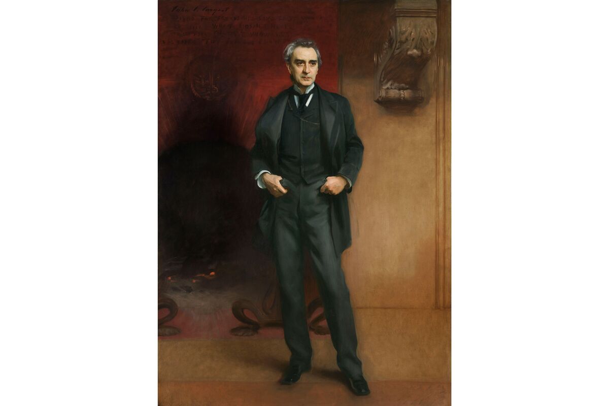
Anthony, your pose and facial expression convey the same pensiveness as found Sargent’s work. When I look at both subjects, I cant help but ask myself what is he thinking about. I really enjoyed the different medium you used in each of your variations. Each could stand on its own, but all connect back to that central demeanor found in Sargent’s work. Your first variation impressed me the most because of how well you merged the two layers of a presumably independently taken back ground and foreground. The highly contrasted and saturated subject fits in well with the painting of bamboo in the background. The background brings to mind the Japanese ink prints which influenced Sargent throughout his works.
I enjoyed your modern take on the original painting. In the original, the man seems slightly aloof which you captured well in your own variations. I like how you experimented with the backgrounds in each variation. My favorite was the photographed version because it looked so ordinary, like it was a scene out of a normal day. You seemed to be in your element as the man in the original Sargent painting seemed to be in his.
This website uses cookies so that we can provide you with the best user experience possible. Cookie information is stored in your browser and performs functions such as recognising you when you return to our website and helping our team to understand which sections of the website you find most interesting and useful.
Strictly Necessary Cookies
Strictly Necessary Cookie should be enabled at all times so that we can save your preferences for cookie settings.
If you disable this cookie, we will not be able to save your preferences. This means that every time you visit this website you will need to enable or disable cookies again.


Anthony, your pose and facial expression convey the same pensiveness as found Sargent’s work. When I look at both subjects, I cant help but ask myself what is he thinking about. I really enjoyed the different medium you used in each of your variations. Each could stand on its own, but all connect back to that central demeanor found in Sargent’s work. Your first variation impressed me the most because of how well you merged the two layers of a presumably independently taken back ground and foreground. The highly contrasted and saturated subject fits in well with the painting of bamboo in the background. The background brings to mind the Japanese ink prints which influenced Sargent throughout his works.
I enjoyed your modern take on the original painting. In the original, the man seems slightly aloof which you captured well in your own variations. I like how you experimented with the backgrounds in each variation. My favorite was the photographed version because it looked so ordinary, like it was a scene out of a normal day. You seemed to be in your element as the man in the original Sargent painting seemed to be in his.